North star · Let oversized, quiet typography and broad tonal fields frame the work, then keep supporting information small, aligned, and easy to scan.
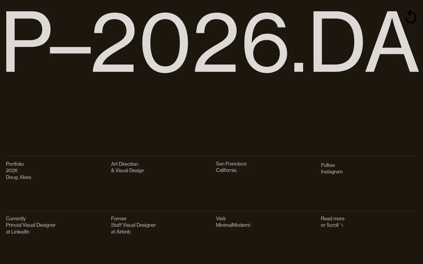
The visual strategy is restrained and editorial: a nearly black-brown opening establishes atmosphere, while bright white and pale blush panels carry the portfolio content. A giant, lightweight masthead dominates the first viewport; small, muted text arranged in aligned columns provides an intentional contrast in scale. The single measured webfont handles the page’s display and utility typography, with regular weight and compact tracking keeping even the dense résumé lists visually controlled. Content alternates between spacious, high-impact project imagery and tightly organized text rather than relying on decorative interface elements. The featured project is shown as a large photographic spread, with its own printed graphics and colors treated as artwork, not brand palette. Subtle horizontal rules separate information bands and tables. The overall rhythm moves from sparse introduction to image-led work and then a dense, pale profile section, using broad color fields and generous breathing room instead of shadows or rounded cards.
配色
点色块复制色值。用途说明来自对页面的实测位置(背景、文字、描边、按钮)与截图判读。
品牌色
表层色
中性色
功能色
页面底色 · Gallery White表层 · Blush Paper表层 2 · Roast Ink表层 3 · Pure Black主文字 · Soft Graphite次要文字 · Gallery White弱文字 · Deep Text
文字
背景
对比度
WCAG
#333333 Soft Graphite
#ffffff Gallery White
12.63:1
AAA
#333333 Soft Graphite
#fff5f2 Blush Paper
11.79:1
AAA
#333333 Soft Graphite
#1d1610 Roast Ink
1.42:1
不达标
#333333 Soft Graphite
#000000 Pure Black
1.66:1
不达标
#ffffff Gallery White
#fff5f2 Blush Paper
1.07:1
不达标
#ffffff Gallery White
#1d1610 Roast Ink
17.88:1
AAA
字体
字号阶梯:Custom(比例约 2.542,正文 12px)。示例用免费替代字体渲染,数值为实测。
Aa 设计
wtqc
网络字体 · 字重 400 · 占比 100%
免费替代:Inter
Single measured webfont used across display, headings, body copy, and links.
角色
示例
字号
字重
行高
字距
特大标题
Oversized portfolio wordmark across the dark opening.
Doug–Alves
197px
400
1.04
-0.003em
一级标题
Primary page or section heading, including the profile introduction.
Doug–Alves
72px
400
1
-0.014em
二级标题
Secondary headings and prominent supporting statements.
Doug–Alves
28px
400
1.29
-0.021em
正文
Compact profile, résumé, and project information.
The quick brown fox 敏捷的狐狸
12px
400
1.33
-0.033em
链接
Small utility and social links.
The quick brown fox 敏捷的狐狸
12px
400
1.33
-0.033em
间距与布局
基准单位 1px · 密度:适中
—版块间距
—元素间距
—卡片内边距
—内容最大宽度
1px
Use broad, full-width color fields rather than a visibly boxed site frame. The opening aligns a giant masthead near the top, then places compact introduction details in four evenly distributed columns separated by thin horizontal rules. Follow with a simple section heading and a wide featured-project image. The pale profile area uses a strong introductory statement followed by carefully aligned information columns and dense award lists. No page maximum width or spacing scale is measured; match the screenshot’s generous upper breathing room and tighter lower information layout.
圆角与层次
没有测到阴影:页面是扁平的,层次靠底色和描边区分。
The page is predominantly flat, built from uninterrupted dark, white, and blush color fields. Use thin horizontal rules to divide information rows rather than shadows, card outlines, or rounded containers. Keep project imagery as a strong, edge-to-edge layer between the section heading and profile content.
组件
下面的预览按实测的按钮、输入框、徽标、卡片样式重建(字体用替代字体)。
Oversized masthead
A single enormous, light-weight wordmark spans the dark opening; keep its scale and tight visual fit as the dominant first impression.
Introductory detail grid
Small muted text is distributed across four columns and two rows, with thin horizontal separators on the dark background.
Latest work heading
A concise, left-aligned title on a white band introduces the featured project.
Featured project image
A broad photographic spread shows printed design material with an angled crop and visible artwork details.
Profile statement
A prominent text block on blush paper summarizes location, current role, and design practice.
Experience and awards lists
Dense, small-text career and recognition details use aligned columns and fine horizontal dividers.
Social links
Minimal text links such as Instagram and LinkedIn sit within the introductory information grid.
Imagery · Use large, editorial project photography as the principal visual content, especially a close, angled view of printed design work that fills its section. Preserve the source image’s crop and its embedded typography and color as project artwork, not as interface styling. The opening remains typographic rather than image-led; no illustration or 3D treatment defines the brand.
该做与不该做
✓ 该做
Use Roast Ink #1d1610 for the dominant introductory field.
Reserve Blush Paper #fff5f2 for the dense profile and résumé content.
Make the opening masthead dramatically larger than supporting text.
Keep utility copy compact, regular-weight, and aligned in columns.
Use thin rules to distinguish information bands.
Show featured work with a large, editorial crop.
✕ 不该做
Do not add gradients or decorative accent colors.
Do not turn the information grid into rounded cards.
Do not add heavy shadows or ornamental borders.
Do not let project artwork colors redefine the site palette.
Do not make the compact profile details compete with the masthead.
Do not force the design into a dense, uniform card grid.
给 AI 的提示词
想快速出一个同风格的新页面,把这段话连同 DESIGN.md 一起发给 AI。
Build a new designer-portfolio page in Doug–Alves’s restrained editorial style. Use Roast Ink (#1d1610) as a substantial opening field, Gallery White (#ffffff) for clean transitions, and Blush Paper (#fff5f2) for detailed profile content. Set a very large, regular-weight masthead above compact, muted introductory details arranged in aligned columns. Use the measured wtqc webfont when available, with Inter as a free substitute; keep small copy tightly set without making it bold. Introduce featured work with a simple heading and a wide project photograph. Treat colors inside that image as artwork, not interface accents. Organize career details in orderly columns with fine rules. Keep surfaces flat and square, avoid shadows and decorative cards, and preserve a clear shift from sparse opening to dense résumé content.