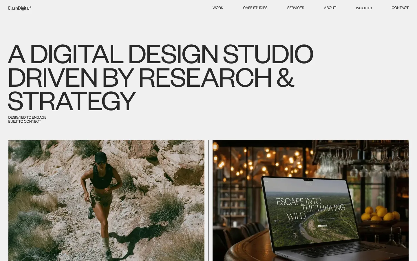
Dash Digital Studio 以醒目的大字、克制的中性色和项目图片展示作品与专业能力。首页采用纵向长页面结构,依次呈现精选项目、客户、奖项、资讯和联系信息。
North star · Let oversized, tightly tracked typography and a calm neutral canvas frame the project imagery, keeping every interface detail flat and deliberate.
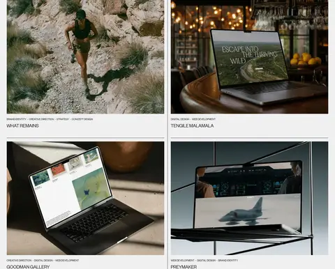
The visual system is built around a pale #f0f0f0 canvas, with #2a2a2a text providing firm contrast without the severity of pure black. Large uppercase headlines in Founders Grotesk establish an editorial, studio-led voice; compact uppercase labels and light body copy keep supporting information quiet. Featured work is arranged in a two-column image grid, with thin pale gutters and plain text captions rather than elevated cards. Later sections stay on the same light ground, using alignment changes and generous gaps to distinguish client stories, brand lists, awards, and news. A muted #bcbcb4 surface and a near-black #161616 section provide occasional tonal breaks; #ffffff appears as a clean surface, especially in the closing contact area. Photography and video bring natural, varied colour, but remain project content rather than a competing brand palette. Hairline #d6d6d6 and #cccccc dividers organize dense lists without shadows.
配色
点色块复制色值。用途说明来自对页面的实测位置(背景、文字、描边、按钮)与截图判读。
品牌色
表层色
中性色
功能色
页面底色 · Soft Canvas表层 · Gallery White表层 2 · Stone Wash表层 3 · Near Black表层 4 · Divider Grey主文字 · Studio Ink描边 · Divider Grey
All measured roles, from oversized display and navigation text to body copy, captions, and buttons.
角色
示例
字号
字重
行高
字距
特大标题
Oversized uppercase hero statement and major display moments.
Dash Digital Studio
101px
400
0.8
-0.03em
一级标题
Primary hero headline and prominent section-level titles.
Dash Digital Studio
70px
400
0.8
-0.03em
二级标题
Section headings such as Featured Work, About, and Latest News.
Dash Digital Studio
40.5px
400
1
-0.03em
三级标题
Project names and supporting content headings.
The quick brown fox 敏捷的狐狸
22px
400
1
-0.018em
四级标题
Compact uppercase subheads and secondary section labels.
The quick brown fox 敏捷的狐狸
21.5px
400
0.9
-0.03em
正文
Light-weight explanatory paragraphs and studio descriptions.
The quick brown fox 敏捷的狐狸
16px
300
1.2
0
辅助文字
Small uppercase metadata and project-category labels.
The quick brown fox 敏捷的狐狸
14px
400
1
-0.02em
按钮
Compact uppercase CTA and view-action labels.
The quick brown fox 敏捷的狐狸
14px
400
1
-0.02em
导航
Large uppercase display-style navigation or menu text.
Dash Digital Studio
101px
400
0.8
-0.03em
间距与布局
基准单位 2px · 密度:适中
58px版块间距
29px元素间距
—卡片内边距
1382px内容最大宽度
2px
3px
4px
7px
12px
14px
20px
24px
29px
32px
37px
58px
115px
The page uses a broad canvas measured at a 1382px maximum width, with content aligned to a consistent outer edge. The hero statement spans much of the width, then project media forms a two-column grid with a narrow gutter. Subsequent modules alternate between two-column copy layouts, full-width lists, and image strips. Vertical spacing is generous but not uniform: tighter within captions and rows, more open between major sections. Dense client and award information is kept orderly with horizontal rules rather than cards.
圆角与层次
没有测到阴影:页面是扁平的,层次靠底色和描边区分。
The interface is predominantly flat, with no measured shadows or decorative gradients. Project images sit directly on the canvas, and cards have square corners rather than rounded containers. Thin grey rules provide separation in brand, award, and footer lists; dark and muted section backgrounds create depth through tonal contrast instead of layering.
组件
下面的预览按实测的按钮、输入框、徽标、卡片样式重建(字体用替代字体)。
Top navigation
Small wordmark at the left and a compact row of text links aligned along the top edge; use #2a2a2a without filled button treatments.
Hero statement
Oversized uppercase Founders Grotesk text with tight tracking and compressed line-height, followed by a small two-line uppercase strapline.
Featured project cards
Square-corner project photography in a two-column grid, followed by small uppercase service metadata and a simple project title.
Client stories
A row of client names with concise copy and small dark pill-shaped view links; preserve the otherwise flat layout.
Brand experience list
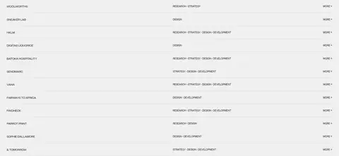
Full-width client rows with brand name, service category, and a compact more action, divided by thin grey hairlines.
Awards list
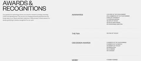
Two-column section with introductory copy on one side and award organizations plus recognition details on the other.
Footer contact block
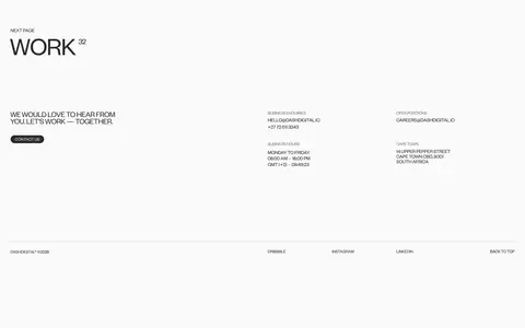
Light closing section with a large work invitation, contact links, grouped business details, and a simple bottom navigation row.
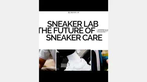
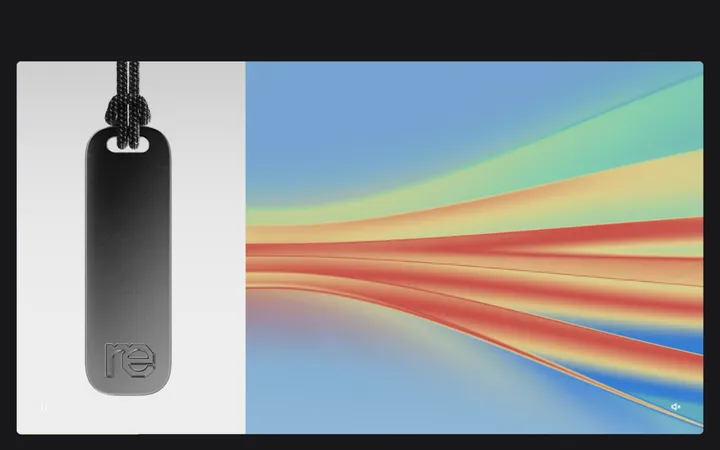
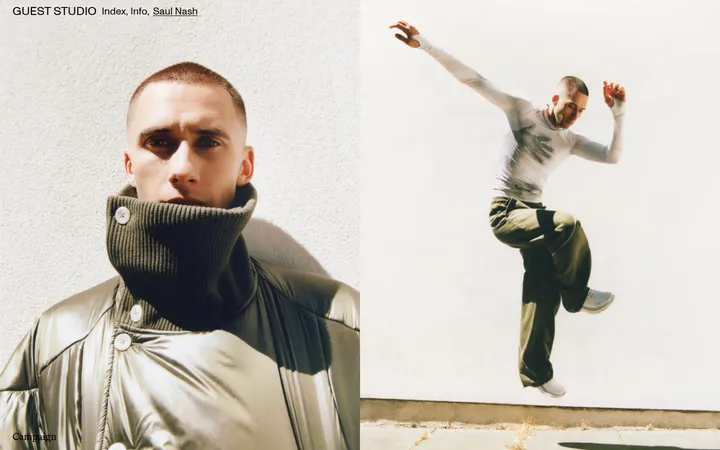
Imagery · Real project photography and video dominate the visual storytelling: campaign scenes, websites shown on devices, studio imagery, and editorial news photographs. Media is cropped into rectangular frames, often in paired columns or horizontal strips, with little decoration around it. Image colour is allowed to remain natural and sometimes warm or dark; it belongs to the featured work rather than the site’s interface palette.
Use the measured neutral colours as the interface foundation.
Set prominent headlines in uppercase with tight tracking.
Give project images large, clean rectangular frames.
Use thin rules to organize dense lists.
Keep links and controls visually understated.
Vary section layouts while preserving clear alignment.
✕ 不该做
Do not add gradients or drop shadows.
Do not introduce bright interface accent colours.
Do not round project media into cards.
Do not use heavy body text where light copy is measured.
Do not crowd the hero statement with extra controls.
Do not let image colours redefine the brand palette.
给 AI 的提示词
想快速出一个同风格的新页面,把这段话连同 DESIGN.md 一起发给 AI。
Build a new digital-studio page in Dash Digital Studio’s restrained editorial style. Use Soft Canvas (#f0f0f0) as the main ground and Studio Ink (#2a2a2a) for typography and navigation; reserve Gallery White (#ffffff), Stone Wash (#bcbcb4), and Near Black (#161616) for occasional surface shifts. Set Founders Grotesk or a close free substitute in oversized uppercase display headlines with tight negative tracking, balanced by light, quiet body copy and compact uppercase captions. Arrange project photography in simple rectangular grids, with plain metadata and titles beneath. Alternate broad two-column sections, full-width lists, and image strips, preserving generous section breathing room. Use Divider Grey (#d6d6d6) or Footer Rule (#cccccc) for hairlines. Keep the interface flat: no shadows, gradients, decorative cards, or unnecessary colour.