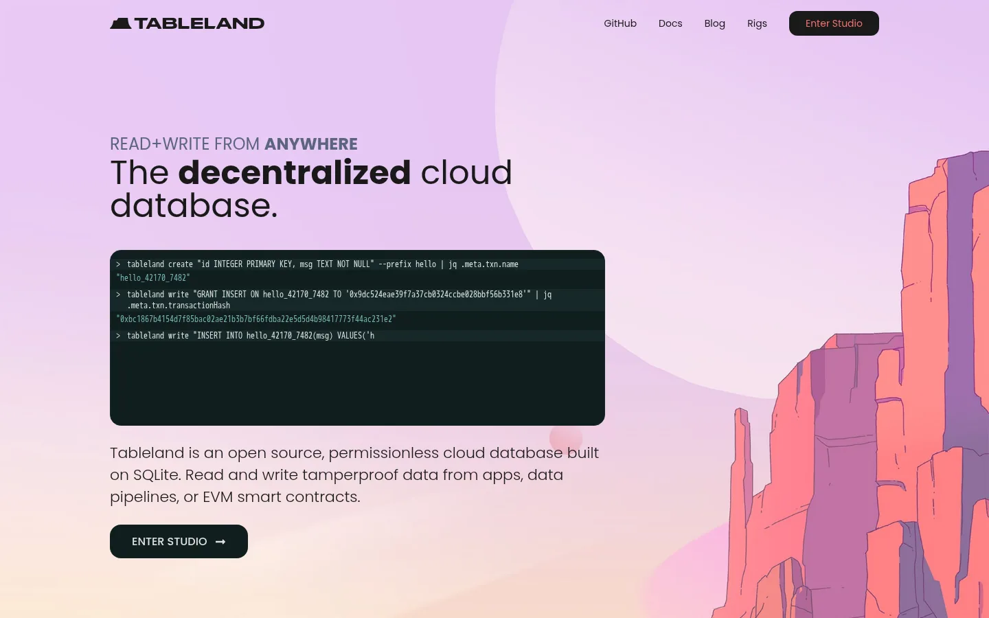
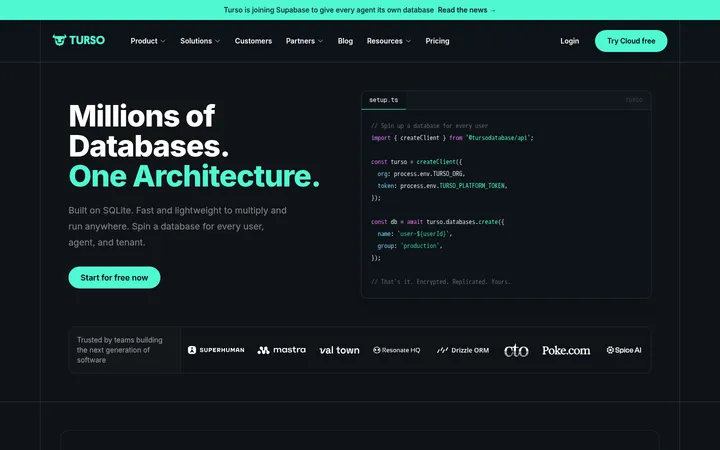
North star · Let a spacious, pastel illustrated hero open into a disciplined dark developer interface, keeping code and content more prominent than decoration.
The page contrasts a light, illustrated hero with a deep green-black canvas that carries through the feature, community, example, and footer sections. The measured hero band uses #e4cbf2; its pastel landscape and warm cliff artwork add visual character, while the screenshots show that illustration colours are artwork rather than the core interface palette. Poppins is the main voice: rounded, approachable sans-serif headings and light-weight body copy keep technical content from feeling dense. The opening pairs a prominent headline with a dark terminal panel, supporting paragraph, and compact CTA. Below, centered section headings introduce restrained grids of features, testimonials, and project examples. Cards use dark green surfaces and muted borders instead of heavy shadows. Spacing is generous between major blocks, with tighter, orderly groupings inside card grids. Teal links and muted text provide quiet contrast; coral and green accents appear sparingly.
配色
点色块复制色值。用途说明来自对页面的实测位置(背景、文字、描边、按钮)与截图判读。
品牌色
强调色
表层色
中性色
功能色
页面底色 · Deep Evergreen表层 · Lilac Sky表层 2 · Pine Surface表层 3 · Slate Moss表层 4 · Frost Light主文字 · Cloud Text次要文字 · Mist Sage弱文字 · Harbor Teal描边 · Pine Surface强调 · Harbor Teal强调 2 · Canyon Coral强调 3 · Signal Mint
Site-wide interface, navigation, headings, body copy, links, and buttons.
Aa 设计
monospace
系统字体 · 字重 300 · 占比 9%
免费替代:Roboto Mono
Terminal commands and code-like content.
角色
示例
字号
字重
行高
字距
一级标题
Primary hero headline.
Tableland
48px
400
1
0
二级标题
Major feature and section headings.
Tableland
30px
400
1.2
0
三级标题
Feature titles and project card headings.
The quick brown fox 敏捷的狐狸
24px
400
1.33
0
四级标题
Supporting subheadings and smaller section introductions.
The quick brown fox 敏捷的狐狸
22px
300
1.45
0
正文
Explanatory copy, feature descriptions, and page text.
The quick brown fox 敏捷的狐狸
14px
300
1.43
0
辅助文字
Compact secondary metadata and small supporting labels.
The quick brown fox 敏捷的狐狸
12px
400
1.33
0
按钮
CTA and action labels.
The quick brown fox 敏捷的狐狸
14px
400
1.43
0
导航
Header navigation links.
The quick brown fox 敏捷的狐狸
12px
300
1.33
0
链接
Inline links and card actions.
The quick brown fox 敏捷的狐狸
12px
400
1.33
0
代码
Terminal commands and technical examples.
const style = 1;
12px
300
1.33
0
间距与布局
基准单位 8px · 密度:宽松
128px版块间距
40px元素间距
24px卡片内边距
1280px内容最大宽度
4px
8px
12px
16px
20px
24px
32px
40px
80px
144px
The page uses a centered, spacious composition within a measured 1280px maximum width. The hero is left-aligned, with a narrow text-and-terminal column balanced by large landscape artwork. Subsequent dark sections alternate between a four-column feature layout, a centered testimonial grid, and a three-column project grid. Major sections have generous separation; card content remains compact and orderly. A distinct CTA band precedes a multi-column footer. Keep headings visually clear and avoid filling the broad areas of dark canvas with unnecessary content.
圆角与层次
按钮 · 4px
卡片 · 8px
图片 · 50%
没有测到阴影:页面是扁平的,层次靠底色和描边区分。
The visual language is mostly flat: large colour bands and subtle dark card surfaces establish hierarchy without measured shadows. Feature and example cards use dark green surfaces, while testimonials are more visibly lifted in slate green. Borders are sparse and dark, with occasional fine section dividers. Keep layering restrained and reserve stronger contrast for the terminal panel and CTA.
组件
下面的预览按实测的按钮、输入框、徽标、卡片样式重建(字体用替代字体)。
Header navigation
Compact links sit across the hero’s upper edge; the dark Enter Studio control contrasts with the pastel background.
Hero terminal
A broad, rounded dark panel contains small monospace command output beneath a left-aligned headline.
Primary CTA
Dark green-black button with light uppercase label and arrow; a separate header CTA uses coral text on near-black.
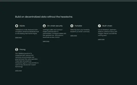
Feature grid
Small icon-led feature summaries arranged across a dark section, with muted copy and understated Learn more links.
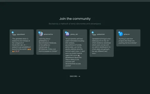
Testimonial cards
Community quotes sit in a multi-column grid of slate-green cards with profile details and light text.
Example project cards
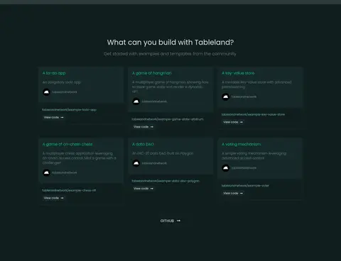
Community-built project examples appear in a three-column dark grid with compact descriptions, repository details, and View code actions.
Footer
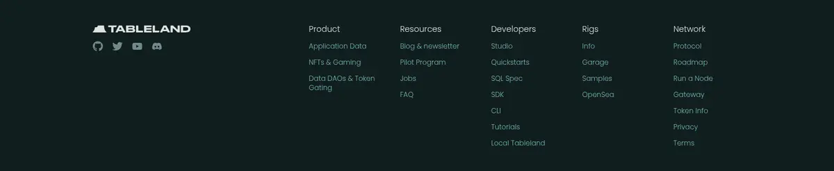
A dark multi-column link directory groups product, resources, developers, rigs, and network destinations.
Imagery · The hero uses a large, stylized landscape illustration: pastel sky and warm coral-purple rock formations frame the content rather than depict a literal product screenshot. Dark terminal content supplies the technical product cue. Lower sections rely on small icons, profile imagery, and community project cards, not large photography. Preserve the illustration’s pastel contrast and keep decorative artwork from overpowering text or code.
Use Deep Evergreen #101e1e as the main canvas for content sections.
Keep the opening hero pastel and illustration-led.
Use Poppins for interface text and a monospace face for code.
Give major sections generous breathing room.
Use teal for restrained links and navigation emphasis.
Group technical content into clear, compact cards.
Keep surface contrast subtle and shadows minimal.
✕ 不该做
Do not extend the pastel hero palette across every section.
Do not use coral or mint as dominant interface colours.
Do not add heavy shadows or glossy effects.
Do not crowd the hero with multiple competing headlines.
Do not make code look like ordinary body copy.
Do not replace the illustrated landscape with generic stock photography.
给 AI 的提示词
想快速出一个同风格的新页面,把这段话连同 DESIGN.md 一起发给 AI。
Build a new Tableland-style developer page with a spacious, confident hierarchy. Use Deep Evergreen (#101e1e) for the main canvas and Pine Surface (#162929) for cards, borders, and dark controls. Reserve Lilac Sky (#e4cbf2) for a light illustrated opening or featured band; treat coral landscape colours as artwork, not the core UI palette. Set interface text in Poppins, with light-weight supporting copy, and use monospace for terminal examples. Use Harbor Teal (#75b6b5) for selective links and navigation, Mist Sage (#718b8b) for muted copy, and Cloud Text (#e6e8e8) for primary text on dark backgrounds. Build clear grids for features or examples, a compact terminal panel, understated card treatments, and generous spacing between sections. Keep shadows absent or barely perceptible and accents sparse.