North star · Use oversized brand headlines and broad light/dark bands as the structure; keep violet for clear, purposeful actions.
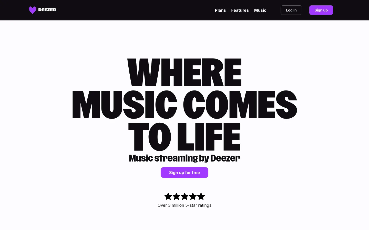
The page alternates a near-black canvas (#0f0d13) with crisp off-white (#fdfcfe) bands, making section changes legible without relying on decorative framing. Vivid violet (#a238ff) is reserved for signup and action emphasis; muted gray supports secondary copy, while borders are restrained. Headlines use Deezer Brand at very large scale, often bold and uppercase, creating a compact, poster-like voice against generous empty space. Inter carries navigation, body copy, and controls in a more neutral, readable register. Layout shifts between centered single-column statements, paired offer cards, and a three-column feature showcase; curved transitions soften the dark-to-light changes. Artwork and app imagery bring saturated color to otherwise flat panels, but remain contained within their feature contexts. Cards stay simple, with modest radii and little apparent elevation. The result is a spacious promotional rhythm punctuated by dense FAQ and footer navigation.
配色
点色块复制色值。用途说明来自对页面的实测位置(背景、文字、描边、按钮)与截图判读。
品牌色
强调色
表层色
中性色
功能色
页面底色 · Deep Ink表层 · Gallery White表层 2 · Card Charcoal主文字 · Gallery White次要文字 · Soft Ash弱文字 · Deep Ink描边 · Quiet Graphite强调 · Signal Violet
Navigation, body copy, captions, links, and buttons.
Aa 设计
Deezer Brand
网络字体 · 字重 700 / 800 · 占比 14%
免费替代:Barlow Condensed
Display and heading typography throughout hero and promotional sections.
角色
示例
字号
字重
行高
字距
特大标题
Oversized uppercase hero or campaign-style display statements.
Deezer
140px
800
0.9
0
一级标题
Primary hero headline and dominant page-level title.
Deezer
120px
700
1
0.002em
二级标题
Major section headings, often centered or left-aligned.
Deezer
56px
700
normal
0.004em
三级标题
Strong feature or subsection headings, sometimes uppercase.
Deezer
46px
700
1.04
0.005em
四级标题
Plan names and smaller promotional card headings.
Deezer
35px
700
1.2
0
正文
Main explanatory copy, plan details, and feature descriptions.
The quick brown fox 敏捷的狐狸
16px
500
1.5
0
辅助文字
Supporting notes, ratings context, and footer detail.
The quick brown fox 敏捷的狐狸
14px
500
1.79
0
按钮
Signup, plan selection, and other primary actions.
The quick brown fox 敏捷的狐狸
16px
700
normal
0
导航
Header navigation and prominent menu labels.
The quick brown fox 敏捷的狐狸
16px
700
normal
0
链接
Inline actions and informational links.
The quick brown fox 敏捷的狐狸
16px
500
1.5
0
间距与布局
基准单位 2px · 密度:宽松
140px版块间距
14px元素间距
24px卡片内边距
880px内容最大宽度
4px
7px
8px
9px
10px
14px
15px
16px
24px
25px
28px
32px
56px
112px
140px
A centered navigation bar sits above a broad, light hero; content then moves through full-width dark and light bands. The measured page max width is 880px, with spacious section separation and compact local groupings. Centered single-column sections alternate with two-column plan cards and a three-column feature grid. Large headlines establish alignment, while curved section edges add movement. The footer becomes a denser five-column link layout.
圆角与层次
按钮 · 12px
卡片 · 8px
图片 · 12px
没有测到阴影:页面是扁平的,层次靠底色和描边区分。
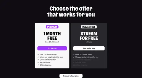
The interface is mostly flat: contrast comes from alternating canvas colors rather than shadows. Cards use restrained corner rounding, and the dark plan card is separated by its charcoal fill. Borders are thin and low-contrast, mainly useful for navigation controls and footer divisions; avoid floating, heavily layered panels.
组件
下面的预览按实测的按钮、输入框、徽标、卡片样式重建(字体用替代字体)。
Top navigation
Dark horizontal header with Deezer mark at left, compact navigation links, an outlined login control, and a violet signup action.
Hero statement
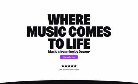
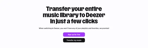
Centered light-canvas hero with massive stacked brand headline, short supporting line, violet signup button, and five-star proof point.
Plan cards
Two side-by-side offer cards on the dark band: a light Premium card and charcoal Free card, each with concise benefits and a clear action.
Feature showcase
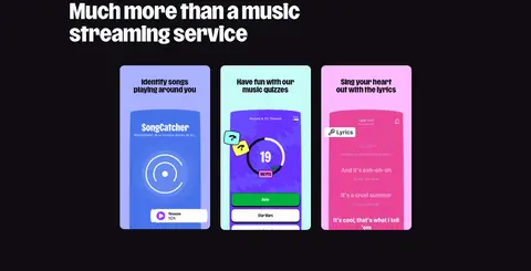
Three-column feature presentation with bold section heading and colorful app-screen previews in softly rounded cards.
FAQ accordion
Centered title above a narrow stack of question rows, supporting answers, and subtle separators on the dark background.
Footer link columns
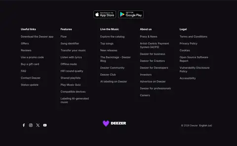
Dark footer with app-store badges, several compact navigation columns, social icons, centered brand mark, and legal detail.
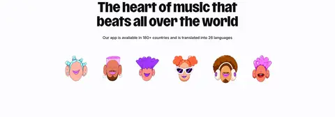
Imagery · The page favors app-interface previews, small user or music-related illustrations, and feature artwork over conventional photography. Feature cards show vivid, colorful phone screens against the dark section canvas; community illustrations appear on the light bands. Keep imagery contained and purposeful, with clean edges and no added effects that compete with the surrounding headline.
Use Deezer-style heavy display lettering for key headlines.
Reserve violet for primary actions and brand accents.
Keep hero messaging centered with generous surrounding space.
Use Inter for readable controls and supporting copy.
Let colorful product artwork sit within simple, contained frames.
✕ 不该做
Do not add gradients absent from the measured page.
Do not use violet as a large page background.
Do not crowd the hero with multiple competing messages.
Do not add pronounced drop shadows or floating-card effects.
Do not make all sections the same background color.
Do not use decorative imagery that overwhelms the typography.
给 AI 的提示词
想快速出一个同风格的新页面,把这段话连同 DESIGN.md 一起发给 AI。
Build a new Deezer-style page with a strong editorial music identity. Use Deep Ink (#0f0d13) and Gallery White (#fdfcfe) as alternating full-width section canvases, and Signal Violet (#a238ff) sparingly for primary actions. Set display headlines in a heavy condensed brand-like face, with Inter for navigation, body copy, and controls. Create a centered hero with a dramatic stacked headline, then vary the page rhythm with simple cards, feature previews, and clear section transitions. Keep the measured content width around the supplied 880px maximum and preserve generous section spacing. Use muted gray for secondary text and restrained graphite borders; avoid gradients, decorative shadows, and unnecessary ornament. Keep imagery colorful but contained within its section and subordinate to the headline hierarchy.