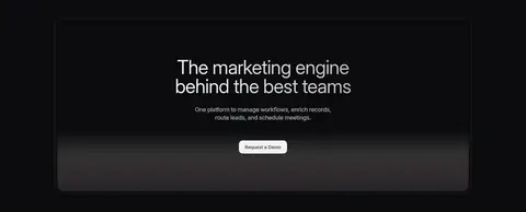
Default 以克制的深色界面、大幅标题和细致的工作流产品画面,展示其 go-to-market 平台。黑白灰表面与细描边维持整体统一,绿色仅用于产品界面中的小面积提示。
North star · Keep the canvas nearly black and let clear typography, fine borders, and authentic workflow UI provide the contrast.
The page is built on a near-black canvas that lets the product interface and typography carry the visual story. Surface changes are subtle: charcoal cards, slightly lighter panels, and fine gray borders separate content without creating bright section bands. White headlines provide the strongest contrast; softer gray copy supports them, while green appears sparingly in workflow statuses and small product indicators rather than as a large marketing fill. Inter is used throughout, with a large, light-weight hero headline and compact navigation and labels. The opening combines a left-aligned headline with concise supporting copy and a demo action, followed by a wide product workflow visual. Subsequent feature cards and testimonials retain a compact, bordered, low-glare treatment. Generous space around major transitions contrasts with dense information inside product mockups. Rounded corners soften cards and controls, but the overall impression stays precise, quiet, and technical.
配色 点色块复制色值。用途说明来自对页面的实测位置(背景、文字、描边、按钮)与截图判读。
品牌色
Carbon Canvas
#0b0c0e
Dominant page canvas and background behind the hero, feature sections, and footer.
强调色
Workflow Green
#22c55e
Small status and workflow indicators inside product UI, not a dominant page fill.
Live Green
#4ade80
Brighter workflow status detail within product mockups and interface indicators.
表层色
Graphite Panel
#121315
Raised navigation, card, and case-study surfaces against the darker canvas.
Night Panel
#171717
Inset product mockups and dark card areas.
Slate Surface
#212326
Alternative charcoal surface for product cards and layered interface panels.
Deep Layer
#1a1b1d
Dark secondary card and footer surface within the charcoal system.
中性色
Quiet Gray
#8b8b8c
Muted navigation and supporting text where emphasis should remain low.
Soft Silver
#e7e7e7
Secondary copy and subdued heading or control text on dark surfaces.
Seam Gray
#292a2b
Fine borders and separators defining cards, badges, and controls.
Signal White
#ffffff
Primary headings, navigation labels, and high-contrast interface text.
Pale Copy
#d0d0d0
Light supporting text, visible in body copy and product-oriented details.
Border Charcoal
#1f1f21
Subtle outlines on cards, footer areas, and navigation elements.
Muted Pewter
#727374
Low-emphasis labels and badge text.
Mist Light
#d9d9d9
Gradient and glow detail; largely atmospheric rather than a defining page color.
Silver Haze
#b8b8b8
Soft gradient and heading detail, used sparingly in visual effects.
Control Gray
#383839
Outlined buttons and navigation controls within dark interface surfaces.
文字 背景 对比度 WCAG #ffffff Signal White#0b0c0e Carbon Canvas19.57:1 AAA #ffffff Signal White#121315 Graphite Panel18.59:1 AAA #ffffff Signal White#171717 Night Panel17.93:1 AAA #ffffff Signal White#212326 Slate Surface15.75:1 AAA #8b8b8c Quiet Gray#0b0c0e Carbon Canvas5.75:1 AA #8b8b8c Quiet Gray#121315 Graphite Panel5.46:1 AA
字体 字号阶梯:Custom(比例约 1.789,正文 20px)。示例用免费替代字体渲染,数值为实测。
Aa 设计
Inter 网络字体 · 字重 400 / 500 / 420 / 450 / 300 / 440 / 480 / 600 / 580 · 占比 99%
免费替代:Inter
All page typography, including display headlines, navigation, body copy, and controls.
角色 示例 字号 字重 行高 字距 特大标题 Oversized hero and campaign headlines, broken into short lines.
Default
64px 400 0.94 -0.02em 一级标题 Primary section headings beneath the hero and across major content blocks.
Default
32px 400 1.18 0 正文 Hero description, feature explanations, and testimonial quotations.
The quick brown fox 敏捷的狐狸
20px 400 1.5 -0.01em 辅助文字 Compact labels, workflow status, and supporting metadata.
The quick brown fox 敏捷的狐狸
12px 400 1.5 0 按钮 Small, medium-weight control and CTA labels.
The quick brown fox 敏捷的狐狸
8px 500 1.38 -0.015em 导航 Header navigation links and compact footer navigation.
The quick brown fox 敏捷的狐狸
12px 400 1.5 0
间距与布局 基准单位 4px · 密度:紧凑
32px 版块间距
6px 元素间距
24px 卡片内边距
1240px 内容最大宽度
1px
2px
3px
4px
5px
6px
7px
8px
10px
12px
14px
16px
24px
32px
Use a centered content frame capped at the measured 1240px page width. The hero begins with a two-column text-and-copy arrangement, followed by a broad product visual; later content moves through centered section headings, a compact feature-card grid, testimonials, a closing CTA, and footer. Keep alignment mostly left within cards and centered for section introductions. The measured spacing system is compact, but use larger breathing room at section transitions and preserve dense detail inside product mockups.
圆角与层次 inset · nav
inset · text
inset · other
hairline · other
Favor flat charcoal surfaces separated by fine gray borders over pronounced shadows. Layer product panels and cards subtly against the canvas, using restrained inset highlights and soft shadow only where a mock interface needs depth. Rounded card and CTA edges soften the otherwise precise, technical presentation.
组件 下面的预览按实测的按钮、输入框、徽标、卡片样式重建(字体用替代字体)。
Header navigation A compact top navigation on the dark canvas, with white links and a bordered, rounded demo action.
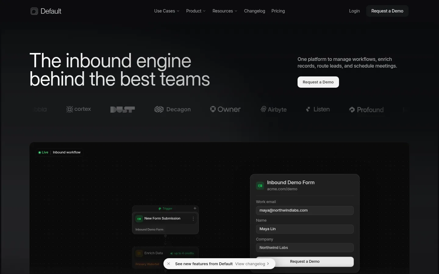
Hero block Large left-aligned headline paired with short supporting copy and a light demo CTA, above a horizontal customer-mark row.
Workflow showcase Wide dark product scene with connected workflow steps and a lead form; small green indicators supply the principal color accent.
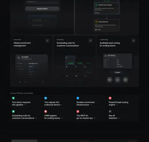
Feature cards Dark bordered cards describe inbound, outbound, enrichment, scheduling, and lead-routing capabilities with embedded UI previews.
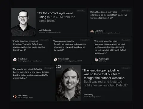
Testimonial grid Compact quote cards use soft charcoal surfaces, restrained borders, small customer portraits, and low-key metadata.
Closing CTA A framed dark panel centers a large headline, concise supporting copy, and a bright demo action.
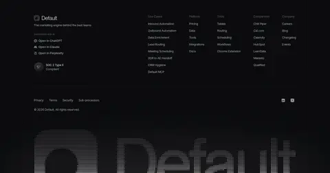
Footer Dense multi-column link groups and company details sit on the dark canvas, with subdued text and a large branded visual near the bottom.
Imagery · Product UI imagery is the main visual asset: dark workflow canvases, lead forms, routing steps, scheduling views, and enrichment panels. Frame these as large, carefully layered interface scenes rather than generic illustrations. Customer marks and testimonial portraits add limited human detail later in the page. Keep mockups low-contrast and dark, with small green status highlights; avoid bright stock photography or decorative imagery that competes with the interface.
页面版块 共 6 个版块,按页面从上到下排列,每个都标了类型、布局和交互套路。
该做与不该做 ✓ 该做 Use #0b0c0e as the dominant canvas. Set large, clean Inter headlines with natural line breaks. Separate dark panels with fine, low-contrast borders. Reserve green accents for product status signals. Show realistic workflow and lead-management interface details. Use generous transitions around sections and compact card interiors. ✕ 不该做 Do not introduce bright section backgrounds. Do not use green as a large CTA or page fill. Do not add heavy shadows to every card. Do not make supporting copy compete with the hero headline. Do not substitute generic stock imagery for product UI. Do not crowd the main page frame with edge-to-edge content. 给 AI 的提示词 想快速出一个同风格的新页面,把这段话连同 DESIGN.md 一起发给 AI。
复制 Build a SaaS marketing page in Default’s restrained dark visual style. Use Carbon Canvas (#0b0c0e) as the continuous background, with Graphite Panel (#121315), Night Panel (#171717), and Slate Surface (#212326) for subtle depth. Use Signal White (#ffffff) for primary headlines and Quiet Gray (#8b8b8c) or Soft Silver (#e7e7e7) for supporting copy. Keep borders in Seam Gray (#292a2b) or Control Gray (#383839), thin and understated. Apply Inter throughout; make the hero headline large and lightly weighted, with compact navigation and labels. Organize content in a centered frame, pairing concise copy with detailed dark workflow UI. Use Workflow Green (#22c55e) and Live Green (#4ade80) only for small interface states. Prefer bordered rounded cards over strong shadows, and preserve clear section breathing room.
DESIGN.md Tailwind v4 CSS 变量 Design Tokens
---
title: "Default design system"
variant: extended
source: https://www.default.com/
captured_at: 2026-10-12
theme: dark
industry: saas
generator: Design DNA (https://four.wiralomi.com/style/default-com)
ai_generated: true
ai_label: "本文件由 AI 辅助生成:数值取自公开网页的实测样式,命名、用途说明与建议为模型解读。商标归原所有者。 / AI-assisted content"
---
# Default · Design System
> A restrained dark canvas for clear product storytelling
**Theme:** dark · **Industry:** saas · **Source:** https://www.default.com/ · **Captured:** 2026-10-12 (1440×900 desktop)
_AI-assisted content: values are measured from the public page at capture time; names, roles and guidance are model-written interpretations. Trademarks belong to their owners._
Default presents its go-to-market platform through a restrained dark interface, oversized headlines, and detailed workflow product visuals. Monochrome surfaces and fine borders keep the page cohesive, while green is reserved for small interface signals.
## North star
Keep the canvas nearly black and let clear typography, fine borders, and authentic workflow UI provide the contrast.
## Overview
The page is built on a near-black canvas that lets the product interface and typography carry the visual story. Surface changes are subtle: charcoal cards, slightly lighter panels, and fine gray borders separate content without creating bright section bands. White headlines provide the strongest contrast; softer gray copy supports them, while green appears sparingly in workflow statuses and small product indicators rather than as a large marketing fill. Inter is used throughout, with a large, light-weight hero headline and compact navigation and labels. The opening combines a left-aligned headline with concise supporting copy and a demo action, followed by a wide product workflow visual. Subsequent feature cards and testimonials retain a compact, bordered, low-glare treatment. Generous space around major transitions contrasts with dense information inside product mockups. Rounded corners soften cards and controls, but the overall impression stays precise, quiet, and technical.
## Colors
| Name | Hex | Token | Group | Role |
|---|---|---|---|---|
| Carbon Canvas | ` | `--color-carbon-canvas` | brand | Dominant page canvas and background behind the hero, feature sections, and footer. |
| Graphite Panel | ` | `--color-graphite-panel` | surface | Raised navigation, card, and case-study surfaces against the darker canvas. |
| Quiet Gray | ` | `--color-quiet-gray` | neutral | Muted navigation and supporting text where emphasis should remain low. |
| Soft Silver | ` | `--color-soft-silver` | neutral | Secondary copy and subdued heading or control text on dark surfaces. |
| Seam Gray | ` | `--color-seam-gray` | neutral | Fine borders and separators defining cards, badges, and controls. |
| Night Panel | ` | `--color-night-panel` | surface | Inset product mockups and dark card areas. |
| Signal White | ` | `--color-signal-white` | neutral | Primary headings, navigation labels, and high-contrast interface text. |
| Pale Copy | ` | `--color-pale-copy` | neutral | Light supporting text, visible in body copy and product-oriented details. |
| Slate Surface | ` | `--color-slate-surface` | surface | Alternative charcoal surface for product cards and layered interface panels. |
| Border Charcoal | ` | `--color-border-charcoal` | neutral | Subtle outlines on cards, footer areas, and navigation elements. |
| Deep Layer | ` | `--color-deep-layer` | surface | Dark secondary card and footer surface within the charcoal system. |
| Muted Pewter | ` | `--color-muted-pewter` | neutral | Low-emphasis labels and badge text. |
| Mist Light | ` | `--color-mist-light` | neutral | Gradient and glow detail; largely atmospheric rather than a defining page color. |
| Silver Haze | ` | `--color-silver-haze` | neutral | Soft gradient and heading detail, used sparingly in visual effects. |
| Workflow Green | ` | `--color-workflow-green` | accent | Small status and workflow indicators inside product UI, not a dominant page fill. |
| Control Gray | ` | `--color-control-gray` | neutral | Outlined buttons and navigation controls within dark interface surfaces. |
| Live Green | ` | `--color-live-green` | accent | Brighter workflow status detail within product mockups and interface indicators. |
### Semantic aliases
`--color-canvas` → ` (Carbon Canvas) · `--color-surface` → ` (Graphite Panel) · `--color-surface-2` → ` (Night Panel) · `--color-surface-3` → ` (Slate Surface) · `--color-surface-4` → ` (Deep Layer) · `--color-text` → ` (Signal White) · `--color-text-muted` → ` (Quiet Gray) · `--color-text-subtle` → ` (Soft Silver) · `--color-border` → ` (Seam Gray) · `--color-accent` → ` (Workflow Green) · `--color-accent-2` → ` (Live Green)
### Contrast (WCAG 2.x)
| Text | Background | Ratio | Level |
|---|---|---|---|
| ` | ` | 19.57:1 | AAA |
| ` | ` | 18.59:1 | AAA |
| ` | ` | 17.93:1 | AAA |
| ` | ` | 15.75:1 | AAA |
| ` | ` | 5.75:1 | AA |
| ` | ` | 5.46:1 | AA |
| ` | ` | 5.27:1 | AA |
| ` | ` | 4.63:1 | AA |
| ` | ` | 15.82:1 | AAA |
| ` | ` | 15.03:1 | AAA |
### Gradients
- `radial-gradient(50% 50%, rgb(217, 217, 217) 0%, rgb(217, 217, 217) 68%, rgba(217, 217, 217, 0.84) 76%, rgba(217, 217, 217, 0.5) 84%, rgba(217, 217, 217, 0.16) 92%, rgba(217, 217, 217, 0) 100%)`
- `linear-gradient(rgba(98, 103, 111, 0) 6.6371%, rgba(110, 107, 111, 0) 35.805%, rgba(112, 103, 103, 0.1) 59.869%, rgba(106, 91, 92, 0.1) 83.702%, rgba(82, 74, 82, 0.1) 97.123%, rgba(65, 68, 79, 0.1) 110.77%, rgba(46, 55, `
- `linear-gradient(rgba(98, 103, 111, 0) 6.6371%, rgba(110, 107, 111, 0) 35.805%, rgba(112, 103, 103, 0.08) 59.869%, rgba(106, 91, 92, 0.08) 83.702%, rgba(82, 74, 82, 0.08) 97.123%, rgba(65, 68, 79, 0.08) 110.77%, rgba(46, `
- `radial-gradient(circle, rgba(255, 255, 255, 0.06) 0.7px, rgba(0, 0, 0, 0) 0.9px)`
## Typography
| Family | Token | Source | Weights | Role | Free substitute |
|---|---|---|---|---|---|
| Inter | `--font-body` | webfont | 400, 500, 420, 450, 300, 440, 480, 600, 580 | All page typography, including display headlines, navigation, body copy, and controls. | Inter |
- **Inter:** Use regular and medium weights; display headlines are large and lightly weighted, with slightly tight tracking. Keep case natural.
### Type scale — Custom (ratio ≈ 1.789, base 20px)
| Role | Size | Weight | Line height | Letter spacing | Case | Family | Used for |
|---|---|---|---|---|---|---|---|
| display | 64px | 400 | 0.94 | -0.02em | — | Inter | Oversized hero and campaign headlines, broken into short lines. |
| h1 | 32px | 400 | 1.18 | 0 | — | Inter | Primary section headings beneath the hero and across major content blocks. |
| body | 20px | 400 | 1.5 | -0.01em | — | Inter | Hero description, feature explanations, and testimonial quotations. |
| caption | 12px | 400 | 1.5 | 0 | — | Inter | Compact labels, workflow status, and supporting metadata. |
| button | 8px | 500 | 1.38 | -0.015em | — | Inter | Small, medium-weight control and CTA labels. |
| nav | 12px | 400 | 1.5 | 0 | — | Inter | Header navigation links and compact footer navigation. |
OpenType features in use: `"ss01", "ss03"` .
## Spacing & layout
- Base unit **4px**, density **compact**.
- Scale (most used values): 1, 2, 3, 4, 5, 6, 7, 8, 10, 12, 14, 16, 24, 32 px.
- Section rhythm 32px · element gap 6px · card padding 24px · max content width 1240px.
Use a centered content frame capped at the measured 1240px page width. The hero begins with a two-column text-and-copy arrangement, followed by a broad product visual; later content moves through centered section headings, a compact feature-card grid, testimonials, a closing CTA, and footer. Keep alignment mostly left within cards and centered for section introductions. The measured spacing system is compact, but use larger breathing room at section transitions and preserve dense detail inside product mockups.
## Shape & elevation
- Radius: button `10px` · card `16px` · media `50%` · badge `10px` · nav `50%` · link `16px` · xs `3px` · sm `4px` · md `5px` · lg `6px` · xl `7px` · 2xl `8px` · pill `9999px`
- Shadow `inset` (nav): `rgb(31, 31, 33) 0px 0px 0px 0.5px, rgb(11, 12, 14) 0px 0px 0px 1.5px inset, rgb(39, 39, 42) 0px 0px 0px 2px inset`
- Shadow `inset-2` (text): `rgba(0, 0, 0, 0) 0px 0px 0px 0px, rgba(0, 0, 0, 0) 0px 0px 0px 0px, rgba(0, 0, 0, 0) 0px 0px 0px 0px, rgba(0, 0, 0, 0) 0px 0px 0px 0px, rgba(255, 255, 255, 0.14) 0px 0px 0px 0.5px inset`
- Shadow `inset-3` (other): `rgba(0, 0, 0, 0.25) 0px 1px 2px 0px inset, rgba(0, 0, 0, 0.02) 0px 2px 4px 0px, rgba(0, 0, 0, 0.02) 0px 0px 8px 0px`
- Shadow `hairline` (other): `rgba(0, 0, 0, 0) 0px 0px 0px 0px, rgba(0, 0, 0, 0) 0px 0px 0px 0px, rgba(0, 0, 0, 0) 0px 0px 0px 0px, rgba(0, 0, 0, 0) 0px 0px 0px 0px, rgba(255, 255, 255, 0.16) 0px 0px 0px 0.5px`
- Shadow `lg` (other): `rgba(0, 0, 0, 0) 0px 0px 0px 0px, rgba(0, 0, 0, 0) 0px 0px 0px 0px, rgba(0, 0, 0, 0) 0px 0px 0px 0px, rgba(0, 0, 0, 0) 0px 0px 0px 0px, rgb(9, 10, 11) 0px 0px 0px 1px, rgba(0, 0, 0, 0.32) 0px 12px 32p`
- Shadow `sm` (media): `rgba(0, 0, 0, 0.04) 0px 0px 0px 1px, rgba(0, 0, 0, 0.06) 0px 1px 1px -0.5px, rgba(0, 0, 0, 0.06) 0px 3px 3px -1.5px`
- Motion: standard transition `0.15s cubic-bezier(0.4, 0, 0.2, 1)` on interactive elements.
Favor flat charcoal surfaces separated by fine gray borders over pronounced shadows. Layer product panels and cards subtly against the canvas, using restrained inset highlights and soft shadow only where a mock interface needs depth. Rounded card and CTA edges soften the otherwise precise, technical presentation.
## Imagery
Product UI imagery is the main visual asset: dark workflow canvases, lead forms, routing steps, scheduling views, and enrichment panels. Frame these as large, carefully layered interface scenes rather than generic illustrations. Customer marks and testimonial portraits add limited human detail later in the page. Keep mockups low-contrast and dark, with small green status highlights; avoid bright stock photography or decorative imagery that competes with the interface.
## Components
### Header navigation
A compact top navigation on the dark canvas, with white links and a bordered, rounded demo action.
### Hero block
Large left-aligned headline paired with short supporting copy and a light demo CTA, above a horizontal customer-mark row.
### Workflow showcase
Wide dark product scene with connected workflow steps and a lead form; small green indicators supply the principal color accent.
### Feature cards
Dark bordered cards describe inbound, outbound, enrichment, scheduling, and lead-routing capabilities with embedded UI previews.
### Testimonial grid
Compact quote cards use soft charcoal surfaces, restrained borders, small customer portraits, and low-key metadata.
### Closing CTA
A framed dark panel centers a large headline, concise supporting copy, and a bright demo action.
### Footer
Dense multi-column link groups and company details sit on the dark canvas, with subdued text and a large branded visual near the bottom.
### Measured component styles
- **Primary button** (“9:00 am”): background ## Do
- Use ## Don't
- Do not introduce bright section backgrounds.
- Do not use green as a large CTA or page fill.
- Do not add heavy shadows to every card.
- Do not make supporting copy compete with the hero headline.
- Do not substitute generic stock imagery for product UI.
- Do not crowd the main page frame with edge-to-edge content.
## Agent prompt
Build a SaaS marketing page in Default’s restrained dark visual style. Use Carbon Canvas (## Page sections (top to bottom)
| # | Type | Layout | UX patterns | UI patterns |
|---|---|---|---|---|
| 1 | hero | Two-column headline and supporting copy above customer marks and a broad workflow product visual. | request-a-demo CTA, customer proof, workflow preview | dark canvas, large white headline, green status dots, layered product mockup |
| 2 | feature-grid | Centered section introduction above a multi-card capability grid. | capability discovery, feature navigation | centered heading, charcoal cards, embedded interface previews |
| 3 | feature-grid | Dark product-led content area with compact interface-led feature panels. | feature exploration | workflow panels, fine borders, low-contrast surfaces |
| 4 | testimonials | Grid of varied testimonial cards with quotes, customer portraits, and role details. | social proof, customer attribution | charcoal quote cards, small portraits, subtle card outlines |
| 5 | cta | Centered headline and supporting copy inside a framed dark panel. | request-a-demo CTA | framed panel, centered typography, light button |
| 6 | footer | Multi-column link groups with company information and a large branded graphic below. | site navigation, legal links | compact muted links, dark canvas, large brand mark |
## Source CSS custom properties (selected)
```css
--theme-accent-hue: 212;
--font-sans: "Inter", "Inter Fallback";
--font-display: "Inter", "Inter Fallback";
--font-hero-display: "Inter", "Inter Fallback";
--font-mono: "Geist Mono", "Geist Mono Fallback";
--radius-xs: .375rem;
--radius-sm: .5rem;
--radius-md: .75rem;
--radius-lg: 1rem;
--radius-xl: 1.5rem;
--section-space: clamp(5.75rem, 7vw, 6.85rem);
--section-space-tight: clamp(4.9rem, 6vw, 5.95rem);
--section-header-gap: clamp(3rem, 3.5vw, 3.5rem);
--radius-pill-md: .625rem;
--radius-pill-sm: .6875rem;
--surface-soft-shadow: inset 0 1px 0 #ffffff14, inset 0 -1px 0 #ffffff05;
--pill-solid-border: #fff3;
--pill-solid-shadow: 0 1px 4px #0000001a, 0 0 1px #0000001a;
--button-pill-primary-hover-filter: brightness(1.06);
--button-pill-primary-bg: