North star · Use a calm charcoal canvas and lightweight, spacious typography, then reserve vivid blue for decisive actions and emphasis.
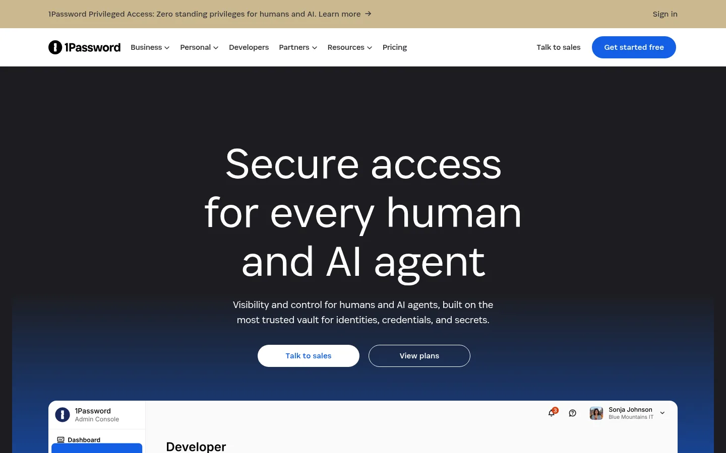
The page alternates a crisp white announcement and navigation area with a deep charcoal hero and expansive dark content sections. White headings and copy sit against the dark canvas; saturated blue is reserved for primary actions, prominent promotional panels, and the hero’s upward blue gradient. Warm sand appears in the announcement strip, while pale blue and muted gold are minor accents rather than dominant page colours. AgileSans supplies the typography: large, lightweight headings with tight tracking give the hero an editorial feel, while compact body copy keeps dense enterprise information legible. The centered hero gives way to broad, left-aligned product storytelling, a four-column offering showcase, and a strong blue award panel. Product screenshots and customer marks provide proof; a real customer image anchors the white testimonial section. Generous section separation, pill-shaped buttons, restrained hairlines, and minimal elevation keep the composition calm and deliberate.
Primary display, headings, body copy, navigation, and button text.
角色
示例
字号
字重
行高
字距
特大标题
Large hero-scale statements and headline moments.
1Password
88px
300
1.1
-0.02em
一级标题
Primary hero heading and major page-level statement.
1Password
64px
300
1.1
-0.02em
二级标题
Section headings for platform and customer content.
1Password
48px
300
1.1
-0.02em
三级标题
Product category titles and secondary feature headings.
1Password
40px
350
1.2
-0.02em
四级标题
Compact feature titles or supporting subheads.
The quick brown fox 敏捷的狐狸
20px
300
1.5
-0.02em
正文
Product explanations, testimonial copy, and general reading text.
The quick brown fox 敏捷的狐狸
16px
350
1.6
-0.02em
辅助文字
Eyebrows, attribution details, and compact supporting labels.
The quick brown fox 敏捷的狐狸
14px
350
1.43
-0.023em
按钮
Pill-shaped primary and secondary action labels.
The quick brown fox 敏捷的狐狸
16px
350
1.6
0
导航
Top navigation and major menu labels.
The quick brown fox 敏捷的狐狸
16px
400
1.5
-0.02em
链接
Inline exploration links and understated text actions.
The quick brown fox 敏捷的狐狸
16px
400
1.5
0
间距与布局
基准单位 4px · 密度:宽松
96px版块间距
8px元素间距
—卡片内边距
1248px内容最大宽度
2px
3px
4px
8px
10px
12px
16px
20px
24px
32px
48px
64px
72px
96px
128px
The measured page uses a 1248px maximum content width and a spacious rhythm built on a 4px base unit, with 96px section gaps. The first viewport starts with two full-width horizontal bars, followed by a centered hero and broad product-interface showcase. Lower content shifts to left-aligned editorial sections and a four-column product lineup. Keep generous separation between major sections, align content consistently to the page frame, and avoid crowding the dark canvas with excess modules.
圆角与层次
按钮 · 9999px
链接 · 2px
没有测到阴影:页面是扁平的,层次靠底色和描边区分。
The page reads as mostly flat: dark and white surfaces, broad colour bands, and product imagery provide hierarchy without a measured shadow system. Use thin, restrained outlines for secondary controls and visible interface boundaries. Reserve stronger layering for the hero’s blue gradient behind the product showcase; do not add decorative shadows or stacked card effects.
组件
下面的预览按实测的按钮、输入框、徽标、卡片样式重建(字体用替代字体)。
Announcement strip
A shallow warm sand band above the white navigation, with a short product announcement, learn-more cue, and sign-in link.
Primary navigation
White horizontal bar with the 1Password mark, compact business and personal menus, resource links, sales action, and bright blue pill CTA.
Hero
Centered white headline and supporting copy on charcoal, followed by contrasting pill actions and a blue gradient beneath the product screenshot.
Product showcase
Large admin-console screenshot framed within the dark hero area; smaller product-interface cards support the following platform section.
Platform feature grid
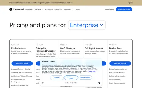
Left-aligned introduction followed by four product categories with interface imagery, concise descriptions, and understated text links.
Promotional panel
High-contrast saturated blue rounded panel with centered award statement, concise supporting copy, and two CTA buttons.
Footer
Dense multi-column link directory on charcoal, with muted text, download links, brand mark, legal links, and social icons.
Imagery · Use product UI screenshots as the main proof point: show a large, crisp admin-console interface beneath the hero, then smaller interface cards in the platform section. Customer logos sit quietly on dark backgrounds. Use a real customer or use-case photograph in the contrasting white testimonial section. Keep imagery clean and rectangular or softly rounded; the measured palette’s unusual screenshot colours may belong to product mockups, not the brand system.
Use white for high-contrast headings and navigation surfaces.
Reserve Signal Blue for decisive actions and promotional emphasis.
Set display headings in lightweight AgileSans with tight tracking.
Give major sections generous vertical breathing room.
Use product UI imagery as concrete evidence of the software.
✕ 不该做
Do not make every section blue or gradient-filled.
Do not replace the dark canvas with a generic light SaaS template.
Do not use heavy display weights or all-caps headings.
Do not add unmeasured shadows to cards and buttons.
Do not treat screenshot colours as brand colours.
Do not crowd the hero with extra copy or interface controls.
给 AI 的提示词
想快速出一个同风格的新页面,把这段话连同 DESIGN.md 一起发给 AI。
Build a new 1Password-style SaaS page with a calm, spacious composition. Use Vault Charcoal (#1d1d21) for the principal content canvas and Gallery White (#ffffff) for clear type and selected light surfaces. Keep Signal Blue (#145fe4) focused on primary actions and key emphasis; use Glacier Blue (#99beff) only as a restrained gradient highlight. Set large headlines in a lightweight AgileSans-like sans serif with tight tracking, then use readable regular-weight body and navigation text. Start with compact announcement and navigation bands, followed by a centered statement and realistic product UI showcase. Organize supporting content into broad sections with generous separation, product screenshots, concise links, and occasional white editorial content. Use rounded pill controls, minimal borders, and little or no shadow; keep warm Announcement Sand (#cbb88e) confined to a narrow announcement accent.