North star · Keep the pale canvas and strong type quiet; use cyan-violet gradients as precise signals, not broad decoration.
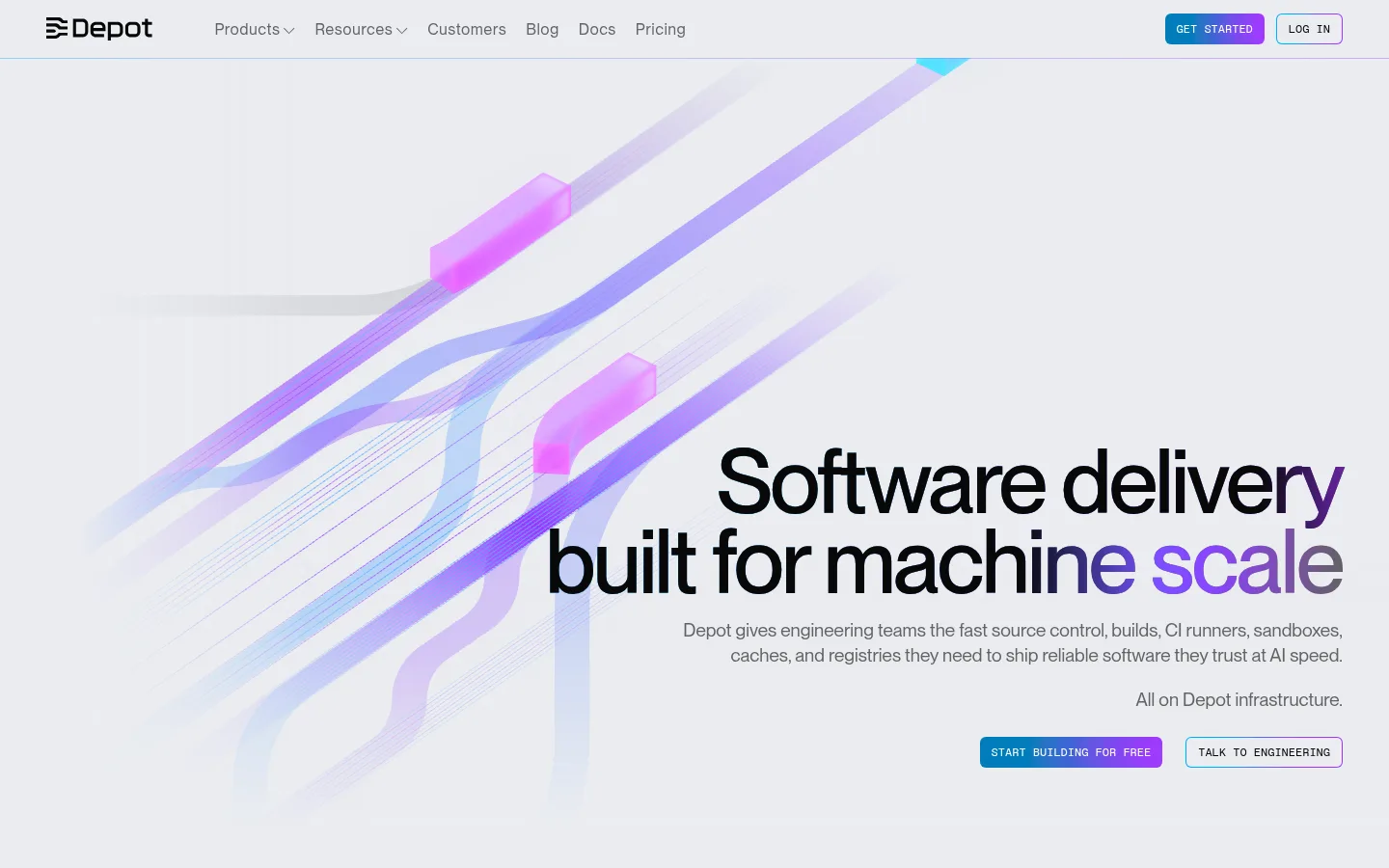
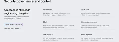
The page uses #eaecf0 as a near-continuous cool gray canvas, letting large black headings and fine gray supporting text carry the hierarchy without heavy section color changes. Cyan #00aaff and violet #a033ff appear as concentrated signals: CTA gradients, highlighted words, thin outlines, and the luminous trails in the abstract delivery artwork. Neue Montreal display typography is tightly tracked and generously scaled; body copy stays compact and muted, while uppercase mono labels mark section context. The composition alternates expansive, open hero and proof areas with denser product, security, and testimonial blocks. Content aligns to a broad centered frame, but individual sections shift between left-led, centered, and right-aligned arrangements. Product visuals are mostly diagrams and soft 3D-like pipeline ribbons rather than photography. Cards remain understated, defined by subtle hairlines and restrained corner rounding instead of pronounced shadows.
Body copy, navigation, and general interface text.
Aa 设计
Neue Montreal
网络字体 · 字重 400 / 500 · 占比 32%
免费替代:Manrope
Display headings and large editorial statements.
Aa 设计
ABC Favorit Mono
网络字体 · 字重 400 · 占比 12%
免费替代:IBM Plex Mono
Section captions, code-like labels, and technical microcopy.
Aa 设计
Red Hat Text Variable
网络字体 · 字重 400 · 占比 2%
免费替代:Red Hat Text
Measured component text including buttons and navigation.
角色
示例
字号
字重
行高
字距
特大标题
Oversized hero statement and major brand message.
Depot
92px
500
0.9
-0.03em
一级标题
Primary page headline and prominent section titles.
Depot
72px
500
0.9
-0.03em
二级标题
Large feature, testimonial, and call-to-action headings.
Depot
52px
400
1.05
-0.02em
三级标题
Product and subsection headings.
Depot
40px
500
1.1
-0.01em
四级标题
Card titles and compact feature headings.
Depot
32px
500
1.2
-0.01em
正文
Paragraphs, explanations, and supporting product copy.
The quick brown fox 敏捷的狐狸
16px
400
1.4
-0.005em
辅助文字
Uppercase mono section labels and small technical captions.
The quick brown fox 敏捷的狐狸
12px
400
1.1
0
导航
Header links and primary navigation labels.
The quick brown fox 敏捷的狐狸
16px
400
1.4
-0.005em
链接
Large feature links or oversized linked statements.
Depot
52px
400
1.05
-0.02em
代码
Compact uppercase technical labels and code-like annotations.
const style = 1;
12px
400
1.1
0
间距与布局
基准单位 8px · 密度:适中
48px版块间距
12px元素间距
24px卡片内边距
1344px内容最大宽度
2px
4px
6px
8px
11px
12px
16px
24px
32px
40px
48px
64px
Use a broad centered content frame, measured at a 1344px maximum width, with comfortable spacing and clear breathing room between major blocks. The page keeps a largely continuous light canvas, establishing rhythm through changes in alignment and content density rather than hard color bands. The hero is right-weighted against expansive abstract artwork; later sections alternate left-led split layouts, centered headings, and right-aligned proof statements. Feature cards and testimonial panels sit in measured grid arrangements, with fine separators and consistent internal padding. Keep paragraphs short and leave visible open space around large headings.
圆角与层次
按钮 · 6px
卡片 · 4px
图片 · 6px
导航 · 6px
链接 · 6px
md · other
md · card
lg · footer
The interface is mostly flat: pale canvas, fine borders, and restrained card outlines do most of the separation. Use the measured 4px card and 6px control rounding where applicable. Glow appears selectively around accent artwork, selected cards, and CTA moments; avoid broad dark shadows or stacked, heavy panels.
组件
下面的预览按实测的按钮、输入框、徽标、卡片样式重建(字体用替代字体)。
Header navigation
A light, quiet top bar with the Depot mark, muted gray navigation links, and compact right-side actions.
Hero CTA pair
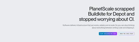
A filled cyan-to-violet primary action beside a light outlined secondary action; labels use compact uppercase technical styling.
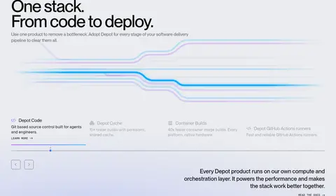
Product feature cards
Light-background cards with dark text, thin #c6ced1 or #d4d6d9 borders, and restrained rounded corners.
Pipeline visual
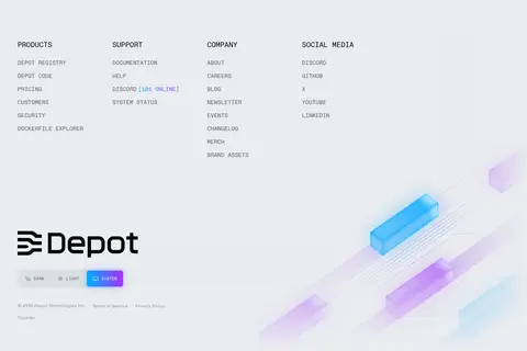
An abstract ribbon diagram in cyan, violet, and pale lavender that suggests delivery stages without becoming a dense illustration.
Section eyebrow
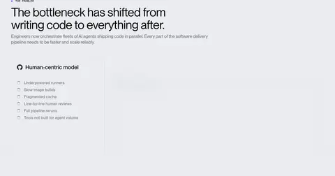
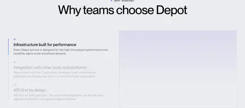
Small uppercase mono label above a large heading, used to identify problem, product, and advantage sections.
Testimonial cards
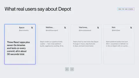
A row of lightly bordered customer quote panels on the shared canvas, with restrained emphasis for the selected card.
Footer CTA
A centered build prompt above the link-rich footer, supported by a soft cyan-violet glow.
Imagery · The visual language avoids conventional product photography. The hero and footer use abstract, dimensional pipeline ribbons: translucent cyan, lavender, and violet tracks with small glowing blocks crossing the pale canvas. Product areas rely on interface-like diagrams, logos, and restrained technical visuals. Keep artwork airy and soft-edged, with low-contrast fades into the background; reserve brighter saturated color for selected paths and focal points.
Set major headings in large, tightly tracked sans-serif type.
Reserve cyan and violet gradients for calls to action and focal details.
Use uppercase mono labels to signpost technical sections.
Separate cards with subtle measured hairlines rather than heavy fills.
Let abstract pipeline artwork fade softly into open space.
✕ 不该做
Do not turn the light page into a dark interface.
Do not spread saturated gradients across every section.
Do not use heavy shadows to define ordinary cards.
Do not crowd hero copy or supporting paragraphs.
Do not substitute stock photography for the abstract technical artwork.
Do not make every heading uppercase or mono.
给 AI 的提示词
想快速出一个同风格的新页面,把这段话连同 DESIGN.md 一起发给 AI。
Build a new Depot-style developer-tools page on a calm #eaecf0 canvas with #080808 headings and #636365 supporting text. Use oversized, tightly tracked Neue Montreal-like sans typography for the primary message and small uppercase mono labels for section context. Treat #00aaff Signal Cyan and #a033ff Vivid Violet as deliberate accents: gradients on primary actions, selected words, and abstract pipeline details, not full-page decoration. Organize content in a broad centered frame with generous whitespace, alternating split, centered, and right-aligned sections. Use fine #c6ced1 and #d4d6d9 borders on restrained cards, modest rounded corners, and little elevation. Favor soft, translucent technical diagrams over photography. Keep copy concise, align controls cleanly, and preserve a clear hierarchy from headline to supporting copy to action.