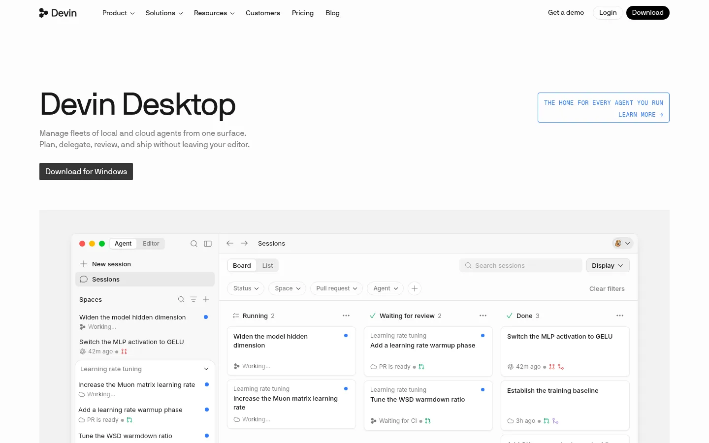
页面以充足留白、清晰排版和大型软件界面预览介绍 Devin Desktop。黑色内容区、纤细灰色分隔线与少量蓝色细节,为整体黑白灰风格增添专注的技术气质。
North star · Keep the page quiet and spacious; let crisp product interfaces and strong typographic hierarchy provide the emphasis.
The page uses Gallery White (#fcfcfc) as a near-white canvas, with Ink (#191919) for headings, navigation, and most primary copy. Cool gray text and hairlines make supporting information quieter without weakening hierarchy; a black FAQ panel creates the clearest contrast break near the bottom. Signal Blue appears sparingly in small interface accents and the outlined hero-side prompt, rather than as a broad marketing fill. The display and heading system uses nbInternationalPro with a light, unforced weight and tight tracking; monospace eyebrow labels add a technical annotation layer. A centered, wide content frame holds a mix of split feature rows, compact grids, testimonials, pricing, and stats. Large product screenshots carry the story, while thin borders and soft shadows separate cards without making the page feel heavy. Sections share a calm, consistent rhythm, with denser information confined to UI previews, pricing, integrations, and FAQ.
配色 点色块复制色值。用途说明来自对页面的实测位置(背景、文字、描边、按钮)与截图判读。
品牌色
Core Ink
#191919
Primary headings, body copy, navigation, and dark interface text.
强调色
Signal Blue
#317cff
Small interface indicators and occasional blue emphasis; keep it restrained, not a large page fill.
表层色
Gallery White
#fcfcfc
Near-white page canvas and the dominant background across the hero and long-form sections.
Deep Black
#000000
Inverse surfaces, including the prominent FAQ panel, and occasional dark controls.
Cool Mist
#f4f4f5
Very pale card or UI surface tint among otherwise white interface panels.
中性色
Soft Graphite
#7e7e7e
Muted explanatory copy and secondary text against the pale canvas.
Rule Gray
#e8e8e8
Fine card outlines and subtle section or component separators.
Quiet Silver
#a3a3a3
Low-emphasis supporting labels and footer text.
Edge Silver
#dfdfdf
Secondary borders and understated outlines in cards and controls.
Near Ink
#1f1f1f
Supporting dark text and occasional dark UI details close to the primary ink.
Link Gray
#8f8f8f
Secondary link and label text where a quiet hierarchy is needed.
Slate Charcoal
#4c4c4c
Intermediate gray text and tonal detail, including low-contrast visual treatments.
Mid Silver
#9e9e9e
Subdued labels and supporting details, not a defining brand color.
Pale Divider
#ededed
Light separators and pale media or footer details.
Badge Gray
#676767
Muted badge and compact interface label text.
功能色
Muted Ochre
#795e26
Measured as a text accent, but not visually dominant in the page’s core identity.
文字 背景 对比度 WCAG #191919 Core Ink#fcfcfc Gallery White17.14:1 AAA #191919 Core Ink#000000 Deep Black1.19:1 不达标 #7e7e7e Soft Graphite#fcfcfc Gallery White3.96:1 AA-large #7e7e7e Soft Graphite#000000 Deep Black5.17:1 AA #000000 Deep Black#fcfcfc Gallery White20.47:1 AAA #795e26 Muted Ochre#fcfcfc Gallery White5.95:1 AA
字体 字号阶梯:Augmented Fourth(比例约 1.414,正文 16px)。示例用免费替代字体渲染,数值为实测。
Aa 设计
nbInternationalPro 网络字体 · 字重 400 / 500 · 占比 48%
免费替代:Inter
Primary display, headings, body copy, navigation, and links
Aa 设计
inter 网络字体 · 字重 400 / 500 · 占比 33%
免费替代:Inter
Compact captions and small supporting interface text
Aa 设计
Menlo 系统字体 · 字重 400 · 占比 13%
免费替代:Roboto Mono
Code samples and developer-facing snippets
Aa 设计
geistMono 网络字体 · 字重 400 · 占比 3%
免费替代:Roboto Mono
Uppercase eyebrow labels and technical section markers
Aa 设计
-apple-system 系统字体 · 字重 400 · 占比 2%
免费替代:Inter
Occasional compact UI badges
角色 示例 字号 字重 行高 字距 特大标题 Large introductory display treatment for the page’s main product message.
Devin
64px 400 1 -0.03em 一级标题 Primary section headings, including feature and conversion sections.
Devin
40px 400 1.04 -0.03em 二级标题 Secondary feature and content-section headings.
Devin
32px 400 1.2 -0.02em 三级标题 Small feature, card, or subsection headings.
The quick brown fox 敏捷的狐狸
20px 400 1.2 0 正文 Product descriptions, explanatory copy, and longer interface-adjacent text.
The quick brown fox 敏捷的狐狸
16px 400 1.5 0 辅助文字 Compact supporting labels and secondary UI copy.
The quick brown fox 敏捷的狐狸
13px 400 1.54 0 导航 Header navigation labels and product menu items.
The quick brown fox 敏捷的狐狸
14px 400 1.4 0 链接 Inline links and text-based calls to action.
The quick brown fox 敏捷的狐狸
16px 400 1.5 0 眉题 Uppercase section markers such as customer, pricing, or feature labels.
The quick brown fox 敏捷的狐狸
12px 400 1.4 0.03em 代码 Code excerpts and developer-oriented examples.
const style = 1;
13px 400 1.46 0
间距与布局 基准单位 4px · 密度:紧凑
36px 版块间距
6px 元素间距
20px 卡片内边距
1206px 内容最大宽度
1px
2px
4px
5px
6px
7px
8px
10px
12px
14px
16px
20px
24px
32px
40px
60px
A wide centered content frame organizes the long page into alternating two-column feature rows, compact multi-column collections, and full-width showcase areas. The hero aligns its title and copy to the left, balanced by a small outlined prompt at the right, with the product interface immediately below. Most sections return to left-aligned headings; the conversion section centers its message and actions. Keep a measured rhythm between sections and avoid filling every available area: the logo cloud and feature transitions rely on substantial open space. Dense information belongs inside product previews, cards, pricing, and FAQ.
圆角与层次 hairline · card, other
inset · other
sm · card
md · card
The page is mostly flat, with separation carried by whitespace and fine gray borders. Cards use restrained outlines and, on some compact UI examples, a barely visible shadow. Product screenshots sit as broad media panels rather than floating objects. Reserve the strongest layering and contrast for the black FAQ block; avoid heavy shadows or stacked decorative surfaces.
组件 下面的预览按实测的按钮、输入框、徽标、卡片样式重建(字体用替代字体)。
Header navigation Quiet horizontal wordmark and text links on the near-white canvas, with a compact dark Download pill at the far end.
Hero actions Left-aligned product heading and muted description, followed by a dark rectangular Windows download button; a thin blue-outlined annotation sits to the right.
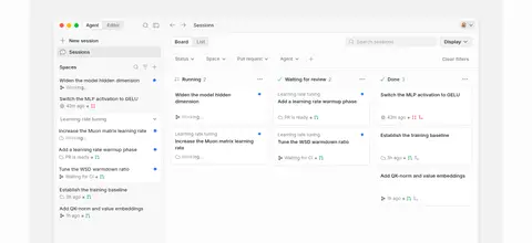
Product preview Large desktop UI capture on a pale gray field, with the interface itself carrying the detail and visual density.
Feature cards White or pale panels with fine gray outlines, dark copy, and restrained corner rounding; use screenshots or compact product content.
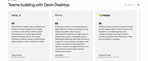
Testimonial cards A horizontal set of pale cards with customer marks, quotation copy, and subdued attribution.
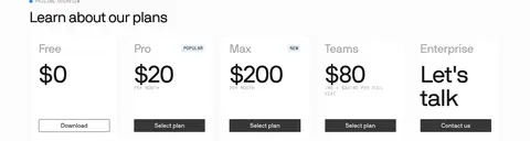
Pricing columns Compact plan columns with prominent dark prices, restrained dividers, small labels, and simple action links or buttons.
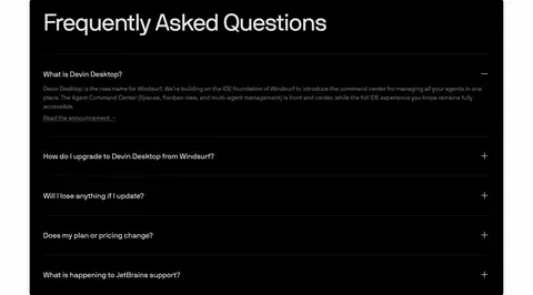
FAQ panel A high-contrast black accordion surface with white heading and copy, separated by subtle dark rules.
Imagery · The imagery is primarily product UI: large desktop interface captures, code panes, agent task boards, and small integration marks. Keep screenshots clean and rectangular, showing realistic interface content rather than decorative mockups. Most media sits on pale gray or white fields with restrained rounded corners and subtle separation. Logos and customer marks appear in a quiet monochrome row. No photographic or cinematic treatment defines the visual identity.
页面版块 共 16 个版块,按页面从上到下排列,每个都标了类型、布局和交互套路。
该做与不该做 ✓ 该做 Use #fcfcfc as the dominant page canvas. Set primary headings and copy in #191919. Reserve #317cff for small, deliberate interface accents. Let product screenshots supply most visual complexity. Use thin gray borders to define cards and separators. Keep section headings aligned consistently and preserve open space. Use monospace only for code and technical eyebrow labels. ✕ 不该做 Do not turn blue into a large promotional background. Do not add gradients or decorative illustration as a defining motif. Do not crowd the page with cards where whitespace is part of the rhythm. Do not use heavy shadows to lift ordinary content. Do not replace product UI previews with generic stock photography. Do not apply all-caps styling to primary headings. Do not introduce unmeasured colors as core palette values. 给 AI 的提示词 想快速出一个同风格的新页面,把这段话连同 DESIGN.md 一起发给 AI。
复制 Build a new product page in Devin’s restrained developer-tool style. Use Gallery White (#fcfcfc) as the canvas, Core Ink (#191919) for primary text, and Soft Graphite (#7e7e7e) for secondary copy. Keep Signal Blue (#317cff) to small interface cues and occasional outlined details; use Rule Gray (#e8e8e8) for fine card boundaries. Establish a wide centered content frame, generous section breathing room, left-aligned feature headings, and a compact horizontal navigation. Use nbInternationalPro or a close sans substitute for natural, light headings, and monospace only for code and small technical labels. Make authentic product UI captures the visual focus. Prefer flat surfaces, subtle borders, and restrained shadows; use one deliberate dark panel for high-contrast content if appropriate. Keep CTAs simple and dark.
DESIGN.md Tailwind v4 CSS 变量 Design Tokens
---
title: "Devin — Desktop design system"
variant: extended
source: https://devin.ai/desktop
captured_at: 2026-10-12
theme: light
industry: devtools
generator: Design DNA (https://four.wiralomi.com/style/windsurf-com)
ai_generated: true
ai_label: "本文件由 AI 辅助生成:数值取自公开网页的实测样式,命名、用途说明与建议为模型解读。商标归原所有者。 / AI-assisted content"
---
# Devin — Desktop · Design System
> Quiet monochrome, built around the working interface.
**Theme:** light · **Industry:** devtools · **Source:** https://devin.ai/desktop · **Captured:** 2026-10-12 (1440×900 desktop)
_AI-assisted content: values are measured from the public page at capture time; names, roles and guidance are model-written interpretations. Trademarks belong to their owners._
A restrained product page introduces Devin Desktop through generous white space, precise typography, and large, legible software previews. Black panels, fine gray rules, and occasional blue details give the mostly monochrome layout a focused technical character.
## North star
Keep the page quiet and spacious; let crisp product interfaces and strong typographic hierarchy provide the emphasis.
## Overview
The page uses Gallery White (## Colors
| Name | Hex | Token | Group | Role |
|---|---|---|---|---|
| Gallery White | ` | `--color-gallery-white` | surface | Near-white page canvas and the dominant background across the hero and long-form sections. |
| Core Ink | ` | `--color-core-ink` | brand | Primary headings, body copy, navigation, and dark interface text. |
| Signal Blue | ` | `--color-signal-blue` | accent | Small interface indicators and occasional blue emphasis; keep it restrained, not a large page fill. |
| Soft Graphite | ` | `--color-soft-graphite` | neutral | Muted explanatory copy and secondary text against the pale canvas. |
| Rule Gray | ` | `--color-rule-gray` | neutral | Fine card outlines and subtle section or component separators. |
| Deep Black | ` | `--color-deep-black` | surface | Inverse surfaces, including the prominent FAQ panel, and occasional dark controls. |
| Quiet Silver | ` | `--color-quiet-silver` | neutral | Low-emphasis supporting labels and footer text. |
| Edge Silver | ` | `--color-edge-silver` | neutral | Secondary borders and understated outlines in cards and controls. |
| Near Ink | ` | `--color-near-ink` | neutral | Supporting dark text and occasional dark UI details close to the primary ink. |
| Link Gray | ` | `--color-link-gray` | neutral | Secondary link and label text where a quiet hierarchy is needed. |
| Slate Charcoal | ` | `--color-slate-charcoal` | neutral | Intermediate gray text and tonal detail, including low-contrast visual treatments. |
| Mid Silver | ` | `--color-mid-silver` | neutral | Subdued labels and supporting details, not a defining brand color. |
| Pale Divider | ` | `--color-pale-divider` | neutral | Light separators and pale media or footer details. |
| Muted Ochre | ` | `--color-muted-ochre` | semantic | Measured as a text accent, but not visually dominant in the page’s core identity. |
| Badge Gray | ` | `--color-badge-gray` | neutral | Muted badge and compact interface label text. |
| Cool Mist | ` | `--color-cool-mist` | surface | Very pale card or UI surface tint among otherwise white interface panels. |
### Semantic aliases
`--color-canvas` → ` (Gallery White) · `--color-surface` → ` (Deep Black) · `--color-text` → ` (Core Ink) · `--color-text-muted` → ` (Soft Graphite) · `--color-text-subtle` → ` (Deep Black) · `--color-border` → ` (Rule Gray) · `--color-accent` → ` (Muted Ochre)
### Contrast (WCAG 2.x)
| Text | Background | Ratio | Level |
|---|---|---|---|
| ` | ` | 17.14:1 | AAA |
| ` | ` | 1.19:1 | fail |
| ` | ` | 3.96:1 | AA-large |
| ` | ` | 5.17:1 | AA |
| ` | ` | 20.47:1 | AAA |
| ` | ` | 5.95:1 | AA |
| ` | ` | 3.44:1 | AA-large |
### Gradients
- `linear-gradient(90deg, rgba(0, 0, 0, 0.36) 0%, rgba(0, 0, 0, 0.36) 35%, rgba(0, 0, 0, 0.7) 50%, rgba(0, 0, 0, 0.36) 65%, rgba(0, 0, 0, 0.36) 100%)`
- `linear-gradient(90deg, rgba(0, 0, 0, 0.06) 0%, rgba(0, 0, 0, 0.06) 100%), linear-gradient(90deg, rgba(255, 255, 255, 0.94) 0%, rgba(255, 255, 255, 0.94) 100%)`
- `linear-gradient(120deg, rgba(25, 25, 25, 0.56) 35%, rgb(0, 0, 0) 50%, rgba(25, 25, 25, 0.56) 65%)`
## Typography
| Family | Token | Source | Weights | Role | Free substitute |
|---|---|---|---|---|---|
| nbInternationalPro | `--font-body` | webfont | 400, 500 | Primary display, headings, body copy, navigation, and links | Inter |
| inter | `--font-inter` | webfont | 400, 500 | Compact captions and small supporting interface text | Inter |
| Menlo | `--font-mono` | system | 400 | Code samples and developer-facing snippets | Roboto Mono |
| geistMono | `--font-geistmono` | webfont | 400 | Uppercase eyebrow labels and technical section markers | Roboto Mono |
| -apple-system | `--font-apple-system` | system | 400 | Occasional compact UI badges | Inter |
- **nbInternationalPro:** Regular weight predominates; display and headings use tight negative tracking. Keep case natural, with no decorative all-caps styling.
- **inter:** Regular, compact supporting text; preserve clear legibility at small sizes.
- **Menlo:** Monospace code styling, regular weight, with restrained line spacing.
- **geistMono:** Small uppercase labels with slightly expanded tracking.
- **-apple-system:** System sans used for small utility labels; keep the treatment compact and plain.
### Type scale — Augmented Fourth (ratio ≈ 1.414, base 16px)
| Role | Size | Weight | Line height | Letter spacing | Case | Family | Used for |
|---|---|---|---|---|---|---|---|
| display | 64px | 400 | 1 | -0.03em | — | nbInternationalPro | Large introductory display treatment for the page’s main product message. |
| h1 | 40px | 400 | 1.04 | -0.03em | — | nbInternationalPro | Primary section headings, including feature and conversion sections. |
| h2 | 32px | 400 | 1.2 | -0.02em | — | nbInternationalPro | Secondary feature and content-section headings. |
| h3 | 20px | 400 | 1.2 | 0 | — | nbInternationalPro | Small feature, card, or subsection headings. |
| body | 16px | 400 | 1.5 | 0 | — | nbInternationalPro | Product descriptions, explanatory copy, and longer interface-adjacent text. |
| caption | 13px | 400 | 1.54 | 0 | — | inter | Compact supporting labels and secondary UI copy. |
| nav | 14px | 400 | 1.4 | 0 | — | nbInternationalPro | Header navigation labels and product menu items. |
| link | 16px | 400 | 1.5 | 0 | — | nbInternationalPro | Inline links and text-based calls to action. |
| eyebrow | 12px | 400 | 1.4 | 0.03em | uppercase | geistMono | Uppercase section markers such as customer, pricing, or feature labels. |
| code | 13px | 400 | 1.46 | 0 | — | Menlo | Code excerpts and developer-oriented examples. |
OpenType features in use: `"cv10", "ss01"` , `"cv09", "cv10", "ss01"` .
## Spacing & layout
- Base unit **4px**, density **compact**.
- Scale (most used values): 1, 2, 4, 5, 6, 7, 8, 10, 12, 14, 16, 20, 24, 32, 40, 60 px.
- Section rhythm 36px · element gap 6px · card padding 20px · max content width 1206px.
A wide centered content frame organizes the long page into alternating two-column feature rows, compact multi-column collections, and full-width showcase areas. The hero aligns its title and copy to the left, balanced by a small outlined prompt at the right, with the product interface immediately below. Most sections return to left-aligned headings; the conversion section centers its message and actions. Keep a measured rhythm between sections and avoid filling every available area: the logo cloud and feature transitions rely on substantial open space. Dense information belongs inside product previews, cards, pricing, and FAQ.
## Shape & elevation
- Radius: button `6px` · card `8px` · media `4px` · badge `5px` · nav `9999px` · xs `2px` · sm `4px` · md `5px` · lg `6px` · xl `7px` · 2xl `8px` · pill `9999px`
- Shadow `hairline` (card, other): `rgba(0, 0, 0, 0.05) 0px 1px 2px 0px`
- Shadow `inset` (other): `rgba(0, 0, 0, 0.08) 0px -1px 0px 0px inset`
- Shadow `sm` (card): `rgba(0, 0, 0, 0.06) 0px 0px 3px 0px, rgba(0, 0, 0, 0.08) 0px 0px 0px 0.5px`
- Shadow `md` (card): `rgba(0, 0, 0, 0.1) 0px 10px 15px -3px, rgba(0, 0, 0, 0.05) 0px -1px 6px -2px`
- Shadow `md-2` (card): `rgba(0, 0, 0, 0.18) 0px 6px 16px -4px, rgba(0, 0, 0, 0.1) 0px 2px 6px -2px`
- Shadow `lg` (card): `rgba(0, 0, 0, 0.14) 0px 8px 24px -6px, rgba(0, 0, 0, 0.06) 0px 2px 6px 0px`
- Motion: standard transition `0.2s cubic-bezier(0.4, 0, 0.2, 1)` on interactive elements.
The page is mostly flat, with separation carried by whitespace and fine gray borders. Cards use restrained outlines and, on some compact UI examples, a barely visible shadow. Product screenshots sit as broad media panels rather than floating objects. Reserve the strongest layering and contrast for the black FAQ block; avoid heavy shadows or stacked decorative surfaces.
## Imagery
The imagery is primarily product UI: large desktop interface captures, code panes, agent task boards, and small integration marks. Keep screenshots clean and rectangular, showing realistic interface content rather than decorative mockups. Most media sits on pale gray or white fields with restrained rounded corners and subtle separation. Logos and customer marks appear in a quiet monochrome row. No photographic or cinematic treatment defines the visual identity.
## Components
### Header navigation
Quiet horizontal wordmark and text links on the near-white canvas, with a compact dark Download pill at the far end.
### Hero actions
Left-aligned product heading and muted description, followed by a dark rectangular Windows download button; a thin blue-outlined annotation sits to the right.
### Product preview
Large desktop UI capture on a pale gray field, with the interface itself carrying the detail and visual density.
### Feature cards
White or pale panels with fine gray outlines, dark copy, and restrained corner rounding; use screenshots or compact product content.
### Testimonial cards
A horizontal set of pale cards with customer marks, quotation copy, and subdued attribution.
### Pricing columns
Compact plan columns with prominent dark prices, restrained dividers, small labels, and simple action links or buttons.
### FAQ panel
A high-contrast black accordion surface with white heading and copy, separated by subtle dark rules.
### Measured component styles
- **Primary button** (“Download for Windows”): background ## Do
- Use ## Don't
- Do not turn blue into a large promotional background.
- Do not add gradients or decorative illustration as a defining motif.
- Do not crowd the page with cards where whitespace is part of the rhythm.
- Do not use heavy shadows to lift ordinary content.
- Do not replace product UI previews with generic stock photography.
- Do not apply all-caps styling to primary headings.
- Do not introduce unmeasured colors as core palette values.
## Agent prompt
Build a new product page in Devin’s restrained developer-tool style. Use Gallery White (## Page sections (top to bottom)
| # | Type | Layout | UX patterns | UI patterns |
|---|---|---|---|---|
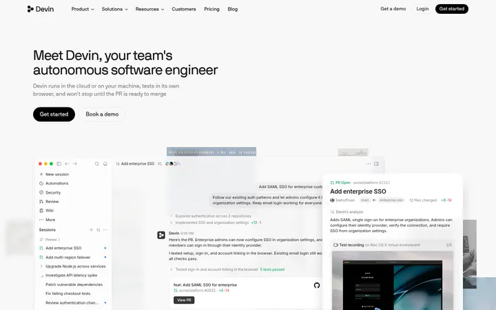
| 1 | hero | Left-aligned product pitch with a small outlined prompt on the right; large UI preview follows. | Primary download action, Secondary learn-more link | Large title, Muted supporting copy, Dark download button, Outlined blue annotation |
| 2 | product-showcase | Wide pale media panel containing a dense three-column desktop interface preview. | Show real product workflow, Expose multiple agent states | Task board, Session sidebar, Filter controls, Pale gray backdrop |
| 3 | logo-cloud | Airy multi-column logo grid centered across the page. | Establish customer familiarity | Small monochrome logos, Even grid alignment |
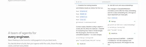
| 4 | feature-split | Two-column feature section with copy and heading beside an agent command-center preview. | Explain coordinated agent work | Eyebrow label, Feature heading, Product screenshot |
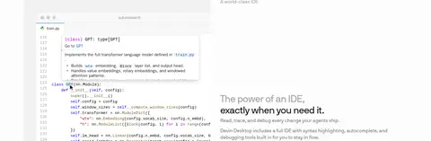
| 5 | feature-split | Two-column feature row pairing an IDE screenshot with explanatory copy. | Explain editor capabilities | Code editor preview, Feature heading, Supporting paragraph |
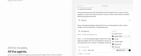
| 6 | feature-split | Two-column feature block with text and a detailed agent-client workflow preview. | Introduce agent and model flexibility | ACP label, Editor screenshot, Compact action controls |
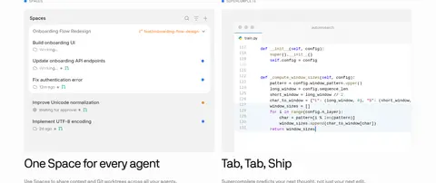
| 7 | feature-grid | Two feature columns, each pairing a product screenshot with heading and short copy. | Present related workflow features | Spaces task list, Code preview, Paired headings |
| 8 | integrations | Centered short heading followed by a horizontal row of agent marks. | Signal ecosystem compatibility | Centered heading, Monochrome partner icons |
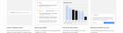
| 9 | feature-grid | Four-column capability band with compact visual examples and short copy. | Scan distinct benefits quickly | Small UI previews, Short headings, Compact descriptions |
| 10 | testimonials | Wide testimonial row with several pale cards and a heading above. | Build trust with customer voices, Browse testimonial cards | Customer marks, Quote text, Muted attribution, Carousel controls |
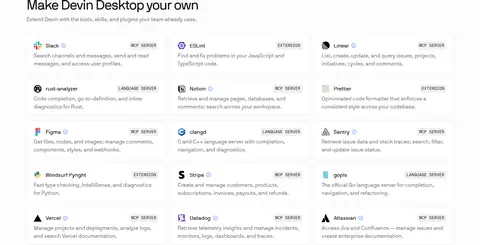
| 11 | integrations | Single-column section heading above a dense multi-column integration list. | Show extensibility options | Tool names, Compact descriptions, Small category labels |
| 12 | cta | Centered heading with two horizontally aligned actions. | Primary download, Secondary demo request | Large centered heading, Dark button, Outlined button |
| 13 | pricing | Five compact plan columns beneath a left-aligned pricing heading. | Compare plan tiers, Select or contact sales | Plan labels, Prominent prices, Small badges, Action links |
| 14 | stats | Open two-column statistics section with large numerals and small explanatory labels. | Reinforce adoption and credibility | Large figures, Muted uppercase captions |
| 15 | faq | Wide black accordion panel with stacked questions and fine internal separators. | Expand answers, Link to related announcement | White heading, Accordion rows, Subtle rules, Inverse text |
| 16 | footer | Three-column link groups on the pale canvas, with the brand mark and legal note. | Navigate company resources, Access legal information | Company links, Legal links, Social links, Brand mark |
## Source CSS custom properties (selected)
```css
--color-dt-text: rgb(25 25 25);
--color-dt-text-secondary: rgb(25 25 25 / .56);
--color-dt-text-tertiary: rgb(25 25 25 / .4);
--color-dt-text-muted: rgb(25 25 25 / .4);
--color-dt-text-disabled: rgb(25 25 25 / .4);
--color-dt-text-inverse: rgb(255 255 255);
--color-dt-text-inverse-adaptive: rgb(255 255 255);
--color-dt-primary: rgb(49 124 255);
--color-dt-primary-tint: rgb(51 125 244 / .1);
--color-dt-blue: rgb(51 125 244);
--color-dt-purple: rgb(149 108 222);
--color-dt-green: rgb(0 165 88);
--color-dt-orange: rgb(245 142 58);
--color-dt-bg: rgb(252 252 252);
--color-dt-wash: rgb(248 248 248);
--color-dt-white: rgb(255 255 255);
--color-dt-black: rgb(25 25 25);
--color-dt-tint: rgb(0 0 0 / .04);
--color-dt-tint-faint: rgb(0 0 0 / .02);
--color-dt-tint-strong: rgb(0 0 0 / .08);
--color-dt-tint-soft: rgb(0 0 0 / .06);
--color-dt-tint-accent: rgb(49 124 255 / .08);
--color-dt-divider: rgb(0 0 0 / .08);
--color-dt-border: rgb(0 0 0 / .08);
--color-dt-border-secondary: rgb(0 0 0 / .06);
--color-dt-border-subtle: rgb(0 0 0 / .06);
--color-text-primary: rgb(25 25 25);
--color-text-secondary: rgb(25 25 25 / .56);
--color-text-inverse: rgb(255 255 255);
--color-background: rgb(252 252 252);
--color-surface: rgb(255 255 255);
--color-button: rgb(54 54 54);
--color-accent: rgb(49 124 255);
--color-border: rgb(0 0 0 / .06);
--font-base-multiplier: 1;
--tint-secondary: 0 0 0 / .06;
--text-primary: 25 25 25;
--text-secondary: 25 25 25 / .56;
--border-secondary: 0 0 0 / .06;
--text-disabled: 25 25 25 / .4;
```
---
本文件由 AI 辅助生成:数值取自公开网页的实测样式,命名、用途说明与建议为模型解读。商标归原所有者。
Generated by Design DNA · https://four.wiralomi.com/style/windsurf-com