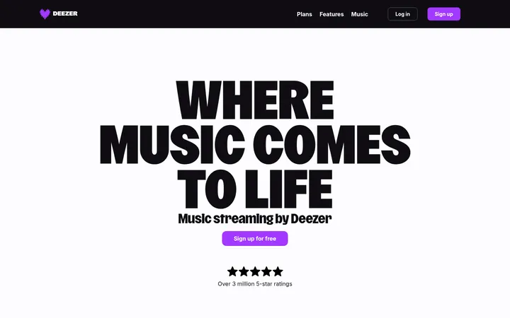
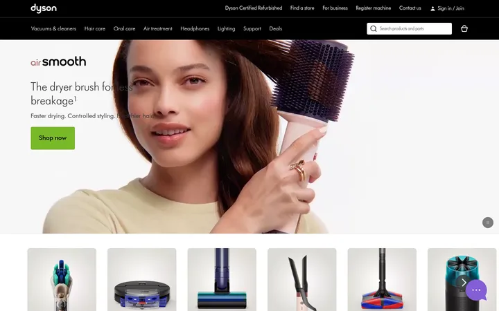
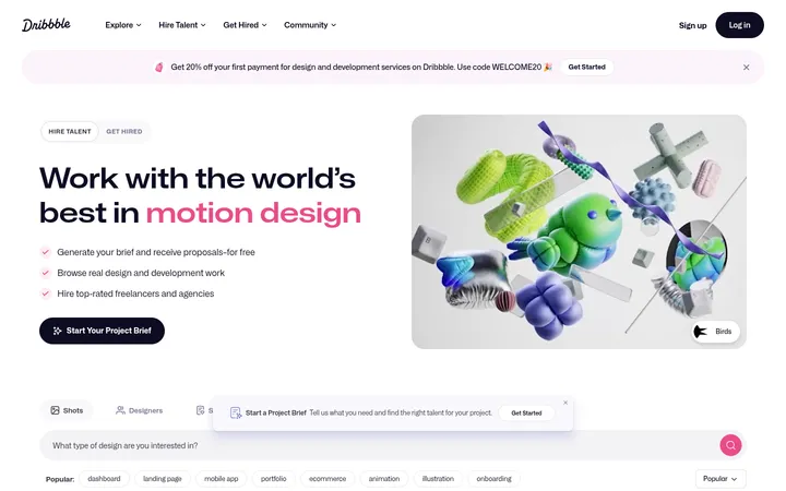
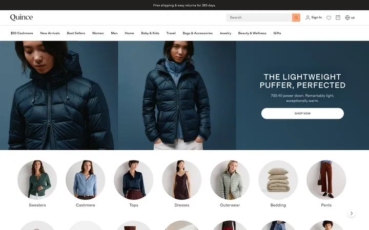
North star · Keep the interface monochrome and spacious, then let oversized type and real live-event imagery deliver the energy.
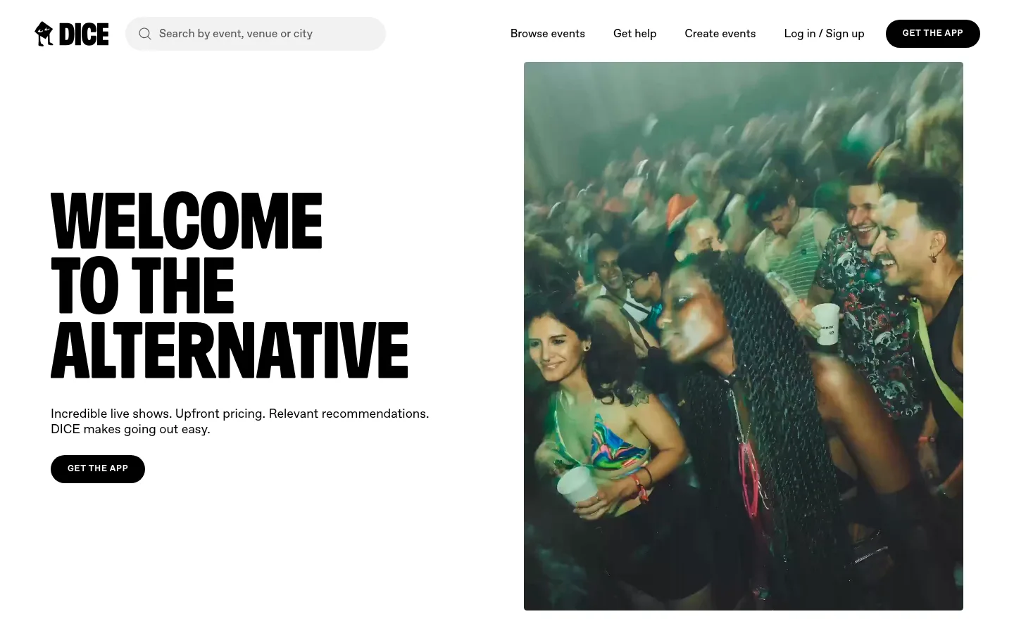
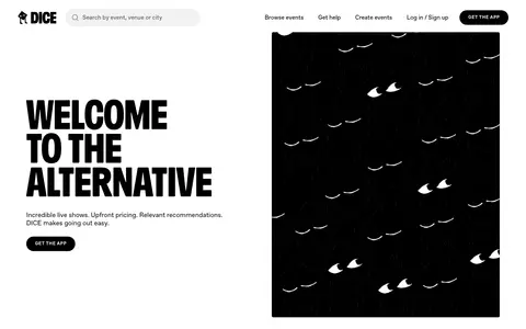
The page uses a quiet white canvas to keep attention on its stark black typography, controls, and saturated concert photography. Black is the functional anchor: it defines the wordmark, navigation text, oversized hero headline, and compact pill CTAs. The opening layout is deliberately asymmetric, placing the headline and concise supporting copy opposite a large, rounded-corner event photograph. Favorit supplies the interface and reading text, while the display headline uses a separate, condensed, heavy-looking face that gives the brand its poster-like character. Broad gaps separate the hero, event discovery, dark feature band, and product-led content, keeping the long homepage airy rather than card-dense. Images carry the page’s colour and personality; the interface itself remains nearly monochrome. Thin neutral dividers and restrained gray details support structure without competing with the photography or headline.
Site-wide interface, navigation, body copy, headings, captions, and buttons.
角色
示例
字号
字重
行高
字距
特大标题
Oversized condensed hero headline, arranged as emphatic stacked lines.
DICE
106px
400
0.83
0
一级标题
Primary page or section heading in the lighter interface typeface.
DICE
28px
350
1.21
0
二级标题
Secondary feature and content-section headings.
The quick brown fox 敏捷的狐狸
18px
350
1.22
0
正文
Supporting descriptions, event information, and editorial copy.
The quick brown fox 敏捷的狐狸
14px
400
1.25
0
辅助文字
Small uppercase metadata and compact labels.
The quick brown fox 敏捷的狐狸
12px
700
1.33
0.06em
按钮
CTA and search-control text.
The quick brown fox 敏捷的狐狸
16px
400
1.15
0
导航
Header links and primary site navigation.
The quick brown fox 敏捷的狐狸
16px
350
1.5
0
眉题
Short uppercase introductory labels above content.
The quick brown fox 敏捷的狐狸
12px
700
1.33
0.06em
间距与布局
基准单位 8px · 密度:宽松
120px版块间距
25px元素间距
—卡片内边距
968px内容最大宽度
1px
2px
4px
8px
16px
22px
24px
25px
Use a centered content frame with a measured maximum width of 968px and a spacious, editorial rhythm. The hero is a two-column composition: left-aligned headline and copy beside a large media block, with the page navigation arranged across the top. Subsequent content alternates compact text-led discovery, a full-width black feature band, and image-and-copy splits. Preserve generous section gaps, clear alignment, and low content density; avoid turning the page into a tight card grid.
圆角与层次
按钮 · 50%
图片 · 8px
链接 · 5px
sm · other
The design is primarily flat, with no prominent card shadows or stacked surfaces. Separate content through whitespace, image blocks, and the occasional dark full-width band. Use fine light-gray hairlines sparingly in the footer and related utility areas; keep borders from outlining every content block.
组件
下面的预览按实测的按钮、输入框、徽标、卡片样式重建(字体用替代字体)。
Header navigation
A compact horizontal header with black wordmark, pale rounded search field, text links, and a black pill-shaped GET THE APP control.
Hero split
Large stacked display headline and short body copy sit opposite a dominant live-event image; align both sides cleanly on the white canvas.
Primary CTA
Black pill-shaped button with white uppercase Favorit text; keep the label short and the treatment visually compact.
Event discovery
A concise location-specific heading and descriptive text pair with a separate browse-events CTA, leaving substantial breathing room.
Dark feature band
A full-width black section reverses to white text and presents a simple heading above a small set of ticketing benefits.
Image-and-copy feature
Alternate product or venue imagery with short copy in an airy split layout; avoid enclosing each side in a bordered card.
Footer
Sparse multi-column utility links and muted legal details on white, with a thin divider and restrained gray text.
Imagery · Use candid live-music photography as the main source of colour and emotion: crowded venues, performers, and fans, framed as large rectangular media with softly rounded corners. Product sections can use phone-screen imagery and partner marks as supporting proof. Keep the imagery authentic and documentary rather than glossy; allow occasional graphic or video assets to retain their own visual character without changing the monochrome interface.
Keep interface text and controls black, white, or muted gray.
Make the hero headline oversized, condensed, and editorial.
Pair short copy with authentic live-event imagery.
Use black pill buttons with clear uppercase labels.
Alternate light sections with occasional full-width black bands.
✕ 不该做
Do not introduce unmeasured accent colours into the interface.
Do not use gradients as a defining background treatment.
Do not crowd the page with dense cards or decorative borders.
Do not make product photography feel glossy or staged.
Do not use rounded cards as the default section container.
Do not let secondary copy compete with the display headline.
给 AI 的提示词
想快速出一个同风格的新页面,把这段话连同 DESIGN.md 一起发给 AI。
Build a new DICE-style page with a spacious white canvas (#ffffff, Gallery White) and a restrained monochrome interface. Use #000000 (Show Ink) for headings, navigation, and compact pill-shaped CTAs; reserve #d9d9d9 (Divider Gray) and #7f7f7f (Footer Gray) for subtle separators and muted utility text. Set interface copy in Favorit or a close sans-serif such as Inter, and give the hero a very large, tightly led condensed display headline. Compose the opening section asymmetrically, pairing stacked text with a dominant candid live-event image. Keep supporting copy concise. Create a clear section rhythm with generous whitespace, occasional full-width black bands, and alternating image-and-copy features. Use rounded corners selectively on media and controls; avoid dense grids, heavy shadows, and extra interface colours.