North star · Keep the interface quiet and monochrome so product photography leads, reserving vivid green for the primary shopping action.
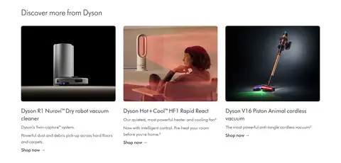
The page uses a white canvas as the dominant field, with black navigation and footer bands anchoring the top and bottom of the long storefront. DysonFutura supplies a consistent, clean sans-serif voice: lightweight navigation and hero messaging sit alongside regular-weight headings and compact body copy. The layouts alternate between a full-bleed, two-column campaign hero, a horizontal category strip, editorial image cards, a four-column benefits and product area, and a three-column discovery feature. Product and lifestyle photography carries most of the colour; it is campaign content rather than a reason to expand the interface palette. A single measured green accent marks the main shopping CTA. Pale gray cards and thin gray borders separate content quietly, while ample white space and repeated left alignment keep the dense catalog legible. The footer reverses to black with subdued text and fine dividers.
Shared typeface for navigation, headings, body copy, links, captions, and buttons.
角色
示例
字号
字重
行高
字距
一级标题
Primary campaign headline in the hero.
Dyson
32px
300
1.25
0
二级标题
Section headings and prominent campaign or product titles.
The quick brown fox 敏捷的狐狸
24px
400
1.33
0
三级标题
Subheads for product, benefit, and editorial card content.
The quick brown fox 敏捷的狐狸
18px
400
1.5
0
正文
Product descriptions, benefit details, and supporting copy.
The quick brown fox 敏捷的狐狸
14px
400
1.43
0
辅助文字
Compact labels, footnotes, and low-priority metadata.
The quick brown fox 敏捷的狐狸
12px
300
normal
0
按钮
Shopping actions and benefit controls.
The quick brown fox 敏捷的狐狸
14px
400
1.43
0
导航
Primary and utility navigation links.
The quick brown fox 敏捷的狐狸
16px
300
1.5
0
链接
Editorial calls to action and category or product links.
The quick brown fox 敏捷的狐狸
18px
400
1.5
0
间距与布局
基准单位 4px · 密度:适中
48px版块间距
4px元素间距
—卡片内边距
1296px内容最大宽度
1px
2px
4px
5px
8px
10px
12px
15px
16px
17px
20px
24px
32px
Use a centered, responsive storefront with measured maximum content width of 1296px. Keep the hero full-bleed in its media while placing copy to the left; follow it with a horizontal category row and editorial content. Build later catalog and benefits areas on compact multi-column grids, then use a three-column discovery row. Maintain comfortable density and a measured 48px section rhythm, with consistent left alignment and short element gaps. Finish with legal copy and a wide, multi-column footer.
圆角与层次
按钮 · 4px
卡片 · 8px
图片 · 8px
徽标 · 4px
导航 · 4px
没有测到阴影:页面是扁平的,层次靠底色和描边区分。
The interface is mostly flat: no measured shadows or gradients. Use white space and pale gray card fills to establish grouping, with thin #ebebeb borders on selected controls and footer divisions. Cards and media have softly rounded corners; dark navigation and footer bands provide the main depth through contrast rather than elevation.
组件
下面的预览按实测的按钮、输入框、徽标、卡片样式重建(字体用替代字体)。
Dual-band navigation
Stack two black navigation rows: utility links above category links, search, and bag. Use small, restrained light text and keep the bands visually compact.
Campaign hero
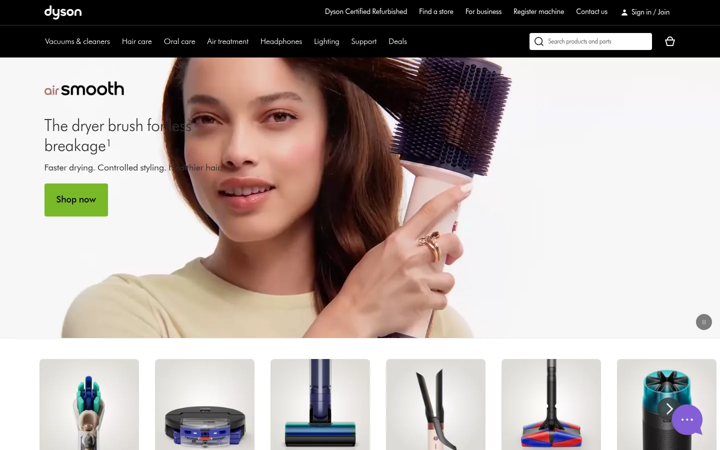
Full-width, image-led two-column hero with left-aligned headline, brief benefit copy, and a prominent green Shop now button.
Category tiles
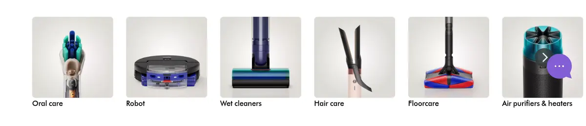
Horizontal row of image cards with product imagery and short category labels, enabling quick entry to major product families.
Editorial feature cards
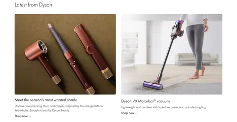
Large campaign imagery paired with concise product or seasonal copy and simple text links; favor white backgrounds and rounded media.
Shopping benefit strip
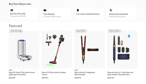
Four-column row presenting financing, shipping, warranty, and returns with compact icons, short labels, and fine borders.
Product cards
Catalog cards use a light gray surface, product image, small badge where relevant, concise title, and price.
Dark link footer
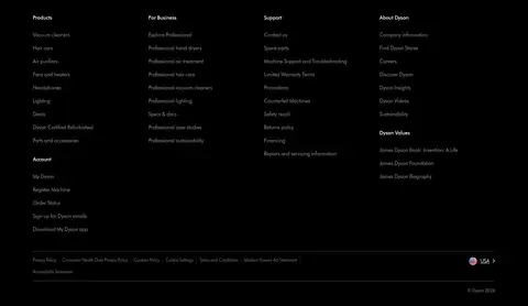
Black footer with several columns of subdued links, small group headings, and fine dividers.
Imagery · Use polished product and lifestyle photography as the main source of visual colour. The opening campaign is a large image-led split composition, while category tiles use isolated product images and lower sections mix product cutouts with domestic scenes. Keep images crisp and generously framed; avoid adding decorative illustration or overlays that compete with the products.
Keep the main canvas white and the global navigation black.
Reserve Dyson Green #79b928 for the primary shopping action.
Let product and lifestyle photography provide the page’s richer colour.
Use DysonFutura or a close geometric sans-serif substitute throughout.
Separate catalog content with pale gray fills and subtle hairlines.
Preserve clear left alignment and comfortable whitespace between sections.
✕ 不该做
Do not add gradients or decorative shadows.
Do not use the green accent broadly across cards or navigation.
Do not compete with product imagery using extra visual decoration.
Do not replace the restrained interface with saturated section backgrounds.
Do not make every link look like a filled button.
Do not compress section content into a dense, uninterrupted grid.
给 AI 的提示词
想快速出一个同风格的新页面,把这段话连同 DESIGN.md 一起发给 AI。
Build a new Dyson-style storefront page with a restrained, image-led visual system. Use Gallery White (#ffffff) as the canvas, Dyson Black (#000000) for the stacked navigation and footer, Charcoal Text (#333333) for headings and links, and Soft Graphite (#555555) for supporting copy. Reserve Dyson Green (#79b928) for one primary shopping CTA. Use DysonFutura or Jost throughout, with light navigation, clean regular-weight headings, and compact body text. Structure the page with a campaign hero, category image row, editorial features, compact benefit strip, product grid, and dark multi-column footer. Keep content aligned within a measured 1296px maximum width, use generous section separation, pale Mist Gray (#f8f8f8) card fills, and Fine Silver (#ebebeb) hairlines. Avoid gradients and shadows; let crisp product photography supply colour and atmosphere.