Dribbble以克制的白色界面承载密集而鲜活的设计作品流。圆润控件、醒目标题和点到为止的粉色强调,让作品发现与人才招聘更易上手。
North star · Keep the interface visually quiet and let vivid, varied portfolio artwork provide the page’s strongest color and personality.
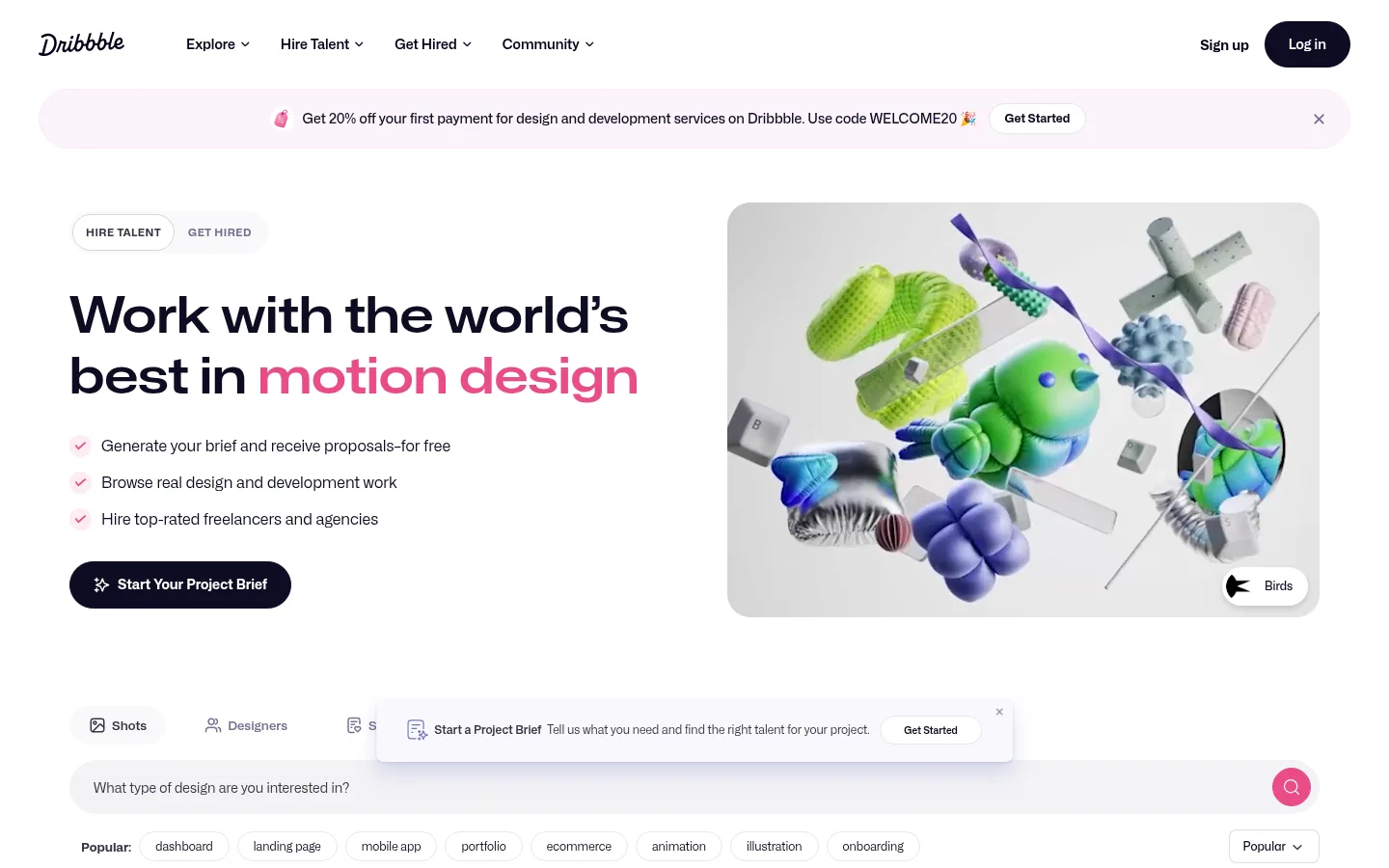
The page uses a white canvas to keep attention on the work, with deep blue-black text providing crisp hierarchy across navigation, hero copy, and card metadata. Dribbble pink is a deliberate highlight for selected headline words and interactive cues, while pale gray-lilac surfaces distinguish search controls, chips, and occasional cards without creating heavy section bands. Mona Sans carries the interface throughout: compact, confident navigation and metadata support a much larger, semibold hero headline. The first screen balances an editorial text-and-image hero with a generous gap, then transitions into a broad search and filter area and a tightly repeated portfolio feed. Cards have strongly rounded media frames, but their artwork retains its own colors and visual character. The layout remains bright, spacious around key actions, and dense where browsing many shots is the point.
配色 点色块复制色值。用途说明来自对页面的实测位置(背景、文字、描边、按钮)与截图判读。
品牌色
Midnight Ink
#0d0c22
Primary headline and interface text; also fills prominent dark actions such as Log in.
强调色
Dribbble Pink
#ea4c89
Signature emphasis in hero wording and small interactive highlights, including the search action.
表层色
Gallery White
#ffffff
Dominant page canvas and frequent card, button, and text color against dark controls.
Cloud Lilac
#f3f3f6
Soft card and control surface behind portions of the browsing interface.
Pale Lilac
#ecebf0
Light chip, card, and button surface used to separate secondary controls from white.
中性色
Muted Slate
#9e9ea7
Secondary muted interface and footer color, including lower-priority link or text treatments.
Violet Charcoal
#3a3546
Supporting dark link or text tone; subordinate to the primary ink.
Muted Violet
#524b63
Secondary text on pale badges, including compact PRO labels.
Blush Hairline
#faebf9
Measured faint border tone; keep borders subtle and avoid using it as a broad section fill.
Footer Gray
#6e6d7a
Muted footer text and secondary information.
Mist Border
#dcdce7
Pale border and card detail tone for low-contrast separation.
功能色
Studio Gray
#595959
Measured gradient component color; not a defining interface color in the screenshots.
Soft Graphite
#676767
Measured gradient component color; appears as supporting tonal data rather than a core brand surface.
True Black
#000000
Appears mainly within individual portfolio artwork and inverse card imagery, not as the page canvas.
Artwork Black
#0f1212
Dark background sampled from portfolio cards; treat as artwork-specific rather than a site-wide surface.
Warm Canvas
#fafaf2
Warm off-white sampled inside portfolio media and artwork, not a primary interface background.
Signal Green
#2cda23
Appears inside an individual portfolio card; do not treat as a recurring interface accent.
文字 背景 对比度 WCAG #0d0c22 Midnight Ink#ffffff Gallery White19.22:1 AAA #0d0c22 Midnight Ink#f3f3f6 Cloud Lilac17.35:1 AAA #0d0c22 Midnight Ink#9e9ea7 Muted Slate7.23:1 AAA #0d0c22 Midnight Ink#ecebf0 Pale Lilac16.2:1 AAA #ffffff Gallery White#f3f3f6 Cloud Lilac1.11:1 不达标 #ffffff Gallery White#9e9ea7 Muted Slate2.66:1 不达标
字体 字号阶梯:Custom(比例约 3.714,正文 14px)。示例用免费替代字体渲染,数值为实测。
Aa 设计
Mona Sans 网络字体 · 字重 500 / 400 / 600 / 800 / 700 · 占比 100%
免费替代:Inter
Site-wide interface font for navigation, hero, search, controls, metadata, and footer.
角色 示例 字号 字重 行高 字距 一级标题 Large hero headline, with pink emphasis on selected words.
Dribbble
52px 600 1.2 0 正文 Supporting hero copy and standard interface text.
The quick brown fox 敏捷的狐狸
14px 500 1.21 0 辅助文字 Compact card details and small supporting labels.
The quick brown fox 敏捷的狐狸
12px 500 1 0 按钮 Short labels inside pill-shaped controls.
The quick brown fox 敏捷的狐狸
12px 400 1 0 导航 Primary navigation labels across the header.
The quick brown fox 敏捷的狐狸
14px 600 2.14 0 链接 Small uppercase PRO or similar compact badge labels.
The quick brown fox 敏捷的狐狸
9px 800 2.22 0 眉题 Uppercase, letter-spaced section or category markers.
The quick brown fox 敏捷的狐狸
11px 700 1 0.045em
间距与布局 基准单位 4px · 密度:适中
72px 版块间距
8px 元素间距
— 卡片内边距
1296px 内容最大宽度
The header and hero sit within a centered, wide desktop canvas, with the hero arranged in two columns: copy on the left and featured media on the right. A clear gap separates the hero from the search and filter controls. The main work feed then shifts into a dense, repeated multi-column card grid, prioritizing quick scanning over large text. Category artwork forms a horizontal strip near the bottom, followed by a compact footer. The measured page max width is 1296px; maintain comfortable outer margins and a clear vertical rhythm.
圆角与层次 sm · button
sm · button
md · other
The page is mostly flat, with white space doing more work than shadows. Pale surfaces and fine, low-contrast outlines distinguish controls and chips. Rounded media cards have defined edges, while a small number of floating prompts and controls use subtle layered shadows. Keep elevation selective so the portfolio grid does not feel like a stack of generic raised panels.
组件 下面的预览按实测的按钮、输入框、徽标、卡片样式重建(字体用替代字体)。
Header navigation White horizontal masthead with the script wordmark, compact dark navigation labels, and right-aligned sign-up and dark pill login actions.
Announcement strip Wide, pale pink-tinted rounded banner beneath the header, pairing a brief promotion with a small light Get Started button and dismiss control.
Split hero Two-column hero with compact audience tabs, a large 52px semibold headline, short checklist, dark pill CTA, and rounded featured artwork.
Search and filters Browsing controls combine content-type choices, a broad pale search field, pink circular search action, popular-topic chips, and a sorting control.
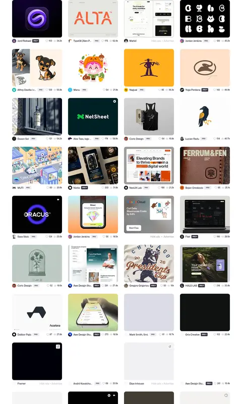
Portfolio card A rounded artwork thumbnail leads each feed item, with compact creator attribution, PRO badge where relevant, and small engagement metadata.
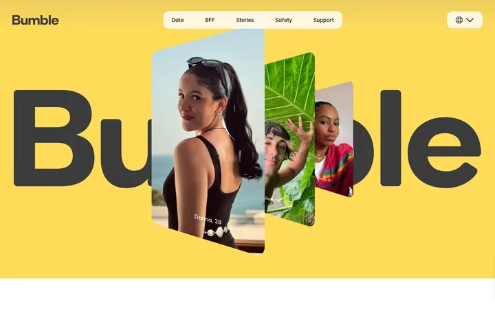
Category strip Horizontal series of colorful category thumbnails with brief labels, giving users a visual route into design disciplines.
Footer Minimal white footer with the wordmark, grouped navigation links, social icons, legal details, and muted secondary text.
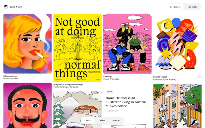
Imagery · Portfolio imagery is the dominant source of color: varied illustrations, product screens, logos, typography, and photographic or rendered work sit in repeated media cards. The hero uses a large, rounded showcase image with bright 3D forms against a pale background. Preserve each artwork’s distinct palette and crop rather than applying a uniform treatment. Video media is present in the feed, but the interface itself stays visually restrained.
页面版块 共 5 个版块,按页面从上到下排列,每个都标了类型、布局和交互套路。
该做与不该做 ✓ 该做 Use white as the primary canvas. Set core interface text in Midnight Ink. Reserve Dribbble Pink for selective emphasis and interactive cues. Let portfolio artwork supply the strongest color. Use rounded controls and media frames. Keep the hero airy and the work feed dense. Make metadata compact and visually subordinate. ✕ 不该做 Do not turn artwork colors into global interface accents. Do not use large dark section bands across the page. Do not crowd the hero headline or featured media. Do not style every card as a raised panel. Do not make secondary labels compete with the artwork. Do not replace the soft neutral surfaces with saturated fills. 给 AI 的提示词 想快速出一个同风格的新页面,把这段话连同 DESIGN.md 一起发给 AI。
复制 Build a new page in Dribbble’s visual style: use Gallery White (#ffffff) as the main canvas and Midnight Ink (#0d0c22) for headings and primary interface text. Add Dribbble Pink (#ea4c89) sparingly to highlight a key phrase or an interactive control. Use Mona Sans, or Inter as a free substitute, with a bold editorial headline and compact navigation and metadata. Arrange the top content in a spacious two-column layout, then provide clear search and filter controls before a dense, repeated portfolio grid. Use Cloud Lilac (#f3f3f6) and Pale Lilac (#ecebf0) for restrained secondary surfaces. Give media and controls rounded silhouettes, while allowing each artwork to retain its own colors and crop. Favor whitespace, fine borders, and selective subtle shadows over heavy panels or dark section backgrounds.
DESIGN.md Tailwind v4 CSS 变量 Design Tokens
---
title: "Dribbble design system"
variant: extended
source: https://dribbble.com/
captured_at: 2026-10-12
theme: light
industry: design
generator: Design DNA (https://four.wiralomi.com/style/dribbble-com)
ai_generated: true
ai_label: "本文件由 AI 辅助生成:数值取自公开网页的实测样式,命名、用途说明与建议为模型解读。商标归原所有者。 / AI-assisted content"
---
# Dribbble · Design System
> A calm canvas for standout creative work
**Theme:** light · **Industry:** design · **Source:** https://dribbble.com/ · **Captured:** 2026-10-12 (1440×900 desktop)
_AI-assisted content: values are measured from the public page at capture time; names, roles and guidance are model-written interpretations. Trademarks belong to their owners._
Dribbble pairs a restrained white interface with a dense, expressive feed of creative work. Rounded controls, bold headlines, and a focused pink accent make discovery and hiring feel approachable.
## North star
Keep the interface visually quiet and let vivid, varied portfolio artwork provide the page’s strongest color and personality.
## Overview
The page uses a white canvas to keep attention on the work, with deep blue-black text providing crisp hierarchy across navigation, hero copy, and card metadata. Dribbble pink is a deliberate highlight for selected headline words and interactive cues, while pale gray-lilac surfaces distinguish search controls, chips, and occasional cards without creating heavy section bands. Mona Sans carries the interface throughout: compact, confident navigation and metadata support a much larger, semibold hero headline. The first screen balances an editorial text-and-image hero with a generous gap, then transitions into a broad search and filter area and a tightly repeated portfolio feed. Cards have strongly rounded media frames, but their artwork retains its own colors and visual character. The layout remains bright, spacious around key actions, and dense where browsing many shots is the point.
## Colors
| Name | Hex | Token | Group | Role |
|---|---|---|---|---|
| Gallery White | ` | `--color-gallery-white` | surface | Dominant page canvas and frequent card, button, and text color against dark controls. |
| Midnight Ink | ` | `--color-midnight-ink` | brand | Primary headline and interface text; also fills prominent dark actions such as Log in. |
| Dribbble Pink | ` | `--color-dribbble-pink` | accent | Signature emphasis in hero wording and small interactive highlights, including the search action. |
| Studio Gray | ` | `--color-studio-gray` | semantic | Measured gradient component color; not a defining interface color in the screenshots. |
| Soft Graphite | ` | `--color-soft-graphite` | semantic | Measured gradient component color; appears as supporting tonal data rather than a core brand surface. |
| Cloud Lilac | ` | `--color-cloud-lilac` | surface | Soft card and control surface behind portions of the browsing interface. |
| Muted Slate | ` | `--color-muted-slate` | neutral | Secondary muted interface and footer color, including lower-priority link or text treatments. |
| Pale Lilac | ` | `--color-pale-lilac` | surface | Light chip, card, and button surface used to separate secondary controls from white. |
| True Black | ` | `--color-true-black` | semantic | Appears mainly within individual portfolio artwork and inverse card imagery, not as the page canvas. |
| Violet Charcoal | ` | `--color-violet-charcoal` | neutral | Supporting dark link or text tone; subordinate to the primary ink. |
| Muted Violet | ` | `--color-muted-violet` | neutral | Secondary text on pale badges, including compact PRO labels. |
| Artwork Black | ` | `--color-artwork-black` | semantic | Dark background sampled from portfolio cards; treat as artwork-specific rather than a site-wide surface. |
| Warm Canvas | ` | `--color-warm-canvas` | semantic | Warm off-white sampled inside portfolio media and artwork, not a primary interface background. |
| Blush Hairline | ` | `--color-blush-hairline` | neutral | Measured faint border tone; keep borders subtle and avoid using it as a broad section fill. |
| Footer Gray | ` | `--color-footer-gray` | neutral | Muted footer text and secondary information. |
| Mist Border | ` | `--color-mist-border` | neutral | Pale border and card detail tone for low-contrast separation. |
| Signal Green | ` | `--color-signal-green` | semantic | Appears inside an individual portfolio card; do not treat as a recurring interface accent. |
### Semantic aliases
`--color-canvas` → ` (Gallery White) · `--color-surface` → ` (Cloud Lilac) · `--color-surface-2` → ` (Muted Slate) · `--color-surface-3` → ` (Pale Lilac) · `--color-surface-4` → ` (True Black) · `--color-text` → ` (Midnight Ink) · `--color-text-muted` → ` (Gallery White) · `--color-border` → ` (Blush Hairline) · `--color-accent` → ` (Dribbble Pink) · `--color-accent-2` → ` (Signal Green)
### Contrast (WCAG 2.x)
| Text | Background | Ratio | Level |
|---|---|---|---|
| ` | ` | 19.22:1 | AAA |
| ` | ` | 17.35:1 | AAA |
| ` | ` | 7.23:1 | AAA |
| ` | ` | 16.2:1 | AAA |
| ` | ` | 1.11:1 | fail |
| ` | ` | 2.66:1 | fail |
| ` | ` | 1.19:1 | fail |
| ` | ` | 3.56:1 | AA-large |
| ` | ` | 3.22:1 | AA-large |
| ` | ` | 1.34:1 | fail |
### Gradients
- `linear-gradient(90deg, rgba(0, 0, 0, 0.24) 0%, rgba(0, 0, 0, 0.08) 58%, rgba(0, 0, 0, 0) 82%), linear-gradient(0deg, rgba(0, 0, 0, 0.12), rgba(0, 0, 0, 0) 42%)`
## Typography
| Family | Token | Source | Weights | Role | Free substitute |
|---|---|---|---|---|---|
| Mona Sans | `--font-body` | webfont | 500, 400, 600, 800, 700 | Site-wide interface font for navigation, hero, search, controls, metadata, and footer. | Inter |
- **Mona Sans:** Use medium-to-semibold weights for interface hierarchy, a semibold large hero, and compact bold uppercase labels; tracking is generally neutral.
### Type scale — Custom (ratio ≈ 3.714, base 14px)
| Role | Size | Weight | Line height | Letter spacing | Case | Family | Used for |
|---|---|---|---|---|---|---|---|
| h1 | 52px | 600 | 1.2 | 0 | — | Mona Sans | Large hero headline, with pink emphasis on selected words. |
| body | 14px | 500 | 1.21 | 0 | — | Mona Sans | Supporting hero copy and standard interface text. |
| caption | 12px | 500 | 1 | 0 | — | Mona Sans | Compact card details and small supporting labels. |
| button | 12px | 400 | 1 | 0 | — | Mona Sans | Short labels inside pill-shaped controls. |
| nav | 14px | 600 | 2.14 | 0 | — | Mona Sans | Primary navigation labels across the header. |
| link | 9px | 800 | 2.22 | 0 | uppercase | Mona Sans | Small uppercase PRO or similar compact badge labels. |
| eyebrow | 11px | 700 | 1 | 0.045em | uppercase | Mona Sans | Uppercase, letter-spaced section or category markers. |
OpenType features in use: `"ss01"` .
## Spacing & layout
- Base unit **4px**, density **comfortable**.
- Scale (most used values): 4, 5, 6, 8, 12, 16 px.
- Section rhythm 72px · element gap 8px · card padding — · max content width 1296px.
The header and hero sit within a centered, wide desktop canvas, with the hero arranged in two columns: copy on the left and featured media on the right. A clear gap separates the hero from the search and filter controls. The main work feed then shifts into a dense, repeated multi-column card grid, prioritizing quick scanning over large text. Category artwork forms a horizontal strip near the bottom, followed by a compact footer. The measured page max width is 1296px; maintain comfortable outer margins and a clear vertical rhythm.
## Shape & elevation
- Radius: button `50%` · input `12px` · card `24px` · media `50%` · link `50%` · xs `4px` · sm `8px` · md `12px` · pill `9999px`
- Shadow `sm` (button): `rgba(0, 0, 0, 0.14) 0px 3px 6px 0px`
- Shadow `sm-2` (button): `rgba(6, 3, 24, 0.01) 0px 4px 4px 0px`
- Shadow `md` (other): `rgba(123, 123, 198, 0.25) 0px 12px 20px 0px, rgba(0, 0, 0, 0.08) 0px 2px 3px 0px`
- Motion: standard transition `0.05s cubic-bezier(0.32, 0, 0.59, 0.03)` on interactive elements.
The page is mostly flat, with white space doing more work than shadows. Pale surfaces and fine, low-contrast outlines distinguish controls and chips. Rounded media cards have defined edges, while a small number of floating prompts and controls use subtle layered shadows. Keep elevation selective so the portfolio grid does not feel like a stack of generic raised panels.
## Imagery
Portfolio imagery is the dominant source of color: varied illustrations, product screens, logos, typography, and photographic or rendered work sit in repeated media cards. The hero uses a large, rounded showcase image with bright 3D forms against a pale background. Preserve each artwork’s distinct palette and crop rather than applying a uniform treatment. Video media is present in the feed, but the interface itself stays visually restrained.
## Components
### Header navigation
White horizontal masthead with the script wordmark, compact dark navigation labels, and right-aligned sign-up and dark pill login actions.
### Announcement strip
Wide, pale pink-tinted rounded banner beneath the header, pairing a brief promotion with a small light Get Started button and dismiss control.
### Split hero
Two-column hero with compact audience tabs, a large 52px semibold headline, short checklist, dark pill CTA, and rounded featured artwork.
### Search and filters
Browsing controls combine content-type choices, a broad pale search field, pink circular search action, popular-topic chips, and a sorting control.
### Portfolio card
A rounded artwork thumbnail leads each feed item, with compact creator attribution, PRO badge where relevant, and small engagement metadata.
### Category strip
Horizontal series of colorful category thumbnails with brief labels, giving users a visual route into design disciplines.
### Footer
Minimal white footer with the wordmark, grouped navigation links, social icons, legal details, and muted secondary text.
### Measured component styles
- **Primary button** (“Log in”): background ## Do
- Use white as the primary canvas.
- Set core interface text in Midnight Ink.
- Reserve Dribbble Pink for selective emphasis and interactive cues.
- Let portfolio artwork supply the strongest color.
- Use rounded controls and media frames.
- Keep the hero airy and the work feed dense.
- Make metadata compact and visually subordinate.
## Don't
- Do not turn artwork colors into global interface accents.
- Do not use large dark section bands across the page.
- Do not crowd the hero headline or featured media.
- Do not style every card as a raised panel.
- Do not make secondary labels compete with the artwork.
- Do not replace the soft neutral surfaces with saturated fills.
## Agent prompt
Build a new page in Dribbble’s visual style: use Gallery White (## Page sections (top to bottom)
| # | Type | Layout | UX patterns | UI patterns |
|---|---|---|---|---|
| 1 | hero | Two-column hero: audience tabs, headline, checklist, and CTA beside large featured media. | Switch between hiring and getting hired, Scan benefit checklist, Start a project brief | Large semibold headline, Pink text emphasis, Rounded media frame, Dark pill CTA |
| 2 | other | Search and content-type controls span the page above topic chips and sorting. | Choose a content type, Search by design interest, Filter by popular topic, Sort results | Pale rounded search field, Pink search action, Compact topic chips, Floating project prompt |
| 3 | product-grid | Dense, repeated multi-column portfolio cards beneath the browsing controls. | Browse creative work, Open an individual shot, Compare creators and engagement | Rounded artwork thumbnails, Compact creator metadata, Small PRO badges, Mixed image and video media |
| 4 | category-nav | A horizontal strip of visual category tiles above the footer. | Browse by design discipline, Select a category | Thumbnail-led category links, Short labels, Horizontal sequence |
| 5 | footer | Compact white footer with brand and grouped links above legal and utility details. | Navigate site sections, Open social channels, Access legal and resource links | Wordmark, Muted link groups, Social icons, Small legal text |
## Source CSS custom properties (selected)
```css
--sl-color-gray-50: hsl(0 0% 97.5%);
--sl-color-gray-100: hsl(240 4.8% 95.9%);
--sl-color-gray-200: hsl(240 5.9% 90%);
--sl-color-gray-300: hsl(240 4.9% 83.9%);
--sl-color-gray-400: hsl(240 5% 64.9%);
--sl-color-gray-500: hsl(240 3.8% 46.1%);
--sl-color-gray-600: hsl(240 5.2% 33.9%);
--sl-color-gray-700: hsl(240 5.3% 26.1%);
--sl-color-gray-800: hsl(240 3.7% 15.9%);
--sl-color-gray-900: hsl(240 5.9% 10%);
--sl-color-gray-950: hsl(240 7.3% 8%);
--sl-color-red-50: hsl(0 85.7% 97.3%);
--sl-color-red-100: hsl(0 93.3% 94.1%);
--sl-color-red-200: hsl(0 96.3% 89.4%);
--sl-color-red-300: hsl(0 93.5% 81.8%);
--sl-color-red-400: hsl(0 90.6% 70.8%);
--sl-color-red-500: hsl(0 84.2% 60.2%);
--sl-color-red-600: hsl(0 72.2% 50.6%);
--sl-color-red-700: hsl(0 73.7% 41.8%);
--sl-color-red-800: hsl(0 70% 35.3%);
--sl-color-red-900: hsl(0 62.8% 30.6%);
--sl-color-red-950: hsl(0 60% 19.6%);
--sl-color-orange-50: hsl(33.3 100% 96.5%);
--sl-color-orange-100: hsl(34.3 100% 91.8%);
--sl-color-orange-200: hsl(32.1 97.7% 83.1%);
--sl-color-orange-300: hsl(30.7 97.2% 72.4%);
--sl-color-orange-400: hsl(27 96% 61%);
--sl-color-orange-500: hsl(24.6 95% 53.1%);
--sl-color-orange-600: hsl(20.5 90.2% 48.2%);
--sl-color-orange-700: hsl(17.5 88.3% 40.4%);
--sl-color-orange-800: hsl(15 79.1% 33.7%);
--sl-color-orange-900: hsl(15.3 74.6% 27.8%);
--sl-color-orange-950: hsl(15.2 69.1% 19%);
--sl-color-amber-50: hsl(48 100% 96.1%);
--sl-color-amber-100: hsl(48 96.5% 88.8%);
--sl-color-amber-200: hsl(48 96.6% 76.7%);
--sl-color-amber-300: hsl(45.9 96.7% 64.5%);
--sl-color-amber-400: hsl(43.3 96.4% 56.3%);
--sl-color-amber-500: hsl(37.7 92.1% 50.2%);
--sl-color-amber-600: hsl(32.1 94.6% 43.7%);
```
---
本文件由 AI 辅助生成:数值取自公开网页的实测样式,命名、用途说明与建议为模型解读。商标归原所有者。
Generated by Design DNA · https://four.wiralomi.com/style/dribbble-com