North star · Keep the interface strictly black and white, using oversized tight-set type and open space to frame vivid, varied portfolio work.
The page uses a strict white-and-black interface: white is the uninterrupted canvas, while black carries the logo, oversized introduction, links, headings and pill outlines. The measured palette contains only #ffffff and #000000; the many colors visible lower on the page belong to project artwork and should not be promoted into interface colors. A single Standard webfont family is used in large, regular-weight text, with tight negative tracking and compact line spacing that make the introduction feel like an editorial statement. The layout stays mostly left-aligned and open, then becomes image-led in the project portfolio, where variable image sizes and generous white gaps preserve each project’s distinct art direction. Rounded outlined pills organize contact and category links, while black-filled section labels punctuate otherwise unboxed content. There are no shadows or decorative gradients; typography, hairline-like outlines, whitespace and the work itself establish hierarchy.
Site-wide display, body, captions, buttons and links.
角色
示例
字号
字重
行高
字距
特大标题
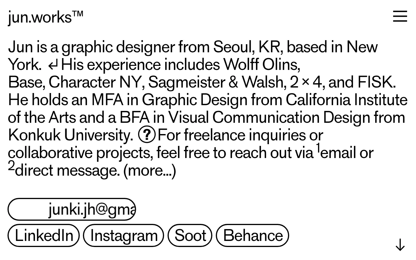
Oversized opening biography and primary introductory statement.
jun.works
65px
400
1.12
-0.045em
正文
Project descriptions, biography copy and service or client details.
jun.works
54.5px
400
1.12
-0.045em
辅助文字
Compact supporting labels, credits and image-related details.
jun.works
45.5px
400
1.12
-0.054em
按钮
Large text inside outlined contact and social pills.
jun.works
54.5px
400
1.15
-0.045em
链接
Prominent linked text for social profiles, tags and navigation.
jun.works
54.5px
400
1.12
-0.045em
间距与布局
基准单位 1px · 密度:适中
45px版块间距
—元素间距
—卡片内边距
1388px内容最大宽度
3px
5px
6px
9px
13px
18px
19px
26px
27px
45px
The page is predominantly a single, left-aligned column on a white canvas, with a wide measured maximum content width. The introduction spans much of the viewport; contact links sit below it, followed by a two-column services-and-clients area and a separate recognition list. Topic pills form a loose wrapping row. Project content continues as a long editorial feed with mixed image widths and generous gaps rather than uniform cards. Keep the section rhythm open and comfortable.
圆角与层次
按钮 · 9999px
没有测到阴影:页面是扁平的,层次靠底色和描边区分。
The interface is flat: measured data reports no shadows or gradients. Use the white canvas and black typography for the primary hierarchy. Rounded outlined pills and occasional black-filled labels supply the visible component edges; project images sit directly in the page flow, separated by whitespace rather than elevated cards.
组件
下面的预览按实测的按钮、输入框、徽标、卡片样式重建(字体用替代字体)。
Wordmark and menu
Place the jun.works™ wordmark at the upper left and a simple three-line black menu icon at the upper right.
Introductory biography
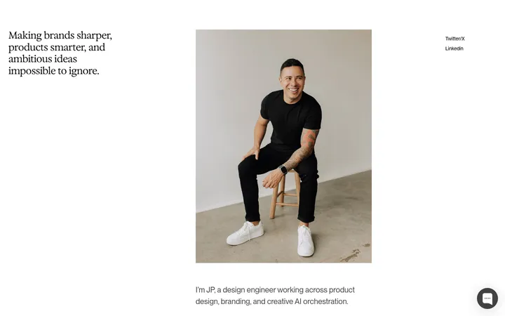
Set the designer bio as large, regular black text with tight tracking, compact leading and a wide line measure.
Contact and social pills
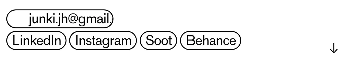
Use white-filled, black-outlined rounded pills with black text for the email and social links.
Section labels
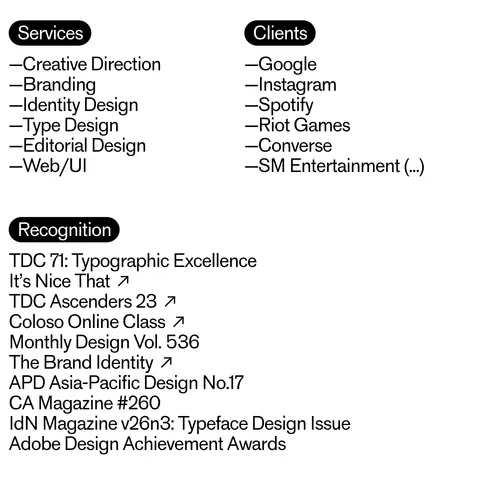
Mark sections such as Services, Recognition and Projects with compact black-filled pills and white text.
Topic tags
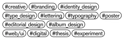
Present creative disciplines as individually outlined, rounded text links that wrap naturally across lines.
Project feed
Pair project names and descriptions with art-directed images of varied widths, maintaining generous white separation.
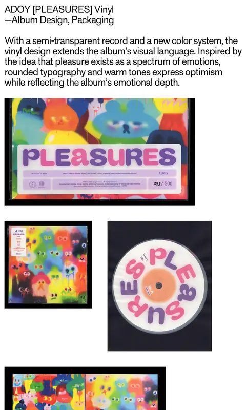
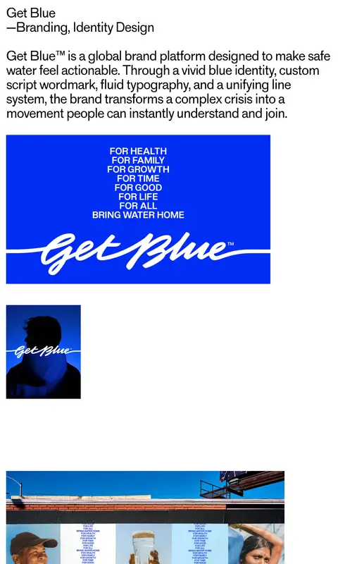
Imagery · Project imagery is the main source of color and includes identity systems, packaging, print, digital work and campaign applications. Images range from bright illustrated album artwork to vivid blue branding, photography and mockups. Preserve the individual artwork’s colors and aspect ratios; use varied, deliberate placement rather than adding a shared color treatment or uniform card frame.
Keep the interface palette to #ffffff and #000000.
Let project artwork provide its own color.
Use large regular-weight typography with tight tracking.
Align editorial copy predominantly to the left.
Use outlined rounded pills for contact and topic links.
Separate portfolio images with generous white space.
✕ 不该做
Do not add interface accent colors sampled from project images.
Do not introduce shadows, gradients or elevated cards.
Do not force all project images into a uniform grid.
Do not replace the expressive large text with small corporate typography.
Do not use filled bright-color buttons.
Do not crowd the page with decorative interface elements.
给 AI 的提示词
想快速出一个同风格的新页面,把这段话连同 DESIGN.md 一起发给 AI。
Build a new page in the jun.works portfolio style. Use Gallery White (#ffffff) as the uninterrupted canvas and Ink (#000000) for text, links, outlines and occasional filled section labels; reserve all other colors for the content of project imagery. Use one regular-weight sans-serif such as Inter, with oversized editorial copy, tight tracking and compact line spacing. Keep content primarily left-aligned, with a spacious introduction, outlined rounded contact and topic pills, and simple black-filled section labels. Present projects as an open editorial feed with mixed image sizes and generous gaps, preserving each image’s original art direction. Keep the interface flat: no shadows, gradients or decorative card surfaces. Make navigation minimal and let typography and portfolio work establish hierarchy.