North star · Keep the interface visually quiet and let large, well-spaced typography and project imagery carry the page.
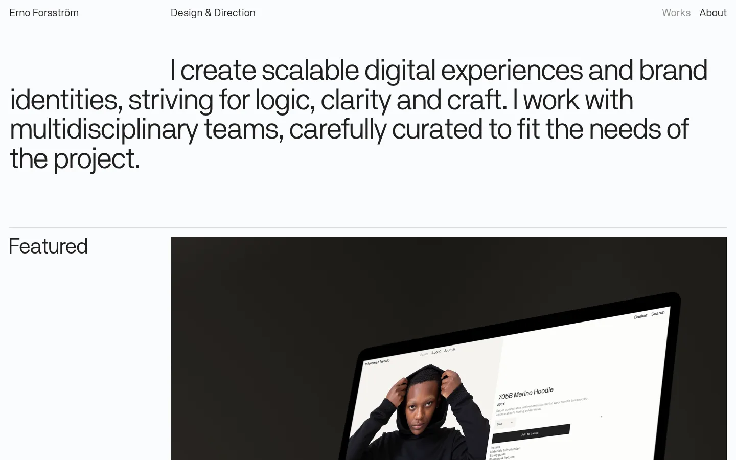
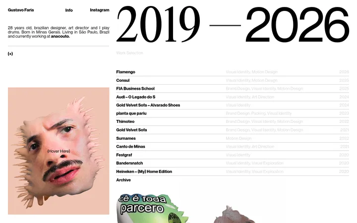
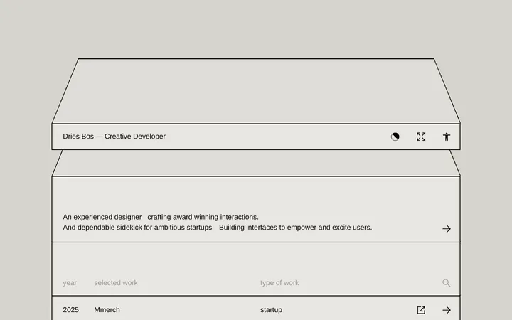
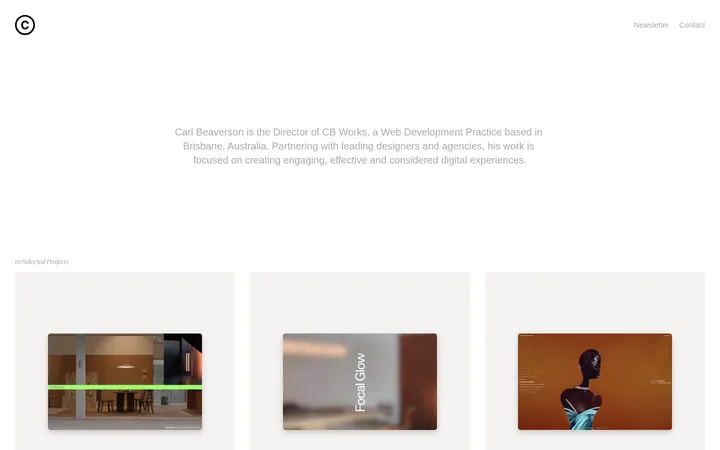
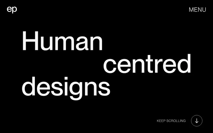
The page uses a near-white canvas (#fafbfc) as a continuous field, with dark charcoal (#202020) typography providing the only strong recurring contrast. Pale gray (#dfdcdc) appears as a fine rule and subtle surface tone rather than a prominent section fill; much of the image color belongs to project work, not the site palette. A single sans-serif family carries everything from compact navigation to the oversized introductory statement, using regular weight and tight tracking for a calm editorial feel. The layout begins with a sparse top bar, then a large, left-aligned statement with generous breathing room. Portfolio sections use a two-column structure: labels occupy a narrow left rail while images and project captions fill the wider right area. A later grid pairs projects side by side. Image crops and varied artwork supply contrast, while thin dividers, flat surfaces, and open spacing maintain a quiet, gallery-like presentation.
The sole typeface for navigation, display copy, headings, captions, links, and body text.
角色
示例
字号
字重
行高
字距
特大标题
Oversized opening statement, set as a calm editorial introduction.
Erno Forsström
57.5px
400
1
-0.05em
一级标题
Section headings and the large contact link.
Erno Forsström
43px
400
1
-0.027em
正文
Introductory copy and project descriptions or captions.
The quick brown fox 敏捷的狐狸
21px
400
1.1
-0.015em
链接
Header navigation, project links, and inline contact links.
The quick brown fox 敏捷的狐狸
21px
400
1
0
间距与布局
基准单位 2px · 密度:适中
49px版块间距
16px元素间距
4px卡片内边距
1404px内容最大宽度
4px
8px
13px
16px
18px
31px
39px
42px
49px
65px
107px
108px
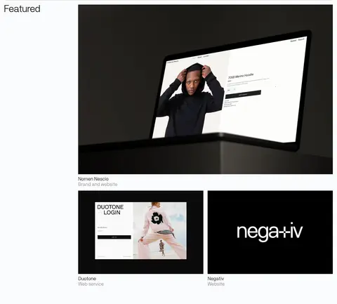
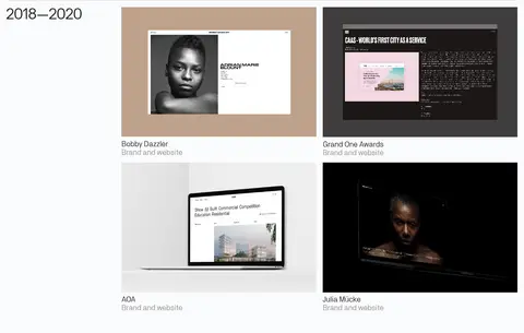
A compact top navigation sits above a broad, left-aligned introduction. The measured maximum content width is 1404px, with comfortable density and a two-column project layout. In the portfolio sections, a narrow label rail sits beside a wider media area; the featured work combines one large item with smaller paired projects, followed by a two-column historical grid. Sections are separated by fine rules and open vertical intervals. Keep alignment crisp and avoid ornamental containers.
圆角与层次
没有测到阴影:页面是扁平的,层次靠底色和描边区分。
The interface is flat: measured data reports no shadows, gradients, or rounded radii. Use pale hairline rules to mark section boundaries and keep cards visually open, with captions on the canvas rather than inside raised containers. Project imagery can contain its own depth, device frames, or dark backgrounds; treat these as media content, not page-level elevation.
组件
下面的预览按实测的按钮、输入框、徽标、卡片样式重建(字体用替代字体)。
Top navigation
Sparse text-only header with the designer name, discipline label, and right-aligned Works and About links.
Intro statement
Large regular-weight text block, left aligned and spanning much of the content width, with tight tracking and ample surrounding space.
Section label rail
A small heading such as Featured or 2018—2020 sits to the left of the project media area.
Featured project
One dominant project image followed by smaller paired items; each project has a concise title and muted visual caption treatment.
Project grid
Two-column presentation of earlier work with consistent rectangular media, direct titles, and short category captions.
Contact callout
Simple closing invitation and prominent Reach out text link, separated from work by open space and a fine rule.
Footer links
Compact, text-only utility links arranged in small groups with a subtle top divider.
Imagery · Project work is presented through large rectangular screenshots, video stills, and portfolio mockups. The media spans varied visual worlds—dark presentation backgrounds, light web pages, photography, and colored artwork—so preserve each project's native image treatment rather than recoloring it to match the site. Use clean crops with captions immediately below; imagery, not interface decoration, supplies most of the page's color and texture.
Use the near-white canvas consistently across sections.
Set text in a single regular-weight sans-serif family.
Make the opening statement the typographic focal point.
Pair narrow section labels with a wider media area.
Keep project images rectangular and let their own artwork retain its colors.
Use fine gray rules and generous open space to separate content.
✕ 不该做
Do not introduce bright accent colors into the interface.
Do not add shadows, gradients, or rounded card treatments.
Do not place captions in heavy, filled containers.
Do not let navigation compete with the introduction.
Do not crop project imagery into decorative shapes.
Do not overfill the page with extra labels or ornament.
给 AI 的提示词
想快速出一个同风格的新页面,把这段话连同 DESIGN.md 一起发给 AI。
Build a new portfolio page in Erno Forsström’s restrained editorial style. Use Gallery White (#fafbfc) as the continuous canvas, Soft Ink (#202020) for text and links, and Quiet Gray (#dfdcdc) only for subtle dividers or understated surface details. Use one regular sans-serif throughout; choose Inter as a close free substitute if the original webfont is unavailable. Create a sparse text navigation, an oversized left-aligned introduction, and a project gallery with a narrow heading rail beside a wide media column. Let project artwork retain its own colors and framing, with concise captions directly below. Keep surfaces flat, corners square, and spacing open. Finish with a simple contact callout and a compact text-link footer. Avoid decorative color, shadows, gradients, and bulky card chrome.