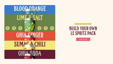
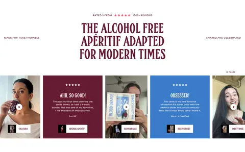
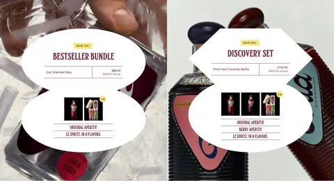
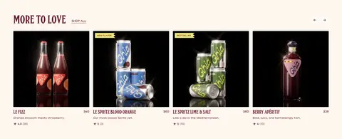
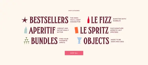
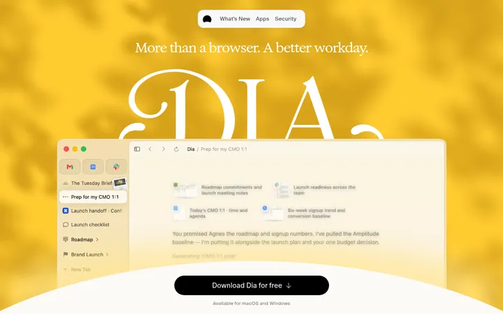
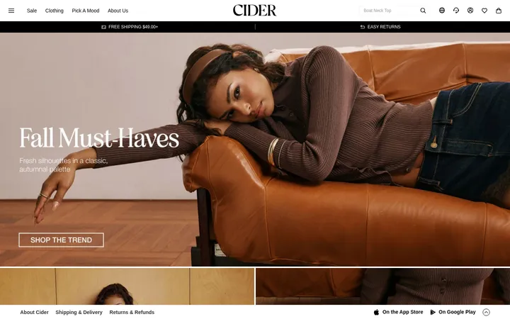
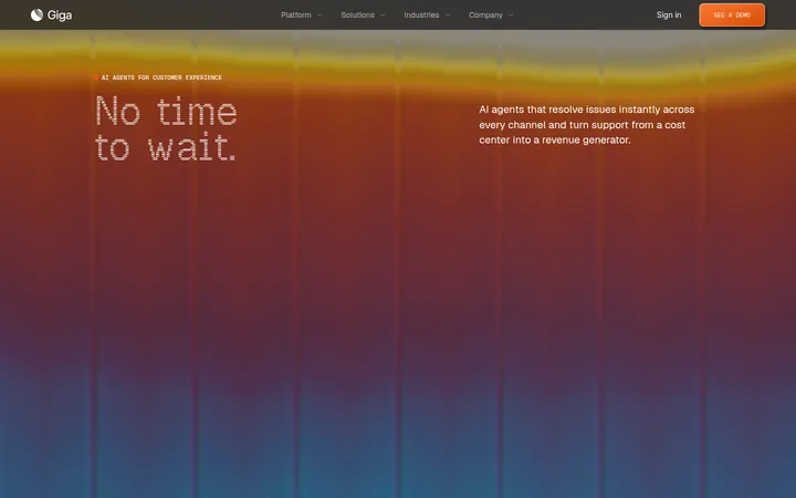
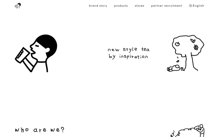
North star · Let warm editorial restraint frame vivid product imagery, with burgundy typography and small, decisive pink or yellow accents.
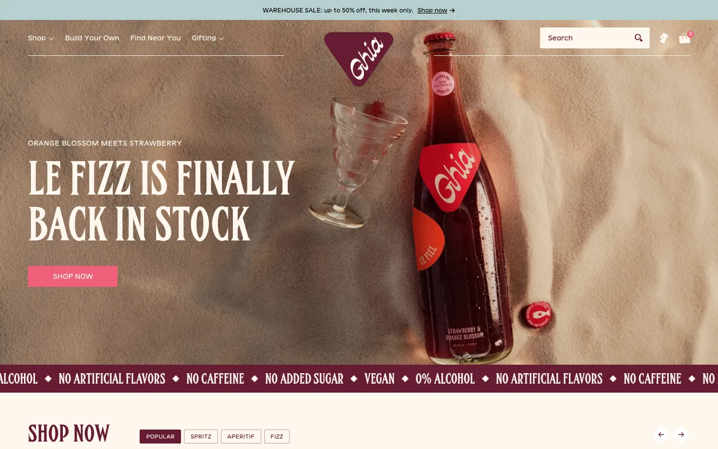
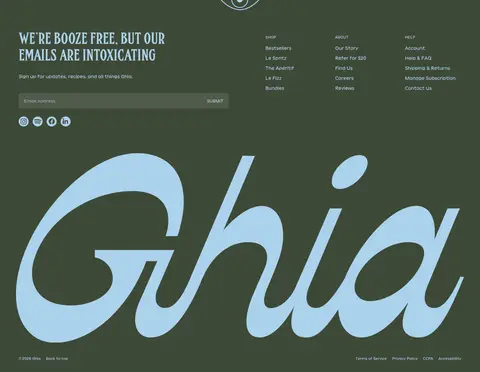
The visual system is built around a creamy canvas (#fef6ee) and deep burgundy (#651c32), letting large condensed uppercase headlines carry the editorial voice. A vivid pink CTA (#ef6079) and lemon-yellow labels (#f0e87b) provide compact moments of emphasis without diluting the restrained base. The opening hero is an immersive, full-bleed product photograph with light navigation and headline overlays; below it, product cards return to a consistent shop grid. Sections alternate between open cream layouts and art-directed feature panels, including blue cookbook imagery and a deep green newsletter footer. FHA Condensed French NC gives display copy a tall, poster-like silhouette, while Vivey 22 Positive keeps navigation and product details approachable. Deliberate image-led color variation is allowed inside campaigns and product photography, while the burgundy, cream, and pink remain the recognizable interface anchors.
Navigation, body copy, captions, buttons, and product details.
Aa 设计
FHA Condensed French NC
网络字体 · 字重 400 · 占比 29%
免费替代:Oswald
Display headlines, section titles, and prominent editorial links.
角色
示例
字号
字重
行高
字距
特大标题
Oversized uppercase campaign headlines and prominent editorial statements.
Ghia
92px
400
1
0
一级标题
Primary hero headline, set in a tall condensed display face.
Ghia
88px
400
1
0
二级标题
Major section headings such as product and category titles.
Ghia
83.5px
400
1
0
三级标题
Secondary campaign or feature headings with close line stacking.
Ghia
80px
400
0.95
0
四级标题
Smaller editorial feature titles and product bundle headings.
Ghia
64px
400
0.95
0
正文
Product descriptions, supporting copy, and explanatory text.
The quick brown fox 敏捷的狐狸
13px
400
1.35
0
辅助文字
Compact reviews, product notes, and image-related details.
The quick brown fox 敏捷的狐狸
12px
400
1.3
0
按钮
Uppercase calls to action and compact shop controls.
The quick brown fox 敏捷的狐狸
11px
400
1.5
0.025em
导航
Utility navigation, category tabs, and footer links.
The quick brown fox 敏捷的狐狸
14px
400
1.43
0
链接
Prominent uppercase editorial and product links.
The quick brown fox 敏捷的狐狸
22px
400
1
0
间距与布局
基准单位 4px · 密度:适中
56px版块间距
4px元素间距
—卡片内边距
1328px内容最大宽度
4px
6px
8px
10px
12px
14px
16px
32px
48px
56px
The page uses a wide, image-led canvas, with the measured content max width at 1328px and a comfortable overall density. The hero runs edge to edge; subsequent sections mix product grids, two-column editorial features, and wider campaign or review compositions. Alignment shifts between left-led shopping sections and centered promotional blocks. Sections share a measured 56px rhythm, while small component gaps keep labels, buttons, and product details compact. Keep the cream canvas continuous where possible, using colored bands as deliberate campaign or footer moments.
圆角与层次
按钮 · 2px
输入框 · 2px
卡片 · 2px
图片 · 10px
徽标 · 50%
导航 · 50%
md · button
lg · media
The interface is mostly flat and editorial, with square-edged card and button treatments rather than conspicuous elevation. Use the measured subtle button shadow sparingly and reserve stronger media shadow for foregrounded imagery. Thin, muted rose borders can distinguish controls; layering comes mainly from text over photography, product artwork, and overlapping campaign compositions.
组件
下面的预览按实测的按钮、输入框、徽标、卡片样式重建(字体用替代字体)。
Hero campaign
Full-bleed product photograph with small supporting copy, large condensed uppercase headline, and a pink SHOP NOW CTA.
Announcement strip
Slim contrasting message band at the top, with concise sale copy and an inline shop link.
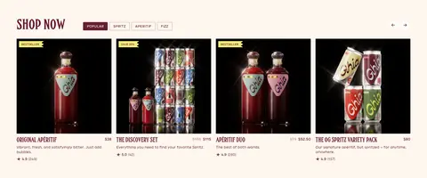
Product card
Dark-backed product photography, compact uppercase product name, brief description, price, and yellow bestseller label when needed.
Category tabs
Compact uppercase filter controls beside a section heading; active option uses burgundy fill and cream text.
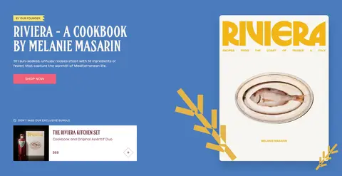
Campaign split feature
Two-column editorial promotion with bold condensed title, supporting copy, CTA, and art-directed cookbook or flavor imagery.
Newsletter footer
Olive-green closing section with light blue heading and oversized brand lettering, signup form, and grouped link columns.
Imagery · Use tactile, close-cropped beverage and packaging photography as the primary visual material: bottles, cans, glasses, and flavor compositions should feel naturally lit and art-directed. The hero photo fills its section and supports overlaid white display copy. Product cards use dark image fields for contrast, while campaign artwork may introduce blue, green, or citrus hues. Customer review imagery includes candid video portraits; avoid treating those image colors as core interface tokens.
Anchor the interface with Cream Canvas (#fef6ee) and Apéritif Burgundy (#651c32).
Use condensed uppercase display type for major editorial headlines.
Keep primary shopping actions visibly pink and concise.
Let product photography carry flavor, texture, and campaign color.
Use Citrus Label yellow for small badges rather than large text blocks.
Vary section composition while preserving clear shopping hierarchy.
✕ 不该做
Do not turn campaign blues or flavor colors into the global interface palette.
Do not use generic geometric display type in place of the condensed editorial face.
Do not crowd the cream canvas with decorative borders or shadows.
Do not make every section a uniform product grid.
Do not use pink as a large background field across the page.
Do not obscure product labels or key copy with image overlays.
给 AI 的提示词
想快速出一个同风格的新页面,把这段话连同 DESIGN.md 一起发给 AI。
Build a new Ghia-style page as an image-led, editorial storefront. Use Cream Canvas (#fef6ee) for the main ground and Apéritif Burgundy (#651c32) for primary text, links, and dark bands. Set large campaign headlines in a condensed uppercase display face similar to Oswald, and use an approachable sans-serif like DM Sans for navigation, copy, and controls. Make the main CTA Fizz Pink (#ef6079), with Citrus Label (#f0e87b) reserved for small badges. Favor tactile beverage photography, full-bleed campaign imagery, and flexible product grids over decorative UI. Keep components mostly flat, use compact square-edged controls, and introduce campaign-specific blue or green only within feature artwork. End with an Olive Footer (#3e4938) and light-blue accents.