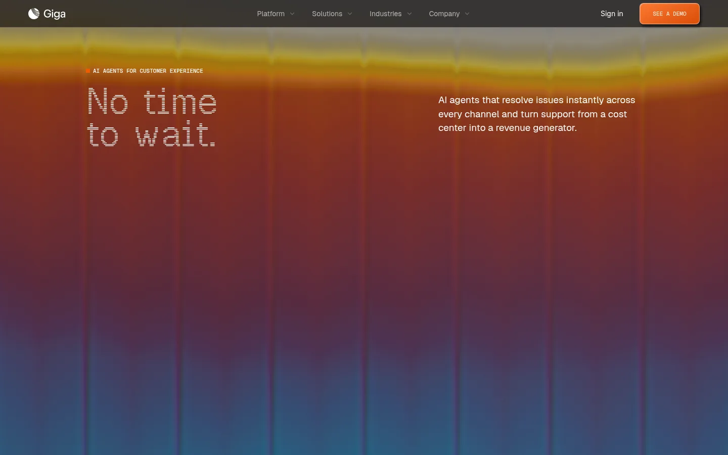
Giga 以近黑画布和像素风展示字体搭配浓烈、富有氛围感的首屏渐变。页面在疏朗的编辑式内容区与细节丰富的产品界面之间切换,直观呈现 AI 客服的工作方式。
North star · Keep the page near-black and editorial, using pixel typography and warm color only to make product moments feel unmistakably focal.
The visual identity is anchored by a black canvas (#000000), with white and cool pale gray reserved for high-contrast headings and readable body copy. A rust-orange accent (#a94827) supports the warm, cinematic hero, where orange-red light transitions through yellow into blue; this is a distinctive hero treatment rather than a page-wide background system. Display headings use a pixel-line face, while Inter and Geist provide clearer reading text and navigation. The opening product demo is a two-part interface: a dark email-entry panel beside a pale voice-and-chat device mockup. Below it, the page returns to spacious black sections, customer marks, understated hairlines, and carefully framed product examples. Compact uppercase mono labels add technical character without overwhelming the larger editorial headings. The overall effect depends on contrast and restraint: vivid color and detailed mockups appear as focal points against long stretches of dark negative space.
Body copy, navigation, links, and general interface text.
Aa 设计
inter
网络字体 · 字重 400 · 占比 29%
免费替代:Inter
Section headings and prominent editorial content.
Aa 设计
Geist Mono
网络字体 · 字重 400 / 500 · 占比 17%
免费替代:IBM Plex Mono
Code-like and technical interface labels.
Aa 设计
geistSans
网络字体 · 字重 400 · 占比 13%
免费替代:Inter
Product cards and secondary interface copy.
Aa 设计
geistPixelLine
网络字体 · 字重 400 · 占比 3%
免费替代:Silkscreen
Pixel-line display and hero headings.
Aa 设计
Geist Pixel Line
网络字体 · 字重 400 · 占比 3%
免费替代:Silkscreen
Large display headings and select section titles.
角色
示例
字号
字重
行高
字距
特大标题
Oversized pixel-line headline treatment in the hero.
Giga
72px
400
0.89
0
一级标题
Primary hero heading and key top-level message.
Giga
52.5px
400
1.2
0
二级标题
Major section headings across the homepage.
Giga
34px
400
1.16
-0.02em
三级标题
Secondary feature headings and product-story titles.
Giga
31.5px
400
1.12
-0.017em
四级标题
Pixel-style smaller display headings.
The quick brown fox 敏捷的狐狸
26.5px
400
0.99
0
正文
Explanatory paragraphs and primary supporting copy.
The quick brown fox 敏捷的狐狸
19px
400
1.45
0
辅助文字
Compact supporting descriptions and product-card copy.
The quick brown fox 敏捷的狐狸
18px
400
1.5
0
按钮
Uppercase mono labels on prominent actions.
The quick brown fox 敏捷的狐狸
11px
400
1.27
0
导航
Header links and navigation labels.
The quick brown fox 敏捷的狐狸
14px
400
1.71
0
链接
Inline and standalone textual links.
The quick brown fox 敏捷的狐狸
16px
400
normal
0
代码
Technical, terminal-like product-demo labels.
const style = 1;
11px
400
1.27
0
间距与布局
基准单位 4px · 密度:适中
86px版块间距
8px元素间距
—卡片内边距
—内容最大宽度
1px
4px
8px
9px
10px
12px
14px
15px
16px
18px
20px
22px
24px
26px
59px
86px
A centered content area organizes the page into a compact horizontal navigation, a broad hero, then vertically separated content blocks. The hero aligns a pixel headline on the left with explanatory copy on the right above a wide, split product demo. Below it, customer logos form a restrained band, followed by editorial feature sections with text and product imagery arranged side by side. Long black intervals create deliberate breathing room between groups. The page feels comfortable rather than dense, with fine separators and small labels guiding the eye.
圆角与层次
按钮 · 8px
卡片 · 4px
导航 · 8px
inset · other
md · card
inset · other
inset · other
Most sections sit flat on the black canvas, so separation comes from negative space rather than stacked cards. Product panels use fine graphite borders, subtle inset highlights, and restrained dark shadows to create tactile depth. The hero mockup's pale device surface contrasts sharply with the adjacent black form panel; keep prominent layering concentrated there.
组件
下面的预览按实测的按钮、输入框、徽标、卡片样式重建(字体用替代字体)。
Top navigation
Compact dark header with the Giga mark, centered navigation links, sign-in text, and an orange demo action.
Hero headline and copy
Pixel-line headline and small uppercase mono eyebrow on the left, balanced by concise supporting copy on the right.
Split voice-and-chat demo
Wide product panel pairing a near-black email-entry form with a pale, device-like voice and chat interface.
Customer logo band
A restrained row of customer marks set against the black canvas with generous surrounding space.
Industry showcase
Editorial section heading and short description above a compact prompt panel and framed industry imagery.
Conversation feature
Text-led feature beside a dark conversation interface showing support exchanges and improvement over time.
Improvement curve
Minimal rising curve graphic with small labels and a fine baseline, presented within a spacious dark section.
Imagery · The hero combines a cinematic orange-to-blue illuminated backdrop with a large, tactile voice-and-chat device mockup. Product screenshots and interface panels carry the feature storytelling; customer logos and a simple rising curve support credibility and the improvement narrative. Treat visual assets as carefully framed focal points against black, not as decorative wallpaper. Warm, photographic colors in mockups belong to those assets and should not redefine the site palette.
该做与不该做
✓ 该做
Use #000000 as the dominant page canvas.
Reserve pixel-line typography for display moments.
Keep body text legible in cool pale or muted gray.
Concentrate warm gradients in the hero and selected accents.
Frame product interfaces with fine, subdued borders.
Use generous dark intervals between editorial sections.
✕ 不该做
Do not spread the hero gradient across the entire page.
Do not set long paragraphs in the pixel-line face.
Do not introduce bright colors beyond the measured palette.
Do not make every section a raised card.
Do not crowd the logo band or editorial layouts.
Do not treat mockup photography colors as brand colors.
给 AI 的提示词
想快速出一个同风格的新页面,把这段话连同 DESIGN.md 一起发给 AI。
Build a new Giga-style AI SaaS page around a dominant Canvas Black (#000000) background. Use Signal White (#ffffff) and Frosted Mist (#e8edef) for legible headings and text, with Quiet Silver (#9fa2a4) for secondary copy. Give major display moments a pixel-line typeface; keep paragraphs, navigation, and controls in a clean sans-serif, with restrained mono labels. Use Rust Glow (#a94827), Ember Orange (#f7732b), and Burnt Orange (#dd520c) sparingly for a cinematic hero gradient and clear primary actions. Structure the page as a compact navigation, editorial hero, prominent product interface, and spacious alternating feature sections. Favor large areas of negative space, fine Graphite Line (#38383a) borders, and layered product mockups over pervasive cards. Keep imagery visually distinct from the core interface palette.