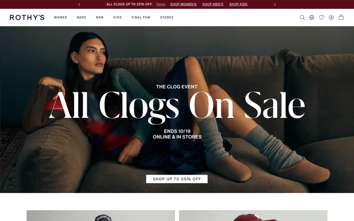
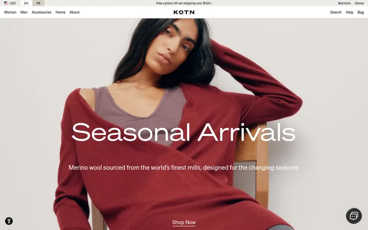
North star · Keep the interface neutral and understated so expressive skincare photography and product details carry the visual emphasis.
The visual system is built on a quiet neutral foundation: white canvas, warm stone-gray text, and pale greige bands that distinguish content without introducing a strong accent colour. Most sections stay flat and spacious, while product cards and editorial blocks use softly rounded corners. Swiss sans-serif handles navigation, product information, and body copy with a clean, practical voice; the heavier Rektorat display face adds a distinctive lowercase note to display and compact nav treatments. The page moves between a full-bleed monochrome video hero, a compact product grid, centered brand philosophy, and paired editorial feature panels. Photography is the main source of colour and contrast, from black-and-white portraiture to close-up skin and strawberry-red product details. Consistent alignment, restrained hairlines, and generous image-led panels make the storefront feel premium while keeping shopping actions easy to locate.
Main interface face for headings, body copy, product details, buttons, and most navigation.
Aa 设计
Rektorat Heavy
网络字体 · 字重 400 · 占比 7%
免费替代:Archivo Black
Display typography and compact lowercase navigation or badge treatments.
角色
示例
字号
字重
行高
字距
特大标题
Distinctive lowercase display headlines and brand-led statements.
rhode
57.5px
400
1
-0.04em
一级标题
Primary page and feature headings.
rhode
36.5px
400
1.2
0.02em
二级标题
Editorial section headings and brand philosophy title.
rhode
36px
400
1.2
-0.02em
三级标题
Product and subsection headings.
The quick brown fox 敏捷的狐狸
27px
700
1.5
0
四级标题
Smaller feature and supporting section headings.
The quick brown fox 敏捷的狐狸
24px
700
1.4
0
正文
Product descriptions, editorial copy, and explanatory text.
The quick brown fox 敏捷的狐狸
16px
400
1.5
0.02em
辅助文字
Compact product details, ratings, and secondary labels.
The quick brown fox 敏捷的狐狸
14px
400
1.5
0.02em
按钮
Uppercase shopping and conversion action labels.
The quick brown fox 敏捷的狐狸
16px
700
1
0.02em
导航
Small lowercase display-style navigation labels.
The quick brown fox 敏捷的狐狸
10px
400
0.75
-0.04em
眉题
Widely tracked uppercase category or section labels.
The quick brown fox 敏捷的狐狸
0px
400
25.32
0.338em
间距与布局
基准单位 4px · 密度:紧凑
32px版块间距
10px元素间距
32px卡片内边距
1375px内容最大宽度
2px
3px
4px
5px
8px
9px
10px
11px
12px
13px
16px
24px
28px
30px
32px
40px
The page uses a centered storefront frame with a measured maximum width of 1375px and a compact overall density. A narrow shipping announcement sits above the main navigation, followed by a full-bleed video hero. Content shifts between a 12-column product grid, centered philosophy panel, two-column editorial features, and a multi-column social gallery. Section spacing follows a measured 32px rhythm, with 10px element gaps and 32px card padding. Alignment alternates intentionally between centered brand messaging and left-aligned shopping or editorial content.
圆角与层次
按钮 · 9999px
输入框 · 12px
卡片 · 12px
图片 · 12px
徽标 · 9999px
导航 · 8px
链接 · 9999px
inset · other, link, nav
inset · other, link
hairline · other
The interface is mostly flat, relying on pale surface bands and thin borders rather than pronounced shadows. Cards and media use rounded corners to separate content from the canvas. Measured inset outlines appear on select controls, with a subtle hairline shadow used sparingly.
组件
下面的预览按实测的按钮、输入框、徽标、卡片样式重建(字体用替代字体)。
Announcement and navigation
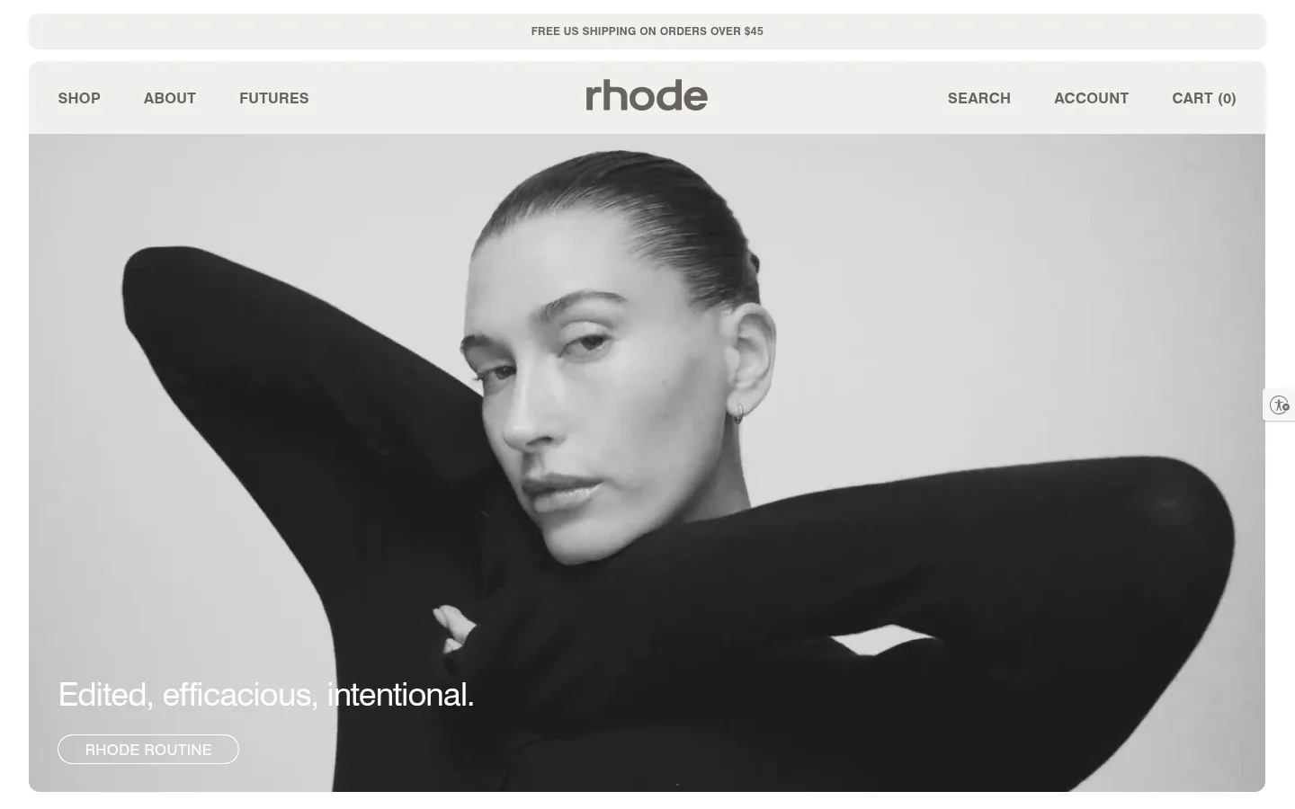
A slim centered shipping message precedes a white navigation bar with left-aligned category links, a centered wordmark, and utility links.
Video hero
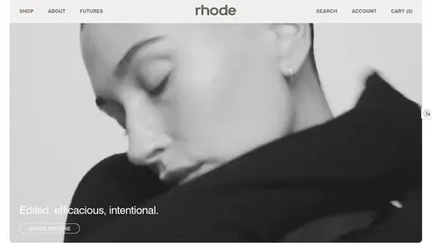
Full-width rounded video panel with a monochrome portrait, lower-left white headline, and a thin outlined pill action.
Product cards
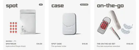
Compact cards on #f1f0ed pair a bold lowercase product heading with product imagery, rating or label details, and a price or buying link.
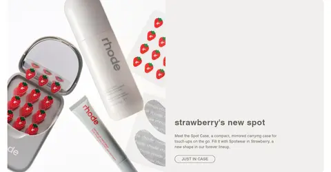
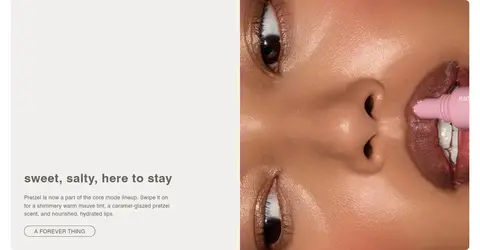
Editorial feature panel
Two-column image-and-copy sections use a pale neutral background, concise text, rounded media, and a small outlined pill CTA.
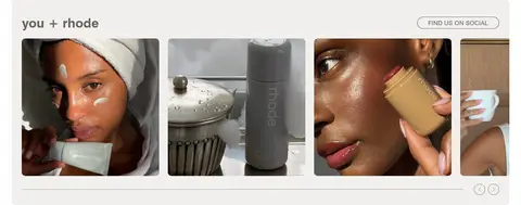
Social gallery
A row of cropped customer and creator images sits beneath a compact heading, with a social link and understated controls.
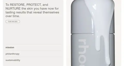
Values accordion
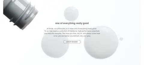
The mission panel pairs a short brand statement and product image with three stacked value rows divided by fine horizontal rules.
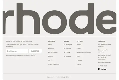
Newsletter footer
Large wordmark artwork anchors the footer above a compact email form, multi-column navigation links, and a country selector.
Imagery · Large lifestyle photography and video lead the experience: the hero uses monochrome portrait footage, while later sections mix product still lifes, close-up skin, social imagery, and product detail. Images are cropped boldly within rounded panels and often occupy half or all of a section. Product colour is concentrated in the imagery, including strawberry-red accents, while interface chrome remains neutral.
Use #ffffff as the main canvas and #f1f0ed for gentle section contrast.
Keep interface text and shopping links in #67645e.
Let product and skin imagery provide most of the colour.
Use rounded cards and pill-shaped actions consistently.
Alternate product browsing with editorial image-and-copy sections.
Keep copy concise and controls easy to scan.
✕ 不该做
Do not introduce saturated interface colours absent from the measured palette.
Do not use heavy shadows to separate ordinary cards.
Do not let decorative gradients dominate the storefront.
Do not crowd the hero with multiple competing actions.
Do not replace product photography with generic decorative illustrations.
Do not use dense, long-form copy in shopping cards.
给 AI 的提示词
想快速出一个同风格的新页面,把这段话连同 DESIGN.md 一起发给 AI。
Build a new beauty storefront page in rhode’s restrained editorial style. Use Gallery White (#ffffff) for the main canvas, Soft Putty (#f1f0ed) for selected cards and content bands, and Warm Graphite (#67645e) for text, links, and controls. Keep typography primarily clean Swiss-like sans-serif, reserving a heavier lowercase display face for expressive headings. Structure the page with a compact announcement and navigation, a large image- or video-led hero, scannable product cards, and alternating editorial image-and-copy panels. Let real product and beauty photography supply colour and contrast. Use softly rounded media and card surfaces, fine Quiet Silver (#c4c4c4) borders, and minimal shadows. Maintain clear section rhythm, concise copy, and pill-shaped actions without making the interface feel crowded.