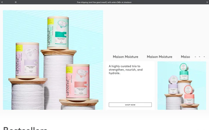
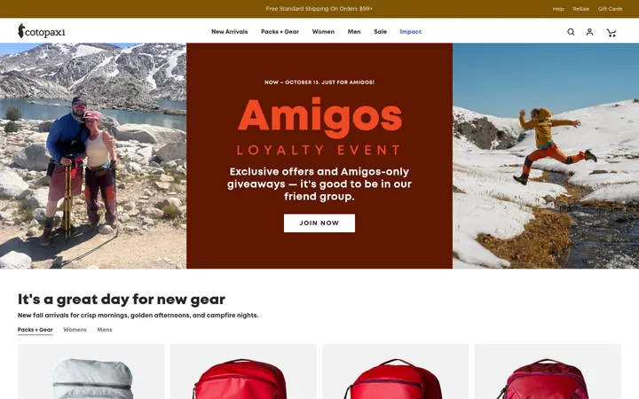
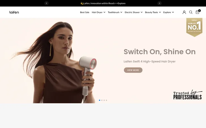
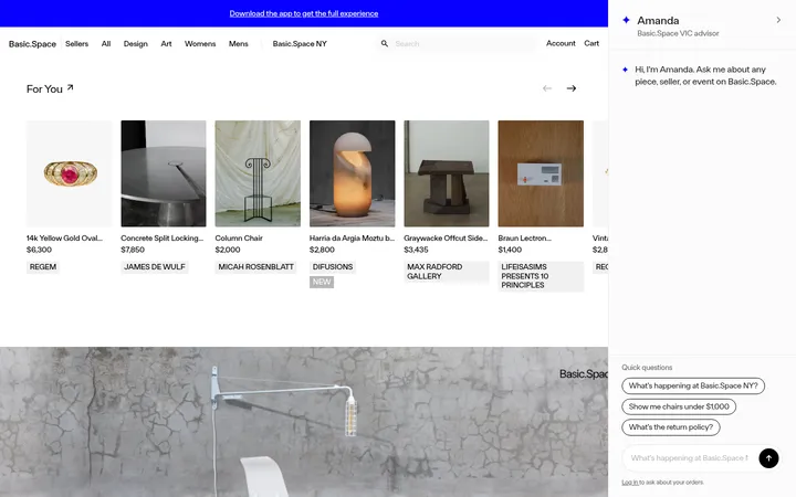
North star · Keep the interface monochrome and disciplined, letting rich red campaign photography—not extra UI colour—supply the drama.
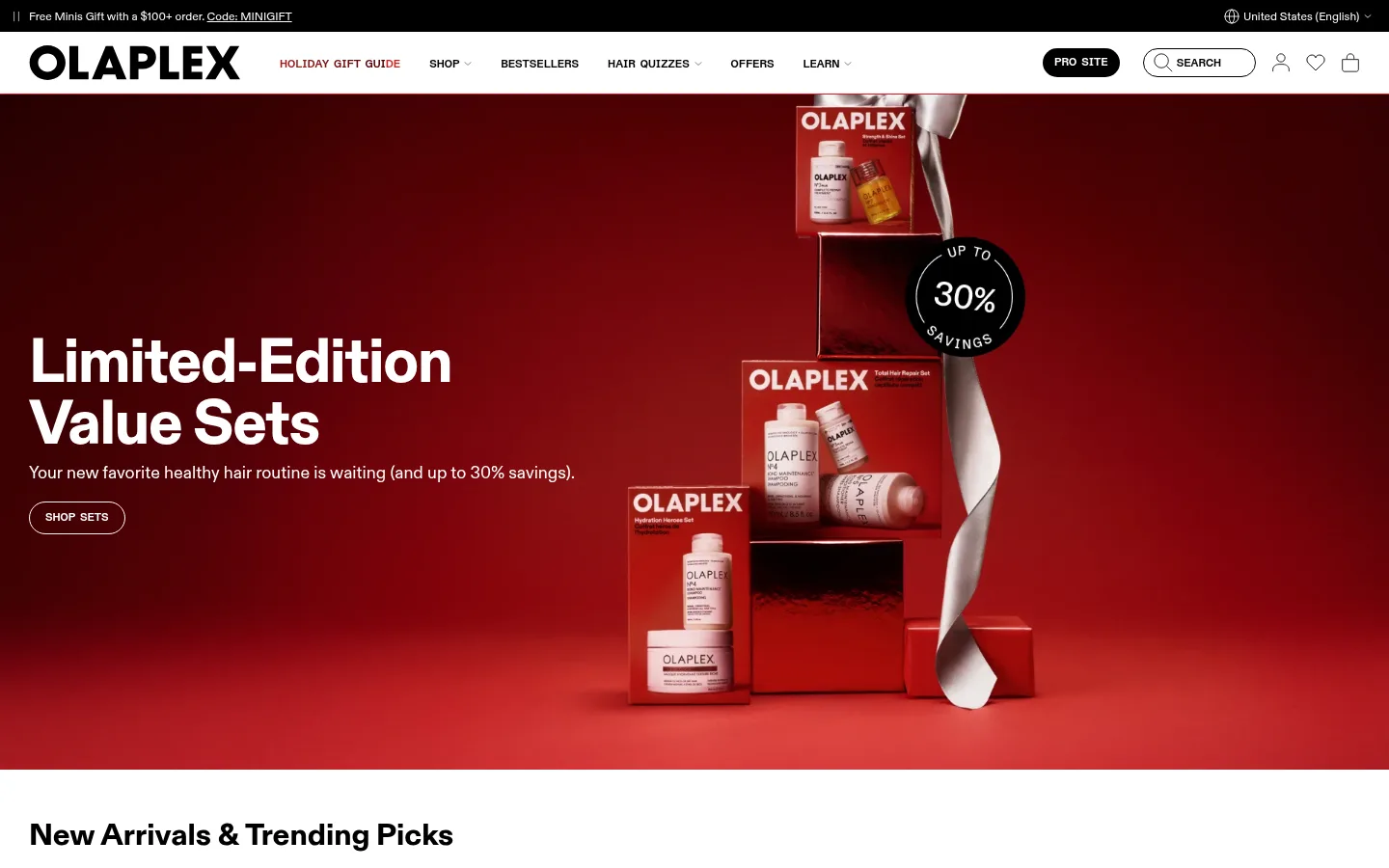
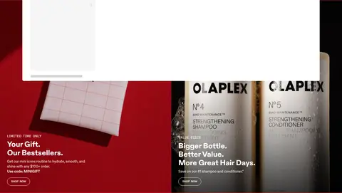
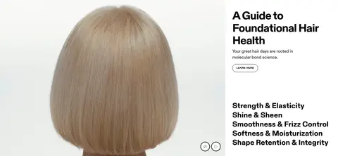
The homepage uses a white canvas and black interface chrome as a quiet frame for image-led campaigns. Deep reds dominate seasonal hero and promotional photography, but they belong to campaign imagery rather than the measured interface palette; keep those distinctions clear. ABC Diatype supplies compact, confident headings and readable body copy, while ABC Diatype Semi-Mono gives navigation, labels, and buttons an uppercase, technical character. A full-width hero gives its headline and CTA room against product imagery, followed by clean product rows, editorial stories, quiz content, and social proof. Alternating image-led compositions keep the long page varied without adding decorative clutter. Product cards use warm off-white surfaces; thin borders and pill outlines define controls. Generous section separation, simple alignment, and restrained elevation preserve a polished, clinical beauty-store feel.
Navigation, buttons, captions, and editorial labels
Aa 设计
ui-sans-serif
系统字体 · 字重 400 · 占比 8%
免费替代:Inter
Fallback and some product-card text
角色
示例
字号
字重
行高
字距
特大标题
Large campaign headlines over full-bleed hero imagery.
OLAPLEX
64px
800
1
-0.02em
一级标题
Primary page or feature headings.
OLAPLEX
48px
800
1.1
-0.03em
二级标题
Section titles such as product and editorial headings.
OLAPLEX
32px
800
1.1
0
三级标题
Secondary feature and module headings.
OLAPLEX
28px
800
1.1
0
四级标题
Compact tertiary headings and product content.
The quick brown fox 敏捷的狐狸
20px
800
1.1
0
正文
Descriptions, promotional copy, and supporting paragraphs.
The quick brown fox 敏捷的狐狸
15px
400
1.4
0
辅助文字
Uppercase dates and small editorial labels.
The quick brown fox 敏捷的狐狸
12px
700
1
0
按钮
Uppercase shopping and navigation actions.
The quick brown fox 敏捷的狐狸
12px
700
1
0
导航
Compact uppercase global navigation labels.
The quick brown fox 敏捷的狐狸
12px
700
1
0
链接
Uppercase, lightly tracked prominent text links.
The quick brown fox 敏捷的狐狸
14px
500
1.2
0.03em
眉题
Uppercase category and promotion preheads.
The quick brown fox 敏捷的狐狸
14px
500
1.2
0.03em
代码
Compact uppercase utility or informational microcopy.
const style = 1;
12px
700
1
0
间距与布局
基准单位 4px · 密度:适中
50px版块间距
8px元素间距
—卡片内边距
1380px内容最大宽度
1px
2px
3px
4px
5px
7px
8px
10px
12px
16px
20px
30px
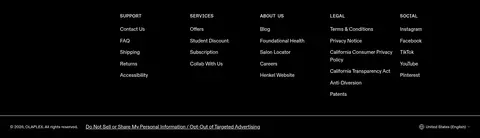
The page alternates full-width campaign panels with contained shopping and editorial modules. The measured maximum content width is 1380px; use broad image fields, clear horizontal alignment, and product carousels or grids where shopping intent is high. Sections are comfortably spaced, while card content stays compact. The long scroll varies between split features, multi-column product areas, blog cards, quiz content, and a dense footer. Preserve a strong headline-to-image relationship, with left-aligned text common across modules.
圆角与层次
按钮 · 9999px
卡片 · 4px
图片 · 50%
徽标 · 9999px
链接 · 9999px
md · card
hairline · other
Most sections and cards feel flat, with contrast, imagery, and white space doing the organizing. Use fine outlines on pill controls and subtle separators rather than heavy containers. Product cards may use a restrained soft shadow, but do not create a floating-card-heavy interface. Layer text directly over hero photography only where contrast is clear.
组件
下面的预览按实测的按钮、输入框、徽标、卡片样式重建(字体用替代字体)。
Announcement strip
Narrow black top band with small light promotional copy and a direct offer or code link.
Pill CTA
Small uppercase semi-mono label inside a rounded outline; use black text and border on light backgrounds, or reverse for dark imagery.
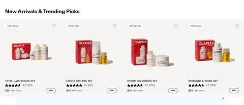
Product card
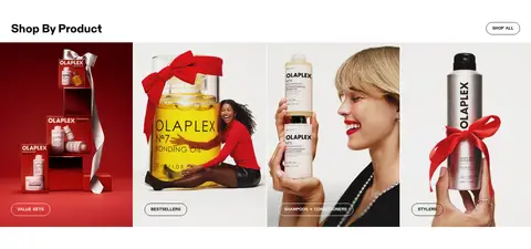
Pale warm surface with prominent product image, compact title, review or price details, savings label, and outlined ADD control.
Product carousel
Horizontally browsable product lineup with concise previous/next or swipe affordances and strong image emphasis.
Editorial feature
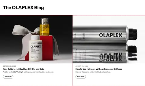
Large photography paired with a short title, date or eyebrow, brief copy, and simple read-more action.
Newsletter form
Dark footer signup area with contrasting heading, rounded outlined fields, and compact uppercase submit actions.
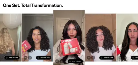
Imagery · Use polished product photography, full-bleed campaign sets, lifestyle portraits, and real customer or ambassador imagery. Hero and promotional visuals use saturated reds, while product photography also sits against pale neutral backgrounds. Frame products clearly and let image crops carry much of the visual mood. Include video or social content where appropriate; avoid decorative illustration as the primary storytelling device.
Use white as the default canvas and black for essential interface contrast.
Let campaign photography carry rich reds instead of tinting the whole interface.
Set headings in a bold, tight sans-serif voice.
Use semi-mono uppercase styling for navigation, actions, and small labels.
Keep shopping controls compact, outlined, and pill-shaped.
Alternate editorial imagery and practical product modules down the page.
✕ 不该做
Do not introduce unmeasured colours as core interface tokens.
Do not turn every section into a bordered card.
Do not rely on shadows for hierarchy.
Do not make small labels sentence case when they function as controls.
Do not let body copy compete with imagery or headings.
Do not confuse red tones inside campaign images with the measured UI palette.
给 AI 的提示词
想快速出一个同风格的新页面,把这段话连同 DESIGN.md 一起发给 AI。
Build a new OLAPLEX-style beauty commerce page with a white Gallery White (#ffffff) canvas and Carbon Ink (#000000) typography and controls. Use Warm Porcelain (#f6f4f2) sparingly for product surfaces; reserve Brand Crimson (#d91920) for measured accent details, and let red campaign imagery provide the dramatic colour. Use a bold, tightly tracked sans-serif for headings and a semi-mono uppercase face for navigation, eyebrows, and CTAs. Structure the page as a long editorial storefront: broad image-led campaign areas, clear product grids or carousels, split feature modules, and concise content cards. Keep controls pill-shaped and restrained, product details compact, and spacing generous between major sections. Prefer flat surfaces and thin outlines; use shadows only lightly. Make shopping actions easy to find without adding decorative UI clutter.