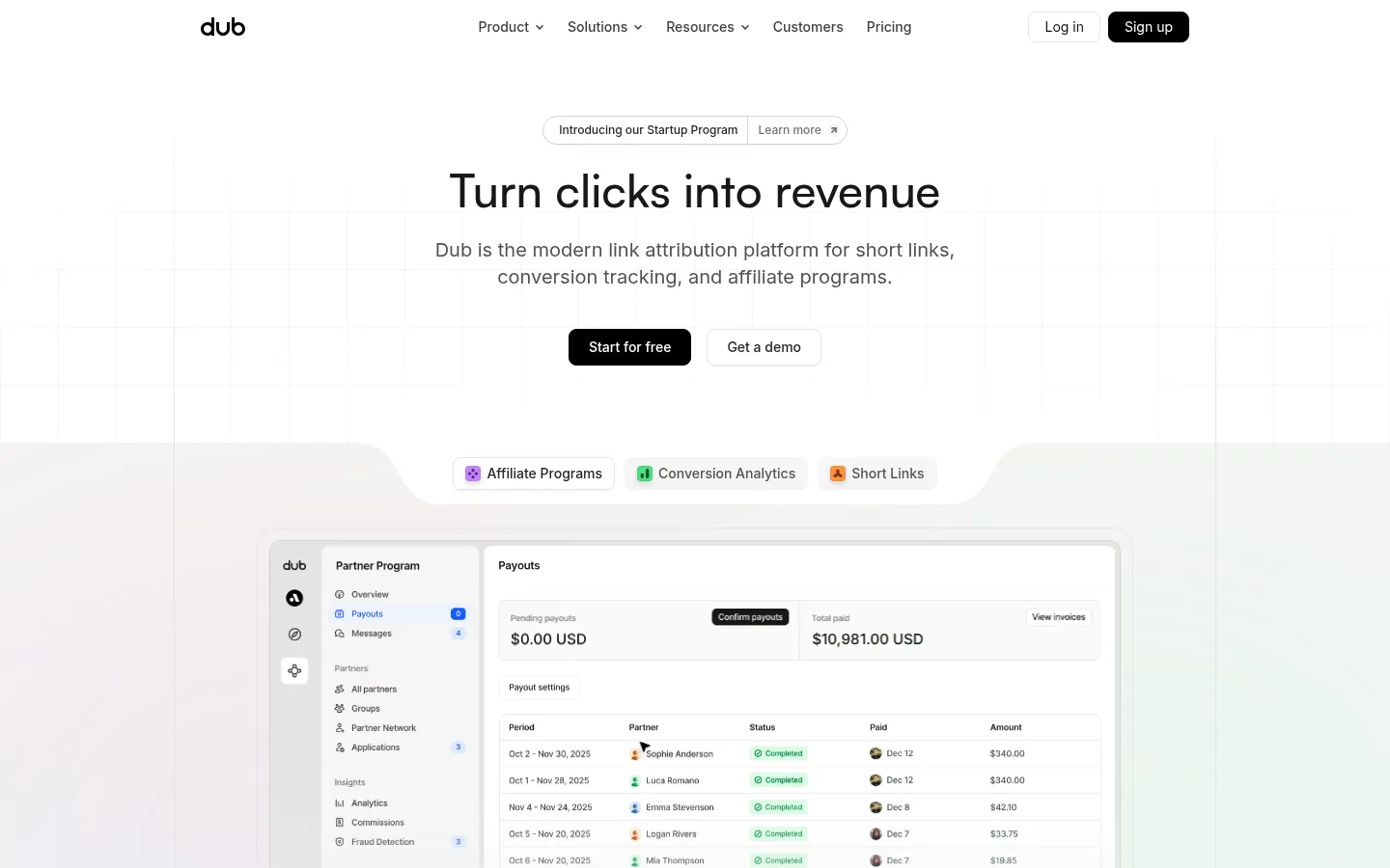
Dub以克制的黑白界面、宽松的产品展示和清晰的模块化内容,呈现链接归因平台。细腻边框、灰阶文字与少量功能色共同突出产品界面和客户案例。
North star · Keep the page quiet and white so product UI, customer proof, and a few functional color cues carry the story.
The page is built on a predominantly white canvas, with pale gray bands used selectively to separate major feature areas and a near-black closing CTA for contrast. Ink-dark headings and muted gray body copy establish a clear reading hierarchy; violet, blue, green, and orange appear sparingly as product-status or category cues, not as a broad decorative brand wash. The hero centers a concise headline and supporting copy above paired actions, then transitions into a large dashboard demonstration. Inter and Satoshi keep the typography clean and modern, while GeistMono is reserved for code-like material. A centered, constrained content frame organizes long-form sections into alternating product descriptions, interface mockups, customer proof, and integrations. Thin neutral borders define cards and section edges; subtle shadows add limited depth. Generous whitespace and repeated modular layouts make a long page feel orderly rather than dense.
配色 点色块复制色值。用途说明来自对页面的实测位置(背景、文字、描边、按钮)与截图判读。
品牌色
Carbon Ink
#171717
Primary heading and body text, inverse surfaces, and the closing CTA band.
强调色
Violet Signal
#7c3aed
Sparse link or button accent and affiliate-category cues.
Tangerine Signal
#ea580c
Occasional orange link or short-link category cue within product/UI content.
Metric Blue
#3b82f6
Blue product visualization or interface control; use sparingly.
Brick Signal
#c73e33
Rare red accent in button or product visualization details.
Coral Signal
#df6547
Small warm-toned interface detail, not a dominant page color.
Petal Detail
#f4b3d7
Rare pink UI/mockup detail; keep confined to product imagery.
表层色
Gallery White
#ffffff
Dominant page canvas and card surface; preserves the airy, low-noise presentation.
Cloud Gray
#f5f5f5
Soft feature-section bands, badges, and restrained secondary surfaces.
中性色
Soft Graphite
#e5e5e5
Fine card outlines, separators, and section hairlines.
Quiet Gray
#737373
Muted supporting copy, secondary links, and subdued labels.
Deep Slate
#262626
Secondary dark text and compact interface details.
Midnight Gray
#525252
Secondary labels and interface text where primary ink would be too strong.
功能色
Mint Status
#bbf7d0
Small success/status details in interface badges; treat as product UI, not a page-wide brand color.
Forest Success
#166534
Success text and status badges inside product mockups.
Leaf Green
#16a34a
Small green status or analytics indicators in dashboard imagery.
Cobalt Badge
#1e40af
Rare blue badge detail inside interface mockups.
文字 背景 对比度 WCAG #171717 Carbon Ink#ffffff Gallery White17.93:1 AAA #171717 Carbon Ink#e5e5e5 Soft Graphite14.23:1 AAA #171717 Carbon Ink#f5f5f5 Cloud Gray16.44:1 AAA #737373 Quiet Gray#ffffff Gallery White4.74:1 AA #737373 Quiet Gray#e5e5e5 Soft Graphite3.76:1 AA-large #737373 Quiet Gray#f5f5f5 Cloud Gray4.35:1 AA-large
字体 字号阶梯:Perfect Fourth(比例约 1.361,正文 14px)。示例用免费替代字体渲染,数值为实测。
Aa 设计
Inter 网络字体 · 字重 400 / 500 / 600 · 占比 91%
免费替代:Inter
Main navigation, body copy, section headings, buttons, links, and interface text.
Aa 设计
GeistMono 网络字体 · 字重 400 / 500 · 占比 7%
免费替代:JetBrains Mono
Code-like and technical snippets in API or product demonstrations.
Aa 设计
satoshi 网络字体 · 字重 500 · 占比 2%
免费替代:Inter
Prominent hero heading.
角色 示例 字号 字重 行高 字距 一级标题 Centered hero headline and major campaign statement.
Dub
48px 500 1 0 二级标题 Primary section headings introducing product capabilities.
Dub
30px 400 1.38 0 三级标题 Feature and sub-section headings within product narratives.
The quick brown fox 敏捷的狐狸
24px 400 1.33 0 四级标题 Compact card or secondary feature headings.
The quick brown fox 敏捷的狐狸
20px 400 1.4 0 正文 Descriptions, testimonials, explanatory copy, and customer content.
The quick brown fox 敏捷的狐狸
14px 400 1.43 0 辅助文字 Small metadata, badges, and understated labels.
The quick brown fox 敏捷的狐狸
10px 400 1.5 0 按钮 Primary and secondary CTA labels.
The quick brown fox 敏捷的狐狸
14px 500 1.43 0 导航 Top-level navigation and footer navigation items.
The quick brown fox 敏捷的狐狸
14px 500 1.43 0 链接 Inline exploration links and section actions.
The quick brown fox 敏捷的狐狸
14px 500 1.43 0 代码 Technical/API snippets and code-like product content.
const style = 1;
14px 400 1.43 0
间距与布局 基准单位 4px · 密度:适中
48px 版块间距
8px 元素间距
16px 卡片内边距
1078px 内容最大宽度
1px
2px
4px
6px
8px
10px
12px
14px
16px
20px
32px
40px
48px
A centered content frame capped at the measured 1078px supports a long vertical SaaS narrative. The hero is centered, while most feature sections shift to left-aligned copy paired with broad product demonstrations. The page alternates white and pale-gray bands, with customer logos, testimonials, and feature modules used as pauses between product stories. Comfortable density and substantial section breathing room keep the page scannable; modular columns appear in showcase, integration, and customer-proof areas.
圆角与层次 hairline · button, other, card
md · other
inset · other
hairline · card
The overall treatment is flat, relying on white space and thin gray borders rather than pronounced depth. Cards use subtle hairline shadows where needed to lift controls or interface panels from their backgrounds. Keep stacking restrained: pale surfaces, outlines, and the near-black CTA provide most of the separation.
组件 下面的预览按实测的按钮、输入框、徽标、卡片样式重建(字体用替代字体)。
Top navigation Compact horizontal links on white with the Dub wordmark, muted secondary actions, and a black sign-up button.
Hero and announcement Centered announcement pill above a Satoshi headline, muted supporting copy, paired CTAs, and a product demonstration below.
Feature showcase Left-aligned section heading and explanatory copy followed by a large dashboard or workflow mockup in a pale bordered panel.
Feature category chips Small rounded category labels with restrained violet, green, or orange icons against pale surfaces.
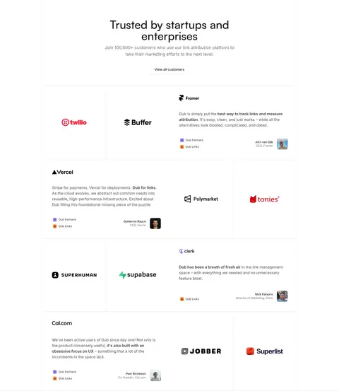
Customer proof grid Logo and testimonial modules arranged in a bordered modular grid, with muted copy and compact customer attribution.
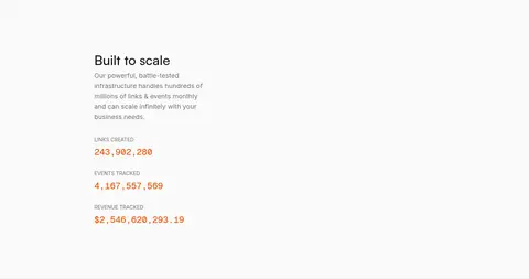
Metric band Pale background section with scale explanation and prominent numeric metrics, using warm details only within the metric treatment.
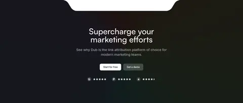
Closing CTA Centered white copy and paired actions on a near-black section, with a curved transition into the footer.
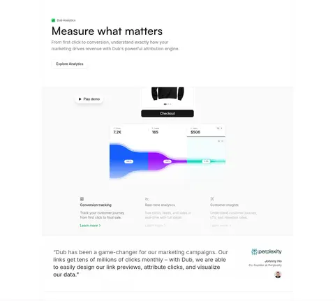
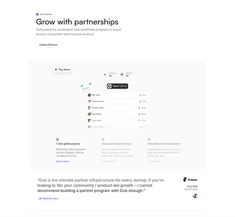
Imagery · Product imagery is primarily interface mockups: dashboards, analytics charts, link lists, partner payouts, and API flows. They sit inside pale, clean panels with fine outlines and are framed as evidence of the product rather than decorative illustrations. Customer logos and small portraits add social proof. Integration marks and small colorful status indicators are contained within these demonstrations; avoid introducing unrelated photography or oversized illustration.
页面版块 共 13 个版块,按页面从上到下排列,每个都标了类型、布局和交互套路。
该做与不该做 ✓ 该做 Use white as the dominant canvas. Separate selected blocks with pale gray bands. Keep headings dark and supporting copy muted. Show realistic product UI as the main visual evidence. Use thin gray borders to define panels. Reserve bright colors for small functional UI cues. ✕ 不该做 Do not make the page a saturated gradient composition. Do not use large decorative illustrations in place of product UI. Do not overuse shadows or floating-card effects. Do not color every CTA or link with an accent hue. Do not compress long feature sections into dense text walls. Do not treat mockup-only status colors as core brand colors. 给 AI 的提示词 想快速出一个同风格的新页面,把这段话连同 DESIGN.md 一起发给 AI。
复制 Build a new SaaS page in Dub’s restrained product-led style. Use Gallery White (#ffffff) as the dominant canvas, Carbon Ink (#171717) for headings and primary actions, Cloud Gray (#f5f5f5) for occasional section bands, and Soft Graphite (#e5e5e5) for fine panel borders. Use Quiet Gray (#737373) for supporting copy. Keep the layout centered and modular, with a concise hero, generous breathing room, and alternating copy-plus-product-demo sections. Make realistic dashboards, charts, and workflow panels the primary imagery; contain bright status colors such as Violet Signal (#7c3aed), Metric Blue (#3b82f6), and Leaf Green (#16a34a) within small UI details. Use Inter for most text, Satoshi for the hero headline, and GeistMono sparingly for technical content. Finish with a strong near-black CTA band.
DESIGN.md Tailwind v4 CSS 变量 Design Tokens
---
title: "Dub design system"
variant: extended
source: https://dub.co/
captured_at: 2026-10-12
theme: light
industry: saas
generator: Design DNA (https://four.wiralomi.com/style/dub-co)
ai_generated: true
ai_label: "本文件由 AI 辅助生成:数值取自公开网页的实测样式,命名、用途说明与建议为模型解读。商标归原所有者。 / AI-assisted content"
---
# Dub · Design System
> Quiet monochrome, vivid proof of product.
**Theme:** light · **Industry:** saas · **Source:** https://dub.co/ · **Captured:** 2026-10-12 (1440×900 desktop)
_AI-assisted content: values are measured from the public page at capture time; names, roles and guidance are model-written interpretations. Trademarks belong to their owners._
Dub pairs a restrained black-and-white interface with spacious product demonstrations and crisp, modular content. Fine borders, muted text, and small functional color accents keep attention on the platform and its customer proof.
## North star
Keep the page quiet and white so product UI, customer proof, and a few functional color cues carry the story.
## Overview
The page is built on a predominantly white canvas, with pale gray bands used selectively to separate major feature areas and a near-black closing CTA for contrast. Ink-dark headings and muted gray body copy establish a clear reading hierarchy; violet, blue, green, and orange appear sparingly as product-status or category cues, not as a broad decorative brand wash. The hero centers a concise headline and supporting copy above paired actions, then transitions into a large dashboard demonstration. Inter and Satoshi keep the typography clean and modern, while GeistMono is reserved for code-like material. A centered, constrained content frame organizes long-form sections into alternating product descriptions, interface mockups, customer proof, and integrations. Thin neutral borders define cards and section edges; subtle shadows add limited depth. Generous whitespace and repeated modular layouts make a long page feel orderly rather than dense.
## Colors
| Name | Hex | Token | Group | Role |
|---|---|---|---|---|
| Gallery White | ` | `--color-gallery-white` | surface | Dominant page canvas and card surface; preserves the airy, low-noise presentation. |
| Carbon Ink | ` | `--color-carbon-ink` | brand | Primary heading and body text, inverse surfaces, and the closing CTA band. |
| Soft Graphite | ` | `--color-soft-graphite` | neutral | Fine card outlines, separators, and section hairlines. |
| Quiet Gray | ` | `--color-quiet-gray` | neutral | Muted supporting copy, secondary links, and subdued labels. |
| Mint Status | ` | `--color-mint-status` | semantic | Small success/status details in interface badges; treat as product UI, not a page-wide brand color. |
| Deep Slate | ` | `--color-deep-slate` | neutral | Secondary dark text and compact interface details. |
| Violet Signal | ` | `--color-violet-signal` | accent | Sparse link or button accent and affiliate-category cues. |
| Midnight Gray | ` | `--color-midnight-gray` | neutral | Secondary labels and interface text where primary ink would be too strong. |
| Forest Success | ` | `--color-forest-success` | semantic | Success text and status badges inside product mockups. |
| Tangerine Signal | ` | `--color-tangerine-signal` | accent | Occasional orange link or short-link category cue within product/UI content. |
| Leaf Green | ` | `--color-leaf-green` | semantic | Small green status or analytics indicators in dashboard imagery. |
| Cobalt Badge | ` | `--color-cobalt-badge` | semantic | Rare blue badge detail inside interface mockups. |
| Metric Blue | ` | `--color-metric-blue` | accent | Blue product visualization or interface control; use sparingly. |
| Brick Signal | ` | `--color-brick-signal` | accent | Rare red accent in button or product visualization details. |
| Coral Signal | ` | `--color-coral-signal` | accent | Small warm-toned interface detail, not a dominant page color. |
| Petal Detail | ` | `--color-petal-detail` | accent | Rare pink UI/mockup detail; keep confined to product imagery. |
| Cloud Gray | ` | `--color-cloud-gray` | surface | Soft feature-section bands, badges, and restrained secondary surfaces. |
### Semantic aliases
`--color-canvas` → ` (Gallery White) · `--color-surface` → ` (Soft Graphite) · `--color-surface-2` → ` (Cloud Gray) · `--color-surface-3` → ` (Carbon Ink) · `--color-text` → ` (Carbon Ink) · `--color-text-muted` → ` (Quiet Gray) · `--color-text-subtle` → ` (Deep Slate) · `--color-border` → ` (Soft Graphite) · `--color-accent` → ` (Violet Signal) · `--color-accent-2` → ` (Metric Blue) · `--color-accent-3` → ` (Brick Signal)
### Contrast (WCAG 2.x)
| Text | Background | Ratio | Level |
|---|---|---|---|
| ` | ` | 17.93:1 | AAA |
| ` | ` | 14.23:1 | AAA |
| ` | ` | 16.44:1 | AAA |
| ` | ` | 4.74:1 | AA |
| ` | ` | 3.76:1 | AA-large |
| ` | ` | 4.35:1 | AA-large |
| ` | ` | 3.78:1 | AA-large |
| ` | ` | 15.13:1 | AAA |
| ` | ` | 12.01:1 | AAA |
| ` | ` | 13.88:1 | AAA |
### Gradients
- `conic-gradient(from -81deg, rgb(58, 139, 253) -72deg, rgb(133, 90, 252) 33deg, rgb(255, 0, 0) 70deg, rgb(234, 179, 8) 136deg, rgb(92, 255, 128) 214deg, rgb(0, 255, 249) 259deg, rgb(58, 139, 253) 288deg, rgb(133, 90, 252)`
- `conic-gradient(from -81deg, rgb(255, 0, 0), rgb(234, 179, 8) 99deg, rgb(92, 255, 128) 162deg, rgb(0, 255, 249) 216deg, rgb(58, 139, 253) 288deg, rgb(133, 90, 252))`
- `conic-gradient(from 279deg, rgb(255, 0, 0), rgb(234, 179, 8) 99deg, rgb(92, 255, 128) 162deg, rgb(0, 255, 249) 216deg, rgb(58, 139, 253) 288deg, rgb(133, 90, 252) 360deg)`
- `linear-gradient(rgba(0, 0, 0, 0.6), rgb(0, 0, 0))`
## Typography
| Family | Token | Source | Weights | Role | Free substitute |
|---|---|---|---|---|---|
| Inter | `--font-body` | webfont | 400, 500, 600 | Main navigation, body copy, section headings, buttons, links, and interface text. | Inter |
| GeistMono | `--font-mono` | webfont | 400, 500 | Code-like and technical snippets in API or product demonstrations. | JetBrains Mono |
| satoshi | `--font-display` | webfont | 500 | Prominent hero heading. | Inter |
- **Inter:** Neutral sans with measured regular, medium, and semibold weights; keep case natural and tracking unembellished.
- **GeistMono:** Monospaced technical accent; use regular weight and avoid extending it to general prose.
- **satoshi:** Medium-weight display treatment with tight, clean line setting; sentence case.
### Type scale — Perfect Fourth (ratio ≈ 1.361, base 14px)
| Role | Size | Weight | Line height | Letter spacing | Case | Family | Used for |
|---|---|---|---|---|---|---|---|
| h1 | 48px | 500 | 1 | 0 | — | satoshi | Centered hero headline and major campaign statement. |
| h2 | 30px | 400 | 1.38 | 0 | — | Inter | Primary section headings introducing product capabilities. |
| h3 | 24px | 400 | 1.33 | 0 | — | Inter | Feature and sub-section headings within product narratives. |
| h4 | 20px | 400 | 1.4 | 0 | — | Inter | Compact card or secondary feature headings. |
| body | 14px | 400 | 1.43 | 0 | — | Inter | Descriptions, testimonials, explanatory copy, and customer content. |
| caption | 10px | 400 | 1.5 | 0 | — | Inter | Small metadata, badges, and understated labels. |
| button | 14px | 500 | 1.43 | 0 | — | Inter | Primary and secondary CTA labels. |
| nav | 14px | 500 | 1.43 | 0 | — | Inter | Top-level navigation and footer navigation items. |
| link | 14px | 500 | 1.43 | 0 | — | Inter | Inline exploration links and section actions. |
| code | 14px | 400 | 1.43 | 0 | — | GeistMono | Technical/API snippets and code-like product content. |
## Spacing & layout
- Base unit **4px**, density **comfortable**.
- Scale (most used values): 1, 2, 4, 6, 8, 10, 12, 14, 16, 20, 32, 40, 48 px.
- Section rhythm 48px · element gap 8px · card padding 16px · max content width 1078px.
A centered content frame capped at the measured 1078px supports a long vertical SaaS narrative. The hero is centered, while most feature sections shift to left-aligned copy paired with broad product demonstrations. The page alternates white and pale-gray bands, with customer logos, testimonials, and feature modules used as pauses between product stories. Comfortable density and substantial section breathing room keep the page scannable; modular columns appear in showcase, integration, and customer-proof areas.
## Shape & elevation
- Radius: button `8px` · card `12px` · media `50%` · badge `9999px` · nav `8px` · link `12px` · xs `2px` · sm `4px` · md `6px` · lg `8px` · xl `10px` · 2xl `11px` · pill `9999px`
- Shadow `hairline` (button, other, card): `rgba(0, 0, 0, 0) 0px 0px 0px 0px, rgba(0, 0, 0, 0) 0px 0px 0px 0px, rgba(0, 0, 0, 0.05) 0px 1px 2px 0px`
- Shadow `md` (other): `rgba(0, 0, 0, 0) 0px 0px 0px 0px, rgba(0, 0, 0, 0) 0px 0px 0px 0px, rgba(0, 0, 0, 0.1) 0px 4px 6px -1px, rgba(0, 0, 0, 0.1) 0px 2px 4px -2px`
- Shadow `inset` (other): `rgba(0, 0, 0, 0) 0px 0px 0px 0px, rgba(0, 0, 0, 0) 0px 0px 0px 0px, rgba(0, 0, 0, 0.2) 0px 2px 6px 0px inset`
- Shadow `hairline-2` (card): `rgb(255, 255, 255) 0px 0px 0px 0px, rgba(0, 0, 0, 0.1) 0px 0px 0px 4px, rgba(0, 0, 0, 0) 0px 0px 0px 0px`
- Shadow `md-2` (other, card): `rgba(0, 0, 0, 0) 0px 0px 0px 0px, rgba(0, 0, 0, 0) 0px 0px 0px 0px, rgba(0, 0, 0, 0.1) 0px 10px 15px -3px, rgba(0, 0, 0, 0.1) 0px 4px 6px -4px`
- Shadow `hairline-3` (other): `rgb(255, 255, 255) 0px 0px 0px 0px, rgba(0, 0, 0, 0.05) 0px 0px 0px 4px, rgba(0, 0, 0, 0) 0px 0px 0px 0px`
- Motion: standard transition `0.15s cubic-bezier(0.4, 0, 0.2, 1)` on interactive elements.
The overall treatment is flat, relying on white space and thin gray borders rather than pronounced depth. Cards use subtle hairline shadows where needed to lift controls or interface panels from their backgrounds. Keep stacking restrained: pale surfaces, outlines, and the near-black CTA provide most of the separation.
## Imagery
Product imagery is primarily interface mockups: dashboards, analytics charts, link lists, partner payouts, and API flows. They sit inside pale, clean panels with fine outlines and are framed as evidence of the product rather than decorative illustrations. Customer logos and small portraits add social proof. Integration marks and small colorful status indicators are contained within these demonstrations; avoid introducing unrelated photography or oversized illustration.
## Components
### Top navigation
Compact horizontal links on white with the Dub wordmark, muted secondary actions, and a black sign-up button.
### Hero and announcement
Centered announcement pill above a Satoshi headline, muted supporting copy, paired CTAs, and a product demonstration below.
### Feature showcase
Left-aligned section heading and explanatory copy followed by a large dashboard or workflow mockup in a pale bordered panel.
### Feature category chips
Small rounded category labels with restrained violet, green, or orange icons against pale surfaces.
### Customer proof grid
Logo and testimonial modules arranged in a bordered modular grid, with muted copy and compact customer attribution.
### Metric band
Pale background section with scale explanation and prominent numeric metrics, using warm details only within the metric treatment.
### Closing CTA
Centered white copy and paired actions on a near-black section, with a curved transition into the footer.
### Measured component styles
- **Primary button** (“CASE STUDY”): background ## Do
- Use white as the dominant canvas.
- Separate selected blocks with pale gray bands.
- Keep headings dark and supporting copy muted.
- Show realistic product UI as the main visual evidence.
- Use thin gray borders to define panels.
- Reserve bright colors for small functional UI cues.
## Don't
- Do not make the page a saturated gradient composition.
- Do not use large decorative illustrations in place of product UI.
- Do not overuse shadows or floating-card effects.
- Do not color every CTA or link with an accent hue.
- Do not compress long feature sections into dense text walls.
- Do not treat mockup-only status colors as core brand colors.
## Agent prompt
Build a new SaaS page in Dub’s restrained product-led style. Use Gallery White (## Page sections (top to bottom)
| # | Type | Layout | UX patterns | UI patterns |
|---|---|---|---|---|
| 1 | hero | Centered announcement pill, headline, supporting copy, paired CTAs, and product demo. | announcement link, primary and secondary CTA, product preview | centered typography, white canvas, dashboard mockup |
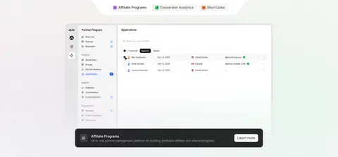
| 2 | feature-grid | Three product categories arranged around a broad showcase area. | category switching, learn-more links | pale gray band, colored category markers, product panel |
| 3 | logo-cloud | Four-column row of customer logos on white. | brand recognition | logo grid, subtle separators |
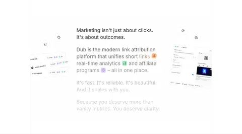
| 4 | feature-split | Copy-led central narrative with small product visuals to either side. | progressive product explanation | white space, scattered interface details |
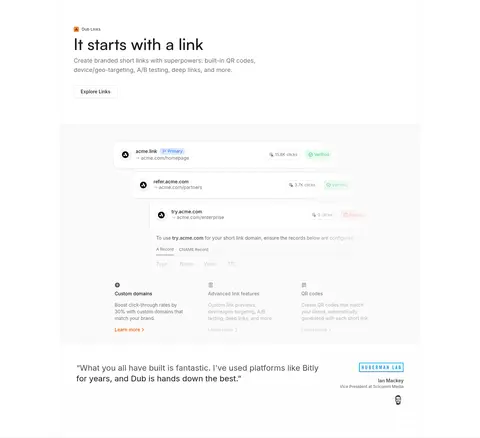
| 5 | product-showcase | Left-aligned feature introduction above a wide link-management interface. | explore links action, product demonstration | bordered mockup, link rows, feature details |
| 6 | product-showcase | Feature copy followed by a broad analytics visualization and supporting details. | explore analytics action, play demo | chart mockup, metric cards, light panel |
| 7 | integrations | Copy on the left and a field of integration marks on the right. | explore integrations action | pale band, floating app marks |
| 8 | product-showcase | Section introduction followed by a wide partner payout and dashboard demonstration. | explore partners action, play demo | payout interface, feature columns, testimonial panel |
| 9 | stats | Centered pale-gray band with explanatory copy and stacked platform metrics. | scale proof | muted surface, large numeric metrics |
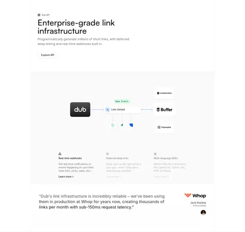
| 10 | product-showcase | Feature introduction above an API workflow diagram and technical details. | explore API action, request demo | workflow diagram, code-like details, testimonial |
| 11 | testimonials | Centered heading and introduction above a modular logo-and-quote grid. | view all customers | customer logos, quote cards, compact attribution |
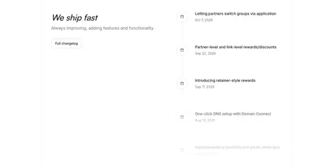
| 12 | timeline | Introductory copy on the left and a dated release list on the right. | full changelog link, chronological updates | timeline list, compact date labels |
| 13 | cta | Centered CTA content on a near-black band, followed by the footer. | start for free, request demo | inverse surface, high-contrast buttons, curved section transition |
## Source CSS custom properties (selected)
```css
--bg-default: 255 255 255;
--bg-muted: 250 250 250;
--bg-subtle: 245 245 245;
--bg-emphasis: 229 229 229;
--bg-inverted: 23 23 23;
--bg-info: 191 219 254;
--bg-success: 220 252 231;
--bg-attention: 255 237 213;
--bg-error: 254 226 226;
--border-emphasis: 163 163 163;
--border-default: 212 212 212;
--border-muted: 245 245 245;
--border-subtle: 229 229 229;
--background: 0 0% 98%;
--foreground: 0 0% 3.9%;
--muted-foreground: 0 0% 45.1%;
--popover-foreground: 0 0% 15.1%;
--card-foreground: 0 0% 3.9%;
--border: 0 0% 89.8%;
--primary: 0 0% 9%;
--primary-foreground: 0 0% 98%;
--secondary: 0 0% 96.1%;
--secondary-foreground: 0 0% 9%;
--accent: 0 0% 94.1%;
--accent-foreground: 0 0% 9%;
--tw-border-opacity: 1;
--tw-bg-opacity: 1;
--tw-text-opacity: 1;
--bg: black;
--fg: #fffa;
--tw-ring-color: rgb(59 130 246/0.5);
```
---
本文件由 AI 辅助生成:数值取自公开网页的实测样式,命名、用途说明与建议为模型解读。商标归原所有者。
Generated by Design DNA · https://four.wiralomi.com/style/dub-co