North star · Use a spacious white canvas and crisp dark typography, reserving saturated blue for the hero, key actions, and product emphasis.
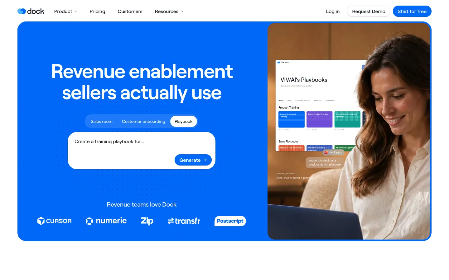
Dock’s visual strategy uses a clean white canvas as the frame for a confident, saturated blue hero. The hero combines a large white headline and simple prompt interface with a warmly lit customer photograph, creating a direct contrast between brand colour and human imagery. Across the page, dark near-black headings and muted supporting text keep the message readable without competing with the blue accents. Roobert is used throughout: headings are compact and weighty, while body copy stays open and straightforward. The layout alternates centered editorial introductions with broad product screenshots and multi-column proof points. Large gaps between sections give each feature room to register, while repeated interface previews make the product tangible. Cards and buttons use soft rounding; borders and shadows are restrained, so the page feels polished and product-focused rather than decorative.
Primary site typeface across hero, headings, body copy, navigation, buttons, and labels.
Aa 设计
Inter
网络字体 · 字重 500 / 400 · 占比 4%
免费替代:Inter
Minor supporting interface or fallback text.
Aa 设计
Arial
系统字体 · 字重 400 / 700 · 占比 4%
免费替代:Arial
System fallback and occasional embedded interface text.
Aa 设计
ui-sans-serif
系统字体 · 字重 400 · 占比 2%
免费替代:Inter
Generic system fallback for small interface details.
角色
示例
字号
字重
行高
字距
特大标题
Oversized hero headline and key high-impact promotional text.
Dock
72px
600
1.06
-0.004em
一级标题
Primary page and section headings.
Dock
29px
500
1.15
-0.025em
二级标题
Feature section titles and supporting subheads.
The quick brown fox 敏捷的狐狸
22.5px
400
1.4
-0.025em
正文
Feature descriptions, explanatory copy, and testimonials.
The quick brown fox 敏捷的狐狸
18px
400
1.45
0
辅助文字
Eyebrows, interface labels, and small supporting annotations.
The quick brown fox 敏捷的狐狸
12px
500
1.42
0
按钮
Primary and secondary action labels.
The quick brown fox 敏捷的狐狸
16px
500
1.2
0
导航
Header navigation and account links.
The quick brown fox 敏捷的狐狸
16px
500
1.2
0
链接
Inline and feature-related navigation actions.
The quick brown fox 敏捷的狐狸
16px
500
1.2
0
间距与布局
基准单位 2px · 密度:宽松
132px版块间距
8px元素间距
—卡片内边距
—内容最大宽度
2px
3px
4px
5px
6px
7px
8px
9px
10px
11px
12px
13px
14px
15px
16px
24px
The page uses a broad centered content area with a compact top navigation and a large, rounded hero panel. The hero divides into a blue text-and-interaction side and a photographic side. Below, centered section introductions alternate with wide product screenshots, proof points, and multi-column feature or testimonial cards. The measured section rhythm is spacious, with ample vertical separation and low visual density. Keep content aligned to clear shared edges, but use centered headings where the page shifts into an editorial feature introduction.
圆角与层次
按钮 · 10px
输入框 · 4px
卡片 · 7px
图片 · 50%
徽标 · 5px
导航 · 9999px
链接 · 28px
inset · text, other
inset · other
inset · text, other, button
sm · card
Most sections are flat and separated by white space rather than heavy shadows. Product previews and cards use subtle hairline outlines and restrained soft shadows to lift them from pale backgrounds. Buttons have modest depth, while the rounded hero and media frames provide the strongest containment. Avoid dramatic layered effects.
组件
下面的预览按实测的按钮、输入框、徽标、卡片样式重建(字体用替代字体)。
Primary CTA
Use Dock Blue (#0068f9) with white text, a pill-like rounded silhouette, medium-weight Roobert, and a subtle shadow.
Hero panel
A large blue field with a white display headline and prompt-style product interaction, paired side-by-side with warm customer photography.
Header navigation
Compact horizontal navigation on white, with dark labels, a restrained logo, and a blue primary action on the right.
Feature introduction
Centered eyebrow, bold dark heading, short supporting copy, and a low-key exploration link.
Product preview
Wide, light product screenshot in a pale or white media area, with restrained borders and soft elevation.
Proof-point row
Customer marks and concise numeric outcomes in a clean horizontal arrangement, with ample whitespace.
Testimonial card
Portrait or video thumbnail, short customer quote, and compact attribution arranged in a tidy multi-column grid.
Imagery · The hero pairs a warm, natural-light photograph of a person working with product content against the blue brand panel. Product screenshots recur throughout the page in broad, light-framed media areas, showing real interface detail rather than abstract illustration. Customer stories use portrait photography and video-style play controls. Keep media crisp, contained, and lightly rounded; let warm photography contrast with cool interface blues.
该做与不该做
✓ 该做
Keep the page canvas white and uncluttered.
Use Dock Blue for primary actions and major brand emphasis.
Set headings in dark Roobert with compact, confident line breaks.
Give feature sections generous vertical breathing room.
Show realistic product interfaces in broad, pale media frames.
Use warm human photography to balance the cool product palette.
✕ 不该做
Do not spread blue across every section background.
Do not add decorative gradients as a dominant brand treatment.
Do not make cards heavily shadowed or visually dense.
Do not crowd the centered feature introductions with extra controls.
Do not use tiny, low-contrast supporting copy.
Do not treat colors inside interface mockups as core brand colours.
给 AI 的提示词
想快速出一个同风格的新页面,把这段话连同 DESIGN.md 一起发给 AI。
Build a new Dock-style SaaS page with a clean white canvas and a restrained, spacious rhythm. Use Midnight Ink (#121722) for headings and primary text, Slate Text (#41454e) for secondary copy, and Dock Blue (#0068f9) for the main CTA and selected product emphasis. Keep Roobert-like sans-serif typography, with bold compact section headings and regular, readable body copy. Start with a broad split hero: blue content panel, white headline, simple product interaction, and warm human photography. Follow with centered feature introductions, wide product screenshots, proof points, and customer testimonials. Use Soft Fog (#f7f7f8) for subtle surface contrast, light borders, modest rounding, and restrained shadows. Prioritize real-looking product UI and generous whitespace over decoration.