North star · Keep the interface calm and legible, using generous open space and Dropbox blue only to make important actions unmistakable.
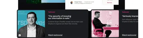
The page is built around a warm, near-white canvas (#f7f5f2) that gives the opening hero a quiet, spacious feel. Near-black text (#1e1919) anchors the brand voice; muted taupe-gray (#716b61) carries supporting copy without competing with headings. Vivid Dropbox blue (#0061fe) is reserved for high-intent actions and selected navigation details, so it reads as a clear signal rather than a wash of color. Large editorial headlines pair with readable sans-serif body text, while left-aligned hero copy contrasts with centered feature introductions and orderly card grids. Broad whitespace separates the long sequence of sections. The page alternates warm and white surfaces with a distinctive near-black integrations band and a black footer. Product UI, customer marks, photography, and motion-led media provide visual evidence; the interface itself remains mostly flat, using softly rounded cards and restrained outlines instead of decorative shadows.
配色
点色块复制色值。用途说明来自对页面的实测位置(背景、文字、描边、按钮)与截图判读。
品牌色
强调色
表层色
功能色
页面底色 · Gallery White表层 · Coconut表层 2 · Graphite表层 3 · True Black表层 4 · Night Panel主文字 · Graphite次要文字 · Coconut弱文字 · Warm Taupe描边 · Dropbox Blue强调 · Dropbox Blue强调 2 · Deep Link Blue
Primary navigation, body copy, links, captions, and smaller headings.
Aa 设计
Sharp Grotesk
网络字体 · 字重 500 · 占比 10%
免费替代:DM Sans
Prominent hero and section headings, plus selected subheadings.
Aa 设计
Sharp Grotesk 23
网络字体 · 字重 400 · 占比 2%
免费替代:DM Sans
Measured secondary section-heading style.
角色
示例
字号
字重
行高
字距
一级标题
Primary hero headline introducing Dropbox content and AI tools.
Dropbox
40px
500
1.2
0
二级标题
Major feature and section introductions.
Dropbox
32px
400
1.2
0
三级标题
Card, integration, and subsection headings.
The quick brown fox 敏捷的狐狸
26px
500
1.3
0
四级标题
Supporting headings within content modules.
The quick brown fox 敏捷的狐狸
20px
400
1.5
0
正文
Paragraphs explaining product benefits and use cases.
The quick brown fox 敏捷的狐狸
16px
400
1.5
0
辅助文字
Small labels, article metadata, and supporting details.
The quick brown fox 敏捷的狐狸
14px
400
1.57
0
导航
Header navigation and utility links.
The quick brown fox 敏捷的狐狸
14px
400
1.43
0
链接
Inline actions and contextual calls to action.
The quick brown fox 敏捷的狐狸
16px
400
1.5
0
间距与布局
基准单位 4px · 密度:适中
72px版块间距
4px元素间距
—卡片内边距
1344px内容最大宽度
4px
8px
12px
16px
24px
32px
48px
52px
72px
120px
Use a wide centered content frame, measured at a 1344px page maximum, with comfortable density and generous whitespace between major stories. The hero is a two-column composition with copy leading on the left and a softly presented product visual to the right. Follow it with a centered trust band, a dark integration section, then broad white feature zones that mix centered introductions with split media-and-copy layouts. Grid cards align consistently and remain visually light. Keep section transitions spacious; reserve denser layouts for the integration cards, testimonials, industry tiles, and footer columns.
圆角与层次
按钮 · 16px
卡片 · 12px
没有测到阴影:页面是扁平的,层次靠底色和描边区分。
The page is mostly flat: clear background bands and whitespace do more work than shadows. Cards have softly rounded corners, with measured 12px card and 16px testimonial radii; buttons use measured 12px or 16px radii. Use dark panels and layered product imagery selectively for contrast, not as a global elevation system. Avoid inventing shadow treatments.
组件
下面的预览按实测的按钮、输入框、徽标、卡片样式重建(字体用替代字体)。
Primary CTA
Bright #0061fe button with light text and a measured 12px or 16px radius; use for prominent conversion actions.
Header navigation
Compact horizontal navigation on a light surface with Graphite text, utility links, and a blue Get started action.
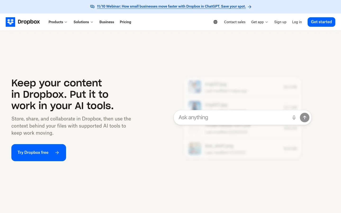
Hero split
Large left-aligned headline, concise supporting paragraph, blue CTA, and product interface media on the right.
Integration band
Full-width #1e1919 section with centered introduction, light text, and a multi-column set of integration cards and links.
Feature story
Spacious white product section pairing a centered or split-layout introduction with product imagery or UI demonstrations.
Industry card
Light, rounded card combining a rectangular industry photo, compact title, brief copy, and a text link.
Footer
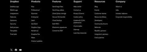
Full-width #000000 block with light text, multiple link columns, social marks, and a language control.
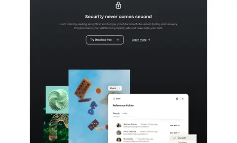
Imagery · Use real product-interface visuals, motion or video frames, and customer or industry photography as proof of the product's role in work. Place imagery in spacious compositions rather than filling every surface. The hero UI appears soft and understated; later security and testimonial content can use stronger dark framing. Brand and partner logos sit on clean backgrounds, while article cards use cropped editorial images.
Use warm off-white and white as the dominant page surfaces.
Reserve #0061fe for high-priority actions and focused accents.
Set primary copy in near-black and supporting copy in muted gray.
Give major content sections generous breathing room.
Alternate light storytelling areas with purposeful dark feature bands.
Use product UI and relevant photography as evidence, not decoration.
✕ 不该做
Do not turn the page into a saturated blue canvas.
Do not compress the long-form sections into a dense dashboard.
Do not use heavy shadows as the main way to separate cards.
Do not style all headings in uppercase.
Do not use decorative gradients across the main page surfaces.
Do not let imagery overpower the text and action hierarchy.
给 AI 的提示词
想快速出一个同风格的新页面,把这段话连同 DESIGN.md 一起发给 AI。
Build a new Dropbox-style SaaS page with a calm, spacious editorial rhythm. Use Coconut (#f7f5f2) and Gallery White (#ffffff) as the primary surfaces, Graphite (#1e1919) for headings and body ink, Warm Taupe (#716b61) for supporting copy, and Dropbox Blue (#0061fe) sparingly for primary actions. Start with a two-column hero: clear left-aligned headline and copy, a rounded CTA, and product UI media opposite. Follow with a centered trust or proof band, then a dark integrations feature on Graphite. Continue with wide, image-supported product stories and tidy card grids, leaving generous whitespace between sections. Use near-black panels selectively for testimonials and keep the footer True Black (#000000). Favor clean sans-serif typography, soft corners, and mostly flat surfaces; avoid invented shadows, excessive decoration, and tight spacing.