North star · Use editorial serif headlines and restrained product imagery against generous space, with the plum hero as the page’s singular dramatic color field.
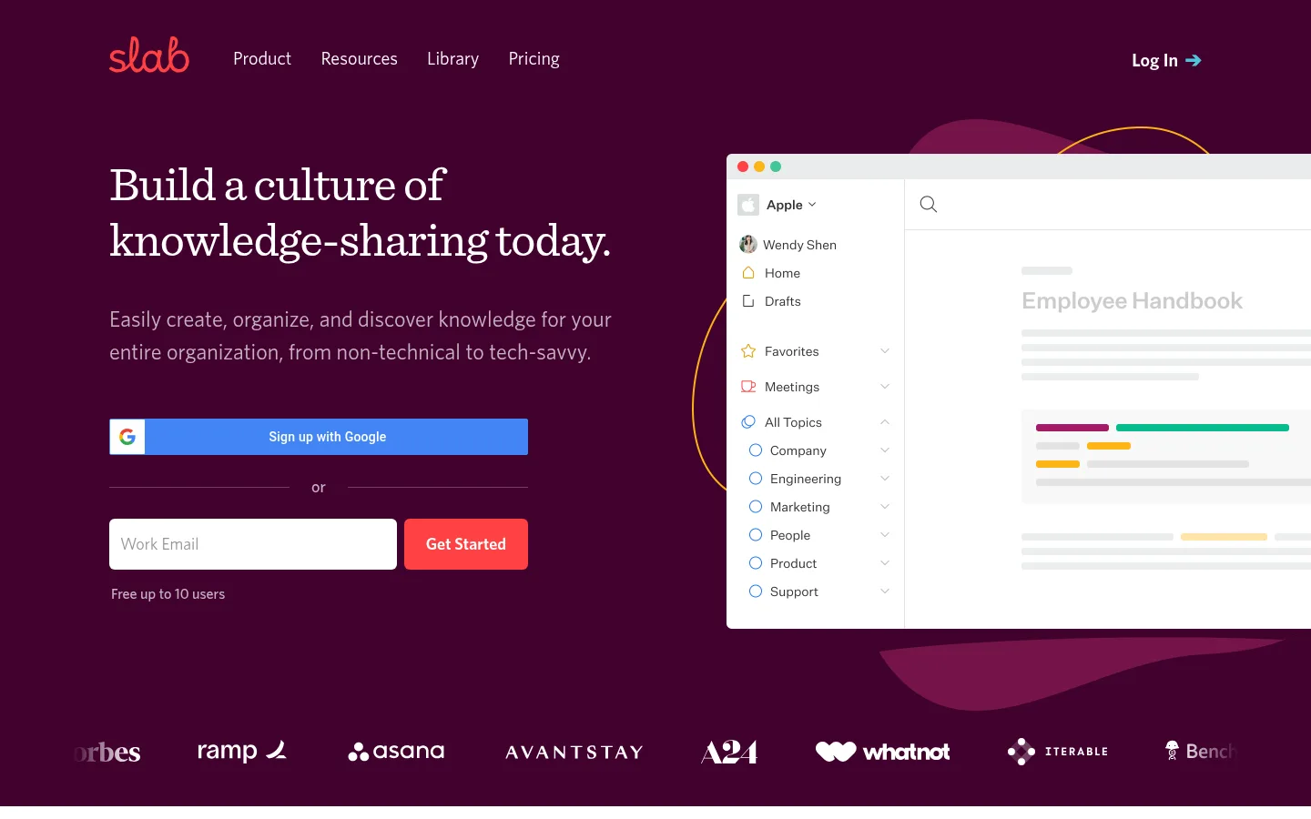
The visual strategy contrasts a saturated deep-plum opening with a bright, quiet product narrative. The hero places a large white Sentinel headline and muted supporting copy beside a crisp interface mockup; a coral primary CTA and blue Google sign-up control provide the strongest functional color signals. After the hero, broad white sections alternate product imagery and concise explanatory copy, keeping each feature easy to scan. Whitney sans-serif handles navigation, body copy, controls, and labels, while Sentinel serif gives major headings an editorial character. Generous vertical gaps separate feature stories, and thin pale borders distinguish the migration panel without introducing heavy card framing. Product screenshots carry most of the visual detail; decorative colored shapes remain secondary. The footer stays restrained, using compact link columns and familiar text-led navigation.
配色
点色块复制色值。用途说明来自对页面的实测位置(背景、文字、描边、按钮)与截图判读。
品牌色
强调色
中性色
功能色
页面底色 · Gallery White表层 · Deep Plum主文字 · Slate Ink次要文字 · Gallery White弱文字 · Quiet Gray描边 · Soft Divider强调 · Coral Signal强调 2 · Google Blue
Navigation, body copy, buttons, links, captions, and eyebrow labels.
Aa 设计
sentinel
网络字体 · 字重 400 · 占比 13%
免费替代:Lora
Primary hero headline and major feature-section headings.
Aa 设计
Roboto
网络字体 · 字重 500 · 占比 1%
免费替代:Roboto
Minor embedded interface or third-party control text.
角色
示例
字号
字重
行高
字距
一级标题
Hero statement, set as a prominent white editorial headline.
Slab
53px
400
1.14
-0.019em
二级标题
Major feature headings throughout the white product-story sections.
Slab
42px
400
1.24
0
三级标题
Supporting feature titles and smaller content headings.
The quick brown fox 敏捷的狐狸
24px
400
1.5
0
正文
Hero description and explanatory product copy.
The quick brown fox 敏捷的狐狸
20px
400
1.6
0
辅助文字
Compact supporting labels and fine-print notes.
The quick brown fox 敏捷的狐狸
12px
600
1.67
0.167em
按钮
Primary CTA labels and sign-up action text.
The quick brown fox 敏捷的狐狸
18px
600
1.33
0
链接
Navigation, inline actions, and footer links.
The quick brown fox 敏捷的狐狸
20px
400
1.6
0
眉题
Short uppercase labels above feature content.
The quick brown fox 敏捷的狐狸
12px
600
1.67
0.167em
间距与布局
基准单位 8px · 密度:宽松
110px版块间距
100px元素间距
—卡片内边距
1200px内容最大宽度
1px
5px
8px
12px
16px
20px
24px
32px
40px
64px
100px
110px
Use a centered content frame capped at the measured 1200px maximum width. The hero is a spacious two-column composition: headline and sign-up form at left, oversized product UI at right, with a customer-logo row near its base. Below, stack broad feature stories that alternate image and copy placement rather than enclosing content in cards. Preserve the measured 110-unit section rhythm and generous element spacing. Keep the migration CTA in its own pale band, followed by a dense but orderly five-column footer.
圆角与层次
按钮 · 6px
输入框 · 6px
hairline · other
Favor flat surfaces and generous whitespace over raised cards. Use thin light-gray rules to separate major bands and subtle framing around embedded interface mockups. The hero’s overlapping UI illustration and decorative forms provide depth; avoid pronounced drop shadows or stacked card treatments.
组件
下面的预览按实测的按钮、输入框、徽标、卡片样式重建(字体用替代字体)。
Top navigation
A dark-plum full-width bar with the coral Slab wordmark, compact text links, and a right-aligned Log In action with an arrow.
Hero sign-up form
Left-aligned headline and supporting copy followed by a blue Google sign-up control, a ruled “or” separator, and an email field paired with a coral Get Started button.
Customer logo row
A horizontal strip of customer marks near the bottom of the plum hero; treat logos as light-colored assets against the dark field.
Product feature story
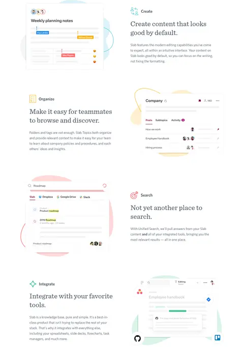
A spacious white feature section pairing an interface mockup with a serif heading, short sans-serif explanation, and small eyebrow label; alternate image and copy sides.
Migration CTA
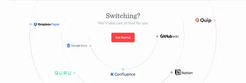
A pale, lightly separated panel with a centered Switching? heading, reassurance copy, migration-service logos, and a coral Get Started action.
Multi-column footer
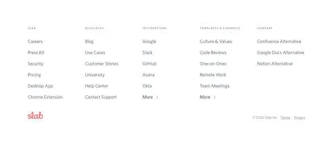
A white footer organized into five compact link columns, ending with the coral Slab mark and understated legal links.
Imagery · Use polished product-interface screenshots and mockups as the main imagery, not lifestyle photography. Frame them large enough to reveal recognizable navigation, search, and document patterns, with bright surfaces against the plum hero or white feature canvas. Add restrained colored organic shapes behind selected mockups as supporting decoration; keep illustrations and UI details subordinate to the message.
Anchor the opening viewport in Deep Plum (#42022e).
Use Sentinel-style serif headlines and Whitney-style sans-serif utility text.
Make the product interface the main visual proof point.
Reserve Coral Signal (#ff4143) for primary actions and small brand details.
Alternate image and copy placement in the white feature stories.
Keep section transitions light, spacious, and clearly ordered.
✕ 不该做
Do not turn every feature into a bordered or elevated card.
Do not use bright accents as large background fields.
Do not replace the product UI with lifestyle photography.
Do not crowd the hero form or navigation with extra controls.
Do not use heavy shadows or dense decorative gradients.
Do not flatten all headings into a generic sans-serif style.
给 AI 的提示词
想快速出一个同风格的新页面,把这段话连同 DESIGN.md 一起发给 AI。
Build a new Slab-style productivity page with a dramatic Deep Plum (#42022e) opening and a crisp transition to open white content. Use a Sentinel-like editorial serif for large headings and Whitney-like sans-serif text for navigation, explanations, and controls. Keep the centered content frame within the measured 1200px maximum width and use generous section spacing. Pair concise feature copy with large, legible product-interface mockups, alternating their sides as the story progresses. Use Coral Signal (#ff4143) for the main action and Google Blue (#4285f4) only for a Google sign-up option; use Slate Ink (#455360) for standard text. Favor flat surfaces, delicate Soft Divider (#e5e5e5) rules, and restrained illustration accents. Finish with a distinct CTA band and a tidy multi-column footer.