North star · Build a sequence of spacious, softly colored panels in which bold Nekst headlines, black actions, and product imagery make language learning feel inviting and tangible.
The visual system balances an inky black frame and typography with broad, softly colored section panels. Lavender-blue anchors the hero; white and very light gray carry the main content, while butter yellow, mint, pink, and warm beige distinguish selected proof points and content groups. Manrope handles navigation, body copy, and card text with a clean, readable texture. Nekst gives headings and calls to action a distinctive geometric display voice; headings are large and mostly regular-weight rather than heavy. The layout alternates roomy split features, centered statements, statistics, and card collections, with rounded panel edges creating a continuous sequence of contained blocks. Phone mockups and friendly character graphics show the learning product in use. Keep real interface imagery visually prominent, and treat incidental colors inside illustrations as product artwork rather than core brand colors.
Navigation, body copy, card content, statistics labels, and utility text.
Aa 设计
nekst
网络字体 · 字重 400 / 700 · 占比 27%
免费替代:Space Grotesk
Display headings, section titles, and prominent CTA labels.
角色
示例
字号
字重
行高
字距
特大标题
Oversized campaign-style hero or statement headings.
Promova
100px
400
1
0
一级标题
Primary hero headline and major page title.
Promova
70px
400
1
0
二级标题
Section headlines for features, testimonials, and tools.
Promova
50px
400
1
0
三级标题
Feature headings and prominent sub-section titles.
Promova
40px
400
normal
0
四级标题
Smaller feature titles and card-level headings.
Promova
30px
400
1.2
0
正文
Explanatory copy, descriptions, and navigation-adjacent text.
The quick brown fox 敏捷的狐狸
18px
400
1.44
0
辅助文字
Compact labels, metadata, and uppercase supporting labels.
The quick brown fox 敏捷的狐狸
15px
700
1.47
0
按钮
Short, prominent action labels such as TRY NOW.
The quick brown fox 敏捷的狐狸
15px
400
normal
0
间距与布局
基准单位 2px · 密度:适中
60px版块间距
10px元素间距
28px卡片内边距
1160px内容最大宽度
3px
5px
6px
10px
15px
20px
30px
40px
60px
80px
100px
120px
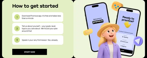
A centered, wide desktop composition is framed by black gutters and divided into large, rounded section bands. The measured page max-width is 1160px, with a comfortable density and a repeating section rhythm. Use two-column splits for hero and feature storytelling, four-column groupings for stats and reviews, and broader single-column panels for testimonials or steps. Alternate left-aligned editorial blocks with centered headings; keep generous breathing room around product mockups and allow long feature sections to unfold vertically.
圆角与层次
按钮 · 20px
卡片 · 30px
导航 · 30px
没有测到阴影:页面是扁平的,层次靠底色和描边区分。
The page relies on flat color fields and rounded panel edges rather than visible shadows. Black gutters separate neighboring bands, while white cards sit directly on pale backgrounds. Use clean borders only where the interface calls for them, such as the outlined navigation sign-up action; keep product-screen layering within the artwork.
组件
下面的预览按实测的按钮、输入框、徽标、卡片样式重建(字体用替代字体)。
Floating navigation
A white rounded navigation capsule on the black frame, with the Promova mark, Manrope links, outlined sign-up, and solid black primary action.
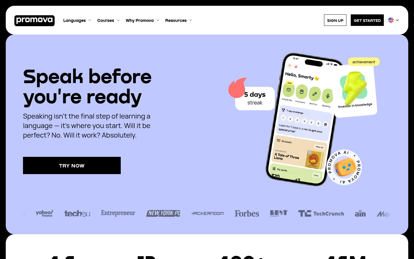
Hero split
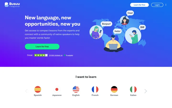
Lavender panel with a large left-aligned Nekst headline, concise supporting copy, black TRY NOW action, phone mockups, and a press-logo strip.
Metric strip
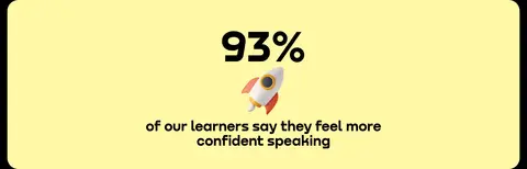
Four evenly distributed bold figures and compact labels on a white band; keep the numbers visually stronger than their captions.
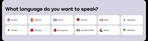
Language selector
Dark section with a prominent question and a multi-column set of white rounded language choices with flag icons.
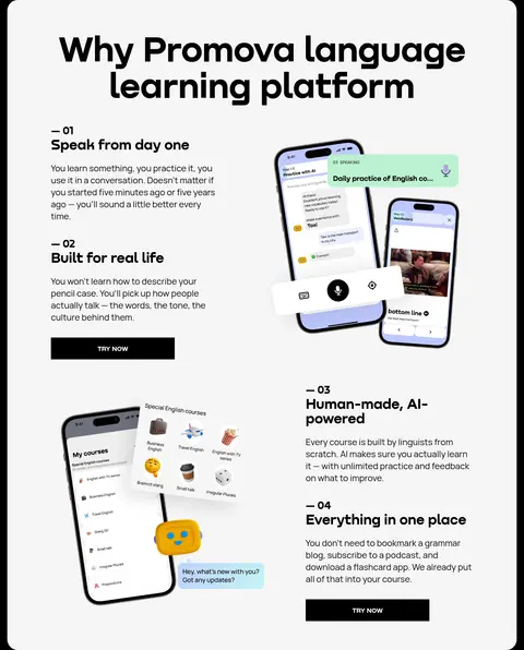
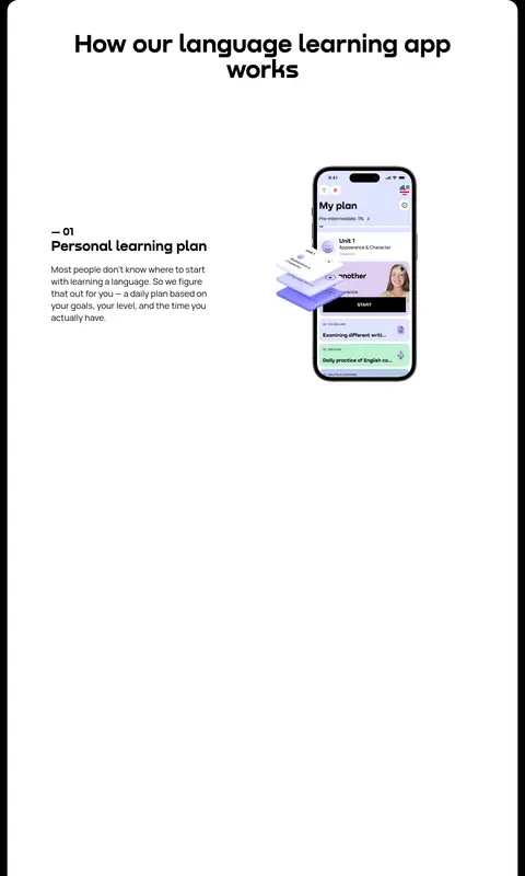
Feature storytelling
Long light-gray feature panel combining numbered copy blocks, product mockups, and repeated black actions.
Review cards
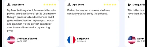
Pale lavender review area with a large title and white cards containing store identity, star marks, review copy, and learner details.
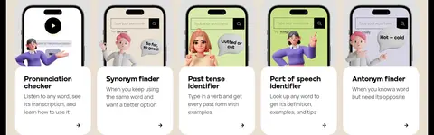
Tool cards
Warm beige content panel with a centered headline and white cards showing app imagery, tool name, short explanation, and directional affordance.
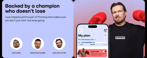
Imagery · Use prominent app-phone mockups, cropped interface screens, friendly character artwork, and occasional human photography. Product imagery is layered within feature panels rather than treated as detached decoration; hero mockups overlap small achievement graphics. Keep imagery crisp and colorful against restrained panel backgrounds. Press logos and app-review marks serve as supporting evidence. Colors appearing only inside phone screens or illustrations are artwork, not extra brand tokens.
Use the measured palette and assign each pastel to a clear section role.
Keep the black page frame and strong black-on-light text contrast.
Set display headlines in Nekst and supporting copy in Manrope.
Use rounded section panels to organize the long scrolling page.
Show product interfaces prominently beside relevant feature explanations.
Keep CTA labels short, direct, and visually high contrast.
✕ 不该做
Do not make every section the same pastel color.
Do not replace the distinctive display type with generic heavy headings.
Do not add decorative shadows to otherwise flat panels.
Do not treat illustration-only colors as core brand colors.
Do not compress explanatory copy and product imagery into dense grids.
Do not use rounded, filled styling for every navigation or action element.
给 AI 的提示词
想快速出一个同风格的新页面,把这段话连同 DESIGN.md 一起发给 AI。
Create a new Promova-style language-learning page using Promova Ink (#000000), Gallery White (#ffffff), and Cloud Gray (#f5f5f5) as the structural foundation. Use Promova Lavender (#bec8ff) for a prominent feature or hero band, then reserve Butter Yellow (#fff8a7), Fresh Mint (#bcf0d0), Award Pink (#f5a3d0), and Warm Sand (#ebe0d3) for distinct supporting sections. Set large geometric headings in Nekst, with Manrope for navigation, body text, labels, and cards. Organize content as spacious rounded panels on a black frame, alternating split product storytelling with stats, steps, and review cards. Use crisp phone-interface mockups and friendly learning illustrations to explain the product. Keep surfaces mostly flat, text readable, and primary actions black with white labels.