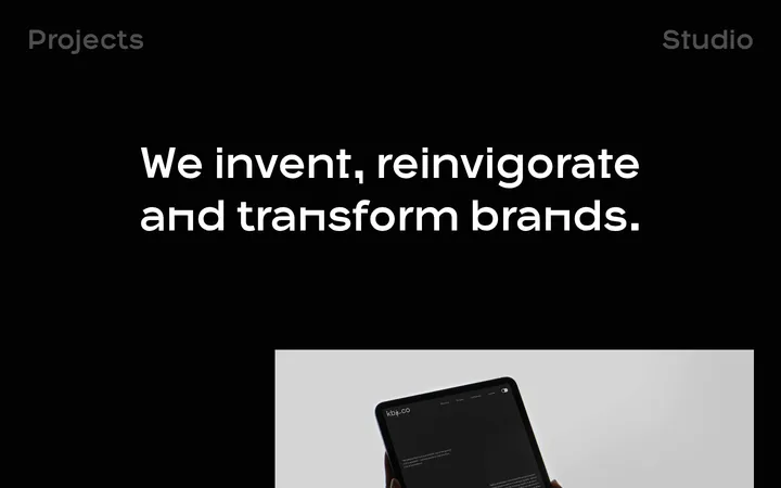
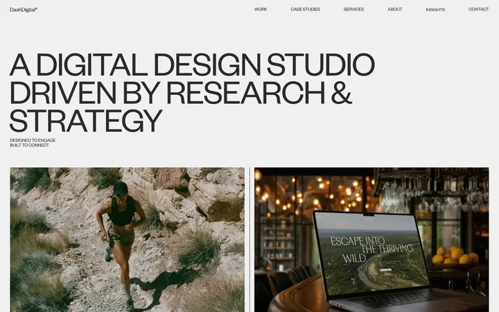
North star · Let oversized, expressive typography lead; keep the surrounding canvas quiet, spacious, and precisely annotated.
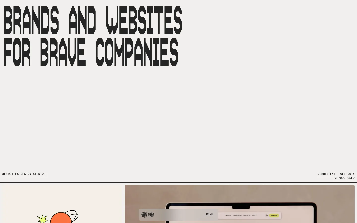
The visual strategy contrasts an exceptionally large, condensed display face with a nearly monochrome, warm off-white and charcoal palette. The hero gives the headline room to dominate, while tiny uppercase monospaced labels anchor the edges and mark status, project categories, and footer navigation. Content unfolds as a long portfolio: large, varied project images sit in a loose, asymmetrical grid, with generous blank intervals separating them. Photography and illustration retain their own vivid or tonal palettes, but remain framed by the quiet neutral page rather than becoming brand colours. Hairline rules define section boundaries without cards, shadows, or heavy containers. The result feels like a printed creative-studio portfolio translated into a web page: typography supplies the identity, images provide variety, and restrained alignment and recurring metadata keep the experience legible.
配色
点色块复制色值。用途说明来自对页面的实测位置(背景、文字、描边、按钮)与截图判读。
表层色
中性色
页面底色 · Studio Parchment主文字 · Carbon Ink
文字
背景
对比度
WCAG
#252525 Carbon Ink
#f1f0ee Studio Parchment
13.46:1
AAA
字体
字号阶梯:Custom(比例约 2.981,正文 18px)。示例用免费替代字体渲染,数值为实测。
Aa 设计
PP Neue Montreal SemiBold
网络字体 · 字重 600 · 占比 59%
免费替代:Inter
Main body copy and prominent supporting text
Aa 设计
PP Neue Montreal Mono Medium
网络字体 · 字重 500 / 400 · 占比 29%
免费替代:Space Mono
Uppercase metadata, captions, navigation, and code-style labels
Aa 设计
PP Neue Montreal Regular
网络字体 · 字重 400 · 占比 9%
免费替代:Inter
Lightweight headings and introductory copy
Aa 设计
AS Therma Bold Condensed
网络字体 · 字重 700 · 占比 3%
免费替代:Oswald
Oversized uppercase hero display headline
角色
示例
字号
字重
行高
字距
特大标题
Oversized uppercase hero headline
Duties
160px
700
0.8
-0.067em
一级标题
Introductory heading or supporting lead
Duties
28px
400
1.05
0
正文
Studio descriptions and service explanations
The quick brown fox 敏捷的狐狸
18px
600
1.15
0
辅助文字
Uppercase project labels and compact metadata
The quick brown fox 敏捷的狐狸
12px
500
1.15
0
代码
Compact uppercase navigation and utility labels
const style = 1;
12px
500
1.15
0
间距与布局
基准单位 2px · 密度:宽松
240px版块间距
10px元素间距
—卡片内边距
1420px内容最大宽度
1px
2px
4px
5px
8px
10px
20px
40px
80px
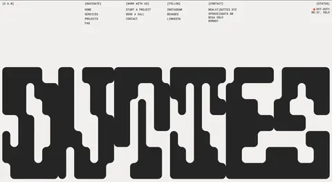
The measured page max width is 1420px, with a spacious overall density and a 240px section gap. The opening headline is flush toward the left and occupies only a portion of the wide canvas, leaving a broad field of negative space. Below, portfolio imagery alternates between wide and split compositions with narrow gutters and small labels. Later information and about sections shift into sparse columns, while the footer distributes navigation and contact details across five columns.
圆角与层次
按钮 · 2px
图片 · 1px
链接 · 2px
没有测到阴影:页面是扁平的,层次靠底色和描边区分。
The interface is predominantly flat: no measured shadows or gradients, and no raised card system. Thin horizontal rules divide major bands, while images provide the main visual depth and texture. Keep controls simple, with a subtle 2px button radius and minimal framing.
组件
下面的预览按实测的按钮、输入框、徽标、卡片样式重建(字体用替代字体)。
Hero display
Large uppercase condensed headline aligned to the left on the warm neutral canvas, followed by substantial open space and small edge-anchored studio and status labels.
Portfolio project row
Large project imagery arranged in varied, asymmetrical splits, with a compact project name and uppercase service-category metadata nearby.
Section divider
Fine horizontal rule marks transitions between broad page sections without adding a box, shadow, or heavy background treatment.
Information blocks
Short, plain-language service and studio statements arranged in sparse columns, with small section markers and occasional supporting imagery.
Utility links
Compact uppercase monospaced navigation, contact, social, and project links distributed in aligned footer columns.
CTA control
Minimal text-led project action; the measured button uses a dark fill, 2px radius, and horizontal padding.
Imagery · The portfolio combines project photography, device mockups, graphic identity work, and occasional playful illustration. Images are presented in broad, rectangular frames, often paired in unequal widths; their own colors and textures remain vivid against the neutral page. Small project names and service tags sit close to the imagery, while substantial blank space separates successive projects.
Use the measured warm off-white canvas and charcoal ink.
Make the hero headline large, uppercase, and distinctly condensed.
Reserve monospaced uppercase text for compact labels and navigation.
Give portfolio imagery varied, asymmetrical widths.
Use generous blank intervals between major content groups.
Separate sections with subtle horizontal rules.
✕ 不该做
Do not add unmeasured brand colours to the page chrome.
Do not crowd the hero with extra copy or controls.
Do not put every project inside a uniform card.
Do not add decorative shadows or gradients.
Do not make small metadata compete with the display headline.
Do not force portfolio imagery into a single repeated crop.
给 AI 的提示词
想快速出一个同风格的新页面,把这段话连同 DESIGN.md 一起发给 AI。
Build a new studio page in the Duties visual style. Use Studio Parchment (#f1f0ee) as the canvas and Carbon Ink (#252525) for primary text and dark controls; keep the site chrome nearly monochrome. Lead with a left-aligned, uppercase condensed display headline, then preserve a broad field of negative space before the work begins. Present projects as large, varied image compositions rather than uniform cards, with small uppercase monospaced labels close to each image. Use restrained sans-serif copy for explanatory sections, thin rules to mark transitions, and sparse columns for studio details and footer links. Keep the layout spacious and editorial, with no shadows or gradients. Let the project imagery retain its own color and character without turning those image colors into interface accents.