North star · Let cinematic product photography carry the drama while keeping the storefront interface bright, monochrome, and quietly structured.
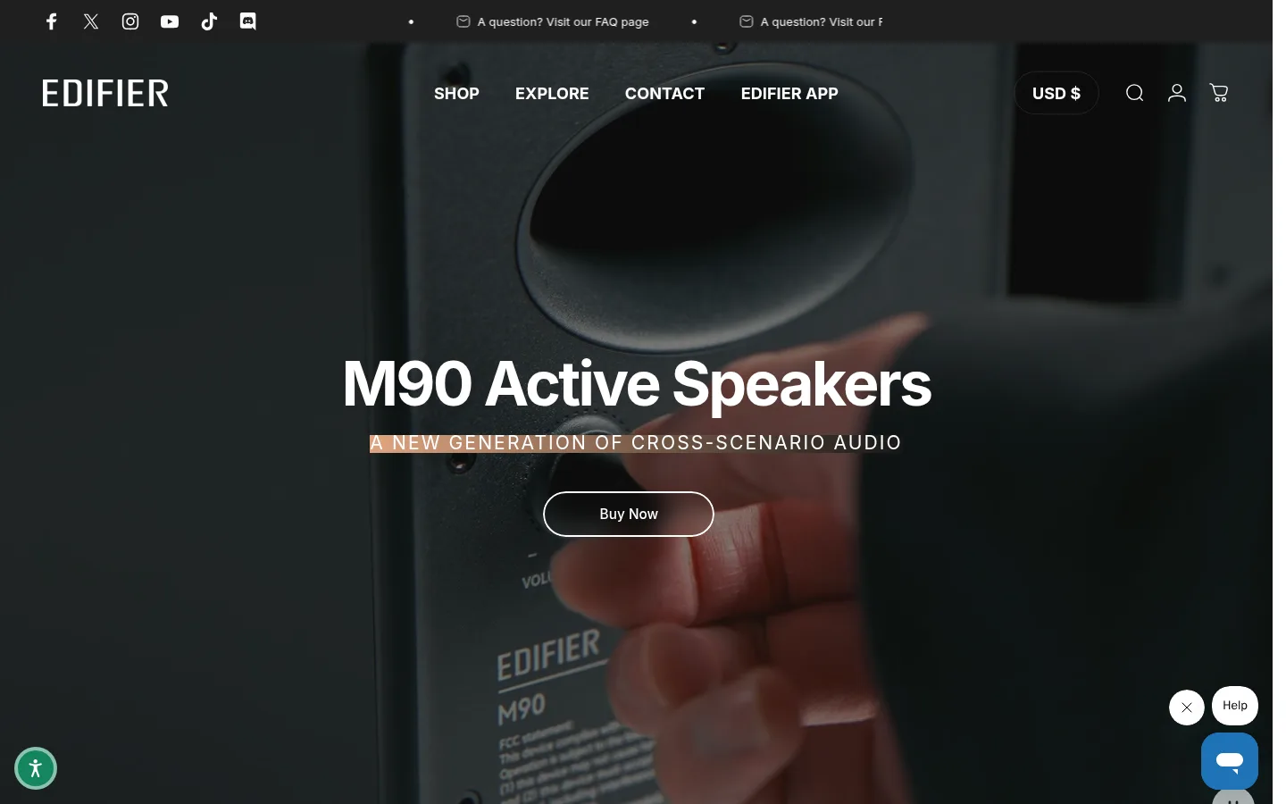
The page uses white as its structural canvas, while dark, full-bleed speaker videos create dramatic contrast at the top. In the hero, white navigation and campaign copy sit directly over the photography; a slim orange-tinted highlight is part of the media treatment, not a general UI colour. The palette stays mostly monochrome: near-black text, restrained gray section surfaces, and fine pale-gray dividers. Inter carries the interface throughout, from compact uppercase navigation to large, heavy campaign headlines and readable card captions. The composition alternates immersive, centered product campaigns with a two-column category gallery. Rounded image corners and pill-shaped controls soften the otherwise sharp, editorial layout. Generous white space separates the campaign, category content, and lower-page modules, keeping product imagery dominant. Bright orange and green appear only in isolated controls and should not be expanded into broad brand bands.
配色
点色块复制色值。用途说明来自对页面的实测位置(背景、文字、描边、按钮)与截图判读。
品牌色
强调色
表层色
中性色
功能色
页面底色 · Gallery White表层 · Steel Gray表层 2 · Cloud Gray表层 3 · Soft Alloy表层 4 · Deep Gray主文字 · Speaker Black次要文字 · Gallery White弱文字 · Muted Graphite描边 · Divider Gray强调 · Signal Orange强调 2 · Signal Green
All measured interface and campaign typography, including headings, navigation, body copy, and links.
角色
示例
字号
字重
行高
字距
特大标题
Oversized campaign headline style for product launch moments.
Edifier
68px
900
1
-0.04em
一级标题
Primary campaign and major section headings.
Edifier
36.5px
400
1
-0.025em
二级标题
Category and feature section headings.
The quick brown fox 敏捷的狐狸
25px
700
1.25
-0.05em
三级标题
Secondary campaign and supporting content headings.
The quick brown fox 敏捷的狐狸
22px
400
1.25
-0.025em
四级标题
Supporting feature titles or compact content headings.
The quick brown fox 敏捷的狐狸
21px
400
1.6
0.004em
正文
Product descriptions and standard storefront copy.
The quick brown fox 敏捷的狐狸
14px
400
1
0.006em
辅助文字
Small metadata, card details, and helper text.
The quick brown fox 敏捷的狐狸
12px
400
1.6
0.007em
导航
Uppercase primary navigation labels.
The quick brown fox 敏捷的狐狸
18px
700
normal
0.004em
链接
Category-card links and standard text links.
The quick brown fox 敏捷的狐狸
16px
400
normal
0.005em
眉题
Uppercase, widely tracked campaign subtitle.
The quick brown fox 敏捷的狐狸
21px
400
1.25
0.1em
间距与布局
基准单位 4px · 密度:适中
48px版块间距
8px元素间距
—卡片内边距
—内容最大宽度
2px
3px
4px
5px
8px
10px
12px
16px
18px
20px
22px
24px
26px
30px
32px
48px
The top campaigns span the viewport, with centered copy layered over full-bleed video or photography. Below, the category section switches to a two-column image-led grid with captions and directional link cues. The page retains a single-column campaign rhythm before moving into denser lower-page product and content modules. The footer is divided into several navigation columns and a signup area. Keep the page comfortable rather than dense, with broad white intervals between major blocks; no measured maximum content width is available.
圆角与层次
按钮 · 9999px
卡片 · 15px
图片 · 5px
导航 · 9999px
链接 · 9999px
hairline · other, link, button
lg · media
Most sections are flat, with separation coming from white space and occasional pale hairlines rather than card shadows. Category cards use rounded image framing; measured card radius is about 15px and media corners about 5px. A larger shadow is measured on media, but avoid adding conspicuous elevation to ordinary content cards.
组件
下面的预览按实测的按钮、输入框、徽标、卡片样式重建(字体用替代字体)。
Campaign hero
Full-bleed product video or photography with centered white headline, uppercase eyebrow, and a pill-shaped CTA.
Transparent header
Social and help strip above a navigation row, both rendered over dark hero imagery with white labels and icons.
Campaign media panel
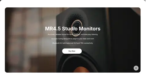
Wide rounded product image or video with centered copy and a small white pill CTA.
Category cards
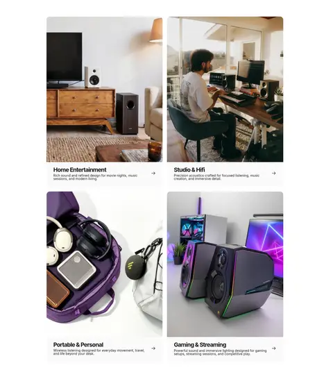
Two-column image-led grid with rounded photography, dark title and description, and a small directional link cue.
Product module
Lower-page multi-column product presentation, measured at five columns, using images, compact controls, and purchase actions.
Pale footer
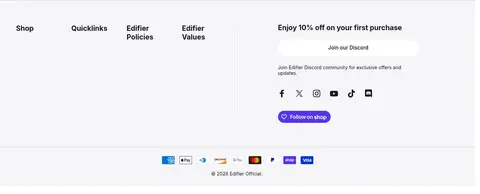
Light gray footer with grouped navigation, signup prompt, social icons, payment marks, and a thin divider.
Imagery · Photography and video of speakers and listening spaces define the page. The first campaign uses a dark, close-up product shot as a full-bleed backdrop, with copy readable over the image; another campaign places a monitor product within a wide rounded media panel. Category cards use lifestyle and product photography, cropped to fill their image frames. Treat the orange warmth and saturated colours within images as photographic content, not interface palette.
Use full-bleed product media to establish the campaign mood.
Keep primary campaign copy centered and white over dark imagery.
Use Inter throughout and reserve heavy weights for prominent headlines.
Keep the main canvas white and supporting bands pale and restrained.
Use pill-shaped controls and modestly rounded image cards.
Give category imagery generous room and concise captions.
✕ 不该做
Do not turn the orange accent into a large page background.
Do not add gradients or saturated colours to ordinary interface sections.
Do not cover product photography with dense text or extra UI.
Do not add heavy shadows to every card.
Do not make the category grid feel tightly packed.
Do not use decorative display fonts or excessive uppercase body copy.
给 AI 的提示词
想快速出一个同风格的新页面,把这段话连同 DESIGN.md 一起发给 AI。
Build a new Edifier-style storefront page with a bright #ffffff Gallery White canvas and cinematic, full-bleed product photography. Layer compact white navigation and centered campaign copy over dark media; use #171717 Speaker Black for ordinary text and only small, isolated #ff9900 Signal Orange or #14865f Signal Green controls. Set all typography in Inter, with bold campaign headlines, uppercase navigation, and restrained supporting copy. Follow campaign sections with spacious, image-led category cards in a two-column grid, rounded framing, concise captions, and directional link cues. Keep backgrounds flat and use #f5f5f7 Cloud Gray and #dcdcde Divider Gray sparingly in the footer. Avoid broad accent bands, decorative gradients, excessive shadows, and dense text over imagery.