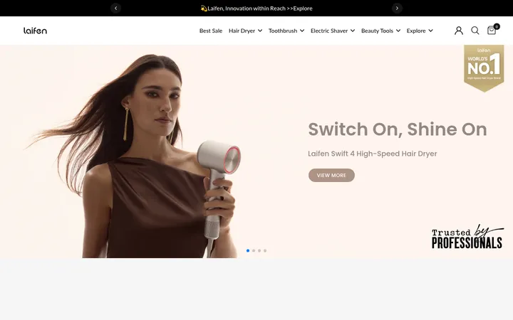
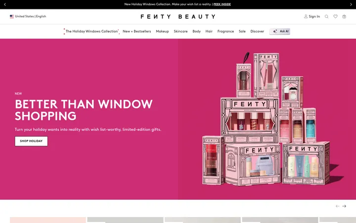
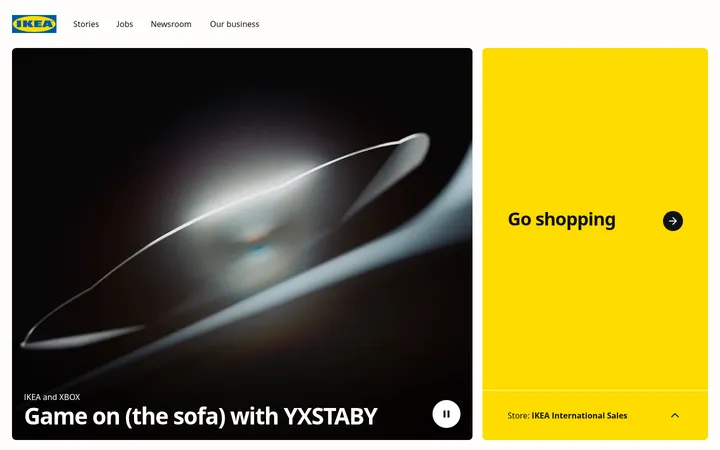
North star · Keep the interface quiet and easy to scan, letting large product imagery and clear shopping actions lead each section.
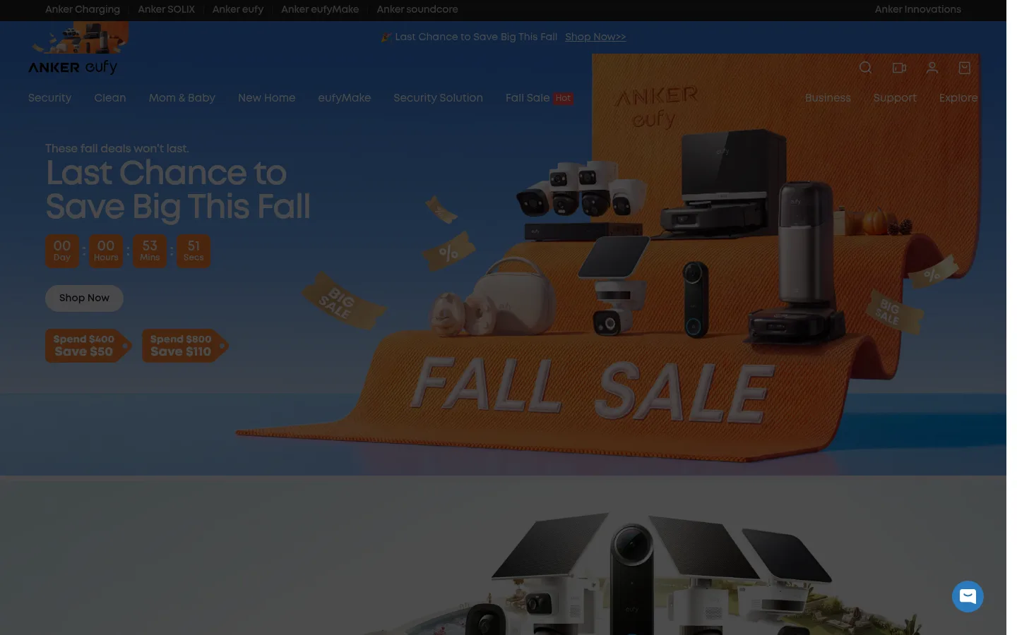
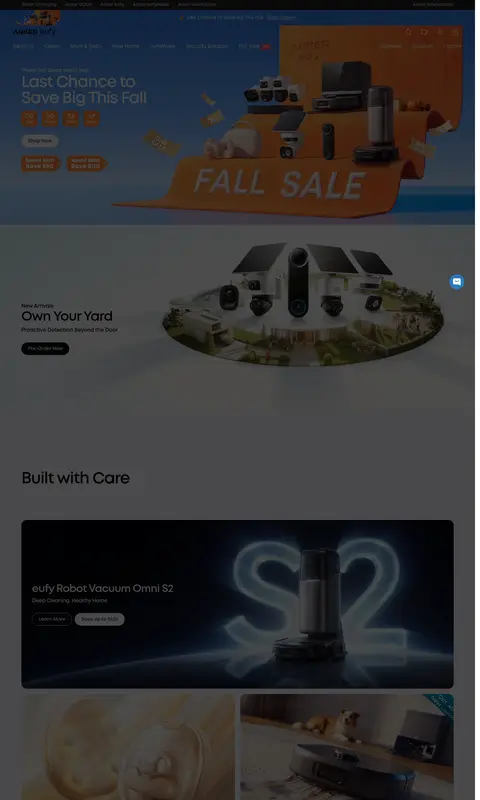
The page uses a restrained interface palette around vivid campaign and product imagery. Near-black text (#080a0f) anchors headings, product descriptions, and dark purchase buttons; white and pale gray provide clean card and canvas surfaces. A substantial charcoal band (#4c4c4c) appears in the measured page data and the screenshots show extensive darkened content, so treat dark sections as intentional contrast rather than applying a dark overlay to the whole page. Eufy blue (#005d8e) is a brand accent, but it is not the dominant homepage color. MontForAnker supplies a geometric sans-serif voice: bold, tightly tracked headings and compact, strong-weight labels. The layout moves through broad campaign banners, product and category grids, and editorial or benefit modules. Rounded cards and pill-shaped CTAs soften the dense catalog structure. Photography, rendered products, and lifestyle scenes carry the storytelling; keep interface decoration quiet, borders subtle, and spacing consistent enough to separate many content groups.
Headings, body copy, navigation, buttons, and links throughout the storefront.
角色
示例
字号
字重
行高
字距
一级标题
Campaign hero headline and primary page statement.
eufy
48px
700
1.1
-0.04em
二级标题
Major homepage section headings.
eufy
40px
700
1
-0.04em
三级标题
Feature, category, and promotional module headings.
eufy
32px
700
1.2
-0.04em
四级标题
Product and card titles.
The quick brown fox 敏捷的狐狸
24px
700
1.2
0
正文
Product descriptions and supporting section copy.
The quick brown fox 敏捷的狐狸
16px
700
1.4
-0.02em
辅助文字
Compact metadata, campaign notes, and product details.
The quick brown fox 敏捷的狐狸
14px
700
1.2
0
按钮
Shopping and discovery calls to action.
The quick brown fox 敏捷的狐狸
14px
700
1.2
0
导航
Primary storefront navigation labels.
The quick brown fox 敏捷的狐狸
15px
600
1.2
0
链接
Text links in cards, footer, and utility navigation.
The quick brown fox 敏捷的狐狸
14px
700
1.2
0
间距与布局
基准单位 4px · 密度:适中
64px版块间距
8px元素间距
111px卡片内边距
—内容最大宽度
3px
4px
6px
8px
10px
11px
12px
15px
16px
20px
24px
32px
60px
64px
Build a long, full-width storefront with a central content area and broad, image-led campaign bands. Arrange product and category content in responsive card grids, with occasional split layouts and horizontal product or editorial rails. The screenshot shows compact gutters and multiple cards per row, balanced by generous separation between major sections. Use a clear heading above each module and align its content consistently. The measured page has no max-width value; avoid imposing an unsupported fixed width and let the layout adapt to the viewport.
圆角与层次
按钮 · 9999px
卡片 · 16px
导航 · 50%
链接 · 16px
hairline · button
lg · card
Favor flat surfaces and restrained separation over heavy interface chrome. Product cards use rounded corners, with a measured large-card shadow available for layered emphasis; most card separation comes from image contrast and light surfaces. Keep borders hairline-thin in appearance, and reserve pronounced depth for overlays or floating elements.
组件
下面的预览按实测的按钮、输入框、徽标、卡片样式重建(字体用替代字体)。
Campaign hero
Wide promotional image panel with prominent campaign copy, deal details, and a rounded shopping CTA.
Product card
Rounded image-led card with concise title, supporting details, price or offer, and shopping links.
Pill CTA
Bold MontForAnker 14px button; measured variants use dark, white, or pale-gray fills and pill-shaped corners.
Category navigation
Compact category links or visual product icons that direct visitors into major product families.
Feature banner
Wide lifestyle or technology visual paired with a short heading, supporting copy, and discovery action.
Product rail
Horizontally browsable product cards with offer badges and distinct learn-more and shop actions.
Imagery · Use large campaign photography, product renders, and lifestyle scenes as the primary visual material. Hero banners can blend product arrangements with promotional graphics; smaller cards should keep the product or scene legible and pair it with concise copy. Dark product imagery appears alongside bright lifestyle photography, so let each image retain its own treatment instead of applying one global filter. Use image crops to fill rounded cards and wide feature panels.
Lead major sections with product or campaign imagery.
Keep headings bold, concise, and tightly tracked.
Use rounded cards and pill-shaped purchase buttons.
Separate catalog modules with clear section headings.
Use pale surfaces to distinguish cards from the canvas.
Let promotional art introduce color without recoloring the interface.
✕ 不该做
Do not tint the entire page charcoal.
Do not use brand blue as a dominant page background.
Do not add ornamental borders around every card.
Do not crowd product cards with long descriptions.
Do not flatten all modules into one continuous grid.
Do not apply a uniform dark overlay to product photography.
给 AI 的提示词
想快速出一个同风格的新页面,把这段话连同 DESIGN.md 一起发给 AI。
Create a responsive eufy-style storefront page with a calm interface and image-led product storytelling. Use Night Ink (#080a0f) for headings and primary dark CTAs, Gallery White (#ffffff) for the canvas, and Soft Mist (#f5f5f7) for quiet card surfaces. Use Eufy Blue (#005d8e) sparingly as an accent, not a dominant fill. Build full-width campaign imagery followed by clearly titled product and category grids, with rounded cards and pill-shaped actions. Use MontForAnker or Montserrat, bold compact headings, and semibold navigation. Keep borders subtle and shadows restrained. Mix product renders with lifestyle photography, preserving each image’s native contrast. Maintain generous separation between modules while keeping catalog rows easy to scan. Add concise purchase or discovery actions to relevant cards.