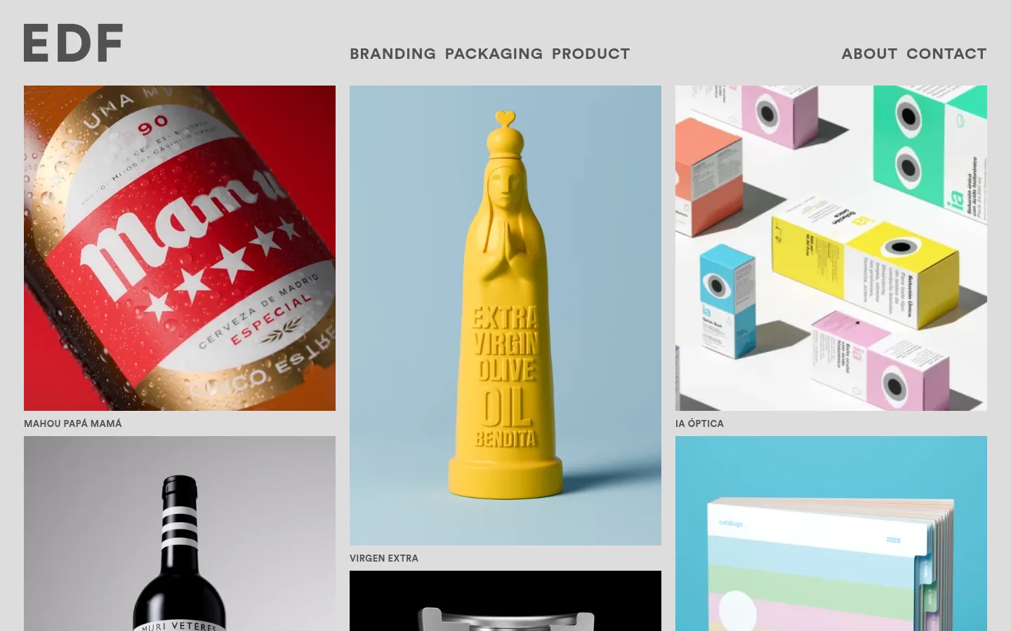
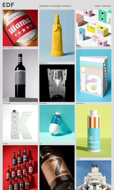
Eduardo del Fraile 的首页以克制的灰色界面,承载密集纵向排列的品牌、包装与产品设计作品。紧凑的大写导航和项目标签不喧宾夺主,让作品图像成为视觉焦点。
North star · Keep the interface quiet and consistent so a dense, varied portfolio grid—not the chrome—commands attention.
The page uses a controlled grayscale foundation: #dddddd forms the main portfolio field, #c8c8c8 appears in card and loading-like areas, and #515151 supplies the text and navigation. These measured interface colors stay neutral while the portfolio imagery introduces vivid reds, yellows, blues, and product-specific palettes; those image colors are not treated as the site’s brand palette. Circular is used throughout in bold uppercase display text, with visibly tracked navigation and small project captions. The header places a large EDF monogram at left, category links centrally, and About and Contact at right. Below it, a compact three-column masonry composition mixes portrait and landscape media with consistent gutters and labels directly under images. The long page is a continuous gallery rather than a sequence of promotional sections. Flat surfaces, sharp corners, and restrained spacing let the work carry the visual variety.
配色
点色块复制色值。用途说明来自对页面的实测位置(背景、文字、描边、按钮)与截图判读。
品牌色
表层色
中性色
页面底色 · Soft Concrete表层 · Gallery Mist主文字 · Studio Graphite
文字
背景
对比度
WCAG
#515151 Studio Graphite
#c8c8c8 Soft Concrete
4.74:1
AA
#515151 Studio Graphite
#dddddd Gallery Mist
5.84:1
AA
字体
字号阶梯:Custom(比例约 1.692,正文 13px)。示例用免费替代字体渲染,数值为实测。
Aa 设计
Circular
网络字体 · 字重 700 · 占比 100%
免费替代:Montserrat
Wordmark, navigation, project labels, and compact interface text.
角色
示例
字号
字重
行高
字距
一级标题
Large uppercase studio wordmark at the top left.
The quick brown fox 敏捷的狐狸
22px
700
1
0.04em
正文
Compact uppercase project labels and supporting interface copy.
The quick brown fox 敏捷的狐狸
13px
700
1.4
0.03em
按钮
Text-led uppercase category links without filled button styling.
The quick brown fox 敏捷的狐狸
22px
700
1
0.04em
导航
Bold uppercase portfolio categories and About navigation.
The quick brown fox 敏捷的狐狸
22px
700
1
0.04em
眉题
Small uppercase captions identifying each portfolio project.
The quick brown fox 敏捷的狐狸
13px
700
1.4
0.03em
间距与布局
基准单位 2px · 密度:紧凑
34px版块间距
12px元素间距
—卡片内边距
—内容最大宽度
10px
12px
34px
112px
A compact header spans the top, with the studio mark aligned left, primary categories centered, and About/Contact aligned right. The gallery begins directly below in three vertical masonry columns, with staggered image heights and labels beneath each work. It continues as a long, dense, single-page feed. Keep gutters consistent and let images retain varied proportions; no measured maximum width is available, so avoid imposing an invented fixed value.
圆角与层次
没有测到阴影:页面是扁平的,层次靠底色和描边区分。
The interface is essentially flat: measured cards have no border, radius, or shadow. Use the gray gallery field as the only persistent surface, and let each project image provide its own internal depth, lighting, and background. Keep the image-to-page relationship clean rather than adding decorative frames.
组件
下面的预览按实测的按钮、输入框、徽标、卡片样式重建(字体用替代字体)。
Studio wordmark
Oversized EDF initials at the header’s left, set in bold #515151 uppercase type.
Primary navigation
Centered, text-only BRANDING, PACKAGING, and PRODUCT links in bold uppercase Circular.
Utility navigation
ABOUT and CONTACT sit at the right side of the header, aligned on the same visual row.
Portfolio masonry
Three staggered columns of image-led projects, with changing media heights and consistent gaps.
Project caption
Small bold uppercase project name directly beneath each image, using #515151.
Project tile
Flat, square-corner image area with no measured border or shadow; image colors vary by project.
Imagery · The page is defined by a large assortment of project imagery: packaging, bottles, books, identity work, objects, and rendered products. Mix photographic, graphic, and 3D work in the masonry columns, preserving each image’s original color and aspect ratio. Captions are small and sit close to their corresponding images.
Preserve each project image’s intrinsic proportions.
Place compact uppercase labels close below images.
Keep the header simple and horizontally balanced.
✕ 不该做
Do not turn project-image colors into interface accents.
Do not add rounded cards, shadows, or decorative borders.
Do not make captions compete with the artwork.
Do not force every project into identical image dimensions.
Do not introduce filled CTA buttons into the navigation.
Do not break the portfolio into unrelated promotional bands.
给 AI 的提示词
想快速出一个同风格的新页面,把这段话连同 DESIGN.md 一起发给 AI。
Build a new design-studio portfolio page using this restrained visual language. Use Gallery Mist (#dddddd) as the main canvas, Soft Concrete (#c8c8c8) only as a supporting neutral surface, and Studio Graphite (#515151) for the wordmark, navigation, and captions. Set the interface in bold, tracked uppercase sans-serif, using Circular or a close substitute. Create a compact horizontal header with a studio mark, centered category links, and right-aligned utility links. Below it, make a dense three-column masonry gallery with varied image proportions and small labels directly beneath each item. Keep the frame flat, sharp-cornered, and free of shadows or decorative borders. Allow artwork to supply its own vivid colors; keep the surrounding interface neutral and unobtrusive.