North star · Let oversized, asymmetrically placed typography and expansive black, white, and pale-grey fields do the work; keep everything else quiet.
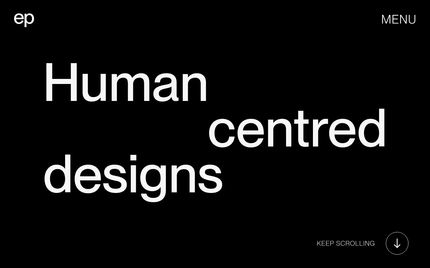
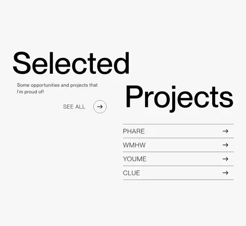
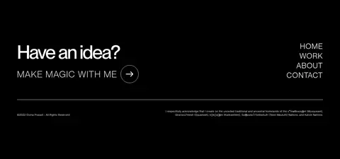
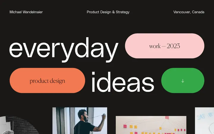
The visual identity is built on a restrained monochrome palette: pure white carries the opening project gallery, black anchors the introductory statement and footer, and pale grey distinguishes the selected-projects section. Neue Montreal supplies the page’s oversized, confident display lettering and light, conversational supporting copy; headings often shift position across the canvas rather than sit in conventional centered blocks. The opening uses a black field with widely separated lines of large white type, while the project gallery presents colorful portfolio work as the exception to the neutral interface. In the selected-projects band, a two-column composition pairs a large title and short note with a simple ruled project list. Spacing is deliberately generous, and section transitions are defined by full-width color changes rather than decorative containers. Keep UI chrome minimal: thin dividers, small arrow cues, and no visible shadows.
Primary display, large headings, body copy, and captions.
Aa 设计
Neue Montreal Variable
网络字体 · 字重 400 · 占比 12%
免费替代:Inter
Uppercase section headings and eyebrow labels.
角色
示例
字号
字重
行高
字距
特大标题
Oversized hero statement and expressive headline lettering.
Elvina Prasad
177.5px
500
1.1
0
一级标题
Primary large title treatment across prominent content.
Elvina Prasad
80px
500
1
-0.05em
二级标题
Uppercase section headings, including project and intro labels.
Elvina Prasad
40px
400
1
0.05em
三级标题
Secondary uppercase headings within content sections.
Elvina Prasad
38.5px
400
1
0.05em
四级标题
Smaller uppercase subheadings and project labels.
Elvina Prasad
32px
400
1
0.05em
正文
Light-weight supporting paragraphs and project descriptions.
The quick brown fox 敏捷的狐狸
17.5px
300
1
0.05em
辅助文字
Compact navigation details, footer notes, and small labels.
The quick brown fox 敏捷的狐狸
11px
400
1.3
0.05em
眉题
Uppercase introductory or section-label text.
Elvina Prasad
32px
400
1
0.05em
间距与布局
基准单位 1px · 密度:宽松
180px版块间距
16px元素间距
—卡片内边距
1296px内容最大宽度
5px
7px
14px
16px
21px
28px
29px
42px
50px
72px
89px
180px
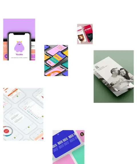
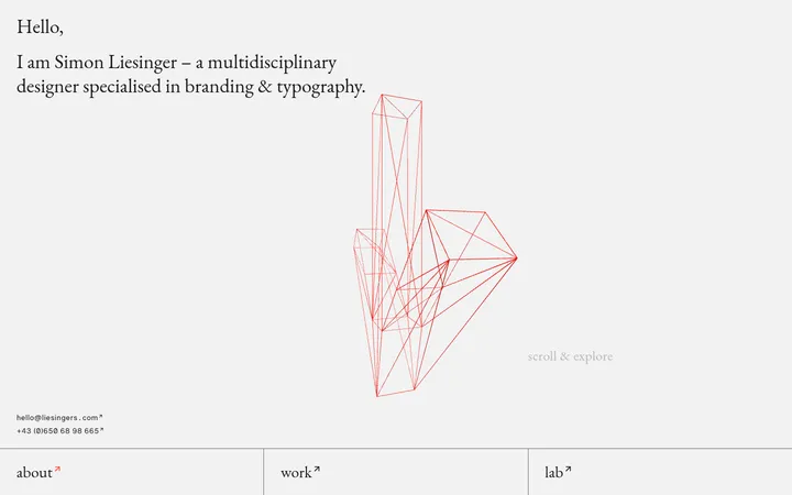
The page alternates full-width monochrome bands with a pale-grey project section. Content sits within a measured 1296px maximum width, but the hero deliberately uses staggered alignment and broad open areas rather than a conventional centered text block. The selected projects area switches to a two-column layout, with heading and intro on one side and a ruled project list on the other. The image gallery uses scattered, varied-size placements on a white field. Section rhythm is spacious, with measured section gaps of 180px and an overall low-density feel.
圆角与层次
没有测到阴影:页面是扁平的,层次靠底色和描边区分。
The interface is fundamentally flat: no measured shadows or gradients. Use full-bleed color fields, whitespace, and thin horizontal rules to establish hierarchy instead of cards or raised surfaces. Small circular arrow controls are outlined rather than filled, and project rows are separated by hairlines.
组件
下面的预览按实测的按钮、输入框、徽标、卡片样式重建(字体用替代字体)。
Hero navigation
Place the small white “ep” mark at the upper left and MENU at the upper right over the black hero field.
Scroll cue
Pair a compact “KEEP SCROLLING” caption with a thin outlined circular down-arrow at the lower right of the hero.
Intro statement
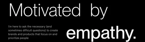
Set large staggered lines on black; pair the human-centred statement with a short, light-weight explanatory paragraph.
Project gallery
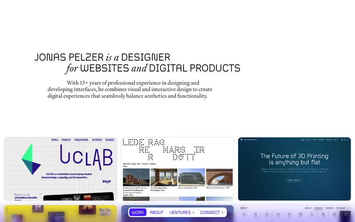
Scatter varied-size portfolio images across a clean white canvas, with generous empty space between pieces.
Selected projects list
Use a pale-grey band with a two-column heading/list composition; separate project links with fine horizontal rules and arrow cues.
Footer CTA
Keep the footer black, with a prominent “Have an idea?” prompt, an outlined circular arrow link, compact navigation, and a thin divider.
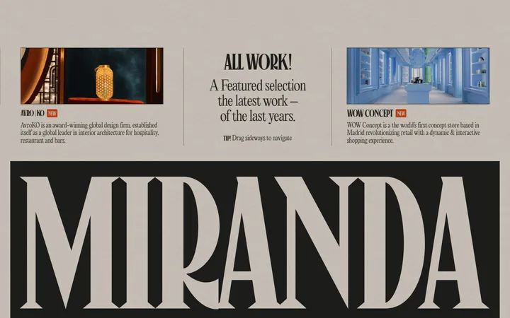
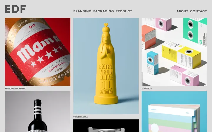
Imagery · Portfolio imagery is presented as colorful design work rather than as a separate brand palette: app mockups, packaging, print, and identity examples appear at varied sizes on the white gallery canvas. Keep each piece sharply framed and let its native color and artwork remain visible. The rest of the site stays image-light, allowing typography and section color to lead.
Use black, white, and pale grey as broad section fields.
Set oversized headlines with deliberate, staggered alignment.
Preserve generous negative space around type and images.
Let portfolio artwork supply the page’s vivid color.
Use fine rules and small arrow cues for navigation.
Keep supporting text light and visually subordinate.
✕ 不该做
Do not add unmeasured brand colors to the interface.
Do not center every headline or align every section identically.
Do not place every project inside a raised card.
Do not introduce gradients or decorative shadows.
Do not crowd the gallery or compress section transitions.
Do not make small navigation copy compete with display type.
给 AI 的提示词
想快速出一个同风格的新页面,把这段话连同 DESIGN.md 一起发给 AI。
Build a new designer-portfolio page in this style. Use Ink Black (#000000), Gallery White (#ffffff), and Soft Paper (#f7f7f7) as the core interface palette; reserve artwork colors for portfolio imagery. Set Neue Montreal, or a close sans-serif substitute, with oversized, medium-weight display lines and light supporting copy. Create full-width alternating sections, an asymmetrically aligned hero, generous open space, and a scattered gallery of project work. A pale-grey projects section should use a two-column arrangement and thin ruled links. Keep controls quiet: small captions, simple arrows, outlined circular cues, and hairline dividers. Avoid shadows, gradients, rounded cards, and added decorative color. Follow the page’s spacious rhythm and use concise navigation and footer details.