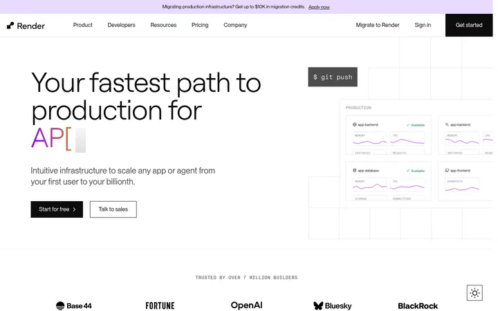
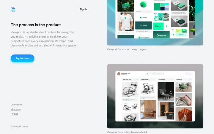
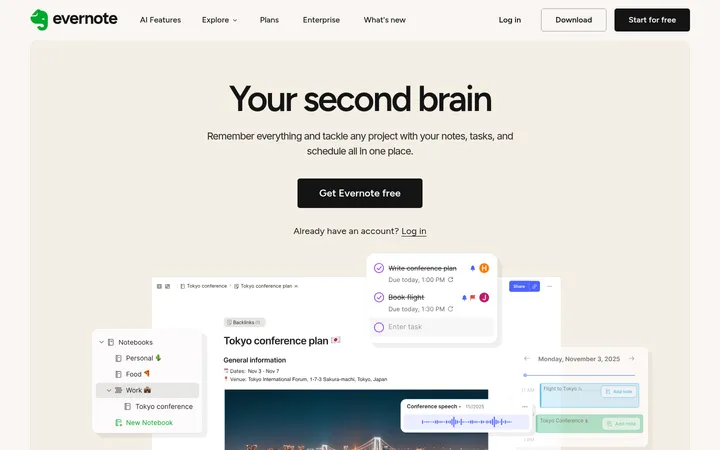
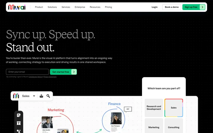
Elementor以大面积白色画布搭配醒目的黑色文字,并用浅灰区块和沉浸式产品画面呈现内容。宽松的编辑式布局与高对比度行动按钮,让建站工具和最终效果始终成为视觉焦点。
North star · Keep the interface monochrome and spacious, letting bold Roobert typography and vivid product media carry the story.
The visual strategy is built around a predominantly white canvas, with black and near-black typography providing clear hierarchy and occasional light-gray bands separating feature content. A black primary CTA with white text is the strongest recurring interface accent; outlined emphasis is otherwise restrained. Roobert is used consistently across navigation, headings, body copy, and buttons. Headings are bold and compact, while body text remains regular and easy to scan. The page alternates broad, quiet stretches of white space with concentrated product demonstrations, video, and feature cards, creating an editorial scroll rhythm rather than a dense dashboard feel. Hero and showcase media provide the visual color and texture, including human photography and website-editor previews; pink or other hues inside those visuals should not be mistaken for the interface palette. The layout uses centered and left-aligned compositions, with a measured maximum content width and generous section spacing. Fine borders and subtle navigation elevation are secondary to flat surfaces.
配色 点色块复制色值。用途说明来自对页面的实测位置(背景、文字、描边、按钮)与截图判读。
品牌色
Pure Ink
#000000
Primary CTA fill, strong text, and full-width dark sections; pair with white for contrast.
表层色
Canvas White
#ffffff
Dominant page canvas and light card surface; also used for text on black sections and dark CTA contrast.
Mist Gray
#f6f6f6
Pale gray background for feature bands and selected content sections.
中性色
Charcoal Ink
#212121
Near-black navigation and text tone, providing softer contrast than pure black.
Muted Gray
#a6a6a6
Minor muted navigation text; measured sparingly and not a defining brand color.
功能色
Hairline Gray
#d1d1d1
Subtle navigation divider and fine interface border.
文字 背景 对比度 WCAG #000000 Pure Ink#ffffff Canvas White21:1 AAA #000000 Pure Ink#f6f6f6 Mist Gray19.43:1 AAA #212121 Charcoal Ink#ffffff Canvas White16.1:1 AAA #212121 Charcoal Ink#f6f6f6 Mist Gray14.9:1 AAA #212121 Charcoal Ink#000000 Pure Ink1.3:1 不达标 #ffffff Canvas White#f6f6f6 Mist Gray1.08:1 不达标
字体 字号阶梯:Perfect Fourth(比例约 1.345,正文 20px)。示例用免费替代字体渲染,数值为实测。
Aa 设计
Roobert 网络字体 · 字重 400 / 600 / 700 / 500 · 占比 100%
免费替代:Inter
Site-wide typeface for navigation, headings, body copy, links, and buttons.
角色 示例 字号 字重 行高 字距 特大标题 Oversized campaign or hero headline.
Elementor
88px 600 1.1 -0.01em 一级标题 Primary page headline and major statement.
Elementor
64px 600 1.1 -0.01em 二级标题 Section headings introducing core product stories.
Elementor
56px 600 1.1 -0.01em 三级标题 Feature and editorial subheadings.
Elementor
40px 600 1.3 0 四级标题 Smaller card or supporting section headings.
Elementor
36px 600 1.4 -0.02em 正文 Explanatory paragraphs beneath feature headings.
The quick brown fox 敏捷的狐狸
20px 400 1.4 0 辅助文字 Supporting labels and compact media descriptions.
The quick brown fox 敏捷的狐狸
18px 500 1.4 0 按钮 Primary and secondary CTA labels.
The quick brown fox 敏捷的狐狸
18px 500 1.4 0 导航 Top-level navigation labels.
The quick brown fox 敏捷的狐狸
16px 700 normal 0 链接 Inline and standalone action links.
The quick brown fox 敏捷的狐狸
18px 500 1.4 0
间距与布局 基准单位 8px · 密度:宽松
96px 版块间距
10px 元素间距
40px 卡片内边距
1248px 内容最大宽度
2px
4px
9px
10px
12px
16px
24px
32px
40px
48px
64px
88px
96px
112px
Use a spacious editorial page with content contained within the measured 1248px maximum width. Sections alternate centered statements, left-aligned feature introductions, media-led showcases, and card rows; use a measured 96px section rhythm and generous internal gaps rather than filling every viewport. The measured spacing system is based on an 8px unit, with a spacious density. Keep headings aligned to their content column, reserving centered alignment for selected hero messaging. Large blank intervals and quiet white sections are intentional parts of the composition.
圆角与层次 Favor flat surfaces and clean transitions between white, pale gray, and black section bands. The measured navigation has a restrained shadow; do not add broad, dramatic elevation to content. Fine gray dividers are appropriate for navigation, while cards rely more on white space and rounded corners than visible outlines.
组件 下面的预览按实测的按钮、输入框、徽标、卡片样式重建(字体用替代字体)。
Primary CTA Black button with white Roobert medium text, measured 18px, an 8px radius, and horizontal padding of 24px.
Inverse CTA White button with black text for use against dark media or black section backgrounds; retain the measured 8px radius.
Navigation Compact horizontal header with Roobert navigation labels, a subtle gray divider, and restrained shadow; measured nav text is 16px bold.
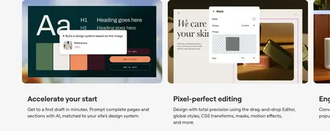
Feature card White content card with a measured 16px radius, generous measured padding, concise heading, and supporting description.
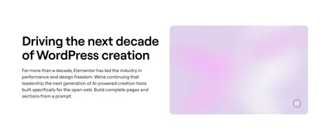
Feature media Rounded video, image, or editor preview placed beside or beneath a clear product-oriented heading.
Dark section band Full-width black background with white heading and supporting content; use a white CTA where appropriate.
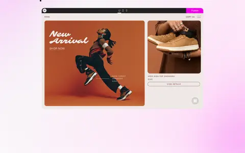
Imagery · Use immersive video or photography for large product-story moments, including people using devices and dark, atmospheric performance imagery. Pair these with crisp website-editor previews and interface mockups in feature showcases. Frame media as supporting proof of the product, not as a source of interface colors: pinks, oranges, and other hues in mockups belong to the pictured websites. Cards and media have rounded corners.
页面版块 共 18 个版块,按页面从上到下排列,每个都标了类型、布局和交互套路。
首屏 定价页标题
Centered eyebrow and large headline beneath the site navigation, with a short guarantee note.
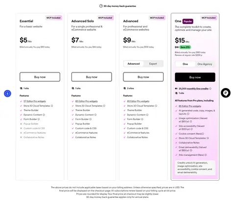
价格方案 套餐价格卡
Four tall plan cards in a row, with the One card visually highlighted; each card stacks price, billing details, CTA, site allowance, and feature list.
图文交替 创作者信赖
Light-gray horizontal band with a large heading on the left and supporting copy on the right.
数据亮点 平台关键数据
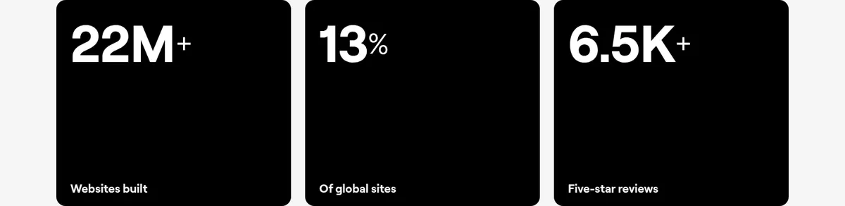
Three equal black statistic tiles beneath the section introduction, each pairing a prominent metric with a small label.
用户评价 用户评价
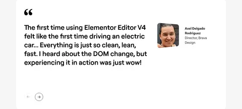
Large white testimonial panel with a quote on the left and reviewer portrait, name, and role on the right; carousel controls sit below.
用户评价区 奖项与评分
Full-width deep-purple band with rating and headline on the left and a grid of award badges on the right.
常见问题 常见问题
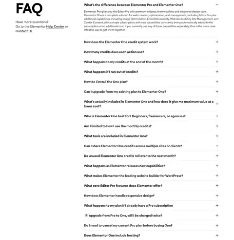
Two-column FAQ area with title and help links on the left and a long accordion list on the right.
页脚 页脚与订阅
A closing CTA and brief brand description lead into a dark, multi-column footer with newsletter signup and grouped site links.
该做与不该做 ✓ 该做 Use #ffffff as the dominant canvas. Set core text in #000000 or #212121. Use #f6f6f6 to distinguish selected feature bands. Make primary actions black with white labels. Let product media provide the page’s visual variety. Preserve generous whitespace between story sections. ✕ 不该做 Do not turn colors inside media mockups into interface tokens. Do not fill quiet sections with extra cards or decoration. Do not use gradients as a defining interface background. Do not replace the measured palette with bright CTA colors. Do not add heavy borders or dramatic shadows to every card. Do not compress the editorial section rhythm into a dense grid. 给 AI 的提示词 想快速出一个同风格的新页面,把这段话连同 DESIGN.md 一起发给 AI。
复制 Build a new Elementor-style page as a spacious editorial SaaS experience. Use Canvas White (#ffffff) for the main canvas, Pure Ink (#000000) for headings and primary CTA fills, Charcoal Ink (#212121) for softer text, and Mist Gray (#f6f6f6) for selected section bands. Use Roobert throughout, or Inter as the closest free substitute; keep headings bold and prominent, body copy regular, and CTA labels medium. Alternate concise text introductions with product videos, editor previews, and rounded feature cards. Use the measured 1248px maximum content width, 8px spacing base, and spacious section rhythm. Keep the navigation restrained, with a fine Hairline Gray (#d1d1d1) divider and only subtle elevation. Treat colors in photographs and mockups as media, not interface tokens.
DESIGN.md Tailwind v4 CSS 变量 Design Tokens
---
title: "Elementor design system"
variant: extended
source: https://elementor.com/
captured_at: 2026-10-12
theme: light
industry: saas
generator: Design DNA (https://four.wiralomi.com/style/elementor-com)
ai_generated: true
ai_label: "本文件由 AI 辅助生成:数值取自公开网页的实测样式,命名、用途说明与建议为模型解读。商标归原所有者。 / AI-assisted content"
---
# Elementor · Design System
> Quiet monochrome, expansive creative canvas
**Theme:** light · **Industry:** saas · **Source:** https://elementor.com/ · **Captured:** 2026-10-12 (1440×900 desktop)
_AI-assisted content: values are measured from the public page at capture time; names, roles and guidance are model-written interpretations. Trademarks belong to their owners._
Elementor pairs an expansive white canvas with bold black typography, restrained neutral section bands, and immersive product imagery. Spacious editorial layouts and direct, high-contrast calls to action keep the builder’s tools and creative outcomes at the center.
## North star
Keep the interface monochrome and spacious, letting bold Roobert typography and vivid product media carry the story.
## Overview
The visual strategy is built around a predominantly white canvas, with black and near-black typography providing clear hierarchy and occasional light-gray bands separating feature content. A black primary CTA with white text is the strongest recurring interface accent; outlined emphasis is otherwise restrained. Roobert is used consistently across navigation, headings, body copy, and buttons. Headings are bold and compact, while body text remains regular and easy to scan. The page alternates broad, quiet stretches of white space with concentrated product demonstrations, video, and feature cards, creating an editorial scroll rhythm rather than a dense dashboard feel. Hero and showcase media provide the visual color and texture, including human photography and website-editor previews; pink or other hues inside those visuals should not be mistaken for the interface palette. The layout uses centered and left-aligned compositions, with a measured maximum content width and generous section spacing. Fine borders and subtle navigation elevation are secondary to flat surfaces.
## Colors
| Name | Hex | Token | Group | Role |
|---|---|---|---|---|
| Canvas White | ` | `--color-canvas-white` | surface | Dominant page canvas and light card surface; also used for text on black sections and dark CTA contrast. |
| Charcoal Ink | ` | `--color-charcoal-ink` | neutral | Near-black navigation and text tone, providing softer contrast than pure black. |
| Mist Gray | ` | `--color-mist-gray` | surface | Pale gray background for feature bands and selected content sections. |
| Pure Ink | ` | `--color-pure-ink` | brand | Primary CTA fill, strong text, and full-width dark sections; pair with white for contrast. |
| Hairline Gray | ` | `--color-hairline-gray` | semantic | Subtle navigation divider and fine interface border. |
| Muted Gray | ` | `--color-muted-gray` | neutral | Minor muted navigation text; measured sparingly and not a defining brand color. |
### Semantic aliases
`--color-canvas` → ` (Canvas White) · `--color-surface` → ` (Mist Gray) · `--color-surface-2` → ` (Pure Ink) · `--color-text` → ` (Pure Ink) · `--color-text-muted` → ` (Charcoal Ink) · `--color-text-subtle` → ` (Canvas White) · `--color-border` → ` (Hairline Gray)
### Contrast (WCAG 2.x)
| Text | Background | Ratio | Level |
|---|---|---|---|
| ` | ` | 21:1 | AAA |
| ` | ` | 19.43:1 | AAA |
| ` | ` | 16.1:1 | AAA |
| ` | ` | 14.9:1 | AAA |
| ` | ` | 1.3:1 | fail |
| ` | ` | 1.08:1 | fail |
| ` | ` | 21:1 | AAA |
## Typography
| Family | Token | Source | Weights | Role | Free substitute |
|---|---|---|---|---|---|
| Roobert | `--font-body` | webfont | 400, 600, 700, 500 | Site-wide typeface for navigation, headings, body copy, links, and buttons. | Inter |
- **Roobert:** Use measured regular, medium, semibold, and bold weights. Headings are large and compact; keep casing natural and tracking subtly tight where measured.
### Type scale — Perfect Fourth (ratio ≈ 1.345, base 20px)
| Role | Size | Weight | Line height | Letter spacing | Case | Family | Used for |
|---|---|---|---|---|---|---|---|
| display | 88px | 600 | 1.1 | -0.01em | — | Roobert | Oversized campaign or hero headline. |
| h1 | 64px | 600 | 1.1 | -0.01em | — | Roobert | Primary page headline and major statement. |
| h2 | 56px | 600 | 1.1 | -0.01em | — | Roobert | Section headings introducing core product stories. |
| h3 | 40px | 600 | 1.3 | 0 | — | Roobert | Feature and editorial subheadings. |
| h4 | 36px | 600 | 1.4 | -0.02em | — | Roobert | Smaller card or supporting section headings. |
| body | 20px | 400 | 1.4 | 0 | — | Roobert | Explanatory paragraphs beneath feature headings. |
| caption | 18px | 500 | 1.4 | 0 | — | Roobert | Supporting labels and compact media descriptions. |
| button | 18px | 500 | 1.4 | 0 | — | Roobert | Primary and secondary CTA labels. |
| nav | 16px | 700 | normal | 0 | — | Roobert | Top-level navigation labels. |
| link | 18px | 500 | 1.4 | 0 | — | Roobert | Inline and standalone action links. |
## Spacing & layout
- Base unit **8px**, density **spacious**.
- Scale (most used values): 2, 4, 9, 10, 12, 16, 24, 32, 40, 48, 64, 88, 96, 112 px.
- Section rhythm 96px · element gap 10px · card padding 40px · max content width 1248px.
Use a spacious editorial page with content contained within the measured 1248px maximum width. Sections alternate centered statements, left-aligned feature introductions, media-led showcases, and card rows; use a measured 96px section rhythm and generous internal gaps rather than filling every viewport. The measured spacing system is based on an 8px unit, with a spacious density. Keep headings aligned to their content column, reserving centered alignment for selected hero messaging. Large blank intervals and quiet white sections are intentional parts of the composition.
## Shape & elevation
- Radius: button `8px` · card `16px` · media `16px` · nav `8px` · link `8px` · xs `8px` · sm `12px` · md `16px`
- Shadow `md` (nav): `rgba(0, 0, 0, 0.05) 0px 0px 15.008px 3.008px`
- Motion: standard transition `0.3s ease` on interactive elements.
Favor flat surfaces and clean transitions between white, pale gray, and black section bands. The measured navigation has a restrained shadow; do not add broad, dramatic elevation to content. Fine gray dividers are appropriate for navigation, while cards rely more on white space and rounded corners than visible outlines.
## Imagery
Use immersive video or photography for large product-story moments, including people using devices and dark, atmospheric performance imagery. Pair these with crisp website-editor previews and interface mockups in feature showcases. Frame media as supporting proof of the product, not as a source of interface colors: pinks, oranges, and other hues in mockups belong to the pictured websites. Cards and media have rounded corners.
## Components
### Primary CTA
Black button with white Roobert medium text, measured 18px, an 8px radius, and horizontal padding of 24px.
### Inverse CTA
White button with black text for use against dark media or black section backgrounds; retain the measured 8px radius.
### Navigation
Compact horizontal header with Roobert navigation labels, a subtle gray divider, and restrained shadow; measured nav text is 16px bold.
### Feature card
White content card with a measured 16px radius, generous measured padding, concise heading, and supporting description.
### Feature media
Rounded video, image, or editor preview placed beside or beneath a clear product-oriented heading.
### Dark section band
Full-width black background with white heading and supporting content; use a white CTA where appropriate.
### Measured component styles
- **Primary button** (“Get started”): background ## Do
- Use ## Don't
- Do not turn colors inside media mockups into interface tokens.
- Do not fill quiet sections with extra cards or decoration.
- Do not use gradients as a defining interface background.
- Do not replace the measured palette with bright CTA colors.
- Do not add heavy borders or dramatic shadows to every card.
- Do not compress the editorial section rhythm into a dense grid.
## Agent prompt
Build a new Elementor-style page as a spacious editorial SaaS experience. Use Canvas White (## Page sections (top to bottom)
| # | Type | Layout | UX patterns | UI patterns |
|---|---|---|---|---|
| 1 | hero | Centered hero messaging over immersive media, with a concise supporting line and CTA. | Primary get-started action, Product promise before detail | High-contrast heading, Video background, White CTA |
| 2 | stats | Three compact proof points lead into a left-aligned platform statement and product preview. | Credibility through metrics, CTA near product claim | Large metric labels, Website preview, Black CTA |
| 3 | feature-split | Left-aligned heading and copy beside a wide video or visual panel. | Context before product detail, Split text-media story | Two-column composition, Soft media treatment |
| 4 | other | A short section-heading band introduces the feature area. | Feature group introduction | Light-gray background, Left-aligned heading |
| 5 | feature-grid | Multiple feature cards with interface imagery, headings, and brief descriptions. | Scan feature benefits, Compare capabilities | Rounded product previews, Compact card copy, Light-gray section |
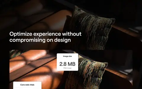
| 6 | video | Full-width dark visual band centered on an immersive performance demonstration. | Visual proof of performance | Black section background, White heading, Layered media |
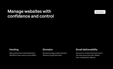
| 7 | feature-grid | Dark section with a left-aligned heading, CTA, and three service columns. | Explore related services, Get-started action | Black background, White text, Three-column content |
| 8 | other | A narrow charcoal band separates the dark product section from the light story below. | Visual section transition | Charcoal fill, Minimal content |
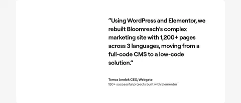
| 9 | testimonials | Light testimonial area with a customer quote and attribution. | Customer proof, Named attribution | White quote surface, Large editorial text |
| 10 | feature-grid | Pale-gray content band with a section heading and three benefit cards. | Agency-focused benefits, Scan supporting proof points | Light-gray background, White cards, Rounded surfaces |
## Source CSS custom properties (selected)
```css
--wp--preset--color--black: