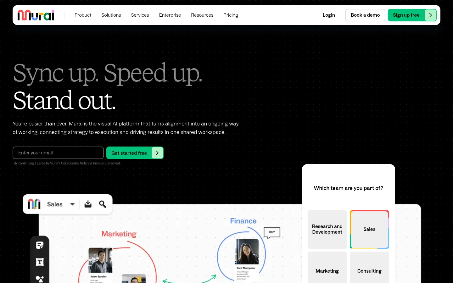
Mural以鲜明的编辑式大标题搭配简洁宽松的SaaS页面布局。醒目的绿色行动按钮和沉浸式工作区画面,为整体克制的设计注入活力。
North star · Use oversized editorial serif headlines and generous white space, reserving green for clear actions and meaningful product details.
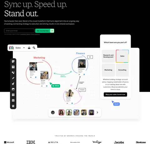
The page contrasts an expansive black hero with a long sequence of white, open sections. Green is reserved for primary actions and selected interface details, while fine gray borders quietly define cards and controls. Large, lightly weighted serif headlines create an editorial character; compact sans-serif body copy and navigation keep product information practical and easy to scan. The hero anchors its copy and email form on the left, balancing them with a large collaborative-workspace composition. Farther down, broad whitespace separates customer proof, outcome metrics, audience cards, product capabilities, and testimonials. Photography and interface imagery show teams working together and Mural's canvas in use, rather than relying on decorative illustration. The visual rhythm comes from alternating text and media, varied card groupings, and ample vertical breathing room—not colored section bands.
配色 点色块复制色值。用途说明来自对页面的实测位置(背景、文字、描边、按钮)与截图判读。
品牌色
Canvas Ink
#000000
Hero surface, main text, navigation text, and dark card treatment.
强调色
Mural Green
#00c27a
Primary signup and conversion buttons; a small, high-contrast accent against white or black.
Mint Highlight
#b4f5c8
Minor pale-green interface and navigation accent; secondary to the saturated CTA green.
表层色
Gallery White
#ffffff
Dominant canvas and light section background; also used for inverse text over the black hero.
Soft Panel
#f3f3f3
Light link and control background, including subdued utility surfaces.
Pale Interface
#eeeeee
Minor light neutral detail in interface areas, not a defining section color.
中性色
Midtone Gray
#808080
Occasional muted link and text treatment; not a dominant brand surface.
Editorial Gray
#8c8c8c
Occasional subdued heading and body text, including secondary headline emphasis.
功能色
Quiet Divider
#dce1e5
Subtle card, navigation, and link borders that define edges without heavy framing.
Slate Control
#4f5457
Input outline detail; use only for form-control edging.
文字 背景 对比度 WCAG #000000 Canvas Ink#ffffff Gallery White21:1 AAA #ffffff Gallery White#000000 Canvas Ink21:1 AAA #00c27a Mural Green#ffffff Gallery White2.33:1 不达标 #00c27a Mural Green#000000 Canvas Ink9:1 AAA
字体 字号阶梯:Augmented Fourth(比例约 1.409,正文 18px)。示例用免费替代字体渲染,数值为实测。
Aa 设计
ABC Social 网络字体 · 字重 300 / 500 · 占比 68%
免费替代:Inter
Body copy, navigation, labels, buttons, and compact utility text.
Aa 设计
STK Bureau 网络字体 · 字重 300 · 占比 32%
免费替代:Instrument Serif
Display and section headlines.
角色 示例 字号 字重 行高 字距 特大标题 Oversized editorial statement or hero headline.
Mural
100px 300 1 0 一级标题 Primary hero heading, with tight tracking and a light serif face.
Mural
80px 300 1.1 -0.05em 二级标题 Major section titles, including customer and product sections.
Mural
70px 300 1 -0.04em 三级标题 Secondary feature and audience-card headings.
Mural
54px 300 1.2 0 四级标题 Smaller card or supporting section headlines.
Mural
40px 300 1.2 -0.04em 正文 Paragraphs, feature descriptions, and supporting product copy.
The quick brown fox 敏捷的狐狸
18px 300 1.5 0 辅助文字 Compact supporting details and secondary descriptions.
The quick brown fox 敏捷的狐狸
16px 300 1.5 0 导航 Header navigation and compact account actions.
The quick brown fox 敏捷的狐狸
16px 300 1 0 链接 Small utility links and legal or card-level destinations.
The quick brown fox 敏捷的狐狸
11px 300 1 0 眉题 Spaced uppercase section labels above editorial headings.
The quick brown fox 敏捷的狐狸
14px 300 1.5 0.175em
间距与布局 基准单位 8px · 密度:适中
48px 版块间距
24px 元素间距
56px 卡片内边距
1360px 内容最大宽度
4px
6px
8px
10px
12px
16px
23px
24px
28px
32px
39px
40px
41px
42px
44px
48px
Use a centered, wide page canvas with a measured maximum width of 1360px and a comfortable density. The hero is a dark, near-full-bleed two-column composition, while the remaining sections return to white and alternate text with product or team imagery. Align most content to the left; center the customer-testimonial heading. Organize outcome metrics and audience content into clear columns or cards. Section spacing is generous, with a measured 48px section gap and 24px element gap as useful references; preserve substantial open space around product capability panels.
圆角与层次 Most content sits on flat white surfaces, with thin #dce1e5 borders defining cards and controls. Cards use generously rounded corners, measured at 24px, while buttons and inputs use 8px corners. Keep shadows restrained; reserve soft depth for floating navigation or layered workspace elements. Let hero imagery overlap the dark canvas rather than adding extra decorative panels.
组件 下面的预览按实测的按钮、输入框、徽标、卡片样式重建(字体用替代字体)。
Floating navigation A white, rounded horizontal bar sits over the dark hero, with logo, compact ABC Social links, account actions, and a green signup CTA.
Hero signup form Left-aligned editorial headline and short copy lead into a dark email field with a #4f5457 border and a #00c27a submit action.
Workspace showcase A bright product canvas overlaps the black hero, accompanied by floating collaboration and team-selection interface panels.
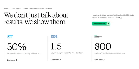
Outcome metrics Three customer proof columns pair compact logos with large serif figures, brief explanations, and small links.
Audience cards Alternating team photography and short role descriptions form staggered, rounded cards with restrained border treatment.
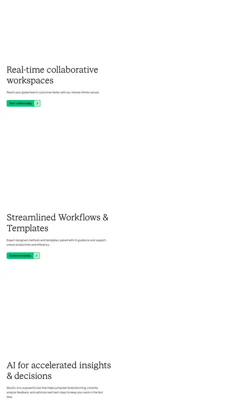
Capability links Product feature panels combine a serif heading, concise sans-serif description, and #00c27a action button.
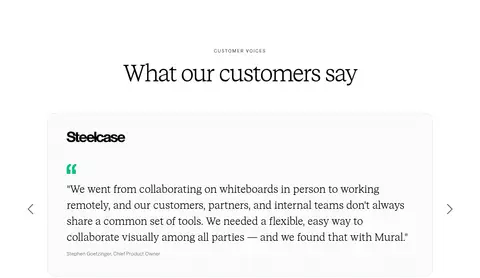
Customer testimonial A large lightly bordered, rounded quote card centers customer voice content beneath a centered serif heading.
Imagery · Prioritize genuine-looking team photography and interface-led workspace compositions. The hero places a large, bright collaborative canvas across the lower area of a black stage, with floating UI panels overlapping its edge. Further down, use rectangular team photos in staggered audience cards and product visuals that support feature stories. Keep imagery crisp and colorful enough to distinguish content, but let white surroundings and restrained framing carry the page.
页面版块 共 23 个版块,按页面从上到下排列,每个都标了类型、布局和交互套路。
首屏 定价页首屏
Centered single-column hero beneath the global navigation, with generous white space and a short eyebrow, large two-line headline, and supporting sentence.
价格方案 套餐价格卡
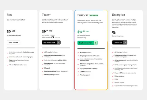
Four side-by-side plan cards on a light-gray band, each with a plan name, summary, price or contact prompt, CTA, and feature checklist.
品牌墙 客户品牌墙
Centered heading above a single horizontal row of customer logos on a white background.
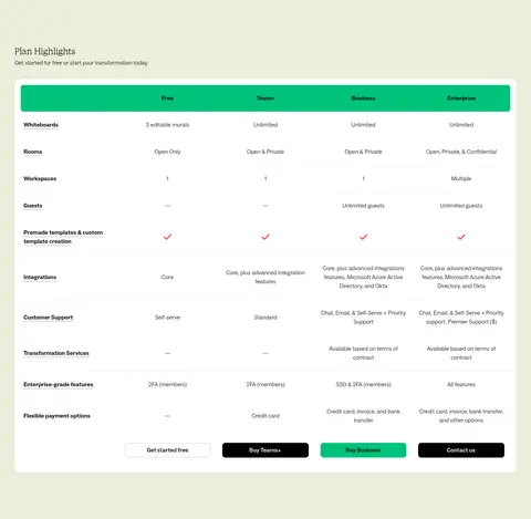
对比表 套餐功能对比
Pale tinted section with a heading and a wide comparison table: feature names at left, four plan columns, and plan CTAs along the bottom.
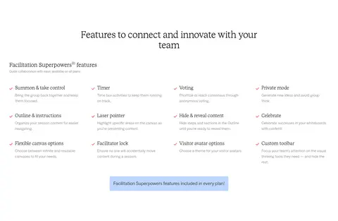
功能网格 协作引导功能
Centered section heading followed by a four-column grid of facilitation features, with a centered plan-availability callout below.
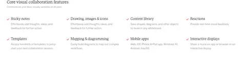
功能网格 核心协作功能
A compact, left-aligned section continuing the feature catalogue in four columns, with feature names and short descriptions.
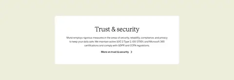
图文交替 信任与安全
Pale tinted band containing a centered white card with a heading, compact security copy, and a text link.
功能网格 协作成员类型
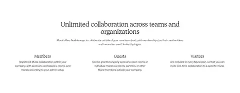
Centered heading and introductory paragraph above three evenly spaced columns describing Members, Guests, and Visitors.
图文交替 转型支持服务
Two-column section with a supporting photo on the left and heading, introduction, checklist, and demo CTA on the right.
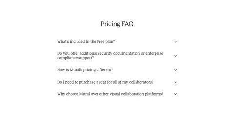
常见问题 定价常见问题
Centered FAQ heading above a narrow, vertically stacked accordion list with disclosure icons.
页脚 网站链接导航
Multi-column footer navigation with grouped link lists, followed by a breadcrumb-style page indicator.
页脚 版权与品牌页脚
Full-bleed closing area dominated by an oversized Mural wordmark, with small centered copyright and company legal text beneath.
该做与不该做 ✓ 该做 Use black for a distinct hero stage, then return to white content surfaces. Set major headlines in a light editorial serif. Keep body copy and navigation in a clean sans-serif. Use #00c27a for primary actions, not broad decorative fills. Frame cards with restrained #dce1e5 borders. Build visual interest through product imagery and generous whitespace. ✕ 不该做 Do not turn the whole page into a dark theme. Do not introduce unmeasured brand colors. Do not make every heading sans-serif or heavy. Do not fill empty space with decorative gradients or ornaments. Do not use thick borders or conspicuous shadows on every card. Do not crowd the page with dense copy or tightly packed sections. 给 AI 的提示词 想快速出一个同风格的新页面,把这段话连同 DESIGN.md 一起发给 AI。
复制 Create a new Mural-style SaaS page using a wide, spacious white canvas and a strong black hero stage. Use #ffffff for the main surface, #000000 for the hero and primary text, #00c27a for key actions, and #dce1e5 for quiet borders; keep #b4f5c8 as a minor interface accent. Set large, light editorial headlines in a serif similar to Instrument Serif, paired with an Inter-like sans-serif for body copy, navigation, labels, and buttons. Arrange hero copy and a conversion form beside a large collaborative product visual, using overlapping interface panels sparingly. Continue with open, left-aligned sections, alternating text and media, customer proof, and rounded cards. Keep imagery focused on real collaboration and product use. Use subtle elevation, generous whitespace, and measured corner styles rather than decorative effects.
DESIGN.md Tailwind v4 CSS 变量 Design Tokens
---
title: "Mural design system"
variant: extended
source: https://www.mural.co/
captured_at: 2026-10-12
theme: light
industry: saas
generator: Design DNA (https://four.wiralomi.com/style/mural-co)
ai_generated: true
ai_label: "本文件由 AI 辅助生成:数值取自公开网页的实测样式,命名、用途说明与建议为模型解读。商标归原所有者。 / AI-assisted content"
---
# Mural · Design System
> Editorial clarity meets a vivid collaborative workspace
**Theme:** light · **Industry:** saas · **Source:** https://www.mural.co/ · **Captured:** 2026-10-12 (1440×900 desktop)
_AI-assisted content: values are measured from the public page at capture time; names, roles and guidance are model-written interpretations. Trademarks belong to their owners._
Mural pairs dramatic editorial typography with clean, spacious SaaS layouts. A vivid green CTA and immersive workspace imagery give the otherwise restrained page its energy.
## North star
Use oversized editorial serif headlines and generous white space, reserving green for clear actions and meaningful product details.
## Overview
The page contrasts an expansive black hero with a long sequence of white, open sections. Green is reserved for primary actions and selected interface details, while fine gray borders quietly define cards and controls. Large, lightly weighted serif headlines create an editorial character; compact sans-serif body copy and navigation keep product information practical and easy to scan. The hero anchors its copy and email form on the left, balancing them with a large collaborative-workspace composition. Farther down, broad whitespace separates customer proof, outcome metrics, audience cards, product capabilities, and testimonials. Photography and interface imagery show teams working together and Mural's canvas in use, rather than relying on decorative illustration. The visual rhythm comes from alternating text and media, varied card groupings, and ample vertical breathing room—not colored section bands.
## Colors
| Name | Hex | Token | Group | Role |
|---|---|---|---|---|
| Gallery White | ` | `--color-gallery-white` | surface | Dominant canvas and light section background; also used for inverse text over the black hero. |
| Canvas Ink | ` | `--color-canvas-ink` | brand | Hero surface, main text, navigation text, and dark card treatment. |
| Mural Green | ` | `--color-mural-green` | accent | Primary signup and conversion buttons; a small, high-contrast accent against white or black. |
| Quiet Divider | ` | `--color-quiet-divider` | semantic | Subtle card, navigation, and link borders that define edges without heavy framing. |
| Midtone Gray | ` | `--color-midtone-gray` | neutral | Occasional muted link and text treatment; not a dominant brand surface. |
| Soft Panel | ` | `--color-soft-panel` | surface | Light link and control background, including subdued utility surfaces. |
| Pale Interface | ` | `--color-pale-interface` | surface | Minor light neutral detail in interface areas, not a defining section color. |
| Editorial Gray | ` | `--color-editorial-gray` | neutral | Occasional subdued heading and body text, including secondary headline emphasis. |
| Slate Control | ` | `--color-slate-control` | semantic | Input outline detail; use only for form-control edging. |
| Mint Highlight | ` | `--color-mint-highlight` | accent | Minor pale-green interface and navigation accent; secondary to the saturated CTA green. |
### Semantic aliases
`--color-canvas` → ` (Gallery White) · `--color-surface` → ` (Canvas Ink) · `--color-text` → ` (Canvas Ink) · `--color-text-muted` → ` (Gallery White) · `--color-border` → ` (Quiet Divider) · `--color-accent` → ` (Mural Green) · `--color-accent-2` → ` (Mint Highlight) · `--color-on-accent` → ` (Canvas Ink)
### Contrast (WCAG 2.x)
| Text | Background | Ratio | Level |
|---|---|---|---|
| ` | ` | 21:1 | AAA |
| ` | ` | 21:1 | AAA |
| ` | ` | 2.33:1 | fail |
| ` | ` | 9:1 | AAA |
### Gradients
- `linear-gradient(rgb(255, 255, 255), rgba(255, 255, 255, 0))`
- `linear-gradient(rgba(255, 255, 255, 0), rgb(255, 255, 255))`
## Typography
| Family | Token | Source | Weights | Role | Free substitute |
|---|---|---|---|---|---|
| ABC Social | `--font-body` | webfont | 300, 500 | Body copy, navigation, labels, buttons, and compact utility text. | Inter |
| STK Bureau | `--font-display` | webfont | 300 | Display and section headlines. | Instrument Serif |
- **ABC Social:** Light, restrained sans-serif; use compact uppercase eyebrow labels with letter spacing and clear, practical body copy.
- **STK Bureau:** Light editorial serif with generous scale; tight negative tracking on major headings and natural sentence case.
### Type scale — Augmented Fourth (ratio ≈ 1.409, base 18px)
| Role | Size | Weight | Line height | Letter spacing | Case | Family | Used for |
|---|---|---|---|---|---|---|---|
| display | 100px | 300 | 1 | 0 | — | STK Bureau | Oversized editorial statement or hero headline. |
| h1 | 80px | 300 | 1.1 | -0.05em | — | STK Bureau | Primary hero heading, with tight tracking and a light serif face. |
| h2 | 70px | 300 | 1 | -0.04em | — | STK Bureau | Major section titles, including customer and product sections. |
| h3 | 54px | 300 | 1.2 | 0 | — | STK Bureau | Secondary feature and audience-card headings. |
| h4 | 40px | 300 | 1.2 | -0.04em | — | STK Bureau | Smaller card or supporting section headlines. |
| body | 18px | 300 | 1.5 | 0 | — | ABC Social | Paragraphs, feature descriptions, and supporting product copy. |
| caption | 16px | 300 | 1.5 | 0 | — | ABC Social | Compact supporting details and secondary descriptions. |
| nav | 16px | 300 | 1 | 0 | — | ABC Social | Header navigation and compact account actions. |
| link | 11px | 300 | 1 | 0 | — | ABC Social | Small utility links and legal or card-level destinations. |
| eyebrow | 14px | 300 | 1.5 | 0.175em | uppercase | ABC Social | Spaced uppercase section labels above editorial headings. |
## Spacing & layout
- Base unit **8px**, density **comfortable**.
- Scale (most used values): 4, 6, 8, 10, 12, 16, 23, 24, 28, 32, 39, 40, 41, 42, 44, 48 px.
- Section rhythm 48px · element gap 24px · card padding 56px · max content width 1360px.
Use a centered, wide page canvas with a measured maximum width of 1360px and a comfortable density. The hero is a dark, near-full-bleed two-column composition, while the remaining sections return to white and alternate text with product or team imagery. Align most content to the left; center the customer-testimonial heading. Organize outcome metrics and audience content into clear columns or cards. Section spacing is generous, with a measured 48px section gap and 24px element gap as useful references; preserve substantial open space around product capability panels.
## Shape & elevation
- Radius: button `8px` · input `8px` · card `24px` · nav `8px` · link `8px` · xs `6px` · sm `7px` · md `8px` · lg `16px` · xl `24px`
- Shadow `md` (nav, card): `rgba(11, 41, 70, 0.32) 0px 0px 1px 0px, rgba(42, 82, 121, 0.08) 0px 24px 20px 0px`
- Shadow `sm` (card): `rgba(0, 0, 0, 0.08) 0px 5.53px 7.38px 0px`
- Motion: standard transition `0.3s cubic-bezier(0.23, 1, 0.32, 1)` on interactive elements.
Most content sits on flat white surfaces, with thin ## Imagery
Prioritize genuine-looking team photography and interface-led workspace compositions. The hero places a large, bright collaborative canvas across the lower area of a black stage, with floating UI panels overlapping its edge. Further down, use rectangular team photos in staggered audience cards and product visuals that support feature stories. Keep imagery crisp and colorful enough to distinguish content, but let white surroundings and restrained framing carry the page.
## Components
### Floating navigation
A white, rounded horizontal bar sits over the dark hero, with logo, compact ABC Social links, account actions, and a green signup CTA.
### Hero signup form
Left-aligned editorial headline and short copy lead into a dark email field with a ### Workspace showcase
A bright product canvas overlaps the black hero, accompanied by floating collaboration and team-selection interface panels.
### Outcome metrics
Three customer proof columns pair compact logos with large serif figures, brief explanations, and small links.
### Audience cards
Alternating team photography and short role descriptions form staggered, rounded cards with restrained border treatment.
### Capability links
Product feature panels combine a serif heading, concise sans-serif description, and ### Customer testimonial
A large lightly bordered, rounded quote card centers customer voice content beneath a centered serif heading.
### Measured component styles
- **Primary button** (“Sign up free”): background ## Do
- Use black for a distinct hero stage, then return to white content surfaces.
- Set major headlines in a light editorial serif.
- Keep body copy and navigation in a clean sans-serif.
- Use ## Don't
- Do not turn the whole page into a dark theme.
- Do not introduce unmeasured brand colors.
- Do not make every heading sans-serif or heavy.
- Do not fill empty space with decorative gradients or ornaments.
- Do not use thick borders or conspicuous shadows on every card.
- Do not crowd the page with dense copy or tightly packed sections.
## Agent prompt
Create a new Mural-style SaaS page using a wide, spacious white canvas and a strong black hero stage. Use ## Page sections (top to bottom)
| # | Type | Layout | UX patterns | UI patterns |
|---|---|---|---|---|
| 1 | hero | Black two-column hero with left-side headline and signup form; large workspace interface overlaps the lower area. | Email signup, Primary signup CTA, Product demonstration | Dark canvas, Floating white navigation, Overlapping workspace panels |
| 2 | logo-cloud | A quiet horizontal customer-logo row followed by a two-column statement and visual area. | Customer credibility, Product benefit introduction | Small uppercase eyebrow, Sparse logo row, Open white space |
| 3 | stats | Editorial heading and supporting copy above three evenly spaced metric columns. | Customer proof, Metric scanning, Case-study links | Large serif figures, Small customer marks, Fine column dividers |
| 4 | feature-split | Single-row editorial headline on the left, short supporting copy and link on the right. | Feature discovery, Learn-more CTA | Uppercase eyebrow, Large serif headline, Green action |
| 5 | product-showcase | Standalone, wide visual area with minimal surrounding copy. | Visual product exploration | Large image region, Open white surround |
| 6 | feature-split | Large multi-line headline and supporting copy with an action in a spacious single-column band. | Audience orientation, Demo CTA | Small eyebrow, Serif headline, Open layout |
| 7 | feature-grid | Staggered two-column sequence combining role descriptions with collaborative team photography. | Audience browsing, Role-specific links | Rounded image cards, Thin borders, Short text blocks |
| 8 | category-nav | A short centered section heading above a horizontal row of capability categories. | Capability navigation, Jump-to-section browsing | Centered serif heading, Pale category tabs, Compact labels |
| 9 | feature-grid | Four-column capability sequence with spacious feature panels and alternating product-visual areas. | Feature exploration, Capability-level CTAs | Serif feature headings, Green action buttons, Open image regions |
| 10 | feature-split | Two-column feature card with black editorial copy panel beside team photography. | Related product discovery, Innovation CTA | Black copy surface, Rounded outer card, Bright green graphic accents |
| 11 | testimonials | Centered section title above a wide quote card with carousel controls at the sides. | Customer testimonial, Carousel navigation | Centered serif heading, Rounded bordered quote card, Green quote mark |
## Source CSS custom properties (selected)
```css
--_typography-old---text-size--nl: 1rem;
--_spacing-old---spacing--none: 0rem;
--_spacing-old---spacing--tiny: .125rem;
--_spacing-old---spacing--2xs: .25rem;
--_spacing-old---spacing--xs: .5rem;
--_spacing-old---spacing--sm: 1rem;
--_spacing-old---spacing--nl: 1.5rem;
--_spacing-old---spacing--md: 2rem;
--_spacing-old---spacing--lg: 3rem;
--_spacing-old---spacing--xl: 4rem;
--_spacing-old---spacing--2xl: 5rem;
--_spacing-old---spacing--hg: 6rem;
--_spacing-old---spacing--xh: 8rem;
--_spacing-old---spacing--2xh: 12rem;
--_typography-old---text-size--md: 1.25rem;
--_typography-old---text-size--hg: 2.5rem;
--_typography-old---text-size--lg: 1.5rem;
--_typography-old---text-size--sm: .875rem;
--_typography-old---text-size--xh: 4rem;
--_typography-old---text-size--2xh: 5rem;
--_typography-old---text-size--2xl: 2rem;
--_typography-old---text-size--xl: 1.75rem;
--_typography-old---text-size--gi: 6rem;
--_typography-old---text-size--xs: .75rem;
--_utilities---radius--md: .5rem;
--_semantics---color--border-default: