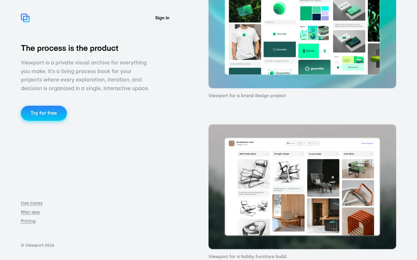
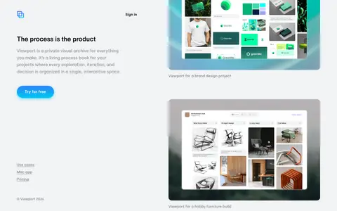
North star · Keep the interface quiet and spacious so the project imagery and a single luminous gradient action carry the visual emphasis.
The page is built on a cool, very light gray canvas (#f1f3f5), with white reserved mainly for the product interfaces inside the showcase imagery. Black headings provide the strongest typographic contrast; muted grays handle explanatory copy, captions, and understated navigation links. A cyan-to-indigo accent brings energy to the primary “Try for free” action, while the imagery itself contains richer greens and other colors that belong to project mockups rather than the site’s core brand palette. Typography is sans serif throughout: a bold display face distinguishes the headline, while Silka carries the body and supporting text with relaxed line spacing. The composition uses a broad two-column feel: concise, left-aligned copy sits opposite a large vertical sequence of project boards. Generous blank space and low visual density keep the page calm, while rounded media and pill-shaped actions soften its precise editorial structure.
The left-aligned hero headline introducing the product proposition.
Viewport
29px
700
1.2
-0.014em
正文
The explanatory paragraph beneath the headline.
The quick brown fox 敏捷的狐狸
18px
400
1.65
-0.011em
辅助文字
Descriptions directly beneath the project showcase images.
The quick brown fox 敏捷的狐狸
15px
400
1.4
0
按钮
Semibold labels on sign-in and the primary CTA.
The quick brown fox 敏捷的狐狸
15px
600
normal
0
链接
Supporting navigation links such as Use cases, Mac app, and Pricing.
The quick brown fox 敏捷的狐狸
15px
400
1.4
0
间距与布局
基准单位 2px · 密度:适中
68px版块间距
10px元素间距
—卡片内边距
—内容最大宽度
10px
16px
18px
26px
32px
34px
41px
44px
68px
72px
Use a wide, open composition with a left-aligned text and CTA column beside a vertically stacked showcase column. Keep the canvas continuous rather than dividing content into colored bands. The hero headline and paragraph align to the left; navigation links sit low in the left column, separated from the main message by generous empty space. Maintain comfortable spacing between sections and image captions. The measured data does not specify a page maximum width, so match the screenshot’s broad margins without inventing a fixed width.
圆角与层次
按钮 · 9999px
图片 · 14px
链接 · 9999px
hairline · media
md · link
The page is mostly flat, with no prominent section cards or heavy shadowing. Media uses a very subtle hairline shadow to separate its rounded frames from the canvas. The primary CTA is the exception: its cyan-indigo fill and soft cyan glow lift it forward. Keep borders delicate, as on the sign-in button, and avoid stacked panels.
组件
下面的预览按实测的按钮、输入框、徽标、卡片样式重建(字体用替代字体)。
Sign-in button
Quiet, transparent pill control with black semibold text and a fine #e3e6ec outline.
Primary CTA
Rounded “Try for free” link with white semibold text, a cyan-to-indigo gradient, and a soft cyan shadow.
Hero copy
Bold, dark headline above a muted explanatory paragraph, both aligned to the start of the left column.
Project showcase
Large rounded project-board media arranged vertically, with a muted caption immediately below each image.
Text navigation
Simple, understated links for Use cases, Mac app, and Pricing; no filled navigation container.
Footer note
Small, muted copyright text positioned beneath the lower-left navigation links.
Imagery · Show large, rounded screenshots of visual project archives, with boards containing identity systems, sketches, references, and finished work. Place each image in a softly colored or atmospheric mockup frame and pair it with a small muted caption. Greens, dark tones, and bright colors within the boards are product content, not the core site palette. Keep imagery crisp and let the embedded project material supply most of the page’s color variation.
Reserve the cyan-indigo gradient for the primary action.
Let large project boards provide the main visual color.
Use muted gray for descriptions, captions, and secondary links.
Keep media rounded and its elevation subtle.
✕ 不该做
Do not add saturated color bands behind page sections.
Do not treat greens inside project boards as brand accents.
Do not use heavy card borders or deep shadows.
Do not center the hero copy or turn it into a dense text block.
Do not style every link as a filled button.
Do not add uppercase labels or decorative type effects.
给 AI 的提示词
想快速出一个同风格的新页面,把这段话连同 DESIGN.md 一起发给 AI。
Build a new page in Viewport’s quiet editorial style. Use Canvas Mist (#f1f3f5) as a continuous backdrop, Ink Black (#000000) for strong headings, and Soft Graphite (#919293) or Slate Whisper (#7f8087) for supporting text and captions. Arrange a concise, left-aligned message and CTA beside large, vertically stacked rounded project imagery. Use Gallery White (#ffffff) primarily within the showcased work, not as a new page band. The main action may use a cyan-to-indigo gradient from Signal Cyan (#00caf2) to Electric Indigo (#4d4dff), with white semibold text and a soft glow; keep secondary controls understated with a fine Border Haze (#e3e6ec) outline. Use sans-serif typography, generous whitespace, subtle media elevation, and quiet text links. Treat colors inside screenshots as project content.