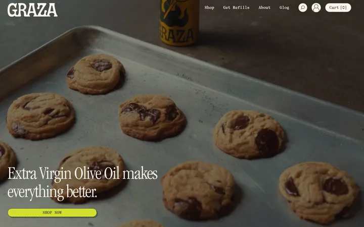
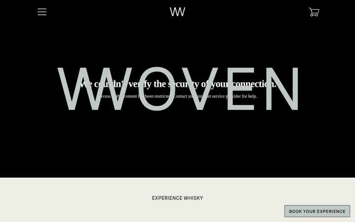
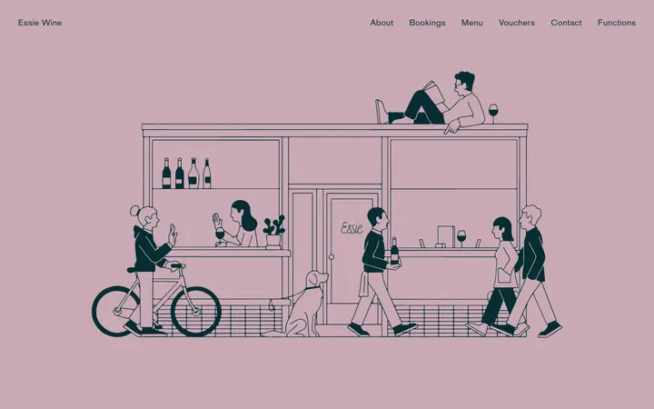
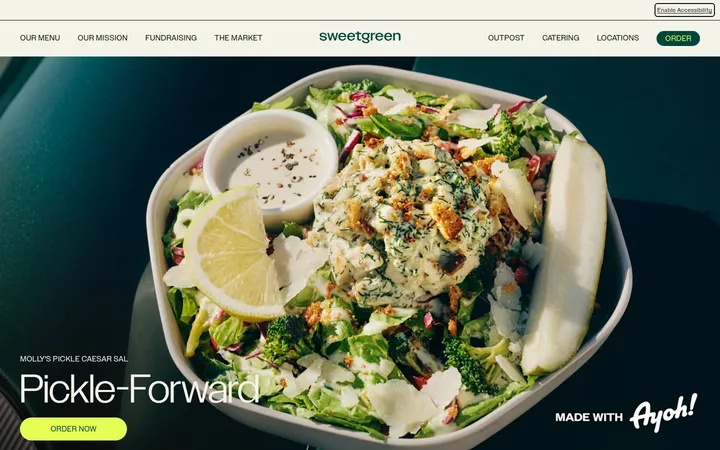
North star · Keep the shop feeling like a warm editorial wine journal: parchment canvas, expressive Romie typography, vivid imagery, and restrained brown-and-orange controls.
The page uses a parchment-like #ece0d2 canvas throughout, so the illustrated hero and product images supply most of the visual variation. Deep brown #573d21 anchors navigation, headings, product names, and rules; muted brown #7c664d softens secondary text. Warm orange accents, especially #e3a36e and #efa164, identify shop actions and echo the wine imagery. Romie supplies the expressive display and body voice, while bold Arial Narrow in uppercase creates compact section labels and product titles. The opening is a full-bleed illustrated landscape with centered messaging and a clear shop action. Below it, centered product collections use image-led grids, followed by an asymmetric about section and a broad peach contact panel. Sections have generous breathing room despite compact internal spacing. Product cards remain square-cornered and mostly flat; thin borders and restrained navigation shadow provide definition without making the page feel polished or corporate.
Large editorial statement, especially the hero headline.
Fallen Grape
64px
400
1.3
0
一级标题
Primary page or section-level editorial heading.
Fallen Grape
48px
400
1.3
0
二级标题
Bold uppercase section titles such as product collection headings.
The quick brown fox 敏捷的狐狸
24px
700
1.3
0
正文
Brand story and descriptive copy, with gently open tracking.
The quick brown fox 敏捷的狐狸
20px
400
1.3
0.03em
辅助文字
Compact bold labels and supporting metadata.
The quick brown fox 敏捷的狐狸
16px
700
1.5
0.063em
按钮
Short shop-action and utility button text.
The quick brown fox 敏捷的狐狸
15px
400
1.2
0
导航
Compact uppercase navigation items.
The quick brown fox 敏捷的狐狸
13px
700
1.3
0
链接
Prominent uppercase product names and collection links.
The quick brown fox 敏捷的狐狸
24px
700
1.3
0
眉题
Small uppercase introductory or category labels.
The quick brown fox 敏捷的狐狸
14px
400
1.3
0.043em
间距与布局
基准单位 2px · 密度:紧凑
36px版块间距
10px元素间距
6px卡片内边距
1240px内容最大宽度
5px
7px
8px
10px
17px
20px
24px
30px
36px
48px
50px
60px
110px
The desktop page uses a wide canvas, with measured content capped at 1240px and a compact underlying spacing scale. A full-bleed, two-column hero gives way to centered intro copy and product areas arranged in three-, four-, and five-column grids. The about section switches to a two-column image-and-copy composition; contact and footer blocks follow. Most section headings are centered, while story and contact copy align left. Keep the vertical rhythm open between sections and the spacing tighter within product groups.
圆角与层次
按钮 · 50%
徽标 · 9999px
lg · nav
The composition is mostly flat: square-cornered product cards, no prominent card shadows, and simple section surfaces. Use brown hairlines to distinguish selected content areas. The navigation is the main measured elevated element, with a restrained soft shadow; avoid stacking multiple shadow treatments.
组件
下面的预览按实测的按钮、输入框、徽标、卡片样式重建(字体用替代字体)。
Announcement strip
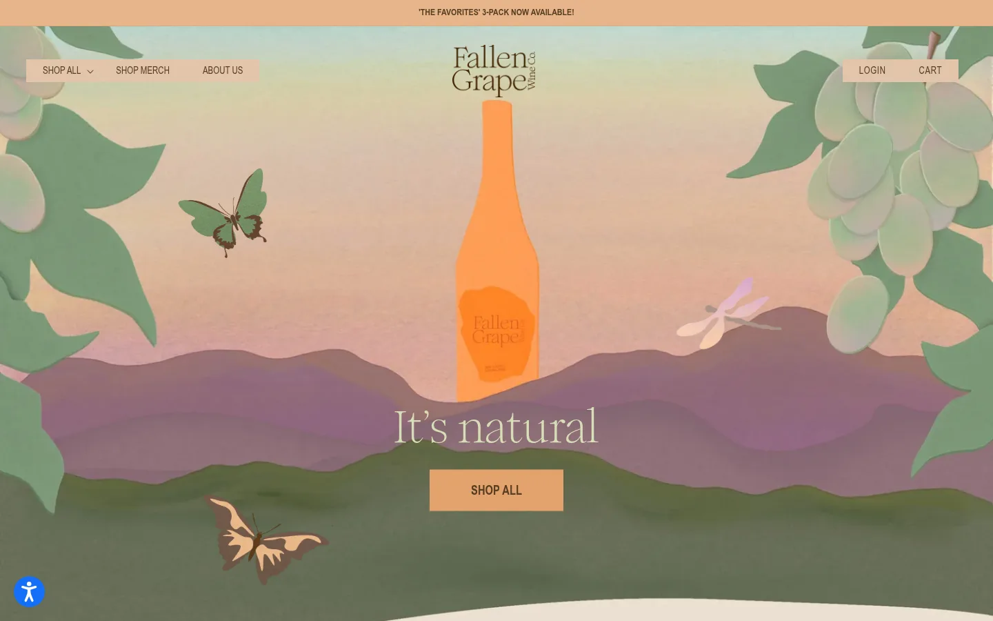
A narrow warm-orange message band sits above the hero with a small centered uppercase announcement.
Navigation
Compact shop and about links sit over the hero, with the centered wordmark and account/cart utilities; use brown text and a subtle shadow where needed.
Shop CTA
Use a warm orange rectangular button with brown text; the measured shop button uses uppercase condensed type.
Product cards
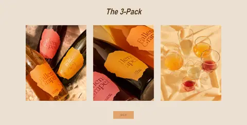
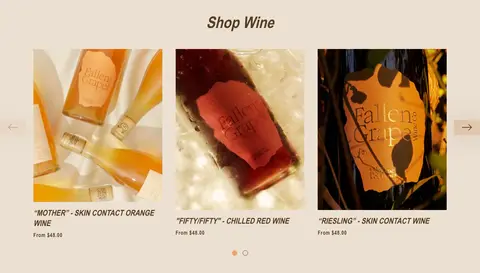
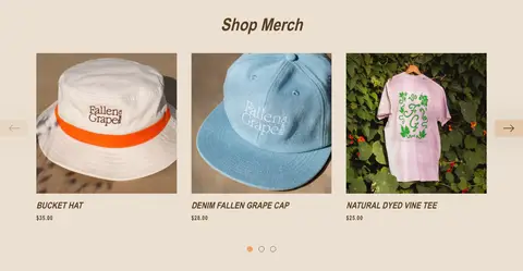
Show square-cornered product imagery first, then compact uppercase condensed titles and understated price copy.
Product carousels
Collection rows use image-led cards, restrained side arrows, and small centered pagination indicators.
About split
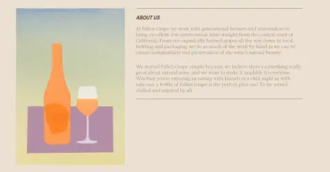
Pair a brand illustration with a left-aligned story block separated by a thin brown rule.
Wholesale contact panel
Set a large editorial contact prompt inside a broad peach-toned rectangular panel.
Footer
Use a parchment ground, small uppercase link groups, a centered hand-drawn mark, and muted legal details.
Imagery · The hero is a full-bleed, storybook-style illustration with a central bottle, layered hills, foliage, and small insects. Product and merch areas rely on close, colorful photographs presented in straightforward square-cornered cards. A smaller bottle illustration supports the about story. Image colors can be more saturated than the interface palette; treat those hues as artwork, not additional brand tokens.
Pair Romie display copy with condensed uppercase labels.
Let product photography and the illustrated hero provide visual color.
Keep product cards square-cornered and largely flat.
✕ 不该做
Do not turn illustration-only hues into interface colors.
Do not use browser-blue links as a signature accent.
Do not add rounded product-card corners.
Do not crowd the page with heavy shadows or gradients.
Do not apply uppercase condensed styling to all body copy.
Do not replace the warm canvas with a stark white page.
给 AI 的提示词
想快速出一个同风格的新页面,把这段话连同 DESIGN.md 一起发给 AI。
Build a new Fallen Grape page as a warm, editorial wine-shop experience. Use Parchment Canvas (#ece0d2) as the dominant ground, Grape Brown (#573d21) for navigation, headings, copy, and rules, and Harvest Orange (#e3a36e) for primary shop actions; Apricot Signal (#efa164) is a related measured accent. Use Romie or a close editorial serif such as Cormorant Garamond for expressive headings and body copy, paired with bold condensed uppercase labels in Barlow Condensed. Keep the layout image-led, with a wide illustrated or photographic feature followed by centered collection grids, a story split, and a spacious footer. Favor square corners, thin borders, and minimal shadow. Treat saturated colors inside product images as artwork rather than interface tokens.