North star · Let generous white space, restrained colour bands, and fine editorial type make hospitality feel intimate rather than transactional.
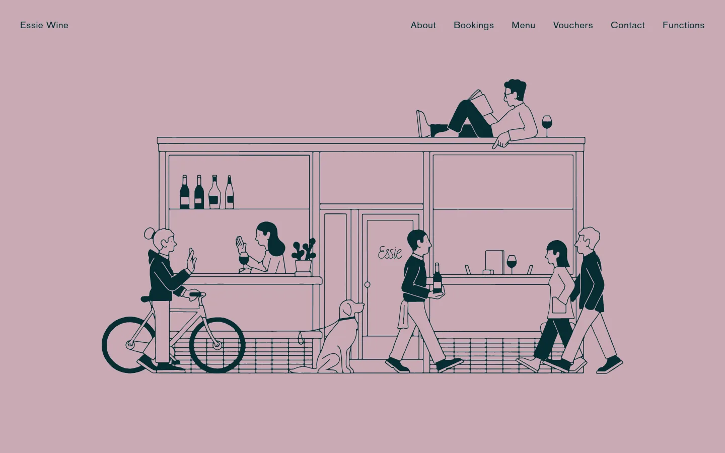
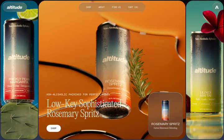
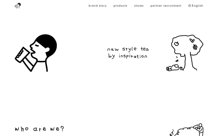
The page balances a white canvas with broad blocks of muted mauve, olive-gold, and pale gray-green. Mauve establishes the illustrated opening and returns in the footer; olive-gold anchors the private-dining and booking area. Near-black text and deep blue-green details provide contrast without making the page feel stark. BasicCommercial LT Com Roman carries headings and navigation in a light, refined voice, while Elementa handles uppercase labels and outlined actions; AdobeCaslon adds a literary serif note to selected copy. Generous whitespace and an asymmetrical image sequence create a calm editorial rhythm rather than a rigid card grid. Photography focuses on food, wine, and interiors, while the opening illustration gives the venue a distinctive, human scale. Borders are thin and rectangular, with no visible shadow system or rounded UI.
Headings, navigation, and selected larger form text.
Aa 设计
Elementa
网络字体 · 字重 300 / 400 · 占比 22%
免费替代:Josefin Sans
Uppercase body labels, buttons, links, and small image captions.
Aa 设计
AdobeCaslon
网络字体 · 字重 300 · 占比 20%
免费替代:Cormorant Garamond
Selected editorial copy, especially the private-dining description.
角色
示例
字号
字重
行高
字距
一级标题
Primary page or hero heading, when present.
Essie Wine
49px
300
1.18
0.003em
二级标题
Section headings for editorial and venue content.
Essie Wine
38px
300
1.18
0.004em
正文
Uppercase supporting copy and small editorial labels.
The quick brown fox 敏捷的狐狸
19px
300
1.16
0.008em
辅助文字
Image captions and compact supporting text.
The quick brown fox 敏捷的狐狸
16px
400
1
0
按钮
Uppercase text in outlined menu and booking actions.
The quick brown fox 敏捷的狐狸
19px
300
1.16
0.008em
导航
Brand wordmark and primary navigation links.
The quick brown fox 敏捷的狐狸
19px
300
1.16
0.026em
链接
Uppercase inline and outlined calls to action.
The quick brown fox 敏捷的狐狸
19px
300
1.16
0.008em
眉题
Widely tracked uppercase section labels.
The quick brown fox 敏捷的狐狸
19px
300
1.16
0.042em
间距与布局
基准单位 2px · 密度:适中
40px版块间距
20px元素间距
—卡片内边距
1088px内容最大宽度
3px
8px
20px
22px
23px
27px
35px
40px
100px
150px
Use a comfortable editorial layout within the measured 1088px maximum page width, with a two-column structure where content and media sit side by side. Alternate this with centered text blocks and offset, asymmetric photo placements rather than repeating uniform cards. Keep the navigation quiet at the top, then let broad colour bands distinguish key moments. The measured rhythm combines a 40px section gap with a 20px element gap; preserve the spacious feel and avoid compressing the content.
圆角与层次
没有测到阴影:页面是扁平的,层次靠底色和描边区分。
The interface is predominantly flat, with no measured shadow system or rounded-card language. Use thin, square-cornered outlines for actions and restrained hairlines for form and footer details. Separate content through whitespace, image placement, and solid section backgrounds instead of raised panels or layered effects.
组件
下面的预览按实测的按钮、输入框、徽标、卡片样式重建(字体用替代字体)。
Primary navigation
A simple horizontal row with the Essie Wine wordmark and links for About, Bookings, Menu, Vouchers, Contact, and Functions; use light Roman styling.
Outlined action
Square-cornered transparent action with a 1px solid #000000 outline, uppercase Elementa text, and generous internal breathing room.
Editorial photo
Unframed food, bottle-shop, or dining image placed asymmetrically with surrounding white space and a small Elementa caption where needed.
Menu panel
A two-column section pairing menu information on #e9e9e2 with wine imagery; offer menu downloads as separate outlined actions.
Booking form
Form fields arranged in a compact two-column layout on the #aa9e54 section, using thin underlines and an outlined submit action.
Footer information
Centered hours, address, phone, and social links on #c9a9b5, with muted #062d32 text and understated credits below.
Imagery · Mix candid venue photography—food, wine shelves, and dining interiors—with a prominent hand-drawn storefront illustration. The opening illustration sits against a flat dusty-mauve field, with deep teal linework; the photographs remain natural and richly detailed. Frame images as editorial moments, sometimes offset within generous white space, and use small restrained captions rather than decorative overlays.
Keep the white canvas dominant between coloured section bands.
Use Dusty Rosé and Olive Cellar as broad, flat backgrounds.
Reserve deep teal for restrained details and illustration linework.
Set actions in uppercase Elementa with thin rectangular outlines.
Arrange photography asymmetrically with ample surrounding whitespace.
Maintain a light, editorial typographic voice.
✕ 不该做
Do not add gradients, drop shadows, or rounded card treatments.
Do not use bright, saturated colours beyond the measured palette.
Do not force the image sequence into a uniform card grid.
Do not crowd the navigation or editorial text blocks.
Do not apply uppercase styling to every heading and paragraph.
Do not treat illustration-only colours as broad interface surfaces.
给 AI 的提示词
想快速出一个同风格的新页面,把这段话连同 DESIGN.md 一起发给 AI。
Build a new hospitality page in the Essie Wine visual style. Use Gallery White (#ffffff) as the main canvas, with broad Dusty Rosé (#c9a9b5) and Olive Cellar (#aa9e54) bands for major moments. Set primary copy in Soft Ink (#000000); use Cellar Teal (#062d32) for restrained secondary text and illustration details. Pair light Roman editorial headings and navigation with uppercase Elementa-style labels and actions. Introduce natural food, bottle, and interior photography in an asymmetrical sequence, balanced by generous whitespace. Prefer thin square-cornered outlines, underlined form fields, and flat surfaces; do not add shadows, rounded cards, or gradients. Keep the structure comfortable and editorial, with centered copy sections, occasional two-column splits, and a quiet footer.