North star · Keep the canvas quiet and the typography confident; use blue only to signal action, and let product evidence carry the detail.
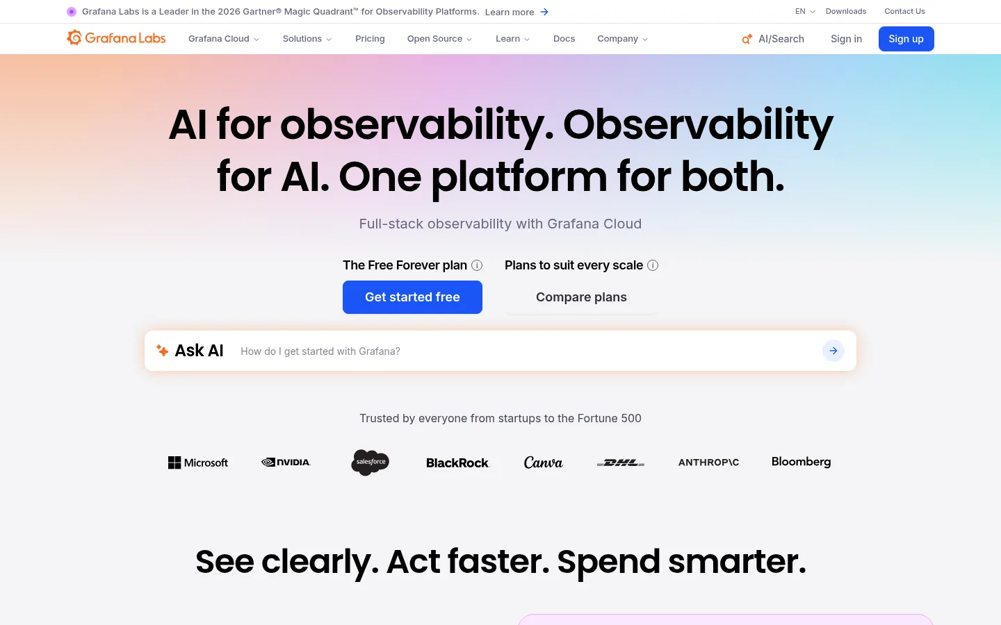
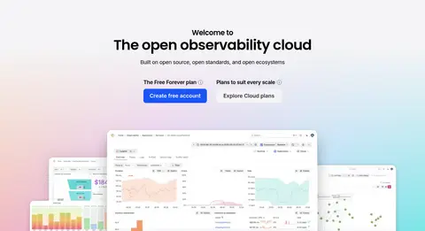
The page is built on a cool, near-white canvas (#f4f4f6), with black headings and muted grey copy keeping the long homepage calm and legible. Signal Blue (#1b55f5) is reserved for primary actions and links, so it reads as a clear interaction cue rather than a decorative wash. Soft pastel gradients—peach, lilac, pale blue and teal—appear behind the hero and final product-led CTA; they frame the content instead of replacing the neutral base. Poppins gives large headings a rounded, confident editorial character, while Inter handles navigation, body text, labels and controls. The layout alternates centered statements with left-aligned feature splits, product UI, customer proof and dense link groups. Generous gaps between major blocks are balanced by compact navigation and footer columns. Cards mostly rely on pale surfaces, hairline borders and rounded corners; dark product screenshots supply contrast and technical detail without turning the site into a dark theme.
Navigation, body copy, captions, links, buttons, and form controls.
Aa 设计
Poppins
网络字体 · 字重 600 / 500 · 占比 20%
免费替代:Plus Jakarta Sans
Display and page headings, including hero and section titles.
角色
示例
字号
字重
行高
字距
特大标题
Oversized lead statements and prominent page-level display headings.
Grafana Labs
60px
600
1.25
-0.025em
一级标题
Primary hero heading and major page titles.
Grafana Labs
48px
600
1.13
-0.025em
二级标题
Main feature-section and CTA headings.
Grafana Labs
36px
600
1.13
0
三级标题
Subsection headings and emphasized feature titles.
Grafana Labs
30px
600
1.25
-0.025em
四级标题
Smaller card and editorial headings.
The quick brown fox 敏捷的狐狸
24px
500
1.25
-0.025em
正文
Feature descriptions, explanatory copy, and general paragraph text.
The quick brown fox 敏捷的狐狸
16px
400
1.5
0
辅助文字
Supporting labels, small explanatory notes, and metadata.
The quick brown fox 敏捷的狐狸
14px
500
1.38
0
按钮
Primary and secondary action labels.
The quick brown fox 敏捷的狐狸
13px
500
1.5
-0.01em
导航
Header navigation and compact utility links.
The quick brown fox 敏捷的狐狸
13px
500
1.5
-0.01em
链接
Inline and standalone text links, often blue when interactive.
The quick brown fox 敏捷的狐狸
14px
600
1.43
0
间距与布局
基准单位 4px · 密度:适中
64px版块间距
12px元素间距
—卡片内边距
1248px内容最大宽度
2px
4px
8px
10px
12px
16px
20px
24px
32px
48px
64px
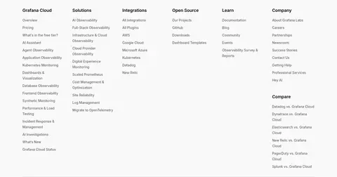
Use a centered content frame with a measured page maximum width of 1248px, broad section breathing room, and a comfortable density. The top hero is centered; feature stories switch to aligned split rows, while product, customer, and editorial blocks mix centered introductions with multi-column content. The products area becomes a denser four-column card grid, and the footer uses compact link columns. Keep repeated section spacing generous and internal gaps more compact.
圆角与层次
按钮 · 8px
输入框 · 8px
卡片 · 24px
图片 · 12px
导航 · 4px
链接 · 8px
sm · other
hairline · link, button, nav
sm · other
hairline · button
The page is mostly flat: use subtle borders and white or tinted surfaces to distinguish cards rather than heavy shadows. Rounded cards and screenshot frames add grouping, while light, restrained elevation appears on select interface elements. Preserve clear contrast between the pale canvas, white panels, and dark product imagery.
组件
下面的预览按实测的按钮、输入框、徽标、卡片样式重建(字体用替代字体)。
Primary CTA
Signal Blue (#1b55f5) button with white text and an 8px radius; use for high-intent actions such as starting free.
Announcement strip
Slim top-line announcement with small copy, a learn-more link, and minimal chrome.
Feature split
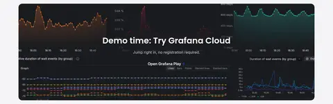
Alternate short copy and blue text links with dark product screenshots in a two-sided story layout.
Integration field
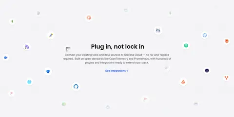
Centered open-standards message surrounded by small integration marks with ample breathing room.
Product card grid
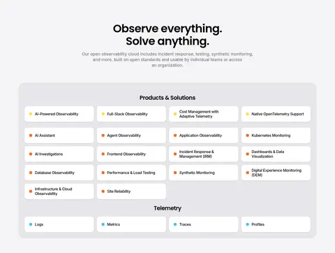
Grouped product and telemetry links in compact white cards within a pale bordered container.
Editorial feature card
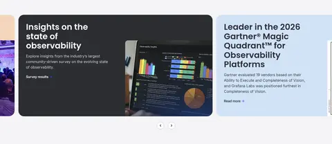
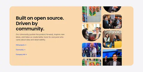
Large rounded image-and-copy panel using dark graphite or warm peach surfaces for contrast.
Newsletter form
White email input and blue Subscribe action, paired with concise supporting copy.
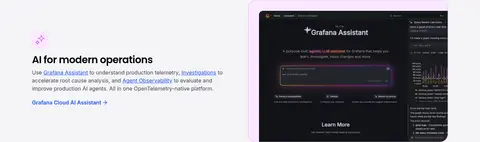
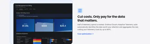
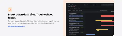
Imagery · Use authentic product-interface screenshots as the primary evidence: dark dashboards and application views sit inside rounded, lightly bordered frames against the pale page. Combine these with customer and community photography, partner and certification logos, and small integration marks. Pastel gradients create atmospheric backdrops, while screenshots remain crisp and legible. Avoid treating the gradient as a substitute for product content.
Use Cloud Canvas (#f4f4f6) as the dominant page background.
Reserve Signal Blue (#1b55f5) for actions and meaningful links.
Set prominent headings in Poppins and supporting UI in Inter.
Alternate centered introductions with aligned product and feature layouts.
Show product screens clearly inside lightly framed rounded containers.
Use pastel gradients as soft backdrops, not as loud content surfaces.
✕ 不该做
Do not turn the full page into a dark theme.
Do not use blue as a large decorative background field.
Do not crowd major sections together.
Do not add heavy shadows to ordinary cards.
Do not let screenshots overwhelm their adjacent explanatory copy.
Do not use gradients in place of real product evidence.
给 AI 的提示词
想快速出一个同风格的新页面,把这段话连同 DESIGN.md 一起发给 AI。
Build a new Grafana Labs-style SaaS page with a calm Cloud Canvas (#f4f4f6) foundation, True Ink (#000000) headings, and Slate Copy (#454554) supporting text. Use Signal Blue (#1b55f5) selectively for primary buttons and links, with white button text. Set display and section headings in Poppins; use Inter for navigation, body copy, labels, and forms. Compose spacious sections that alternate centered statements with split feature rows and compact card grids. Use crisp dark product screenshots in rounded, lightly bordered frames. Add soft pastel gradient washes using Pastel Coral (#f7bfa3), Soft Lilac (#e6b3e6), Pale Sky (#a3d8f7), and Quiet Aqua (#7be7e7) only behind key narrative moments. Prefer hairline borders over strong shadows, and keep the footer dense but orderly.