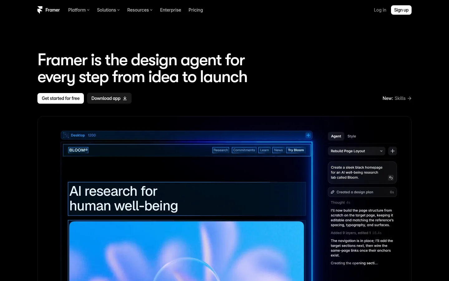
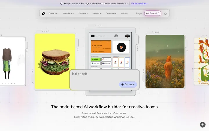
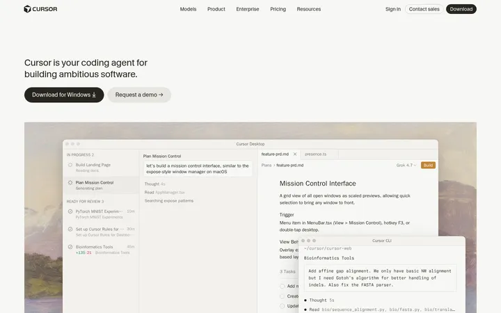
Framer 首页以近乎纯黑的画布、醒目的白色字体和明亮蓝色界面光效,呈现 AI 设计产品。充足留白让产品演示和分段标题成为视觉重点。
North star · Keep the site nearly black and quiet, reserving bright white and electric blue for hierarchy, actions, and product-interface glow.
The page is anchored by pure black (#000000), creating a continuous, low-distraction canvas from navigation through the long-form product story. White (#ffffff) headings are crisp and prominent, while muted gray text supports navigation, captions, and secondary copy without competing for attention. Saturated blue is used selectively: #0066ff appears as a CTA accent, and #0099ff defines luminous interface edges and fine borders. Dark gray surfaces separate product cards and interface mockups subtly rather than forming bright section bands. Large, rounded product visuals introduce much of the page’s color through electric-blue glows; treat these as imagery effects, not as a reason to tint the overall background. Display headings use GT Walsheim Medium with tight tracking, paired with compact Inter body and navigation text. A centered, constrained content area, broad vertical pauses, and dark media panels create a restrained rhythm across the page.
Major section headings throughout the product story.
Framer
44px
500
1.1
-0.04em
正文
Supporting product descriptions and explanatory copy.
The quick brown fox 敏捷的狐狸
18px
400
1.35
-0.011em
辅助文字
Small labels and secondary interface descriptions.
The quick brown fox 敏捷的狐狸
14px
400
1.4
-0.007em
导航
Top navigation and compact menu text.
The quick brown fox 敏捷的狐狸
14px
400
1.4
-0.007em
链接
Small links and low-emphasis calls to action.
The quick brown fox 敏捷的狐狸
12px
500
1.3
0
代码
Code-like labels and technical interface details.
const style = 1;
12px
400
1.33
0
间距与布局
基准单位 1px · 密度:紧凑
40px版块间距
10px元素间距
30px卡片内边距
1200px内容最大宽度
1px
3px
4px
5px
6px
8px
10px
15px
20px
25px
30px
40px
Use a centered, constrained content column within the wide desktop canvas; the measured maximum width is 1200px. The hero is left aligned, while the closing idea-start section centers its heading and visual. Long-form sections stack with generous vertical pauses, and product showcases occupy broad dark panels. Keep controls and small labels compact. The page feels spacious overall despite dense interface content inside its mockups.
圆角与层次
按钮 · 8px
卡片 · 20px
图片 · 8px
导航 · 8px
链接 · 18px
sm · other, button
hairline · other
hairline · other
sm · other
The page relies more on contrast and subtle hairlines than on visible card shadows. Dark surfaces sit only slightly above the black canvas, with rounded media and card corners. Fine blue borders and interface glow create focused depth around product visuals; avoid elevating every content block.
组件
下面的预览按实测的按钮、输入框、徽标、卡片样式重建(字体用替代字体)。
Top navigation
Compact horizontal navigation on the black canvas, with small muted links, a white signup button, and restrained spacing.
Hero headline
Large white, left-aligned display heading above concise actions and a broad product demonstration.
Primary CTA
High-contrast light signup action with dark text, rounded corners, and a secondary dark download action nearby.
Product showcase
Wide dark product panel with rounded framing; use restrained borders and luminous blue interface details within the media.
Feature section
Short white heading followed by dark interface previews and product-led content rather than decorative section backgrounds.
Closing CTA
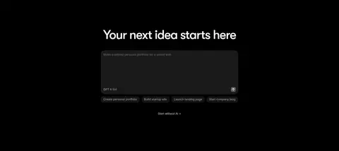
Centered heading and compact signup action above a dramatic blue-glowing editor interface visual.
Imagery · Product-interface imagery is the visual centerpiece: dark canvas previews, editor panels, templates, and CMS screens are framed within rounded, near-black panels. Electric-blue outlines and soft blue glows make selected UI details luminous against the black page. Screenshots and interface mockups dominate; preserve their dark treatment and let any brighter colors remain contained within the product visuals.
Keep the page canvas black and visually continuous.
Use white display headings with tight tracking.
Reserve blue glow for product-interface imagery and focused accents.
Build broad product previews on dark, subtly rounded panels.
Use muted gray for secondary navigation and explanatory text.
Leave generous vertical breathing room between major sections.
✕ 不该做
Do not turn the page into a light or brightly banded layout.
Do not apply blue glow to every card or section.
Do not make secondary copy compete with the main headings.
Do not introduce unmeasured colors as brand accents.
Do not crowd the page with decorative borders or heavy shadows.
Do not treat mockup colors as the global site palette.
给 AI 的提示词
想快速出一个同风格的新页面,把这段话连同 DESIGN.md 一起发给 AI。
Build a new Framer-style page on a continuous #000000 canvas. Use white #ffffff for confident, tightly tracked display headings and #999999 or #cccccc for restrained supporting text. Choose a geometric sans-serif display face close to GT Walsheim Medium and Inter for body copy and navigation. Keep content centered within a constrained desktop column, but allow hero copy to align left and use large product panels to tell the story. Render interface previews on subtle #111111 or #171717 surfaces with rounded corners; reserve #0099ff and #0066ff for focused blue borders, actions, and product-demo glow. Maintain generous vertical pauses between sections, compact controls, quiet hairlines, and minimal elevation. Keep bright effects inside product visuals rather than washing the whole page in color.