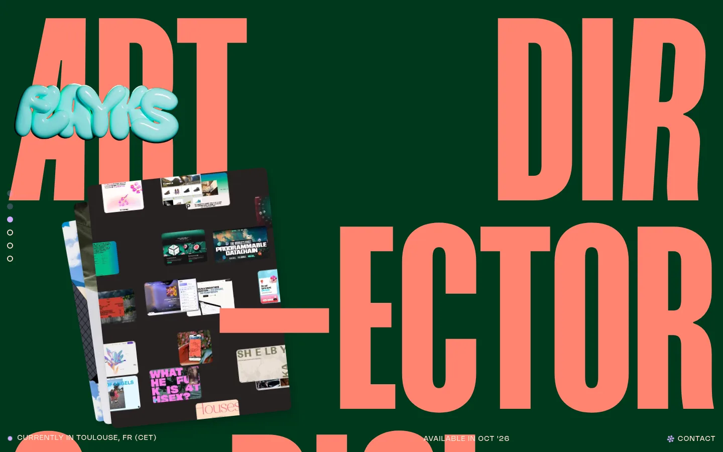
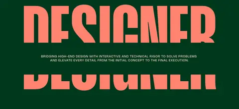
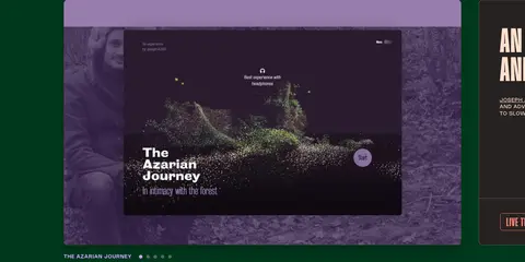
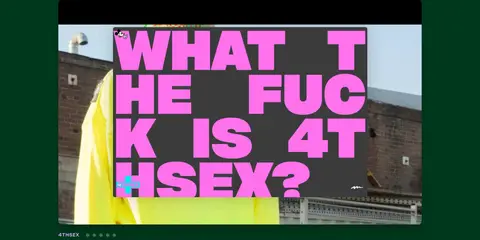
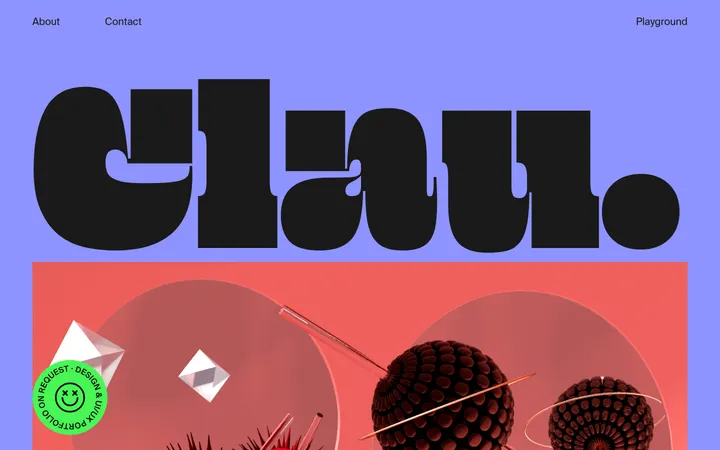
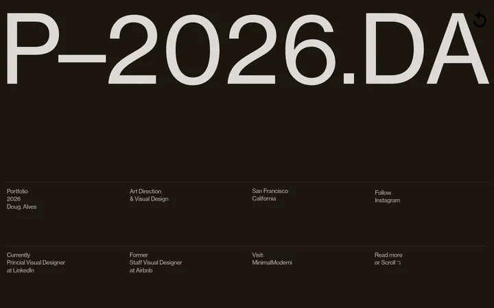
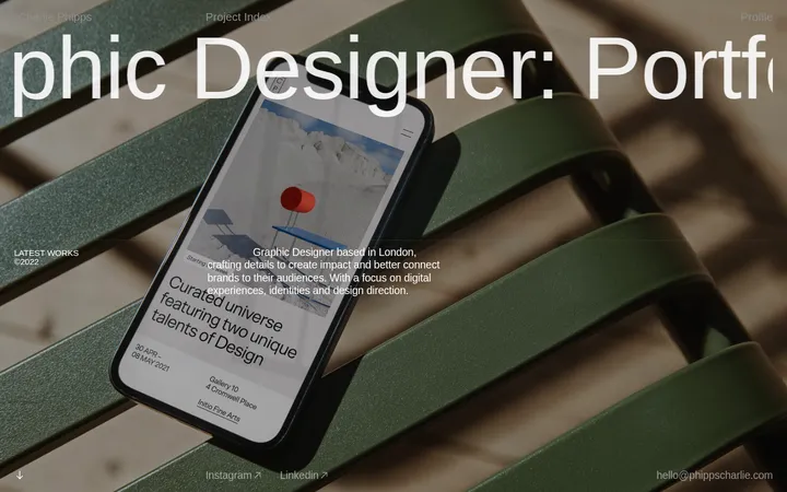
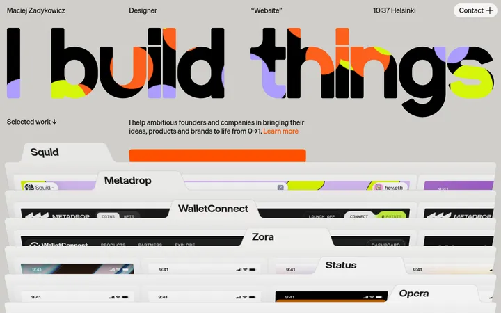
North star · Let oversized coral typography command the deep green canvas, while project media remains the page’s changing visual counterpoint.
The page is built around a nearly uninterrupted deep green field (#00381c), which makes the coral display lettering (#ff8370) the immediate focal point. Warm peach (#ffe0ce) carries most utility and descriptive text, while lavender (#d1adff) highlights select navigation and calls to explore. Mango Grotesque supplies very large, tightly composed uppercase display headlines; Nohemi handles small uppercase labels, navigation, and copy. The layout treats the opening typography almost as a poster, with oversized words extending across the viewport and project imagery layered into the composition. Below, a spacious sequence of portfolio entries alternates broad media previews with compact dark information panels, preserving a consistent rhythm rather than using a dense conventional grid. Project imagery brings its own varied colors, so keep those hues within the media rather than promoting them to global interface colors. Thin warm borders, restrained rounded corners, and subtle shadows separate interactive elements from the otherwise flat canvas.
配色
点色块复制色值。用途说明来自对页面的实测位置(背景、文字、描边、按钮)与截图判读。
品牌色
强调色
表层色
中性色
功能色
页面底色 · Soft Charcoal表层 · Forest Canvas表层 2 · Slate Panel表层 3 · Pure Black表层 4 · Stone Gray主文字 · Warm Parchment描边 · Muted Umber强调 · Signal Coral强调 2 · Dusty Lilac强调 3 · Lilac Signal
文字
背景
对比度
WCAG
#ffe0ce Warm Parchment
#272221 Soft Charcoal
12.57:1
AAA
#ffe0ce Warm Parchment
#00381c Forest Canvas
10.62:1
AAA
#ffe0ce Warm Parchment
#2c2f34 Slate Panel
10.75:1
AAA
#ffe0ce Warm Parchment
#000000 Pure Black
16.81:1
AAA
#ff8370 Signal Coral
#272221 Soft Charcoal
6.53:1
AA
#ff8370 Signal Coral
#00381c Forest Canvas
5.52:1
AA
字体
字号阶梯:Custom(比例约 2.059,正文 14px)。示例用免费替代字体渲染,数值为实测。
Aa 设计
Nohemi
网络字体 · 字重 400 / 600 · 占比 86%
免费替代:Space Grotesk
Body copy, navigation, location labels, project details, and links.
Aa 设计
Mango Grotesque
网络字体 · 字重 700 / 500 · 占比 13%
免费替代:Bebas Neue
Hero and section display headlines, project headings, and large outlined CTA text.
角色
示例
字号
字重
行高
字距
特大标题
Monumental uppercase lettering framing the opening and oversized section moments.
Flayks
518.5px
700
1
0
一级标题
Primary portfolio and section headlines, set in large uppercase display type.
Flayks
93.5px
700
0.85
0.015em
二级标题
Project names and major portfolio section headings.
Flayks
48px
700
1
0.02em
三级标题
Secondary project titles or prominent short statements.
Flayks
40px
500
0.85
0.025em
四级标题
Compact project-card headings and small emphatic labels.
Flayks
32px
700
0.85
0.025em
正文
Uppercase designer introduction, project descriptions, and supporting copy.
The quick brown fox 敏捷的狐狸
14px
400
1.35
0.1em
辅助文字
Small media captions, project identifiers, and secondary notes.
The quick brown fox 敏捷的狐狸
13.5px
400
normal
0
链接
Uppercase utility links and project actions; selected discovery link uses lavender.
The quick brown fox 敏捷的狐狸
14px
400
1.35
0.1em
眉题
Small uppercase location, availability, and section-context labels.
The quick brown fox 敏捷的狐狸
14px
400
1.35
0.1em
间距与布局
基准单位 2px · 密度:宽松
72px版块间距
48px元素间距
—卡片内边距
1090px内容最大宽度
3px
4px
6px
8px
10px
14px
16px
20px
29px
36px
48px
58px
64px
72px
79px
The opening uses expansive poster-like typography arranged across the viewport, with media layered into the letterforms and small utility labels near the edges. A measured max width of 1090px anchors the content while project showcases create broad media-and-description pairings. The page remains spacious, with a measured 72px section gap and 48px element gap. Project order is vertical and consistent, with varied column counts inside media groups; oversized headings and irregular alignment keep the sequence from feeling like a standard card grid.
圆角与层次
按钮 · 6px
卡片 · 10px
图片 · 10px
徽标 · 50%
导航 · 50%
xl · card
xl · card
md · card
inset · card
The green page field stays largely flat, while media and project cards receive restrained separation through soft shadows and rounded corners. Thin warm-brown borders outline some interactive buttons and card edges. Selected media or card treatments use inset highlights; avoid turning the whole interface into a stack of elevated panels.
组件
下面的预览按实测的按钮、输入框、徽标、卡片样式重建(字体用替代字体)。
Poster-like hero
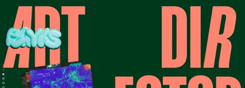
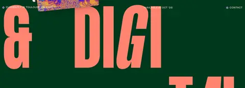
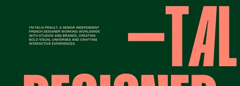
Oversized coral uppercase display words dominate a full green canvas, with portfolio imagery layered across the typography and tiny utility labels at the edges.
Project media preview
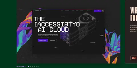
Broad, rounded project screenshots or video frames retain their own source colors and sit beside compact descriptions and controls.
Project information panel
Dark charcoal content surface pairs a large uppercase project title with concise uppercase copy and an outlined coral visit button.
Outlined project CTA
Transparent background, coral text and 1px coral border, 6px radius, uppercase Mango Grotesque styling.
Utility navigation
Small uppercase Nohemi links in peach or lavender, kept visually quiet against the continuous green background.
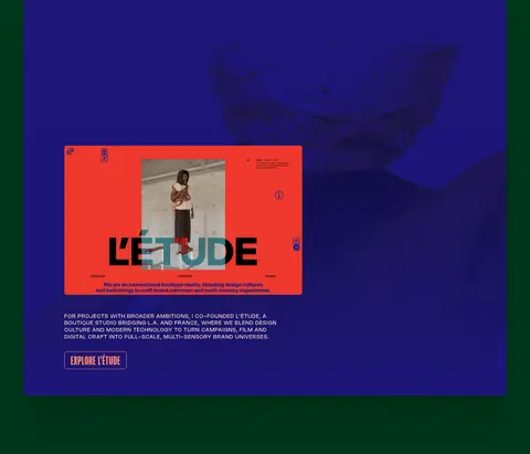
Studio feature block
Large blue-toned media area pairs an embedded studio image with compact supporting copy and an outlined action.
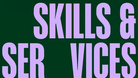
Skills display
Oversized lilac uppercase Mango Grotesque heading stretches across the page as a strong closing section treatment.
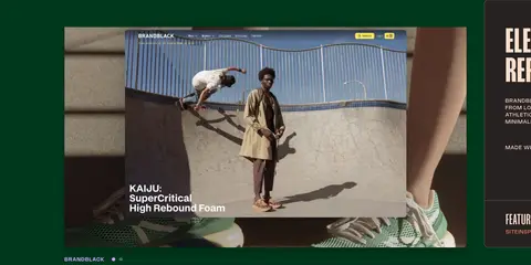
Imagery · Project previews mix website screenshots, video frames, photography, motion, and occasional illustration. Media appears as wide rounded rectangles with the original project’s colors intact, including vivid purples, blues, and warm photographic tones. The opening uses layered portfolio mockups as a collage over the headline. Keep imagery richly visible and framed as project work rather than applying a uniform tint or filter.
Use #00381c as the dominant uninterrupted page canvas.
Set the biggest headlines in uppercase Mango Grotesque or a close condensed substitute.
Use #ff8370 for display type and the outlined project CTA.
Reserve #ffe0ce for legible supporting text and utility labels.
Let project media keep its own vivid color palette.
Keep small navigation and copy visually secondary to the typography.
Use spacious section rhythm and restrained card elevation.
✕ 不该做
Do not replace the green canvas with a generic black theme.
Do not use lavender as the primary headline color across the page.
Do not normalize the hero into a conventional centered banner.
Do not apply one global color filter to all project previews.
Do not fill the page with uniformly elevated cards.
Do not use small, tightly packed body text.
Do not introduce extra palette colors as recurring UI colors.
给 AI 的提示词
想快速出一个同风格的新页面,把这段话连同 DESIGN.md 一起发给 AI。
Build a new portfolio page in the Flayks visual style. Use Forest Canvas (#00381c) as the continuous background, Signal Coral (#ff8370) for oversized uppercase display typography and outlined actions, and Warm Parchment (#ffe0ce) for readable supporting copy. Use Lilac Signal (#d1adff) sparingly for selected links or a standout section title. Pair a condensed, bold display face with a clean sans-serif for small uppercase labels. Compose the hero like a typographic poster, layering project media across the words rather than centering a standard banner. Follow with spacious, vertically paced project showcases pairing wide rounded media previews with concise dark information panels. Preserve the distinct color and texture of each project’s imagery. Keep borders fine, shadows soft, and the overall canvas visually flat.