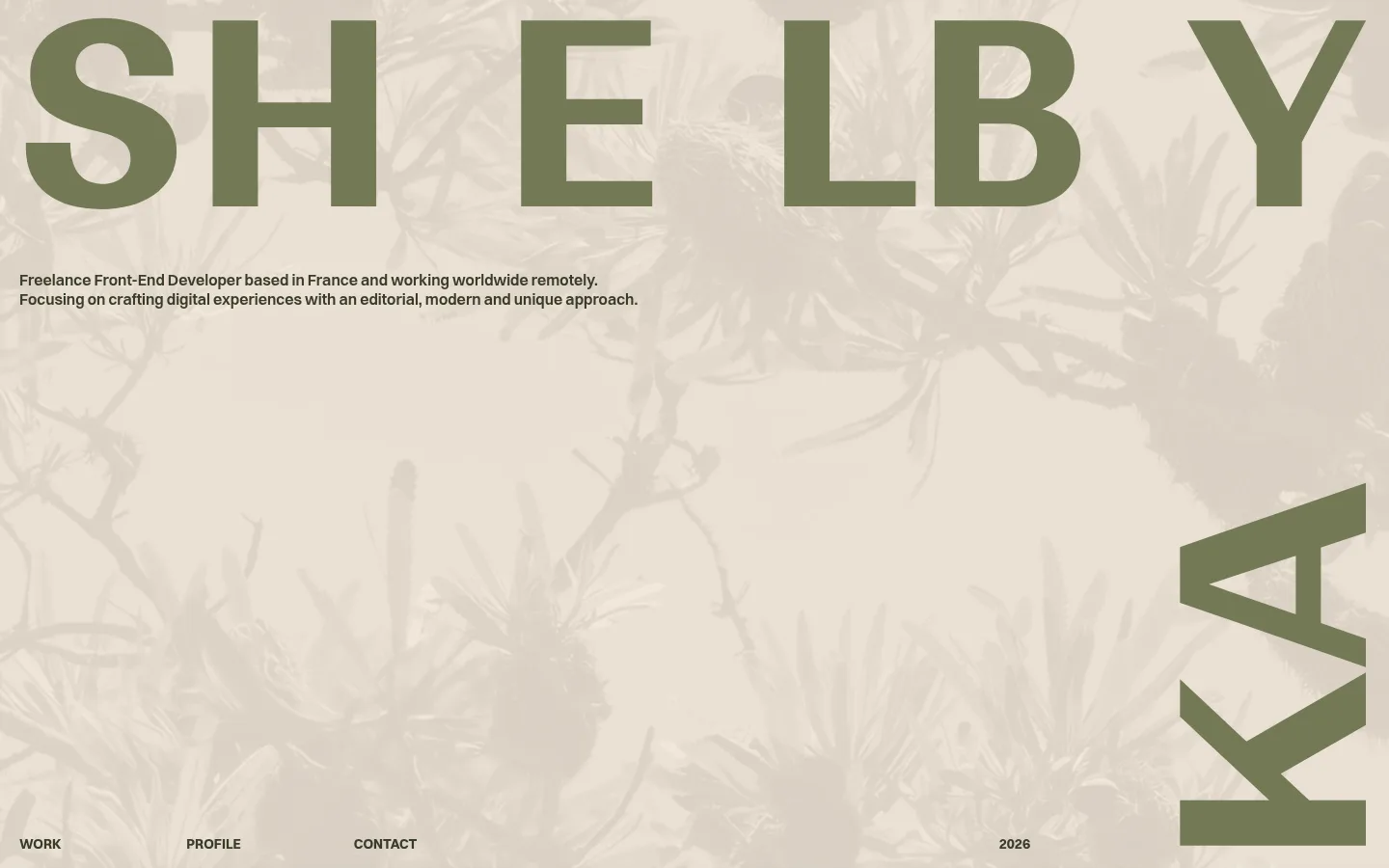
Shelby Kay 的作品集以超大编辑风格字体搭配温暖柔和的底色,并集中展示大量网页项目。页面从留白充足的姓名主视觉,过渡到密集作品画廊和简洁的个人介绍。
North star · Let oversized olive typography and warm paper tones frame the work, while project imagery supplies the colour.
The page is built around a warm paper-like canvas (#efe6d9) and dark olive ink (#393c2a), with muted taupe, sand, and sage tones used as occasional section surfaces. The palette feels deliberately subdued; the vivid colours in the long project archive belong to individual site thumbnails, not the portfolio’s core identity. Ranade supplies oversized uppercase display typography, creating a bold, almost poster-like name treatment. Switzer handles compact navigation, descriptions, and metadata with a practical, readable texture. Layout shifts from a sparse hero with enormous lettering and a small introduction to a tightly packed multi-column project archive, then opens into a widely spaced profile area. A faint botanical image texture softens the hero without competing with the typography. Overall, the visual strategy balances expressive scale with small, orderly project labels and a restrained editorial rhythm.
Primary uppercase page or section title treatment.
Shelby Kay
158.5px
700
1
0
二级标题
Large uppercase headings introducing major sections.
Shelby Kay
83px
700
1
0
三级标题
Compact uppercase subsection headings.
The quick brown fox 敏捷的狐狸
24px
700
1.2
0
正文
Short introduction and profile information.
The quick brown fox 敏捷的狐狸
14px
500
1.2
0
辅助文字
Tiny uppercase project metadata and labels.
The quick brown fox 敏捷的狐狸
10px
500
1.2
0
导航
Compact primary navigation links.
The quick brown fox 敏捷的狐狸
14px
600
1.3
0
链接
Project titles and inline navigation links.
The quick brown fox 敏捷的狐狸
14px
500
1.2
0
间距与布局
基准单位 1px · 密度:紧凑
40px版块间距
8px元素间距
—卡片内边距
—内容最大宽度
7px
8px
12px
20px
The hero spans the viewport, placing oversized lettering across the top, a short introduction below it, and navigation along the bottom edge; a rotated name fragment anchors the right side. The work section becomes a dense four-column thumbnail archive with small labels and generous outer breathing room. Profile content is widely distributed across the canvas rather than enclosed in cards. Keep alignment deliberately asymmetrical and section transitions calm; measured spacing uses a compact 8px element gap and a 40px section gap.
圆角与层次
没有测到阴影:页面是扁平的,层次靠底色和描边区分。
The page reads as flat and print-like, with no measured shadow system or rounded-corner language. Project previews are separated through their own thumbnail frames and surrounding canvas, not floating card elevation. Keep surfaces and sections flush, using colour changes and whitespace instead of decorative borders or layered UI effects.
组件
下面的预览按实测的按钮、输入框、徽标、卡片样式重建(字体用替代字体)。
Oversized hero wordmark
Run the name in huge uppercase Ranade over the warm canvas, with olive lettering and a cropped, rotated name element at the right edge.
Hero introduction
A short, left-aligned two-line description in compact Switzer sits beneath the display name.
Bottom-edge navigation
Small bold uppercase links for Work, Profile, and Contact sit along the hero’s lower edge, with the year separated toward the right.
Project archive
A dense four-column gallery of small website previews, each paired with tiny project metadata; thumbnail colours vary by project.
Profile details
A spacious profile block combines a muted portrait with compact skill, values, and recognition lists.
Text links
Use plain, unboxed dark-olive links with no measured border, radius, or shadow treatment.
Imagery · A low-contrast botanical texture sits behind the hero lettering, reading as a soft photographic or image-based wash. The portfolio gallery is the main imagery: many small, framed website previews with varied palettes, layouts, and subject matter. A single portrait appears in the profile section with a muted olive treatment. Preserve the thumbnails’ variety without letting them redefine the site palette.
该做与不该做
✓ 该做
Use Warm Paper (#efe6d9) as the dominant canvas.
Set primary type in Olive Ink (#393c2a).
Use Ranade for bold, uppercase display moments.
Keep body copy compact and straightforward in Switzer.
Let project thumbnails retain their individual colour palettes.
Balance dense gallery content with generous section-level breathing room.
✕ 不该做
Do not turn the muted palette into a saturated interface theme.
Do not apply a single accent colour across every project thumbnail.
Do not put the whole portfolio into rounded or elevated cards.
Do not add heavy borders or drop shadows.
Do not make the hero introduction compete with the display lettering.
Do not force the asymmetric layout into a uniform centered template.
给 AI 的提示词
想快速出一个同风格的新页面,把这段话连同 DESIGN.md 一起发给 AI。
Build a portfolio page in this editorial, warm-toned style. Use Warm Paper (#efe6d9) for the main canvas and Olive Ink (#393c2a) for display lettering, body text, and links. Keep Dusty Taupe (#afa199), Soft Putty (#d2cabf), Sandstone (#d6b292), and Sage Slate (#7b8785) as restrained secondary surfaces. Use Ranade-like bold uppercase display type for a dramatic name or page title, paired with compact Switzer-like sans-serif for navigation, copy, and metadata. Compose a spacious, asymmetric hero, then a dense multi-column archive of small, varied project previews and a looser profile section. Keep the interface flat: no ornamental shadows, rounded cards, or heavy borders. Use whitespace and typography for hierarchy.