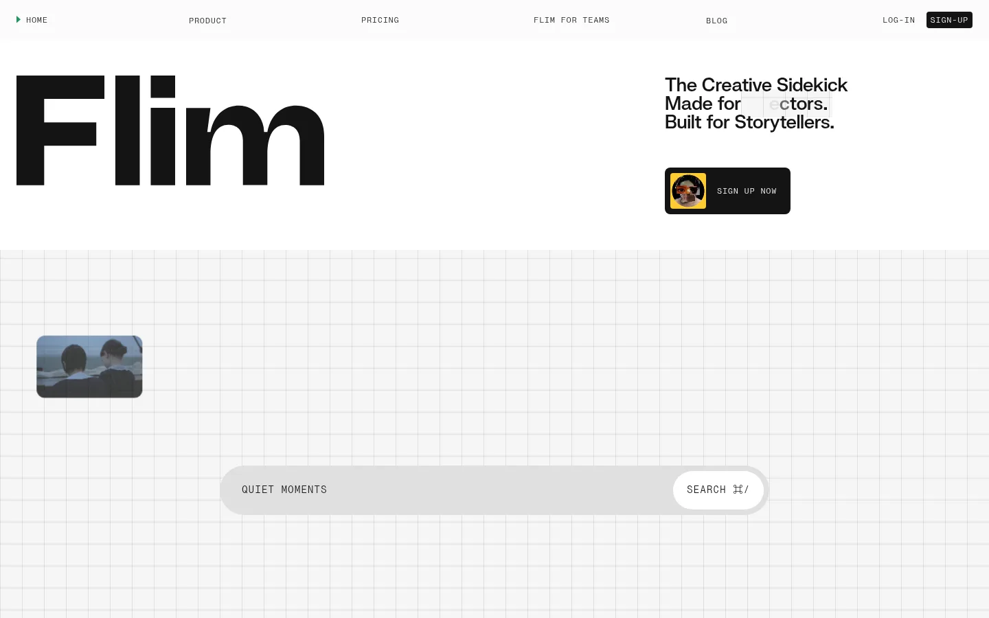
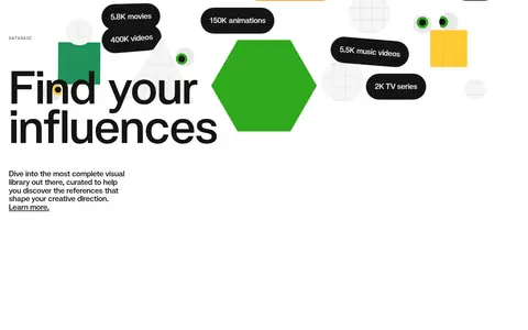
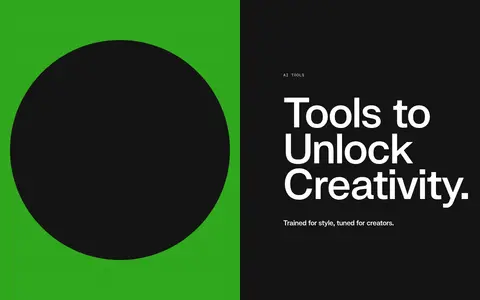
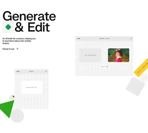
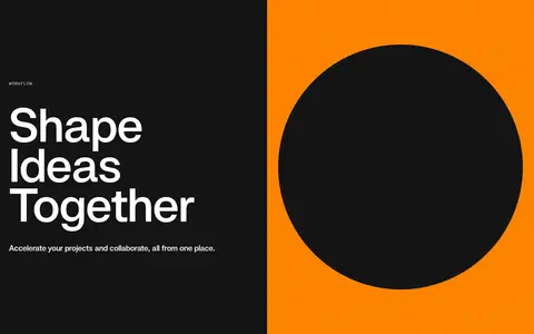
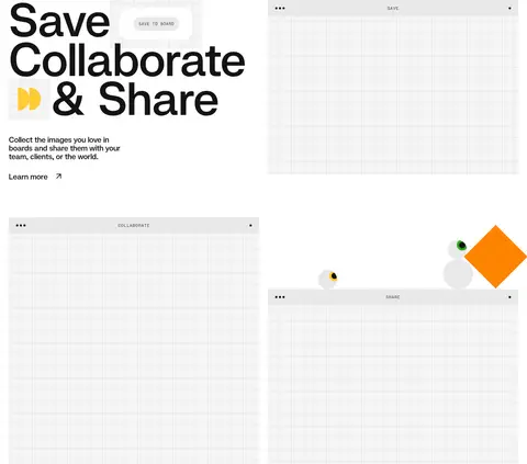
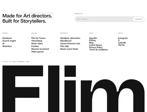
Flim 以宽松、编辑式的首页展示 AI 视觉素材搜索产品,核心视觉是电影画面与克制的黑白配色。细密网格、超大标题和少量鲜亮几何色块,让产品兼具电影感与创作工具的趣味。
North star · Keep the page predominantly white and editorial, using oversized Swizzy type, fine grid details, cinematic stills, and vivid color only as deliberate accents.
The page uses white as its main canvas, with near-black typography and occasional full-width dark bands to create a calm but deliberate editorial rhythm. Light gray panels and a subtle technical grid give product previews a workspace-like frame without competing with the film stills. Orange, green, and yellow appear sparingly as bright geometric interruptions, metric chips, or small marks; they are accents rather than a broad interface palette. Swizzy carries the large, tightly tracked display and heading styles, while PP Neue Montreal Mono sets uppercase navigation, labels, and supporting UI text. The layout alternates oversized open compositions with compact product details, split feature panels, and image-led demonstrations. Generous whitespace separates sections, while the imagery itself supplies most of the color and cinematic atmosphere. Rounded media and pill-shaped metric treatments soften the otherwise crisp, flat structure.
配色
点色块复制色值。用途说明来自对页面的实测位置(背景、文字、描边、按钮)与截图判读。
品牌色
强调色
表层色
中性色
功能色
页面底色 · Projection White表层 · Studio Mist表层 2 · Film Ink主文字 · Film Ink次要文字 · Projection White强调 · Frame Orange强调 2 · Signal Green强调 3 · Reel Yellow
Display headlines, section headings, prominent statements, and large links.
Aa 设计
PP Neue Montreal Mono
网络字体 · 字重 400 / 500 · 占比 23%
免费替代:Space Mono
Navigation, eyebrows, captions, search labels, and compact interface copy.
角色
示例
字号
字重
行高
字距
特大标题
Oversized Flim wordmark and dominant display moments.
Flim
125px
500
0.86
-0.02em
一级标题
Primary hero and major section headlines.
Flim
47px
500
1.1
-0.02em
二级标题
Feature and section-level headings.
The quick brown fox 敏捷的狐狸
27px
500
1
-0.02em
三级标题
Smaller feature titles and supporting headings.
The quick brown fox 敏捷的狐狸
20.5px
500
1.1
-0.02em
正文
Uppercase mono supporting copy and interface labels.
The quick brown fox 敏捷的狐狸
14.5px
400
1
0.06em
辅助文字
Compact metadata, section eyebrows, and small labels.
The quick brown fox 敏捷的狐狸
12px
400
1
0.06em
导航
Uppercase mono navigation items.
The quick brown fox 敏捷的狐狸
12px
400
1
0.06em
链接
Prominent Swizzy text links within feature content.
The quick brown fox 敏捷的狐狸
20.5px
500
1.1
-0.02em
眉题
Small uppercase section identifiers such as DATABASE and AI TOOLS.
The quick brown fox 敏捷的狐狸
12px
400
1
0.06em
代码
Compact mono-style interface or utility text.
const style = 1;
12px
400
1
0.06em
间距与布局
基准单位 4px · 密度:宽松
98px版块间距
24px元素间距
24px卡片内边距
1392px内容最大宽度
2px
4px
5px
6px
8px
9px
10px
12px
16px
20px
24px
25px
30px
32px
52px
100px
Use a spacious, fluid editorial composition within the measured 1392px page maximum. The measured layout uses a 4px base unit, a 98px section gap, and a 24px element gap; preserve the generous rhythm rather than filling every area. The hero places an enormous wordmark opposite concise copy and a compact signup CTA. Later sections alternate full-width dark split bands, open white feature areas, and multi-column content. Align headings to the start, let product imagery occupy broad areas, and keep navigation and labels visually light.
圆角与层次
按钮 · 4px
卡片 · 9999px
图片 · 16px
导航 · 4px
没有测到阴影:页面是扁平的,层次靠底色和描边区分。
The visual language is predominantly flat: rely on white space, background shifts, and thin grid lines rather than drop shadows. Separate white and dark sections with clean, hard transitions. Layer film frames and preview panels over the grid only where needed to suggest a working canvas; use rounded media and restrained pills for softer details.
组件
下面的预览按实测的按钮、输入框、徽标、卡片样式重建(字体用替代字体)。
Top navigation
Light, low-profile navigation with uppercase tracked mono labels, widely distributed links, and a compact dark signup control.
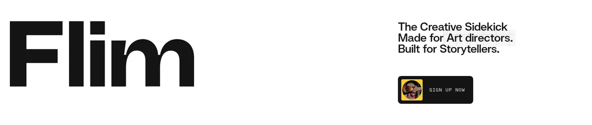
Hero wordmark
Oversized near-black Flim lettering anchors the white hero, balanced by a concise stacked proposition and dark signup CTA.
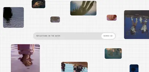
Search canvas
Pale fine-grid workspace with floating cinematic stills and a long pill-like search field; keep the search action visually distinct.
Metric chips
Large rounded statistic pills use dark ink or Frame Orange (#ff8400) with white text for library counts.
Feature bands
Full-width split panels pair a near-black (#141414) text field with a vivid orange or green geometric image field.
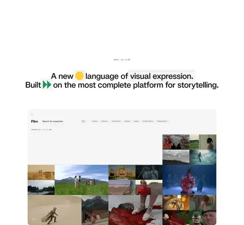
Product preview
Light, grid-backed board or search interface imagery sits within otherwise open white feature sections.
Footer and newsletter
A spacious multi-column footer combines a short brand statement, compact link groups, newsletter input, and an oversized wordmark.
Imagery · Use cinematic film and series stills as the main source of visual richness, presented in scattered floating frames or dense search-result mosaics. Product previews show pale grid-based workspaces and image boards, with restrained interface chrome. Add simple geometric shapes in vivid brand accents as deliberate graphic motifs. Keep image frames soft-cornered and let the imagery retain its natural colors.
Set large headlines in Swizzy or a close geometric sans.
Reserve the mono face for navigation, labels, and metadata.
Use #141414 for primary text and dark CTA surfaces.
Add fine grid lines to product-preview canvases.
Use orange, green, and yellow as selective graphic accents.
Preserve generous whitespace between major sections.
✕ 不该做
Do not fill the page with accent colors.
Do not use heavy shadows to create depth.
Do not make navigation large or visually dominant.
Do not crowd headings, imagery, and supporting copy together.
Do not present film stills as generic stock photography.
Do not apply uppercase mono styling to prominent headlines.
Do not add decorative gradients without a measured visual purpose.
给 AI 的提示词
想快速出一个同风格的新页面,把这段话连同 DESIGN.md 一起发给 AI。
Build a new page in Flim’s editorial visual language. Use #ffffff Projection White as the primary canvas and #141414 Film Ink for headlines, navigation, and CTA surfaces. Set expressive, tightly tracked headlines in Swizzy or Manrope; use a tracked uppercase mono such as Space Mono for navigation, eyebrows, captions, and utility copy. Keep the composition spacious, with broad open sections, clean alignment, and fine grid details behind product previews. Feature cinematic stills in rounded frames or board-like mosaics. Introduce #ff8400 Frame Orange, #30a81d Signal Green, and #fecc33 Reel Yellow only as occasional geometric or metric accents. Alternate white content areas with confident full-width dark bands. Favor flat surfaces and crisp boundaries over shadows, and make the product imagery—not ornamental UI—the main source of visual texture.