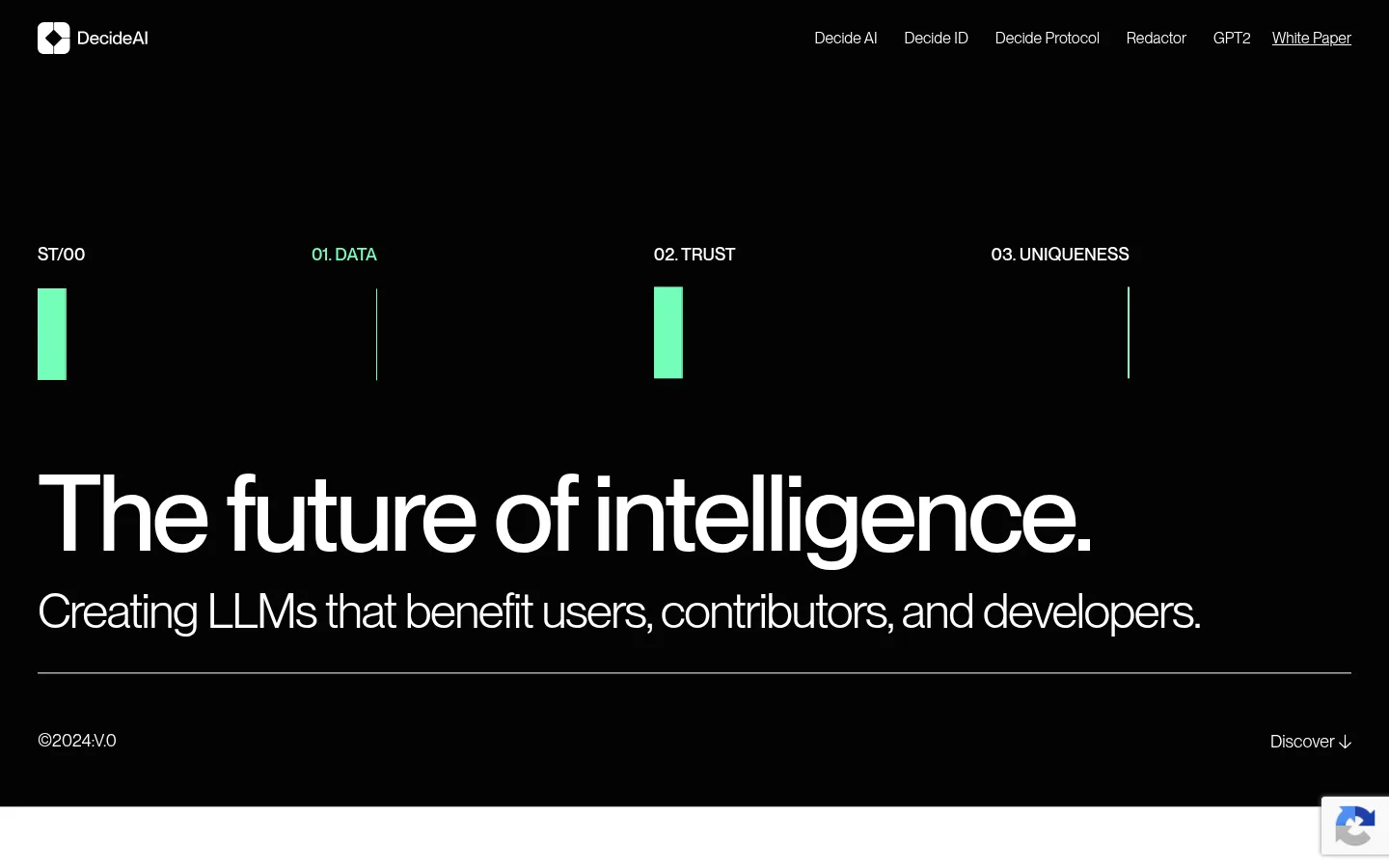
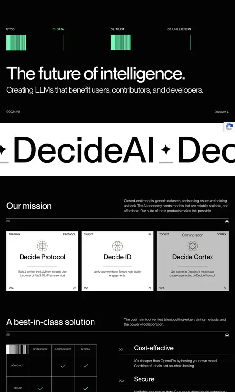
Decide AI 以近黑色画布和超大白色字体为主,用克制的薄荷绿标记突出关键信息。产品卡片、技术网格图形与高对比白色页脚,为长页建立清晰而有节奏的层次。
North star · Let oversized white type lead on a near-black canvas, and use mint only as a precise technical signal.
The visual identity is built on a near-black canvas (#030303) with white typography and large, sharply contrasting white bands. The mint green (#73ffb9) is a rare signal, reserved for hero indicators and small technical marks rather than broad fills. A neutral gray card (#c1c1c1) differentiates one product tile, while the pale hairline color (#f4f6f6) appears in fine separators and interface details. PP Neue Montreal carries the full page: oversized, tightly tracked headlines sit above restrained body copy and compact uppercase labels. Layout alternates between spacious black sections, a scrolling wordmark band, compact white product cards, and dark feature panels. Fine grid lines, comparison tables, and abstract wireframe forms lend technical character without relying on photography. The footer reverses the dark palette into a broad white closing panel. Keep surfaces mostly flat, using thin rules and precise alignment to organize the dense product story.
The site-wide sans-serif for navigation, hero headlines, body copy, labels, cards, and links.
角色
示例
字号
字重
行高
字距
特大标题
Oversized hero and marquee display lettering.
Decide AI
220px
500
1
0
一级标题
Primary hero headline and major page titles.
Decide AI
110.5px
500
1
-0.036em
二级标题
Section headings, including mission and solution sections.
Decide AI
54px
500
1
0
三级标题
Feature and product-panel headings.
Decide AI
50px
400
1
-0.032em
四级标题
Emphasized subheadings within product or feature content.
Decide AI
46px
700
1
0
正文
Descriptions, supporting paragraphs, and explanatory card copy.
The quick brown fox 敏捷的狐狸
17px
400
1.27
0
辅助文字
Compact uppercase labels, indexes, and technical metadata.
The quick brown fox 敏捷的狐狸
14.5px
500
1
0
间距与布局
基准单位 4px · 密度:适中
40px版块间距
20px元素间距
14px卡片内边距
1362px内容最大宽度
1px
6px
7px
8px
12px
14px
16px
20px
32px
36px
39px
40px
48px
56px
60px
80px
Use a wide, centered content frame with the measured maximum width of 1362px. The desktop hero aligns to the left, pairing an expansive headline with a lighter supporting line; a thin rule anchors its lower edge. The long page alternates full-width visual bands with inset product and feature panels. Product cards form a three-column row, while comparison content splits into a table and numbered text. Spacious black intervals offset compact labels and dense technical detail, creating a comfortable rather than crowded rhythm.
圆角与层次
链接 · 9px
sm · other
The interface is predominantly flat, with surfaces distinguished by strong black-to-white contrast rather than shadows. Fine pale rules separate content and form the comparison-table grid. Keep cards square-edged as measured, without adding rounded treatments; the measured link radius is 9px. Maintain artwork and text on clear layers without heavy overlays.
组件
下面的预览按实测的按钮、输入框、徽标、卡片样式重建(字体用替代字体)。
Header navigation
Compact brand mark at the left and a right-aligned row of white product and resource links on the black canvas.
Hero status rail
Four numbered or labeled signals above the headline; use white labels and sparse Signal Mint (#73ffb9) bars or rules.
Hero headline
Large white, left-aligned display copy with a lighter supporting sentence and a thin pale divider below.
Product cards
Three adjacent square-edged cards for Protocol, ID, and Cortex; primarily white, with Cortex shown on Soft Alloy (#c1c1c1).
Comparison block
Fine-lined comparison table beside a numbered list of benefits; use restrained mint checks and compact supporting copy.
Technical showcase panels
Large dark feature panels with subtle grid artwork, wireframe forms, small corner labels, and underlined action links.
White footer band
High-contrast white closing surface with a black brand mark, oversized wordmark treatment, navigation, and social links.
Imagery · Avoid conventional lifestyle photography. The page uses abstract technical visuals: fine grid fields, wireframe spherical forms, comparison marks, and oversized scrolling wordmarks. Keep graphics monochrome and low-contrast against black, with occasional mint details; frame artwork inside broad dark panels. Product tiles are clean typographic compositions with small diagram-like emblems rather than image-led cards.
Alternate dark sections with deliberate white bands.
✕ 不该做
Do not introduce broad saturated color fields.
Do not use lifestyle photography as the main visual.
Do not add heavy shadows or glossy gradients.
Do not round every card or panel.
Do not crowd the hero with supporting elements.
Do not use mint as a large-area background.
给 AI 的提示词
想快速出一个同风格的新页面,把这段话连同 DESIGN.md 一起发给 AI。
Build a new AI product page in Decide AI’s visual style. Use Obsidian Canvas (#030303) for the primary background, Gallery White (#ffffff) for headline and body contrast, and Signal Mint (#73ffb9) only for sparse technical indicators. Use Soft Alloy (#c1c1c1) for a secondary product surface and Pale Trace (#f4f6f6) for subtle rules. Set type in PP Neue Montreal or a close sans-serif substitute, with oversized, tightly tracked headings, restrained body copy, and uppercase micro-labels. Create a wide, left-aligned hero, then alternate open dark sections with product cards, comparison content, and grid-based technical artwork. Keep panels flat and square-edged. Finish with a broad white footer. Favor abstract wireframes and precise alignment over photography.