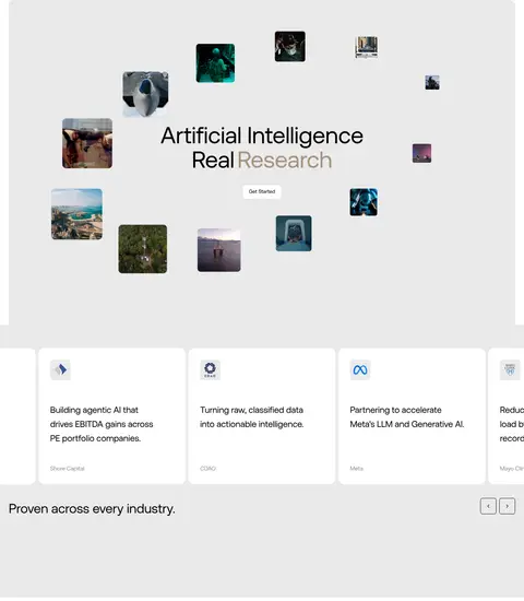
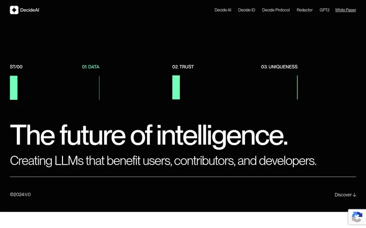
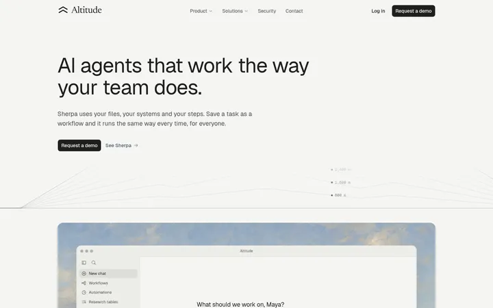
Scale AI 以克制的黑白界面搭配电影感影像和宽松有力的字体,塑造可靠、专业的品牌气质。首页从沉浸式主视觉展开,依次呈现实力背书与内容卡片,最后以暖棕色转化区和醒目的黑色大字页脚收尾。
North star · Let cinematic proof carry the emotion, while a monochrome, spacious interface keeps every message clear and credible.
The visual strategy is predominantly monochrome: white is the reading canvas, black anchors navigation, calls to action, and the closing footer, while pale gray separates selected content bands and cards. Warm taupe and deep green appear as limited section or card colors rather than a broad accent system. Aeonik’s clean sans-serif forms carry the oversized, centered hero statement and quieter supporting copy; mono is reserved for compact uppercase labels and button text. The page alternates between full-bleed, darkened photography and broad, calm white space, then uses modular cards for customer proof and editorial updates. Content is held within a measured central width, with generous vertical pauses between major blocks. Borders are thin and subdued, corners are gently rounded, and elevation stays understated. Reproduce the contrast between cinematic imagery and unhurried, minimal interface chrome rather than making the page feel uniformly dense.
Display, headings, body copy, navigation, and most interface text.
Aa 设计
mono
网络字体 · 字重 400 · 占比 4%
免费替代:Space Mono
Uppercase buttons, eyebrow labels, and compact code-like labels.
角色
示例
字号
字重
行高
字距
特大标题
Oversized brand or closing statement where shown.
Scale AI
116px
400
1
-0.01em
一级标题
Primary hero headline and major page-level statement.
Scale AI
64px
400
1.05
-0.01em
二级标题
Section headings introducing content or proof.
Scale AI
40px
400
1.25
-0.01em
三级标题
Editorial and prominent card titles.
Scale AI
36px
400
1.1
-0.01em
四级标题
Secondary card or subsection headings.
Scale AI
32px
400
1.19
-0.01em
正文
Paragraphs, supporting explanations, and card descriptions.
The quick brown fox 敏捷的狐狸
16px
400
1.3
-0.01em
辅助文字
Compact card metadata and emphasized supporting labels.
The quick brown fox 敏捷的狐狸
14px
600
1.5
0
按钮
Small uppercase mono labels on actions.
The quick brown fox 敏捷的狐狸
13px
400
1.2
-0.01em
导航
Header links and compact navigation items.
The quick brown fox 敏捷的狐狸
14px
400
1
0
眉题
Uppercase section category labels.
The quick brown fox 敏捷的狐狸
11px
400
1
0.05em
代码
Compact uppercase technical or interface labels.
const style = 1;
13px
400
1.2
-0.01em
间距与布局
基准单位 8px · 密度:适中
64px版块间距
16px元素间距
32px卡片内边距
1159px内容最大宽度
2px
3px
4px
8px
12px
16px
20px
24px
32px
48px
Use a centered content frame with a measured maximum width of 1159px, while selected hero media and color bands span nearly the full viewport. The header is a slim horizontal row, with brand at left, navigation beside it, and account actions at right. Set the hero headline centrally over image media. Build later content from broad section bands and modular cards, with a three-column editorial area. Keep comfortable density: 64px section rhythm, 16px element gaps, and 32px card padding are measured anchors. Preserve large blank pauses between major blocks.
圆角与层次
按钮 · 6px
卡片 · 16px
导航 · 8px
链接 · 16px
sm · other
hairline · button
The interface is mostly flat, with no prominent shadow language. Use thin pale borders and subtle gray surface shifts to distinguish navigation details and cards. Cards have measured 16px corners; buttons use restrained rounded corners. Keep layering focused on media overlays, rather than floating panels or dramatic drop shadows.
组件
下面的预览按实测的按钮、输入框、徽标、卡片样式重建(字体用替代字体)。
Header navigation
White horizontal header with black wordmark and links, a restrained outlined login action, and a black Get Started CTA.
Image-led hero
Broad media frame with dark image treatment and a large centered white Aeonik headline; avoid heavy text-box framing.
Customer proof band
Black section with video or proof content and a contained deep green card accented by white or gray surfaces.
Feature and proof cards
White cards on a light gray band, with measured 16px corners, 32px padding, concise copy, and quiet metadata.
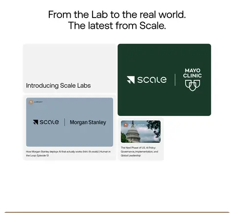
Editorial feed
Three-column story area with image-led cards, left-aligned headings, and short supporting titles.
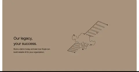
Legacy CTA panel
Large warm taupe section with a compact message and supporting visual; use the measured #a8927c rather than inventing a new accent.
Oversized footer
Black footer with grouped small navigation links followed by a large white closing statement.
Imagery · Lead with expansive photographic or video frames: the hero uses darkened footage or imagery with its headline centered over the subject, while the measured first viewport shows a vivid abstract mineral-like image. Later media spans robotics, research, healthcare, and institutional stories. Use image overlays for legible white text; keep supporting thumbnails cropped into neat editorial cards. Treat green brand panels and warm legacy artwork as contained section-specific visuals, not a site-wide palette.
Use white space as a deliberate part of the page rhythm.
Keep the core interface palette black, white, and pale gray.
Center the main hero statement over darkened media.
Reserve green and taupe for contained, specific sections.
Use Aeonik-style sans-serif typography for most content.
Keep card borders, shadows, and decoration understated.
✕ 不该做
Do not turn every section into a card grid.
Do not apply accent colors across the whole interface.
Do not place white text on imagery without a dark overlay.
Do not add colorful gradients as a default treatment.
Do not crowd the page with dense copy or tight spacing.
Do not use heavy shadows or excessive ornamental borders.
给 AI 的提示词
想快速出一个同风格的新页面,把这段话连同 DESIGN.md 一起发给 AI。
Build a new enterprise AI page in Scale AI’s visual language. Use a white canvas (#ffffff), Decision Black (#000000) for primary text, navigation, CTA buttons, and footer, and Panel Gray (#eaeaea) for quiet section contrast. Keep Legacy Taupe (#a8927c) and Research Green (#193a29) localized to purposeful panels. Use an Aeonik-like sans serif for headlines and body, with a restrained mono face for uppercase eyebrows and actions. Compose a slim left-to-right header, a cinematic media hero with a centered white headline and dark overlay, spacious content bands, and modular proof or editorial cards. Preserve the measured central width and generous section pauses. Keep borders fine, corners soft, and elevation nearly flat; make imagery, not UI decoration, supply visual drama.