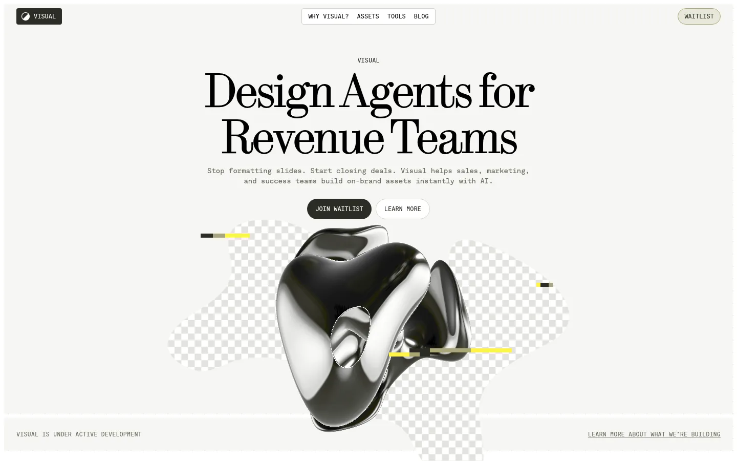
North star · Keep the interface quiet and editorial, using typography and product imagery—not color or ornament—to create contrast.
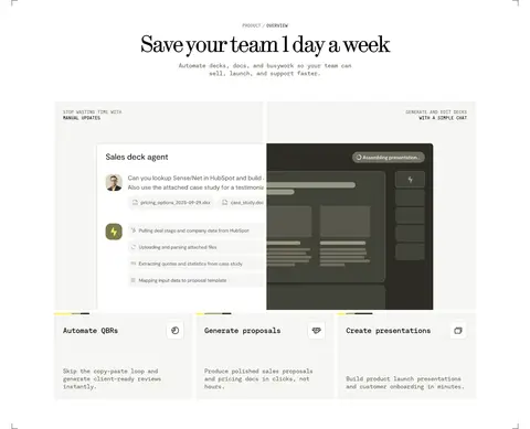
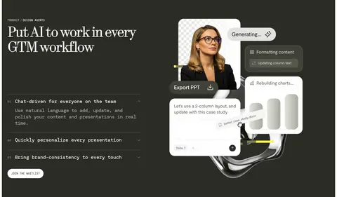
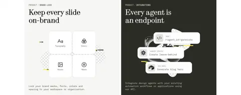
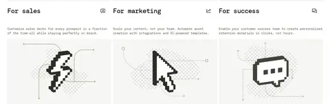
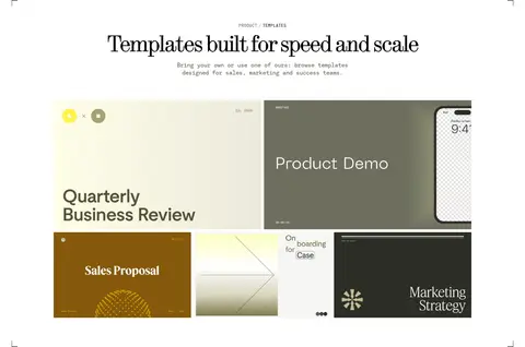
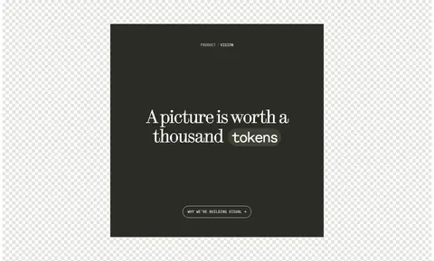
The page uses a warm, near-white canvas and pale gray-beige bands to create a calm foundation, punctuated by deep charcoal feature and footer sections. Black carries the main headlines and body copy, while muted olive-gray handles secondary links and labels; occasional yellow-green accents appear mainly in product artwork. Large, high-contrast serif headlines establish an editorial voice, balanced by compact monospaced navigation, captions, body text, and uppercase buttons. Layout alternates centered hero moments with generous two-column product demonstrations, bordered or pale cards, and a three-column audience section. Product screenshots, interface mockups, pixel-art icons, and glossy 3D forms provide contrast without introducing a broad color palette. Borders and thin rules define structure more than shadows. The overall rhythm is spacious, with clear transitions between white content and dark feature bands.
Navigation, body copy, captions, buttons, labels, and interface-style text.
Aa 设计
fontSerif
网络字体 · 字重 300 / 400 · 占比 16%
免费替代:DM Serif Display
Display headlines, section headings, and prominent editorial links.
角色
示例
字号
字重
行高
字距
特大标题
Oversized central hero headline and other statement-scale moments.
Visual
96px
400
0.94
-0.05em
一级标题
Primary page headline and major feature headings.
Visual
64px
300
1
-0.05em
二级标题
Section titles introducing product, vision, or content blocks.
Visual
48px
300
1
-0.025em
三级标题
Card and feature headings in the main content flow.
Visual
32px
400
1.13
-0.025em
四级标题
Compact subheadings and product-interface labels.
Visual
28px
500
1
-0.025em
正文
Descriptions, supporting paragraphs, and product card copy.
The quick brown fox 敏捷的狐狸
14px
500
1.33
-0.025em
辅助文字
Uppercase eyebrow labels, metadata, and small annotations.
The quick brown fox 敏捷的狐狸
12px
500
1
0
按钮
Uppercase CTA and utility button labels.
The quick brown fox 敏捷的狐狸
12px
500
1
0
导航
Uppercase primary navigation links.
The quick brown fox 敏捷的狐狸
12px
500
1
0
链接
Prominent editorial article links and large text links.
The quick brown fox 敏捷的狐狸
24px
400
1.13
-0.025em
代码
Code-like snippets and agent or integration interface text.
const style = 1;
14px
500
1.33
-0.025em
间距与布局
基准单位 8px · 密度:适中
80px版块间距
8px元素间距
24px卡片内边距
1376px内容最大宽度
4px
6px
8px
12px
16px
24px
32px
64px
80px
Use a centered page frame with a measured maximum width of 1376px and comfortable content density. The hero is centered, followed by broad, spacious sections that alternate between two-column product storytelling and three-column audience or article grids. Preserve generous section separation and use alignment changes to create rhythm: centered introductions, left-aligned feature copy, and neatly aligned cards. Thin borders and corner marks lightly frame selected content areas without enclosing every section.
圆角与层次
按钮 · 9999px
卡片 · 8px
图片 · 6px
导航 · 3px
没有测到阴影:页面是扁平的,层次靠底色和描边区分。
Keep surfaces largely flat, with no measured shadows. Use fine gray hairlines, pale card fills, and occasional dark panels to establish hierarchy. Rounded pill CTAs contrast with mostly square card geometry; let media overlap or float within its frame for depth instead of adding shadow effects.
组件
下面的预览按实测的按钮、输入框、徽标、卡片样式重建(字体用替代字体)。
Primary navigation
Compact uppercase monospaced links centered near the top, with the dark Visual mark at left and a light, outlined waitlist pill at right.
Hero
Large centered serif headline, small uppercase eyebrow, short monospaced description, paired CTAs, and a glossy 3D visual over a checker motif.
Primary CTA
Charcoal pill-shaped button with white uppercase monospaced text; use the measured #2c2c26 and #ffffff pairing.
Product feature band
Dark charcoal section with left-aligned serif feature heading and concise UI-like copy, balanced by a product/AI visual on the right.
Feature cards
Pale #f6f6f4 cards with dark monospaced copy, supported by thin #d0d0c8 borders where needed.
Audience grid
Three adjacent sales, marketing, and success columns, each led by a concise heading, supporting copy, and an illustrative icon.
Editorial feed
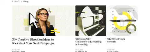
Three-column blog preview with image-led cards, serif article titles, and compact uppercase dates and author metadata.
Footer
Deep charcoal four-column footer with small uppercase monospaced links, subdued copyright text, and a contrasting waitlist control.
Imagery · Combine product UI mockups and slide previews with polished reflective 3D abstract forms, checkerboard transparency motifs, and occasional pixel-art icons. Keep media framed within the content grid, with graphics sometimes overlapping nearby space. The images can carry brighter yellow-green details, but the surrounding interface remains restrained; treat those colors as artwork accents rather than core UI colors.
Use large, tightly tracked serif headlines for key statements.
Set navigation, labels, and buttons in compact uppercase monospace.
Keep light sections predominantly white and warm off-white.
Use charcoal bands to create decisive contrast between content groups.
Let product previews and 3D artwork provide most of the visual variety.
Use thin rules and pale surfaces instead of shadows for structure.
✕ 不该做
Don't introduce a broad or saturated UI color palette.
Don't use generic sans-serif typography for the main display headlines.
Don't add heavy shadows or glossy effects to interface cards.
Don't crowd the hero with extra labels or competing actions.
Don't apply illustration-only accent colors to every UI control.
Don't round every card; reserve pill forms mainly for CTA controls.
给 AI 的提示词
想快速出一个同风格的新页面,把这段话连同 DESIGN.md 一起发给 AI。
Build a new page in Visual’s editorial AI SaaS style. Use Gallery White (#ffffff) and Porcelain Mist (#f6f6f4) for quiet light sections, then use Charcoal Olive (#2c2c26) for one strong feature band or footer. Set major headlines in a high-contrast serif with tight tracking; use compact monospaced typography for navigation, labels, body copy, and uppercase buttons. Use Editorial Ink (#000000) for primary text and Olive Hush (#6d6e5e) for subdued links. Structure the page with a centered introduction, spacious feature splits, and orderly multi-column cards. Define edges with Soft Rule (#d0d0c8), not shadows. Add product UI previews or carefully framed 3D artwork, allowing any brighter accents to remain inside imagery. Keep the interface sparse, readable, and product-led.