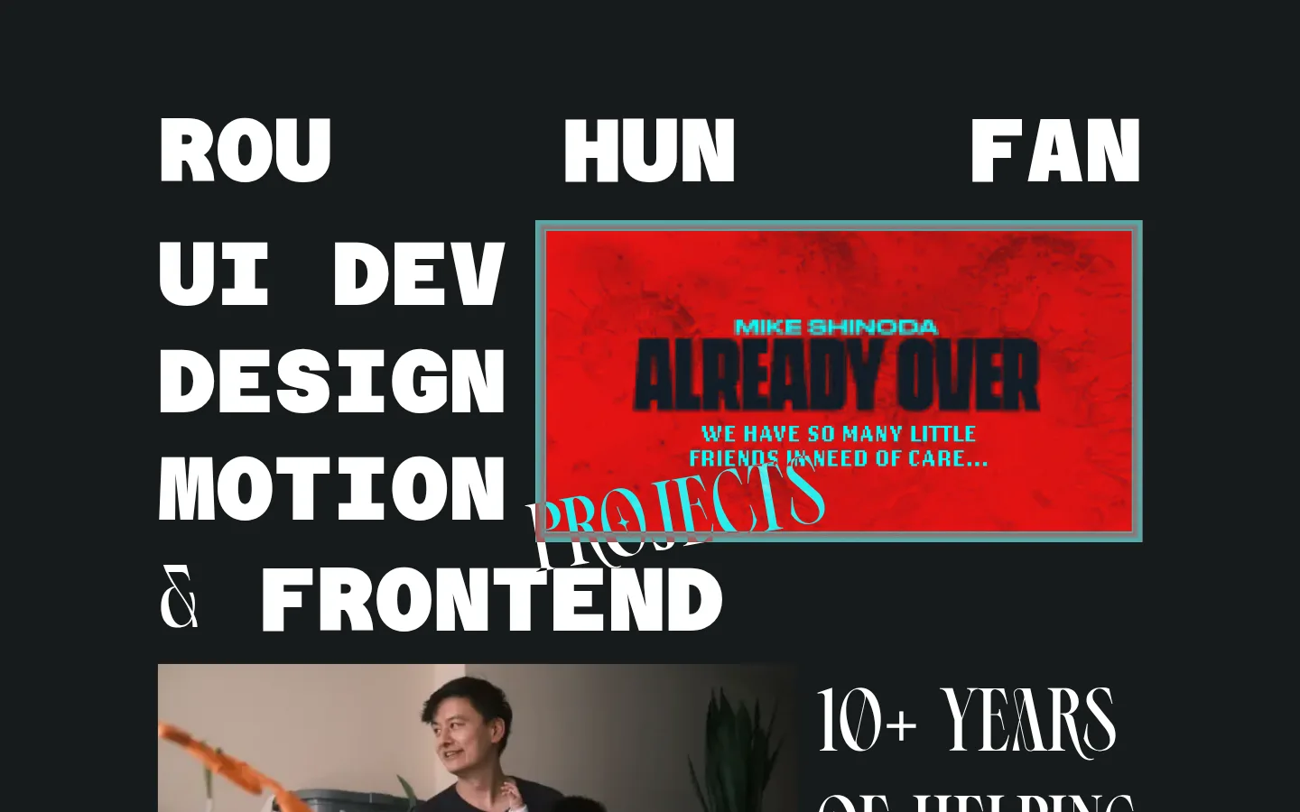
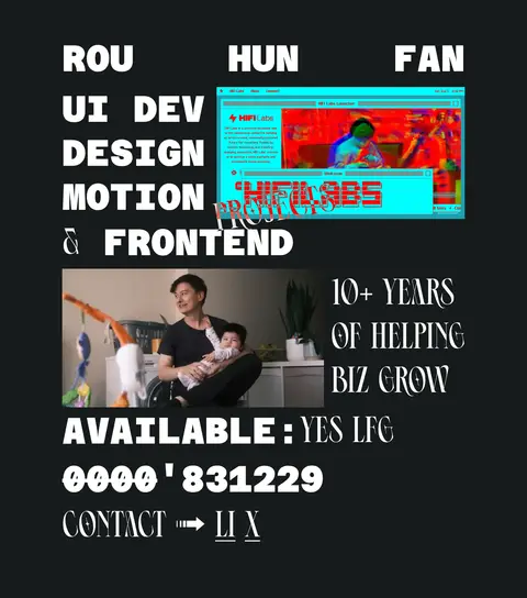
Rou Hun Fan 的作品集以近黑色画布搭配醒目的白色大字和个性鲜明的项目图片。整体像一张个人编辑海报,紧凑、有活力,也刻意跳脱常规。
North star · Treat oversized uppercase typography as the layout itself, set against a quiet charcoal canvas and interrupted by vivid project imagery.
The page is built around a near-black charcoal canvas (#161b1b) that occupies nearly the entire visual field, creating strong contrast for white (#ffffff) type. Oversized, uppercase lettering is the main visual structure rather than a supporting layer: a heavy, monospaced display face sets the name and service list, while a narrow decorative face adds a contrasting editorial voice to selected phrases and supporting copy. The composition is deliberately irregular, with the name spread across the top and service labels aligned as a bold left-hand stack. Project imagery interrupts and overlaps the typography, giving the page a collage-like, poster feel. Red (#ff0000) appears as an accent in project lettering, not as the dominant interface colour; vivid cyan and other bright hues belong to embedded project artwork and should not be mistaken for the site palette. Generous dark negative space keeps the dense type and images legible without conventional cards or ornamental UI.
配色
点色块复制色值。用途说明来自对页面的实测位置(背景、文字、描边、按钮)与截图判读。
品牌色
强调色
中性色
页面底色 · Charcoal Canvas主文字 · Poster White强调 · Project Red
Heavy uppercase name, navigation, service labels, and code-like details
Aa 设计
Ephidona
网络字体 · 字重 400 · 占比 49%
免费替代:Bodoni Moda
Decorative display and supporting editorial phrases
角色
示例
字号
字重
行高
字距
特大标题
Decorative, oversized project and editorial headings.
Rou Hun Fan
108px
400
1.2
0
正文
Large uppercase supporting copy and statements.
Rou Hun Fan
100px
400
1.2
0
导航
Bold uppercase identity and navigation labels.
Rou Hun Fan
100px
700
1.2
0
代码
Bold uppercase numeric or code-like details.
const style = 1;
100px
700
1.2
0
间距与布局
基准单位 1px · 密度:适中
90px版块间距
—元素间距
—卡片内边距
1067px内容最大宽度
9px
90px
135px
The measured content uses a 1067px maximum width and a comfortable density, with a 90px section rhythm. The page is left-aligned and visually assembled rather than divided into conventional cards: the name spans the upper row, service labels form a large left column, and project imagery occupies adjacent space. At the first viewport, media overlaps the service typography and the lower portrait begins beside supporting copy. Preserve generous dark gaps while allowing selected elements to collide or cross-align for a poster-like composition.
圆角与层次
没有测到阴影:页面是扁平的,层次靠底色和描边区分。
The interface is visually flat: no measured shadows, gradients, or card treatments define the page. Use the charcoal canvas as the continuous surface, and rely on contrast, image placement, and typographic overlap for depth. Keep borders and framing subordinate; any strong edge belongs to the project artwork itself.
组件
下面的预览按实测的按钮、输入框、徽标、卡片样式重建(字体用替代字体)。
Name masthead
Set the creator’s name in bold, uppercase white monospaced lettering, distributed across the top of the composition.
Service stack
Present UI, design, motion, and frontend as a large left-aligned uppercase typographic list.
Project artwork
Place vivid rectangular project imagery beside or across the service lettering; treat its colors as artwork, not interface tokens.
Experience statement
Pair a personal photo with narrow decorative uppercase copy about years of experience and business growth.
Availability line
Show availability as a high-contrast uppercase status near the lower part of the hero composition.
Contact links
Use simple uppercase text links and an arrow cue; keep them flat and visually integrated with the typography.
Imagery · Use project screenshots and personal photography as prominent, rectangular inserts rather than decorative background textures. The visible portrait is a candid, environmental photograph; project artwork is vivid and varies in palette. Let media sit close to or overlap large type. Keep embedded artwork colors confined to their image regions rather than promoting them to interface tokens.
Use the monospaced face for bold, structural labels.
Contrast it with decorative display lettering for selected phrases.
Let project imagery interrupt the text composition.
Keep interface colors restrained and high contrast.
✕ 不该做
Do not turn project-image colors into site-wide palette colors.
Do not add conventional rounded cards or shadows.
Do not center every element into a uniform grid.
Do not use small, quiet typography for the main identity.
Do not add gradients unsupported by the measured design.
Do not make red the dominant page background or CTA color.
给 AI 的提示词
想快速出一个同风格的新页面,把这段话连同 DESIGN.md 一起发给 AI。
Build a new portfolio page in Rou Hun Fan’s expressive editorial style. Use Charcoal Canvas (#161b1b) as the continuous background and Poster White (#ffffff) for the dominant uppercase typography. Establish hierarchy with a heavy monospaced face for identity, navigation, and service labels, contrasted by a narrow decorative display face for selected editorial phrases. Compose the content like a poster rather than a standard card grid: left-align oversized service text, distribute the name across the upper area, and let rectangular project images overlap or interrupt the type. Use Project Red (#ff0000) sparingly, especially where it belongs to project artwork. Keep surfaces flat, avoid ornamental UI, and preserve dark negative space around dense visual clusters. Make contact and availability readable but visually part of the composition.