North star · Keep the interface quiet and dark so each project’s imagery supplies the colour, scale, and visual drama.
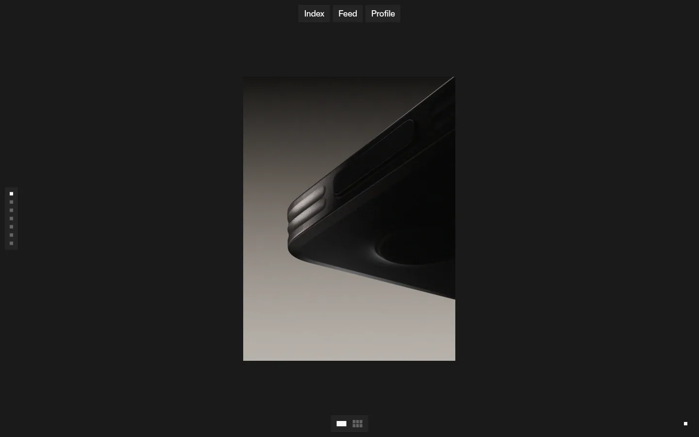
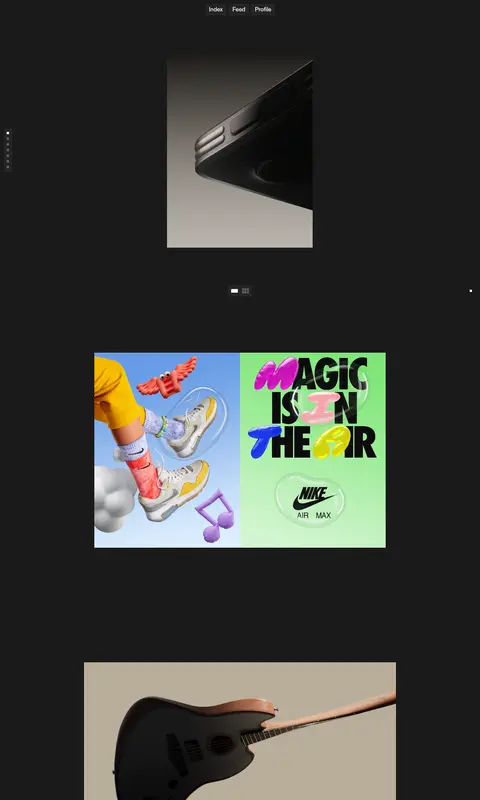
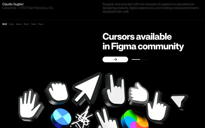
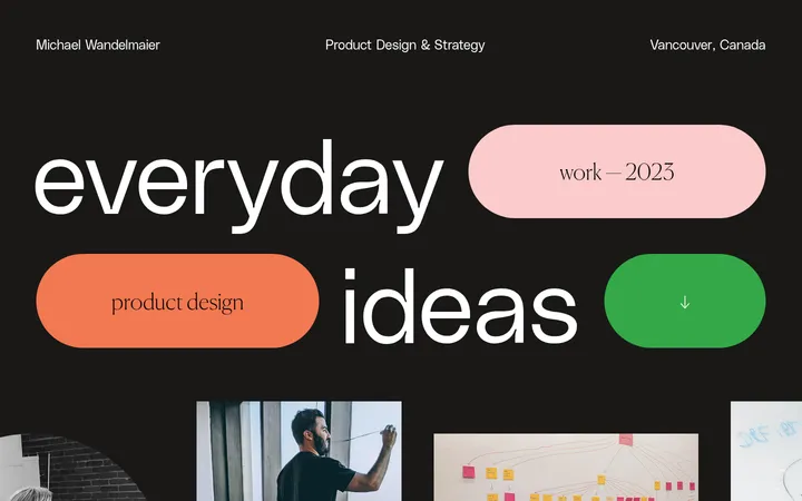
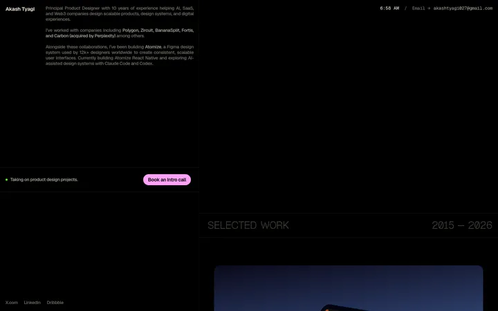
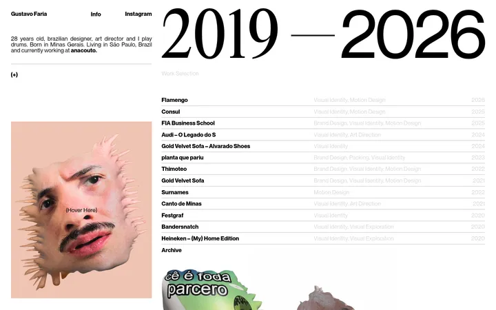
The visual strategy is built around a nearly uninterrupted charcoal canvas (#1a1a1a), with off-white (#fafafa) reserved for legible interface text. The measured palette is deliberately sparse; vivid colour belongs to the project artwork, not to the site chrome. ABC Diatype Medium provides a compact, contemporary sans-serif voice, with tight negative tracking and medium weight in the measured heading and body roles. The page presents a centered navigation above an open, vertically paced portfolio feed. Project media varies in scale and aspect ratio, alternating landscape and portrait compositions rather than sitting in uniform cards. Small edge controls and view toggles stay visually quiet against the dark background. Wide gaps around the work create a gallery-like rhythm, while the absence of visible borders, card surfaces, and shadows keeps attention on the images and videos. Treat artwork colours as project-specific, not as reusable interface accents.
Measured heading and body text, including the compact site identity and interface labels.
角色
示例
字号
字重
行高
字距
一级标题
Compact site identity or primary heading within the portfolio interface.
The quick brown fox 敏捷的狐狸
22px
500
1.13
-0.025em
正文
Navigation labels, project-related interface text, and supporting copy.
The quick brown fox 敏捷的狐狸
18px
500
1.15
-0.025em
间距与布局
基准单位 2px · 密度:适中
50px版块间距
10px元素间距
—卡片内边距
936px内容最大宽度
5px
7px
8px
10px
12px
13px
14px
50px
The measured content has a 936px page max width, while the screenshot shows a centered, narrow media column within a much wider dark viewport. A compact navigation sits near the top; small controls align near the page edges and around the media area. Projects form a single vertically paced feed with varied image widths and aspect ratios, not a rigid card grid. The comfortable density comes from large qualitative gaps between pieces, with the measured section gap at 50px and element gap at 10px.
圆角与层次
没有测到阴影:页面是扁平的,层次靠底色和描边区分。
The page reads as flat: the dark canvas carries no measured shadows, gradients, or border system. Artwork sits directly against the background without visible card framing. Small dark control backplates provide subtle separation where needed, but avoid adding decorative elevation or layered surfaces.
组件
下面的预览按实测的按钮、输入框、徽标、卡片样式重建(字体用替代字体)。
Top navigation
A small centered row of Index, Feed, and Profile links near the top, set in light text on restrained dark backplates.
Portfolio feed
A vertically paced sequence of project media with varied proportions and widths, separated by generous dark negative space.
Edge index
A compact vertical set of small indicators along the left side, functioning as a quiet navigation cue.
View toggle
A small control group beneath the lead media with light icon details on a subtle dark backing.
Project links
Minimal text links associated with work; keep link treatment visually close to the off-white interface text.
Imagery · The portfolio mixes motion clips, CGI product scenes, and graphic compositions. Media appears as clean, rectangular frames in varied portrait and landscape proportions, often centered with dark space around it. Some artwork is colourful, but that colour is contained within the project media rather than applied to the site interface.
Reserve #fafafa for concise, readable interface text.
Give project media varied rectangular proportions.
Center the artwork within generous dark negative space.
Keep navigation and controls compact and subdued.
Let each project provide its own colour palette.
✕ 不该做
Do not introduce unmeasured interface colours.
Do not turn project artwork colours into brand accents.
Do not place every project in a uniform card.
Do not add visible decorative borders or heavy shadows.
Do not crowd the feed with dense captions.
Do not replace the quiet gallery rhythm with a busy grid.
给 AI 的提示词
想快速出一个同风格的新页面,把这段话连同 DESIGN.md 一起发给 AI。
Build a new creative portfolio page in PostNew’s restrained gallery style. Use Gallery Charcoal (#1a1a1a) as the continuous canvas and Soft Chalk (#fafafa) for interface text; do not invent additional interface palette colours. Use ABC Diatype Medium or a close free sans-serif such as DM Sans, with compact medium-weight labels and slightly tight tracking. Place a small centered navigation above a vertically paced feed. Present projects as varied rectangular image or video frames surrounded by generous dark space, without forcing them into uniform cards. Keep any edge index or view controls small and unobtrusive. Let the artwork supply its own vivid colours; keep the surrounding interface flat, with no decorative borders, gradients, or shadows.