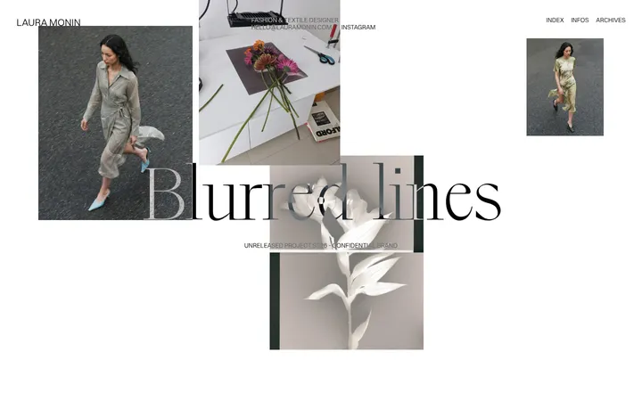
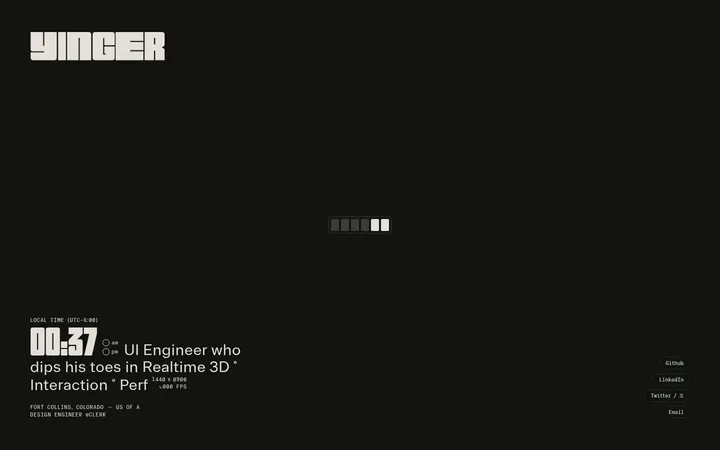
North star · Let oversized, precise typography and hairline grid rules define the page, keeping colour and decoration deliberately restrained.
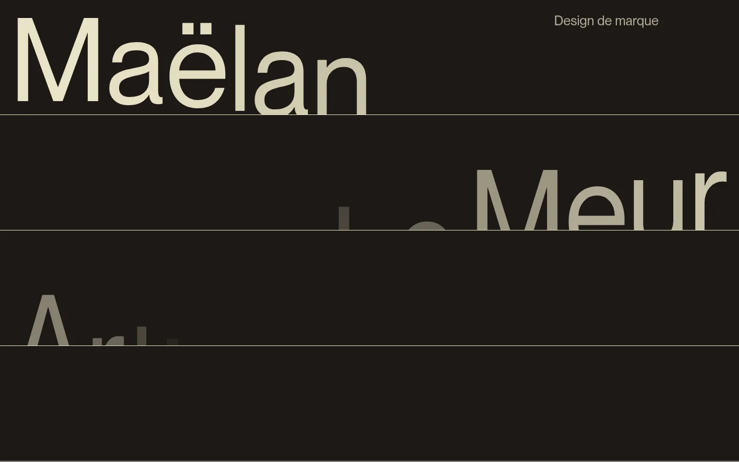
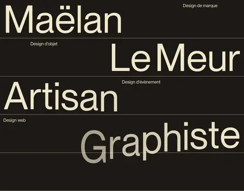
The page uses a warm, near-black canvas as its continuous ground, allowing pale ivory typography and fine grid rules to carry the composition. A muted brown band distinguishes the selected-work area, while the light footer creates a deliberate final contrast. Typography is the primary visual material: PP Neue Montreal appears in a regular weight, from compact uppercase labels to extremely large, unembellished display words. The opening sequence treats the name and professional disciplines as oversized, staggered typographic panels. Subsequent sections use repeated vertical and horizontal rules to divide statements, geometric motifs, and a compact project index. The layout is spacious in its overall rhythm but intentionally dense within the portfolio table. Project imagery and motion sit within the brown work section, acting as a supporting showcase rather than competing with the typographic identity. Keep the surface treatment flat, with borders and alignment doing the structural work.
Display typography, headings, body copy, navigation, labels, and links throughout.
角色
示例
字号
字重
行高
字距
特大标题
Oversized opening name and profession typography.
Maëlan Le Meur
317px
400
1
0
一级标题
Primary hero name and major page statements.
Maëlan Le Meur
225px
400
1
0
二级标题
Large section statements and project-area display heading.
Maëlan Le Meur
115px
400
0.95
0
三级标题
Secondary headings and prominent portfolio titles.
Maëlan Le Meur
57.5px
400
1
0
四级标题
Compact section and project headings.
The quick brown fox 敏捷的狐狸
26px
400
1
0
正文
Introductory statements, supporting copy, and project descriptions.
The quick brown fox 敏捷的狐狸
16px
400
1.2
0
辅助文字
Small uppercase metadata and discipline labels.
The quick brown fox 敏捷的狐狸
15px
400
1.2
0
链接
Uppercase portfolio and navigation links.
The quick brown fox 敏捷的狐狸
15px
400
1
0
间距与布局
基准单位 4px · 密度:宽松
210px版块间距
—元素间距
—卡片内边距
1400px内容最大宽度
12px
17px
20px
40px
50px
60px
A spacious page composition extends to a measured maximum width of 1400px. The hero uses full-width typographic bands, with alternating left and right alignment divided by thin rules. A repeated column grid structures the statement and geometric-mark sections; the audience and supporting-copy areas remain aligned to the same visual system. Selected work shifts to a brown surface and presents a broad media area above a dense, ruled project index. The measured section gap is generous, while content within the project list is compact. A single-column pale footer closes the page.
圆角与层次
按钮 · 50%
链接 · 9999px
没有测到阴影:页面是扁平的,层次靠底色和描边区分。
The page is predominantly flat, with no measured shadows or gradients. Thin, low-contrast rules divide the hero bands, grid cells, and project rows. Section backgrounds—not raised cards—provide separation; preserve the crisp, planar feel and avoid decorative layered effects.
组件
下面的预览按实测的按钮、输入框、徽标、卡片样式重建(字体用替代字体)。
Typographic hero bands
Full-width oversized words alternate alignment across dark panels, separated by fine horizontal rules; small discipline labels sit opposite the display text.
Grid statement panel
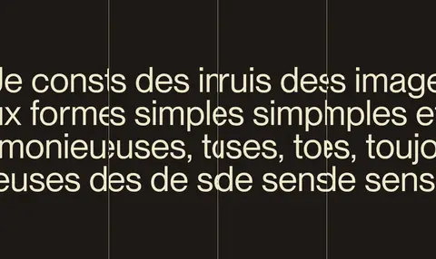
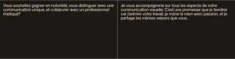
Large ivory introductory copy crosses a column grid on the dark canvas, with vertical and horizontal hairlines visible through the composition.
Geometric mark strip
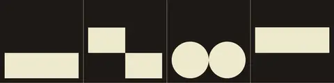
Simple ivory rectangular and circular forms sit in ruled grid cells, echoing the page’s restrained visual language.
Selected-work showcase
A brown work section combines project media with a broad, oversized section title and a compact project index.
Project index
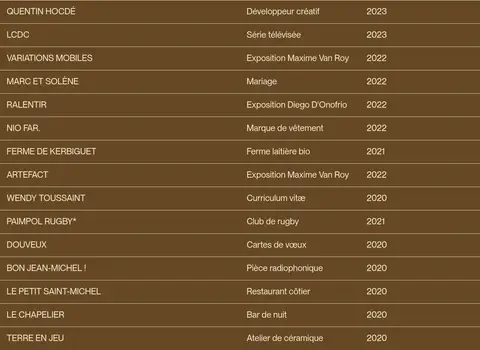
A dense, ruled list organizes project name, description, and year in aligned columns; keep labels small and legible.
Credits footer
A pale ivory closing section groups contacts, credits, and site attribution with dark text and minimal ornament.
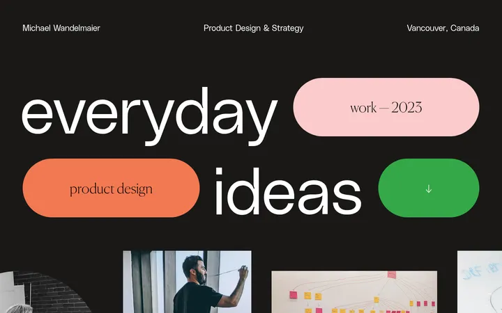
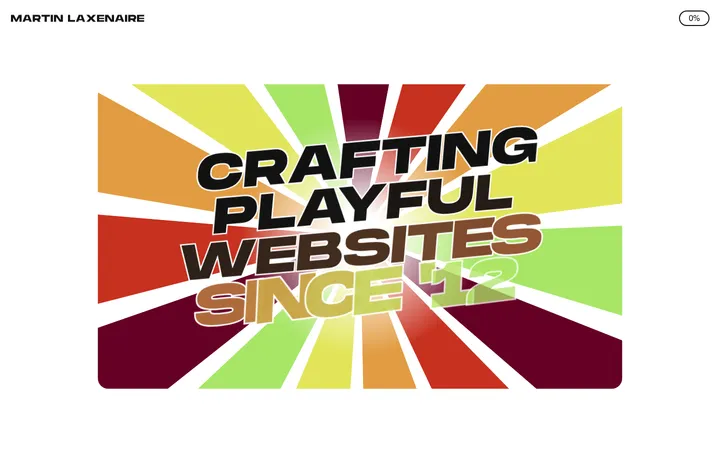
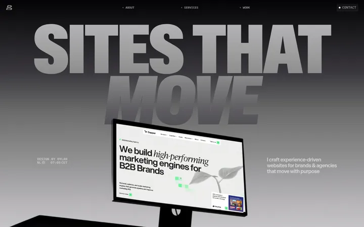
Imagery · The opening is intentionally typography-led rather than image-led. The portfolio section contains project imagery and two measured videos, presented as part of a broad showcase and supported by a tabular project listing. Treat project visuals as varied client work, not as a single consistent product photography style; keep their presentation anchored by the brown section and clean grid.
Build a new page in the visual style of Maëlan Le Meur’s portfolio. Use Roasted Umber (#1e1915) as the main canvas, Parchment Ivory (#eee9cc) for prominent typography and geometric details, and Earth Brown (#674825) to distinguish the selected-work area. Keep Muted Black (#111111) limited to footer text where appropriate. Use a clean, regular sans serif close to PP Neue Montreal, with exceptionally large display words, understated supporting copy, and compact uppercase labels. Structure the page with full-width typographic bands, thin grid rules, alternating alignment, and spacious section transitions. Present any work as a restrained gallery or project index rather than card UI. Use flat surfaces, precise alignment, and minimal decoration; avoid shadows, gradients, extra colours, and ornamental effects.