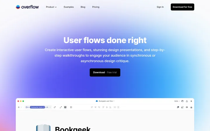
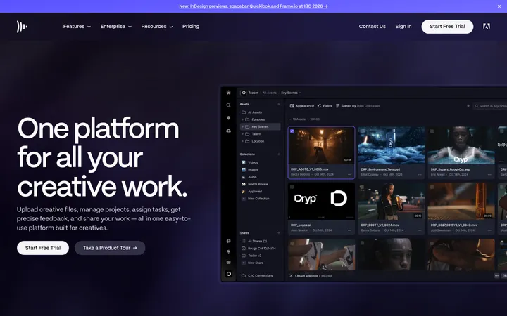
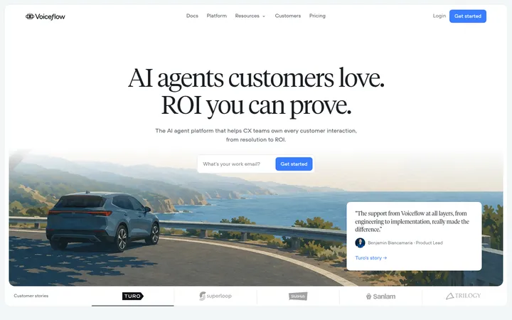
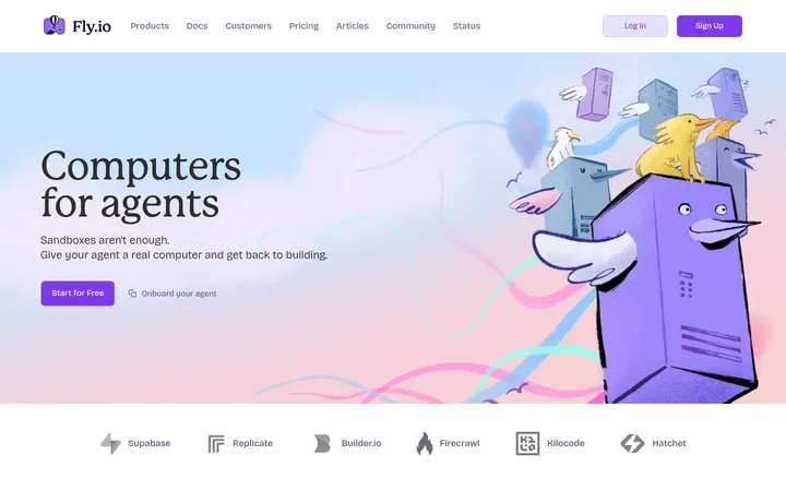
North star · Keep the page nearly black and let clear typography, real product UI, and restrained violet accents do the explaining.
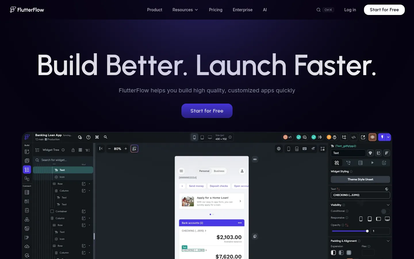
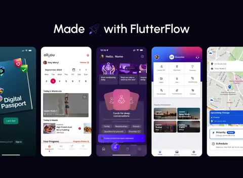
The page is anchored by an almost-black violet canvas (#060311), with white headings and subdued gray supporting copy creating a crisp, high-contrast hierarchy. Violet accents appear in key calls to action and interface details, while deep-purple gradients add depth to selected cards and testimonial panels; the page itself stays visually dark and consistent. Urbanist gives display headings a rounded, modern character, while Inter handles body copy and navigation with restrained clarity. The hero centers a large promise above a prominent editor screenshot, making the product the primary visual. Below it, centered section headings alternate with two- and three-column feature layouts, deployment device mockups, code imagery, gallery tiles, and customer proof. Generous vertical breathing room separates these modules, while their internal content remains compact. Cards are defined mostly by subtle dark borders and rounded corners rather than pronounced shadows. White pill-shaped navigation and CTA controls provide distinct, legible interaction points.
Body, navigation, captions, links, buttons, and feature copy.
Aa 设计
Urbanist Variable
网络字体 · 字重 500 / 600 · 占比 14%
免费替代:Urbanist
Display and large section headings, plus prominent CTA text.
角色
示例
字号
字重
行高
字距
特大标题
Oversized hero display headline.
FlutterFlow
100px
600
1
0
一级标题
Primary hero heading and major page titles.
FlutterFlow
72px
600
1
0
二级标题
Feature and section headings.
The quick brown fox 敏捷的狐狸
24px
500
1.3
0
三级标题
Feature-card and supporting subheadings.
The quick brown fox 敏捷的狐狸
20px
400
1.4
0
正文
Explanatory copy and customer testimonial text.
The quick brown fox 敏捷的狐狸
14.5px
400
1.62
0
辅助文字
Compact descriptions and small supporting labels.
The quick brown fox 敏捷的狐狸
14px
400
1.43
0
按钮
CTA and control labels.
The quick brown fox 敏捷的狐狸
14px
500
1.43
0
导航
Header navigation and footer navigation links.
The quick brown fox 敏捷的狐狸
14px
400
1.43
0
链接
Inline and resource-card links.
The quick brown fox 敏捷的狐狸
16px
400
1.5
0
眉题
Uppercase section kicker above a feature heading.
The quick brown fox 敏捷的狐狸
12px
600
1.33
0.05em
间距与布局
基准单位 4px · 密度:紧凑
32px版块间距
10px元素间距
36px卡片内边距
1288px内容最大宽度
4px
6px
8px
10px
12px
16px
20px
24px
32px
36px
40px
64px
128px
Use a centered content frame with a measured maximum width of 1288px, while letting prominent product visuals span broad areas. The homepage is a long single-column sequence of centered section introductions and modular content grids: two-column feature compositions, three-column integration and collaboration groups, and full-width product showcases. Section spacing is generous relative to the compact body copy. Keep headings centered for most feature bands, use consistent alignment inside cards, and maintain a dense but orderly footer link grid.
圆角与层次
按钮 · 9999px
卡片 · 20px
导航 · 29px
链接 · 20px
xl · nav
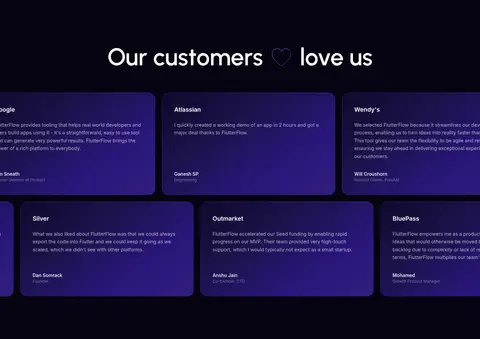
The page relies more on tonal separation and hairline borders than visible shadow. Cards use dark surfaces against the near-black canvas, with select testimonial borders in deep violet and rounded corners. Screenshots create their own layered depth; keep overlays and floating UI restrained, and reserve stronger visual prominence for CTA controls.
组件
下面的预览按实测的按钮、输入框、徽标、卡片样式重建(字体用替代字体)。
Navigation bar
Compact dark header with logo, centered product links, utility actions, and a white rounded Start for Free CTA.
Hero
Centered oversized headline and muted supporting line above a violet CTA and wide product-builder screenshot.
Feature modules
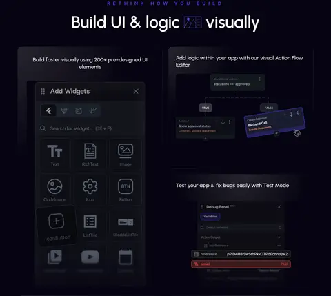
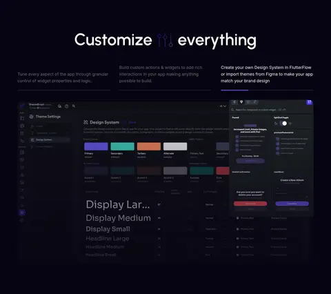
Centered section title followed by two- or three-column descriptions and product UI imagery.
Product showcase
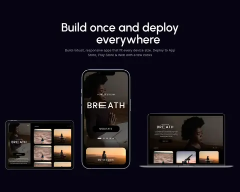
Large editor, code, or responsive-device mockups framed by generous dark negative space.
Testimonial cards
Rounded dark panels with white customer quotes and restrained deep-violet outlines or gradient treatments.
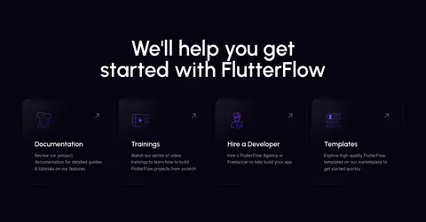
Resource cards
Compact documentation, training, hiring, and template links arranged in a simple row.
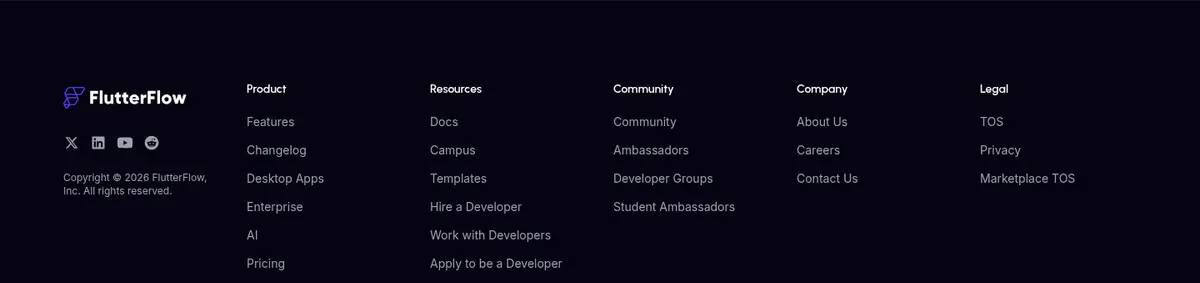
Footer
Dark multi-column navigation with small muted links, grouped by product, resources, community, company, and legal.
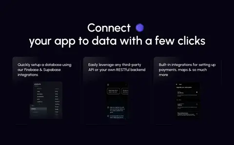
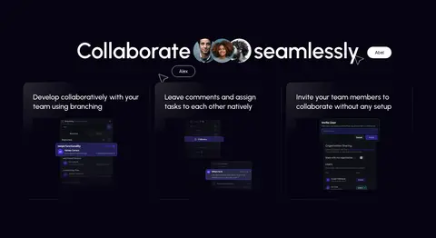
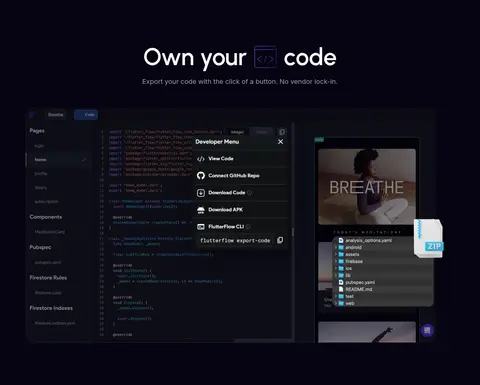
Imagery · Prioritize crisp screenshots and mockups of the actual visual app builder, including editor panels, mobile previews, code, and deployment devices. Place interface imagery directly beneath or beside concise feature copy, using dark surroundings so detailed UI remains legible. Gallery and customer sections mix varied app screens with compact, polished testimonial cards. Violet UI details are part of the imagery, not a reason to recolor the page.
Set major headlines in Urbanist and interface copy in Inter.
Use white for high-priority headings and controls.
Reserve violet gradients for selective emphasis and product details.
Show real-looking app-builder interfaces as the main imagery.
Separate large content bands with generous vertical breathing room.
✕ 不该做
Do not introduce bright page-wide section backgrounds.
Do not let gradients overpower the dark canvas.
Do not replace product UI with unrelated lifestyle photography.
Do not add heavy drop shadows to every card.
Do not make supporting copy compete with the main headings.
Do not crowd the long-scroll page with dense, uniform grids.
给 AI 的提示词
想快速出一个同风格的新页面,把这段话连同 DESIGN.md 一起发给 AI。
Build a new FlutterFlow-style page on a #060311 Midnight Canvas. Use Clean White (#ffffff) for crisp headings, navigation, and key controls, with Soft Ash (#a8a7ac) and Cool Slate (#9ba1ae) for secondary copy. Apply Flow Violet (#2b167c) and Launch Violet (#321f7f) sparingly in gradients, CTA emphasis, and interface details; keep dark panels and borders subtle. Set display headings in Urbanist and body, navigation, and controls in Inter. Center section introductions, then arrange concise feature content in modular two- and three-column groups. Make believable product-builder screenshots and app mockups the primary visuals, with generous separation between page bands. Prefer fine borders and rounded cards over strong shadows. Include a clear hero CTA, customer proof, resources, and a compact grouped footer.