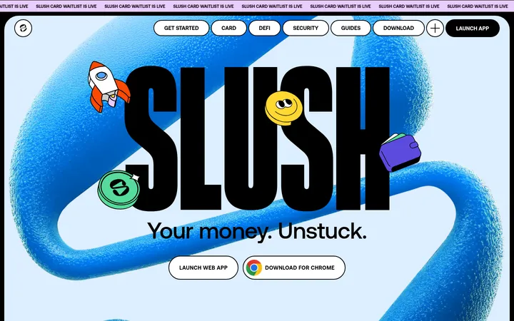
North star · Set oversized condensed type and vivid product imagery against calm open space, using dark bands to create deliberate contrast.
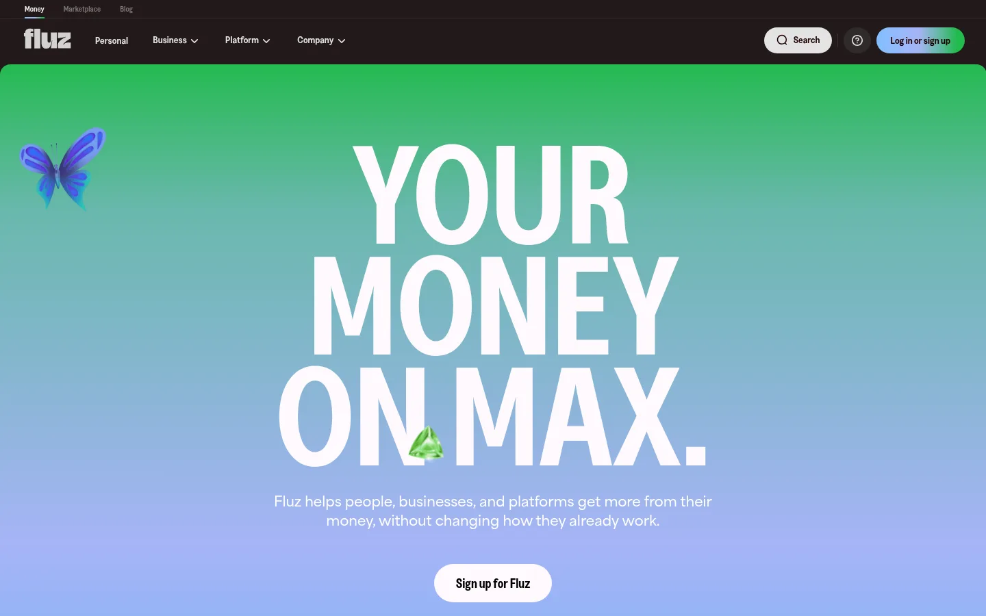
The page balances a pale warm-gray canvas with near-black navigation and large dark feature bands. Its hero uses a vivid green-to-blue gradient, centered white condensed lettering, and a compact white pill CTA; gradients reappear in framed product visuals rather than as a uniform page background. Greed Condensed SemiBold gives headlines their tall, compressed, assertive silhouette, while Area Semibold supports navigation and body copy. Layout alternates between centered statements, spacious two-column product explanations, image-led cards, and dark benefit sections. The phone and interface imagery is paired with playful floating objects and saturated landscapes, giving functional fintech products a tactile, approachable quality. Rounded pills and soft-corner media soften the sharp typographic contrast. Hairline borders organize dark navigation and comparison content; the overall treatment stays flat and relies on tonal bands, framing, and scale rather than prominent shadows.
Primary body text and prominent navigation labels.
Aa 设计
Greed Condensed SemiBold
网络字体 · 字重 700 · 占比 20%
免费替代:Barlow Condensed
Display, hero, section, and CTA headings.
Aa 设计
Greed-SemiBold
网络字体 · 字重 700 / 400 · 占比 2%
免费替代:Inter
Small navigation and compact supporting labels.
Aa 设计
Greed SemiBold
网络字体 · 字重 700 / 600 · 占比 1%
免费替代:Barlow
Secondary headings and captions.
角色
示例
字号
字重
行高
字距
特大标题
Oversized hero statement, stacked across multiple lines.
Fluz
205px
700
0.79
-0.005em
一级标题
Primary page or major feature headline.
Fluz
96px
700
0.91
-0.025em
二级标题
Large section titles and benefit statements.
Fluz
64px
700
0.91
-0.02em
三级标题
Secondary feature titles and prominent card headings.
Fluz
54px
600
0.92
-0.03em
四级标题
Compact uppercase section labels and product headings.
Fluz
42px
700
1.15
-0.02em
正文
Navigation, feature descriptions, and paragraph copy.
The quick brown fox 敏捷的狐狸
16px
700
1.5
0
辅助文字
Small labels and short supporting captions.
The quick brown fox 敏捷的狐狸
15px
700
1.6
0
按钮
Pill CTA labels and prominent action text.
The quick brown fox 敏捷的狐狸
20px
700
1.2
0
导航
Compact menu and category labels.
The quick brown fox 敏捷的狐狸
14px
700
1.29
0
间距与布局
基准单位 2px · 密度:宽松
115px版块间距
16px元素间距
—卡片内边距
1418px内容最大宽度
2px
7px
8px
10px
12px
14px
15px
16px
18px
20px
24px
25px
28px
30px
32px
36px
Use a wide centered content area, measured page max width 1418px, with generous section breaks and compact spacing within UI groups. Alternate centered title-and-copy sections with two-column product explanations and image-led card rows. The page is spacious overall: the canvas remains open around content, while dark feature bands contain tightly grouped benefit grids. Keep text alignment purposeful—centered for hero and section introductions, left-aligned for product details—and use asymmetry between copy and product media.
圆角与层次
按钮 · 9999px
图片 · 20px
徽标 · 9999px
导航 · 9999px
没有测到阴影:页面是扁平的,层次靠底色和描边区分。
The page is primarily flat, with contrast created by alternating pale and espresso-dark section bands rather than shadows. Use thin borders and subtle tonal boundaries to define navigation and comparison surfaces. Media frames and card groups sit directly within the layout; rounded corners provide separation without a pronounced elevation effect.
组件
下面的预览按实测的按钮、输入框、徽标、卡片样式重建(字体用替代字体)。
Top navigation
Compact dark two-level header with white Fluz mark, small links, a pale rounded Search control, and a gradient sign-in pill.
Hero CTA
Centered white pill button beneath the stacked headline and short supporting copy; use the measured Greed Condensed SemiBold button style.
Product feature split
Alternate left-aligned feature copy and framed phone or interface imagery across a generous light section.
Product card trio
Three rounded media-led cards pair product categories with concise labels and bright interface artwork.
Dark benefits band
Espresso background holds centered condensed headings and a compact multi-column grid of benefits.
Comparison panel
Dark rounded panel organizes Fluz advantages against other providers with fine dividers and small status icons.
Pill buttons
Use full capsule shapes for primary actions, with white-on-dark or dark-on-white contrast depending on the surface.
Imagery · Use crisp product-interface imagery, especially phones, cards, and dashboards, framed by colorful landscape scenes. Supplement with playful floating objects and occasional 3D-style illustrations. Product frames have soft rounded corners; visuals are saturated and lively against the neutral canvas. Keep important UI readable and let imagery carry the color when adjacent copy stays restrained.
Use Greed Condensed for short, oversized headlines.
Keep the pale canvas dominant across light sections.
Reserve saturated gradients for hero and framed product moments.
Alternate light sections with deliberate espresso-dark bands.
Use pill silhouettes for navigation actions and CTAs.
Pair product copy with recognizable phone or interface imagery.
✕ 不该做
Do not fill every section with gradients.
Do not crowd the page with dense copy or tight spacing.
Do not replace condensed display typography with generic wide headlines.
Do not add heavy drop shadows to otherwise flat sections.
Do not use saturated accents as long blocks of body text.
Do not make every product section symmetrical.
给 AI 的提示词
想快速出一个同风格的新页面,把这段话连同 DESIGN.md 一起发给 AI。
Build a new Fluz-style fintech page with a spacious #ededec canvas and occasional #f2f2f2 sections. Use #221919 for deep editorial bands and #1a0000 for dark text or CTA fills. Give the hero a vivid gradient sweep using #21ba4c, #5bb89a, #a6b4f7, and #7db4f4, with oversized white condensed lettering and a centered pill action. Keep body copy restrained and pair left-aligned product explanations with rounded phone or dashboard imagery. Use Greed Condensed-style headlines and clean bold sans-serif UI text. Alternate image-led product rows with centered section introductions and compact benefit grids. Favor open spacing, fine borders, and flat surfaces over shadows. Keep accents vivid but concentrated in gradients and product artwork; use rounded capsule controls consistently.