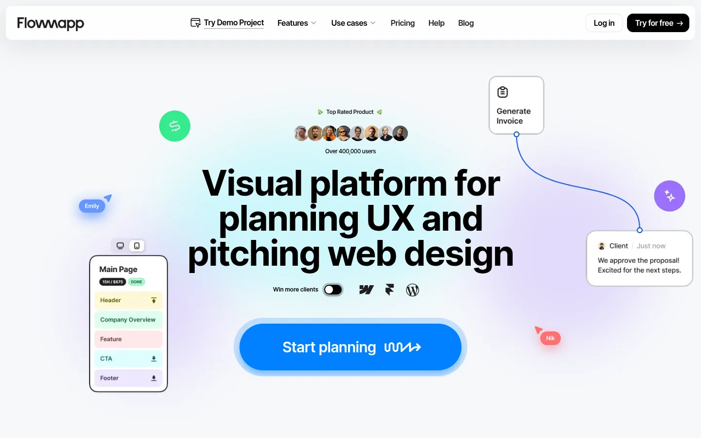
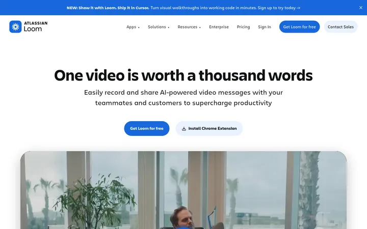
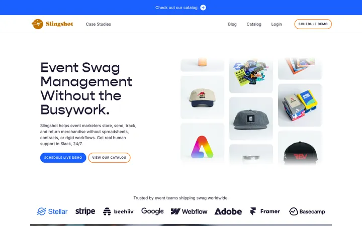
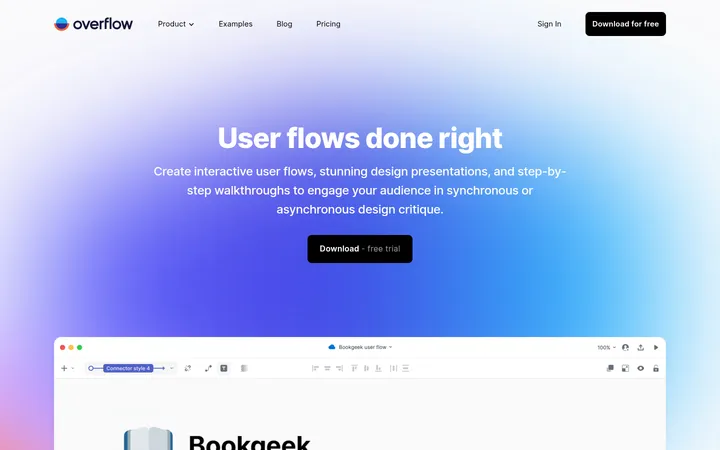
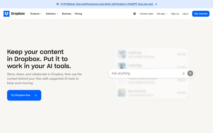
North star · Keep the page calm and spacious, then use oversized black type and saturated blue to make the product workflow unmistakable.
The visual system is built on a cool, nearly white canvas (#f6f8fa) with black typography and precise blue accents. The hero uses a large centered headline, a bright blue pill-shaped CTA, and a soft, colourful product scene; the surrounding whitespace keeps this dense composition legible. Inter is used throughout, with heavy display headings, tight negative tracking, and smaller, more restrained supporting copy. Most sections retain the pale canvas, while white bands and cards distinguish the four-step workflow. Rounded cards, thin blue outlines, and diagrams make product capabilities tangible without relying on conventional lifestyle photography. A saturated blue client-logo panel creates the strongest full-width colour break. Testimonials and educational links return to the quieter palette. Spacing is generous between major stories, while card interiors remain information-rich and structured.
All page typography, from navigation and body copy to display headlines and CTAs.
角色
示例
字号
字重
行高
字距
特大标题
Oversized hero and high-impact promotional headlines.
Flowmapp
84px
700
1.04
-0.03em
一级标题
Primary page headline and major section titles.
Flowmapp
72px
700
1
-0.03em
二级标题
Large section headings introducing product stories.
Flowmapp
64px
700
1
-0.029em
三级标题
Workflow and feature-card titles.
Flowmapp
48px
700
1.04
-0.03em
四级标题
Subsection headings and supporting feature titles.
Flowmapp
36px
700
1.09
-0.02em
正文
Emphasized explanatory copy and prominent UI text.
The quick brown fox 敏捷的狐狸
16px
600
1.4
-0.015em
辅助文字
Step labels, small metadata, and card details.
The quick brown fox 敏捷的狐狸
13px
500
1.3
-0.037em
导航
Main navigation links and header actions.
The quick brown fox 敏捷的狐狸
16px
600
1.4
-0.04em
链接
Inline links and understated supporting navigation.
The quick brown fox 敏捷的狐狸
16px
400
1.25
-0.04em
间距与布局
基准单位 8px · 密度:适中
48px版块间距
16px元素间距
24px卡片内边距
1280px内容最大宽度
4px
5px
6px
7px
8px
10px
11px
12px
14px
16px
20px
24px
26px
32px
40px
48px
The main content is contained within a measured 1280px maximum width, with centered hero messaging and varied multi-column sections below. The page alternates generous, pale-canvas storytelling areas with white two-column product bands and a full-width blue proof panel. Major sections have a measured 48px gap; content stays comfortable rather than compressed. Cards use measured 24px internal padding. Align feature headings to the left, but reserve centered alignment for the opening hero. Keep diagrams and copy visually balanced.
圆角与层次
按钮 · 12px
卡片 · 12px
图片 · 50%
导航 · 8px
链接 · 9999px
md · other
xl · nav
sm · other
md · card
Most cards read as clean white or canvas-coloured surfaces, with modest rounded corners and restrained shadows. Blue outlines define selected workflow cards and diagrams; they are more characteristic than heavy elevation. Layered hero UI elements, soft blue glow, and gentle shadows add depth selectively. Avoid turning every surface into a floating card.
组件
下面的预览按实测的按钮、输入框、徽标、卡片样式重建(字体用替代字体)。
Floating navigation
White rounded bar on the pale canvas with black logo and links; a quiet outlined Log in action sits beside the black Try for free button.
Hero action
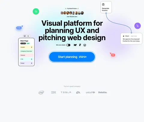
Large bright-blue pill CTA with white label, centered below a bold three-line headline and surrounded by product UI illustrations.
Workflow feature band
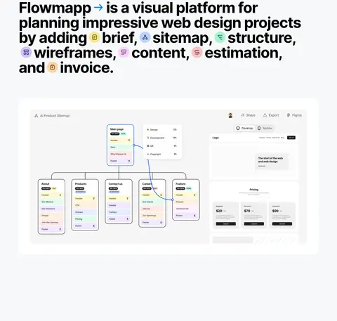
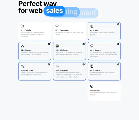
White section with left-aligned step headline and supporting features balanced against a large product-interface preview.
Outlined capability cards
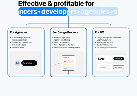
White cards with 12px measured radius, measured 24px padding, and crisp blue borders for process and audience details.
Client proof panel
Saturated blue panel with a large white statement, a highlighted Flowmapp link, and a dense grid of customer wordmarks.
Testimonial collection
Quiet canvas section with compact quote cards, profile details, and a prominent rounded white link to more team stories.
Learning feed
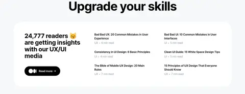
White rounded content surface pairing a reader-count introduction with compact article links and reading-time metadata.
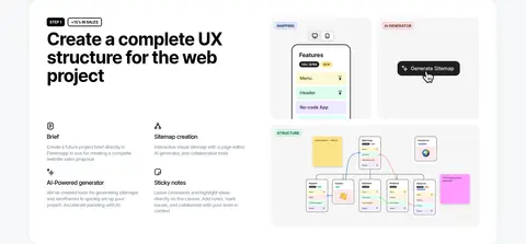
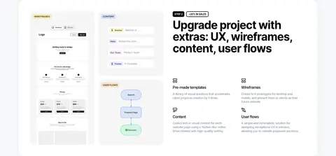
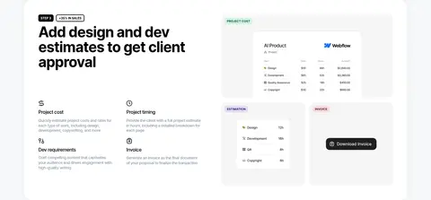
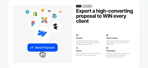
Imagery · Product imagery is primarily interface mockups, sitemap and workflow diagrams, wireframes, proposal previews, and small floating UI details. The hero composes these elements around the central headline as a colourful product-led scene, not lifestyle photography. The blue proof section uses a dense field of customer wordmarks. Testimonial cards mix short quotations with compact profile imagery; illustrations should remain clear and contained.
Use the measured pale canvas as the default page background.
Set major headlines in bold Inter with tight tracking.
Reserve saturated blue for high-priority actions and proof moments.
Use white bands to separate product workflow stories.
Show product capability through clear interface mockups and diagrams.
Keep generous space between sections and structured detail inside cards.
✕ 不该做
Do not replace the restrained palette with multiple competing colours.
Do not make every section a white card grid.
Do not use lifestyle photography as the main product explanation.
Do not center-align the workflow section headings.
Do not add heavy shadows to every card.
Do not use loose, oversized tracking in headlines.
给 AI 的提示词
想快速出一个同风格的新页面,把这段话连同 DESIGN.md 一起发给 AI。
Build a new Flowmapp-style page with a cool #f6f8fa canvas, black #000000 Inter typography, and crisp #0080ff accents. Use #0050ff sparingly for borders and interface emphasis; reserve #c5e0fb and #9cccfc for quiet supporting details. Create a spacious, centered opening with a bold oversized headline, vivid pill CTA, and carefully arranged product-interface illustrations. Follow with a varied rhythm of pale sections, white product bands, and structured cards rather than repeating one template. Keep workflow headings left-aligned, pair concise explanatory content with clear diagrams, and use a strong blue customer-proof panel as a deliberate colour break. Use rounded corners, light elevation, readable muted copy in #8c9baa, and generous separation between stories. Avoid lifestyle imagery and unnecessary decoration.