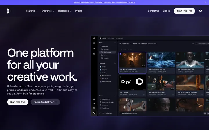
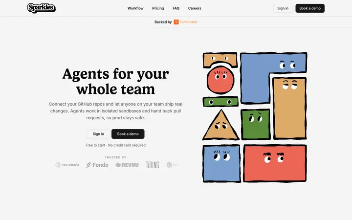
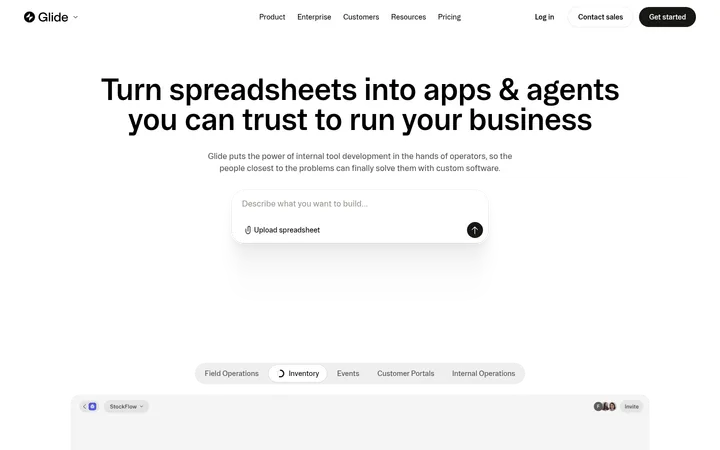
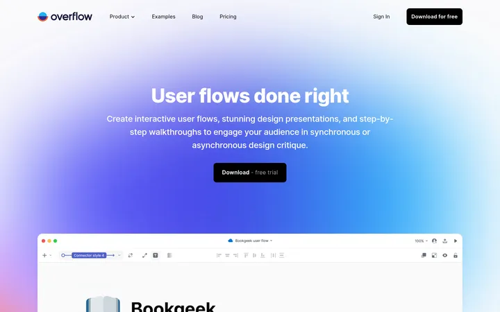
North star · Keep the interface calm and spacious, letting expressive illustrations carry the colour while purple actions and serif headlines provide a consistent anchor.
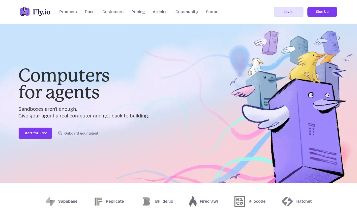
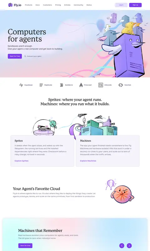
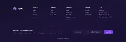
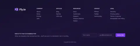
The page starts with a clean white navigation bar, then opens into a wide illustrated hero washed in soft blue, pink, and lilac. The illustration supplies much of the page’s colour and personality; keep the interface itself anchored in the measured palette rather than treating every artwork colour as a brand token. Mackinac serif headlines create a distinctive editorial voice, while Fricolage Grotesque handles navigation, body copy, and controls in a friendly, practical style. Purple is reserved for primary actions and text links, with muted violet-gray supporting secondary copy. The long homepage alternates open white sections with pale lavender cards and broad pastel gradient panels, using generous vertical breathing room to separate product explanations, metrics, testimonials, and calls to action. Thin lavender borders define cards more often than heavy shadows. The dark plum footer creates a clear visual endpoint and supports reversed, subdued text.
Navigation, body copy, captions, buttons, links, and eyebrow labels.
Aa 设计
Mackinac
网络字体 · 字重 500 · 占比 6%
免费替代:Bree Serif
Display and section headings, including the hero headline.
角色
示例
字号
字重
行高
字距
特大标题
Oversized editorial statement headlines in prominent hero moments.
Fly.io
72px
500
0.95
-0.02em
一级标题
Primary page and major feature headlines.
Fly.io
48px
500
1.25
-0.025em
二级标题
Section titles across product, support, and content bands.
Fly.io
36px
500
1.15
-0.02em
正文
Explanatory copy for products, features, and testimonials.
The quick brown fox 敏捷的狐狸
17px
325
1.5
0
辅助文字
Small supporting labels, metadata, and compact descriptions.
The quick brown fox 敏捷的狐狸
14.5px
450
1.66
0
按钮
Primary CTA and newsletter action text.
The quick brown fox 敏捷的狐狸
15.5px
450
1.5
0
导航
Main navigation labels and compact menu items.
The quick brown fox 敏捷的狐狸
14.5px
500
1.5
0
链接
Prominent inline calls to explore products or sign up.
The quick brown fox 敏捷的狐狸
19px
450
1.5
0
眉题
Uppercase, letter-spaced section labels where needed.
The quick brown fox 敏捷的狐狸
12px
575
1.5
0.05em
间距与布局
基准单位 8px · 密度:宽松
100px版块间距
24px元素间距
24px卡片内边距
1390px内容最大宽度
4px
8px
10px
12px
16px
20px
24px
32px
40px
64px
96px
100px
150px
Use a centered, spacious composition with a measured maximum page width of 1390px. The header sits above a wide, media-led hero, followed by a logo strip and stacked product, feature, stats, testimonial, CTA, and footer areas. Major sections have generous vertical separation; cards use measured 24px padding and feature grids align in clear columns. Alternate open white space with pale cards and full-width pastel bands. Keep copy blocks compact and left aligned, balancing them with illustration or structured content.
圆角与层次
按钮 · 8px
输入框 · 8px
卡片 · 10px
图片 · 8px
导航 · 4px
链接 · 9999px
inset · button
lg · section
inset · link
The interface favors flat surfaces and fine lavender borders over prominent depth. Cards are separated by hairlines and pale fills; broad gradient panels provide section-level emphasis. Shadows are subtle and occasional, while buttons use a restrained inset highlight. Reserve stronger layering for the illustrated artwork and the dark footer transition.
组件
下面的预览按实测的按钮、输入框、徽标、卡片样式重建(字体用替代字体)。
Primary CTA
Use Signal Violet (#7c3aed) with white text, an 8px radius, and measured horizontal padding of 20px for the main action.
Text link
Set prominent product links in Signal Violet (#7c3aed); keep them visually lighter than filled CTA buttons.
Feature card
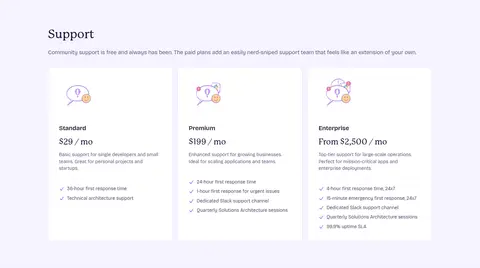
Use a pale surface, a thin Lavender Rule (#d5cfef) border, and generous measured card padding; avoid heavy shadows.
Navigation
Keep the top bar white and uncluttered, with compact Fricolage Grotesque labels and violet sign-up action.
Pastel feature band
Separate major feature content with a broad, soft pink-to-blue gradient and lightly defined card groupings.
Footer
Use Midnight Plum (#191034), subdued Footer Lavender (#a39ac1) text, grouped link columns, and a newsletter form.
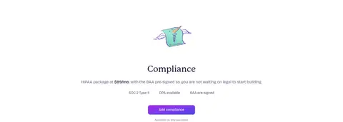
Imagery · Illustration is the defining visual asset: hand-drawn, character-led scenes and playful diagrams, with the hero artwork occupying a large portion of the right side. Product cards use small, distinct illustrations rather than conventional photography. Pastel fields and loose marks surround the drawings, while logos and technical content stay relatively restrained. Use artwork as expressive section support, not as a substitute for clear text hierarchy.
Keep navigation and body copy in Fricolage Grotesque.
Reserve Signal Violet (#7c3aed) for actions and selected links.
Alternate open white sections with pale cards and pastel bands.
Let original illustrations provide the strongest playful colour.
Use thin lavender borders to define card edges.
✕ 不该做
Do not turn the whole page into a dark interface.
Do not use gradients as the default background for every section.
Do not let illustration overwhelm the text hierarchy.
Do not replace the editorial serif headings with generic geometric sans.
Do not use heavy shadows to separate ordinary cards.
Do not invent extra palette colours from artwork.
给 AI 的提示词
想快速出一个同风格的新页面,把这段话连同 DESIGN.md 一起发给 AI。
Build a new page in Fly.io’s visual style: spacious, developer-focused, editorial, and playful. Set the main canvas to Gallery White (#ffffff), use Mackinac for prominent serif headlines and Fricolage Grotesque for navigation, copy, and controls. Apply Signal Violet (#7c3aed) selectively to primary buttons and links; use Muted Iris (#686082) for secondary copy and Lavender Rule (#d5cfef) for fine card borders. Organize content in generous, clearly separated sections with pale cards and occasional soft pastel gradient bands. Pair concise explanatory copy with original hand-drawn, characterful illustrations; do not treat artwork colours as interface tokens. Keep surfaces mostly flat, use restrained shadows, and finish with a Midnight Plum (#191034) footer and subdued footer text.