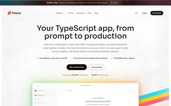
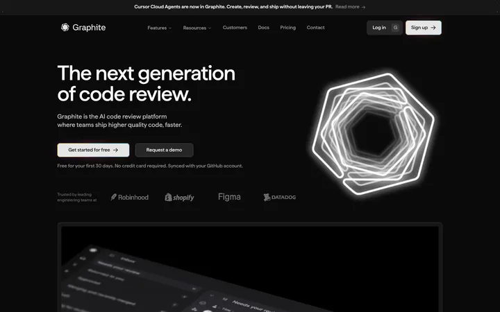
North star · Keep the interface monochrome and spacious, letting real product screens—not decorative color—carry the visual interest.
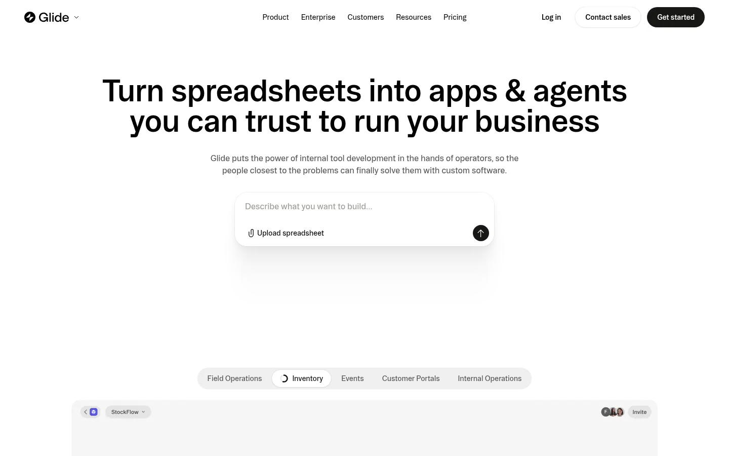
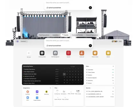
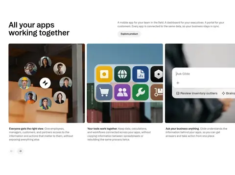
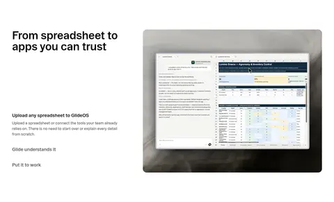
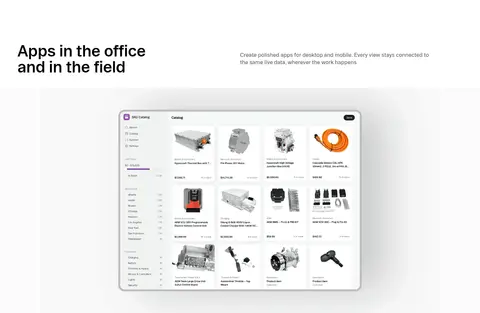
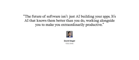
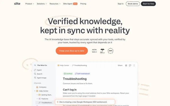
The visual system is built on white space, near-black text, and a limited set of soft gray surfaces. Black is reserved for strong headings, primary actions, and a few high-contrast bands; muted gray supports explanatory copy, while pale hairlines quietly separate controls and content. BootonFont carries most of the interface, with compact navigation and body copy balancing large, tightly tracked display headings. AffairsFont adds a distinct editorial note to select heading roles. The page is spacious and predominantly single-column or split-layout, with centered treatments for integrations and template discovery. Product UI screenshots and demos are the central imagery, supported by workplace photography, customer portraits, and colorful app icons. Those saturated colors belong mostly to product imagery rather than the core brand palette. Rounded controls and cards soften the otherwise crisp, minimal presentation.
Primary display, navigation, body copy, captions, links, and buttons.
Aa 设计
affairsFont
网络字体 · 字重 450 · 占比 7%
免费替代:DM Sans
Select secondary display headings and editorial-style feature titles.
角色
示例
字号
字重
行高
字距
特大标题
Large hero or campaign statement.
Glide
60px
575
1
-0.02em
一级标题
Primary page headline and prominent section headline.
Glide
56px
575
1.2
-0.02em
二级标题
Major feature and content-section headings.
Glide
48px
575
1
-0.02em
三级标题
Secondary editorial-style feature heading.
Glide
36px
450
1.2
-0.01em
四级标题
Smaller feature or card heading.
The quick brown fox 敏捷的狐狸
27px
450
1.2
0
正文
Explanatory paragraphs and primary supporting copy.
The quick brown fox 敏捷的狐狸
16px
450
1.4
-0.01em
辅助文字
Compact labels and image or card details.
The quick brown fox 敏捷的狐狸
14px
450
1.3
-0.01em
按钮
Primary and secondary CTA labels.
The quick brown fox 敏捷的狐狸
14px
575
1.3
-0.01em
导航
Header navigation and menu items.
The quick brown fox 敏捷的狐狸
14px
450
1.3
-0.01em
链接
Text links, integration labels, and inline actions.
The quick brown fox 敏捷的狐狸
14px
450
1.3
-0.01em
间距与布局
基准单位 4px · 密度:宽松
128px版块间距
8px元素间距
—卡片内边距
1336px内容最大宽度
4px
5px
6px
8px
11px
12px
16px
20px
24px
40px
52px
128px
Use a centered content frame capped at the measured 1336px maximum width, with generous section spacing and a spacious overall density. The hero is centered, while feature stories alternate between aligned text and broad product media. Several sections use simple two-column or multi-column structures; integrations and template discovery return to centered composition. Keep large white gaps between major content blocks, with occasional full-width dark bands and image-led closing content.
圆角与层次
按钮 · 8px
卡片 · 8px
图片 · 7px
徽标 · 9999px
导航 · 6px
链接 · 9999px
sm · link, button
inset · card
hairline · other, card
xl · card
The page is mostly flat, relying on whitespace and thin pale borders rather than pronounced shadows. Cards use measured rounded corners and occasional restrained inset or soft shadows, especially around product UI. Layered preview frames and floating input controls create depth without making the overall interface feel glossy.
组件
下面的预览按实测的按钮、输入框、徽标、卡片样式重建(字体用替代字体)。
Header navigation
Minimal horizontal header with black wordmark, compact links, login action, outlined contact control, and dark rounded Get started CTA.
Hero builder prompt
Centered headline and muted supporting copy above a broad product media stage; a white prompt input with upload action and circular submit affordance overlays the preview.
Pill controls
Rounded navigation and CTA controls use compact BootonFont labels; primary action uses #171715 with #ffffff text.
Product feature cards
Product stories combine image or video previews with concise labels and descriptions; cards use #f5f5f2 surfaces and measured 8px rounding.
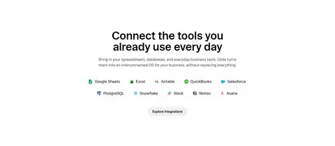
Integration list
Centered heading and brief copy above compact integration names and icons, followed by a subdued rounded exploration action.
Security band
Full-width #0d0d0d section pairs light text and security CTA with certification-style marks and restrained contrast.
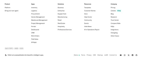
Footer directory
Dense multi-column link directory on a light surface, with small labels, grouped product links, and a compact legal and utility row.
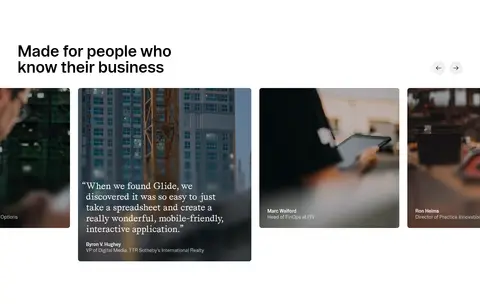
Imagery · Favor crisp product screenshots, app previews, and demo video as the primary visual language. Frame software inside quiet light surfaces, often with rounded corners and subtle separation from the white canvas. Use workplace photography and customer portraits in testimonial and closing sections. Bright icon colors appear inside app illustrations and interface previews; do not promote them into the site-wide palette.
Keep the core interface palette monochrome and restrained.
Use generous whitespace between major sections.
Make product previews the primary visual focus.
Use near-black for headings and high-priority actions.
Use muted gray for supporting copy, not competing headlines.
Keep buttons and cards softly rounded.
Reserve saturated colors for product imagery and app icons.
✕ 不该做
Do not add a bright site-wide accent color.
Do not crowd the layout with dense decoration.
Do not use heavy shadows as the default card treatment.
Do not make every section a centered text block.
Do not let screenshots overwhelm their surrounding whitespace.
Do not use decorative gradients as a primary brand motif.
给 AI 的提示词
想快速出一个同风格的新页面,把这段话连同 DESIGN.md 一起发给 AI。
Build a new page in Glide’s visual language: use a clean #ffffff canvas, #000000 headings, and #5c5c5c supporting copy. Use #171715 for the primary CTA and #edede8 for quiet borders; reserve #0d0d0d for an occasional full-width contrast band. Keep layouts spacious within the measured 1336px maximum content width, mixing centered introductions with aligned feature splits and broad product previews. Use BootonFont or a close sans-serif substitute for most interface text, with tight heading tracking and compact navigation. Give buttons and cards soft rounded corners, but keep surfaces largely flat. Use real product UI, app screens, and relevant workplace photography; let saturated colors remain inside these visuals rather than expanding the brand palette. Build clear section rhythm, concise copy, and unobtrusive interactions.