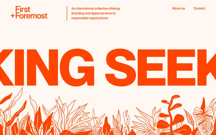
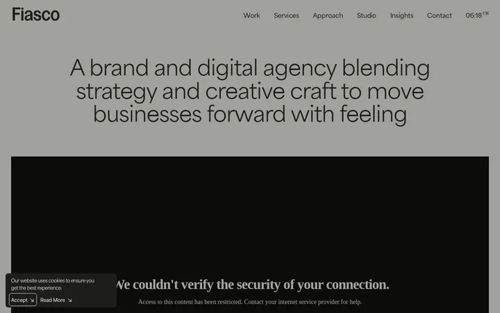
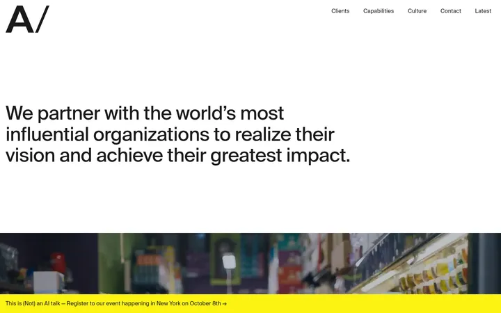
North star · Treat the homepage as a disciplined editorial grid: let whitespace, oversized identity, and a few confident color panels carry the story.
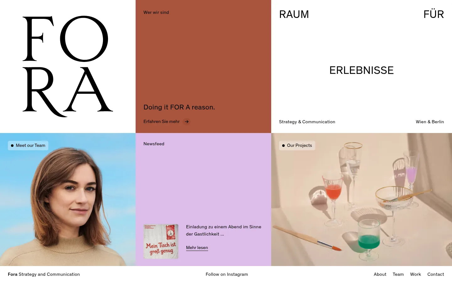
The page is built as a calm editorial mosaic rather than a conventional hero followed by stacked sections. White is the primary canvas, giving the black FORA wordmark and sparse headings room to command attention. A rust-colored statement tile and a lilac news tile provide the strongest brand color moments; neither is treated like a conventional button. The single measured sans-serif, Theinhardt, carries navigation and supporting copy with light, regular-weight clarity, while the oversized serif-like wordmark is a distinctive graphic identity element. Short uppercase display phrases and small, restrained labels establish contrast without relying on decorative effects. Image tiles introduce human and project context, including a portrait against blue and still-life glassware. The composition favors broad, aligned rectangular panels, crisp transitions, and generous breathing room. Keep the treatment flat and direct: color, type, and image placement do the work.
Primary typeface for navigation, body copy, headings, and text links.
角色
示例
字号
字重
行高
字距
一级标题
Oversized uppercase display statement and prominent brand messaging.
FORA
35px
400
1.17
0.01em
二级标题
Section and tile headings, including the primary agency statement.
The quick brown fox 敏捷的狐狸
23px
400
1.3
0.016em
正文
News excerpts, supporting descriptions, and small editorial copy.
The quick brown fox 敏捷的狐狸
15px
400
1.33
0.024em
按钮
Compact text actions such as team links and learn-more prompts.
The quick brown fox 敏捷的狐狸
15px
400
1.33
0
导航
Header identity/navigation and the persistent bottom navigation.
The quick brown fox 敏捷的狐狸
15px
400
1.33
0.024em
间距与布局
基准单位 1px · 密度:适中
50px版块间距
25px元素间距
—卡片内边距
1390px内容最大宽度
5px
10px
20px
25px
30px
50px
Use a broad, page-filling modular grid with panels aligned edge to edge and a four-column underlying structure. The measured maximum content width is 1390px. At the first viewport, the identity, statement, and typographic display occupy the upper band; portrait, news, and project imagery form a lower band. Keep text aligned to panel starts, with generous panel breathing room and a comfortable rather than dense rhythm. A slim footer line anchors navigation below the mosaic.
圆角与层次
按钮 · 5px
没有测到阴影:页面是扁平的,层次靠底色和描边区分。
The page reads as flat, with no measured shadows or gradients. Panels meet through crisp rectangular edges rather than cards floating above a background. Avoid adding decorative borders; rely on the grid, white space, and strong changes between white, rust, and lilac surfaces to define hierarchy. Buttons remain text-led and understated.
组件
下面的预览按实测的按钮、输入框、徽标、卡片样式重建(字体用替代字体)。
Brand panel
Large white grid cell with the FORA wordmark, treated as an oversized graphic rather than ordinary navigation text.
Statement tile
Rust panel with a small introductory label, a concise agency statement, and a text-based learn-more link.
Display phrase panel
White typographic cell with widely separated uppercase phrase fragments and small service/location labels near its lower edge.
Portrait tile
Editorial team image with a compact, lightly surfaced team link positioned near the upper edge.
News tile
Lilac content panel pairing a small article image with a short title and a simple underlined read-more link.
Project tile
Large project photograph with a compact project label near the top, keeping the image itself as the main focus.
Footer navigation
Slim white strip with the agency descriptor, social link, and compact About, Team, Work, and Contact links.
Imagery · Use editorial photography as content tiles, not as a full-bleed background behind copy. The visible portrait is naturally framed against a blue setting; the project still life uses soft, warm light and a quiet tabletop composition. Preserve the photographs' own colors as image content, while keeping the surrounding interface palette restrained. Small news artwork may sit beside concise text.
Reserve #a9553c for a prominent statement surface.
Use #ddbdea for a distinct editorial or news tile.
Keep interface text black on white and colored panels.
Use concise labels and short text actions.
Let photography occupy its own grid cells.
✕ 不该做
Do not add gradients or drop shadows.
Do not turn every panel into a rounded card.
Do not use imagery as a busy text background.
Do not add unmeasured interface colors.
Do not crowd the grid with extra decoration.
Do not make links look like heavy primary buttons.
给 AI 的提示词
想快速出一个同风格的新页面,把这段话连同 DESIGN.md 一起发给 AI。
Create a new FORA-style agency page as a restrained editorial mosaic, not a conventional stacked marketing template. Use #ffffff as the open canvas and #000000 for all primary interface text. Organize content in aligned rectangular grid panels with generous breathing room: reserve #a9553c for a confident statement block and #ddbdea for a news or editorial feature. Use Theinhardt, or a close sans-serif substitute, in regular weight with understated tracking; pair concise labels and navigation with large, selective uppercase display copy. Give team portraits and project photography their own tiles, preserving their natural image colors. Keep links text-led, surfaces flat, and panel edges crisp. Include a slim footer navigation. Avoid shadows, gradients, decorative borders, excessive rounding, and extra colors not present in the measured palette.