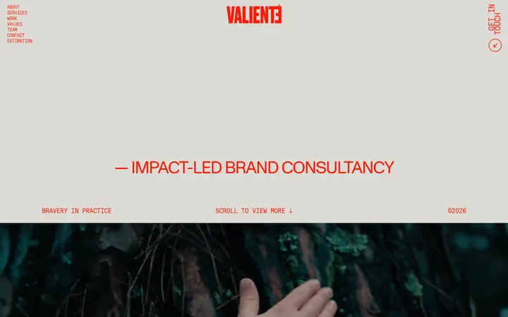
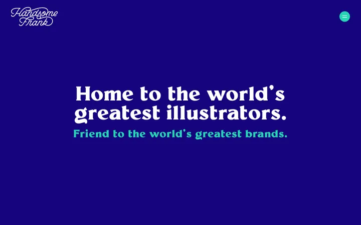
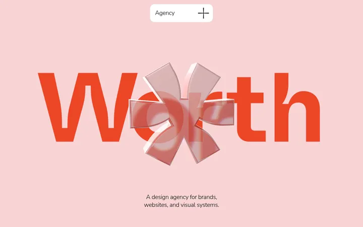
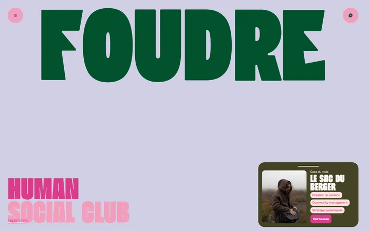
North star · Let oversized orange typography lead, and use warm open space and purposeful imagery to keep the message human.
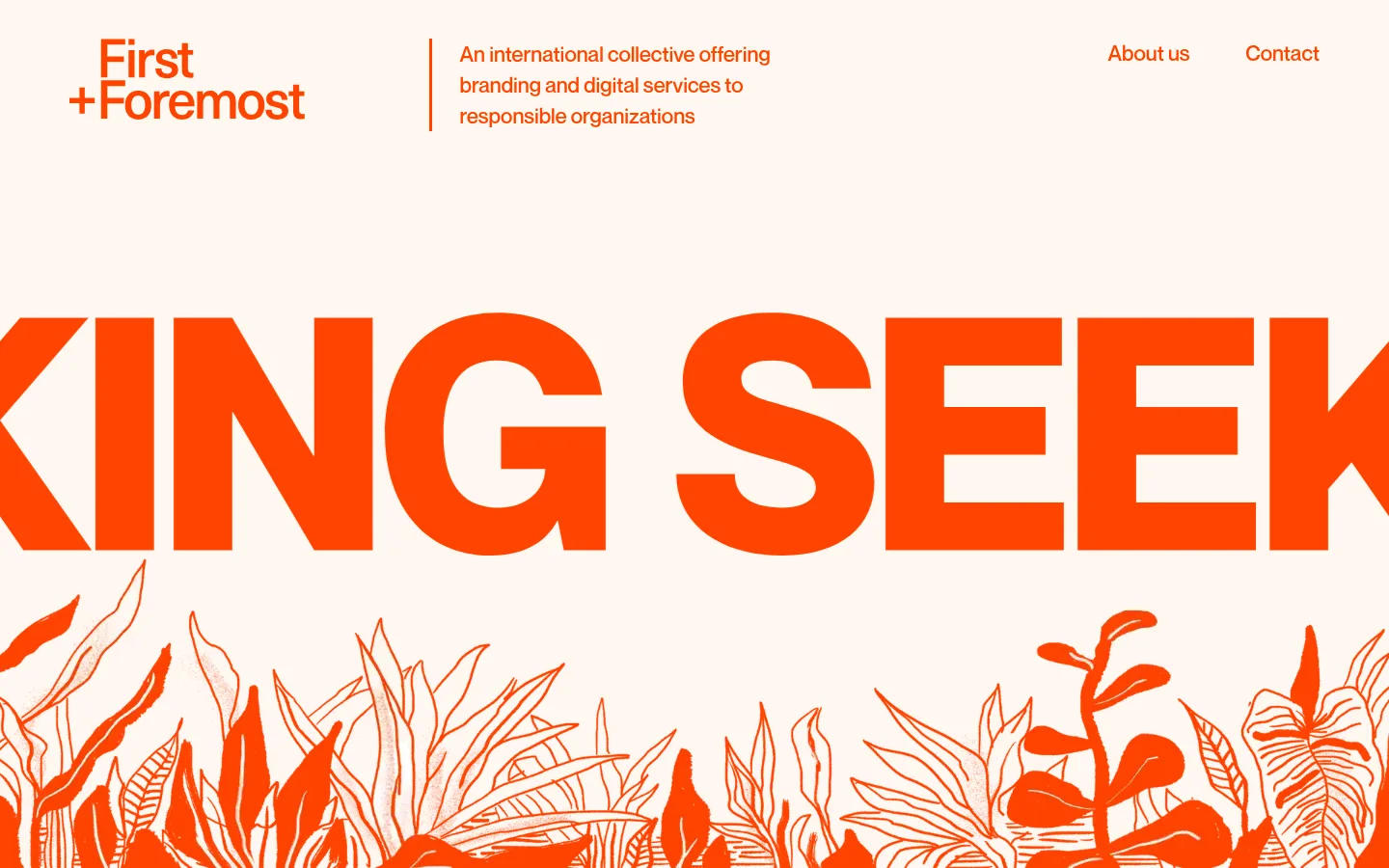
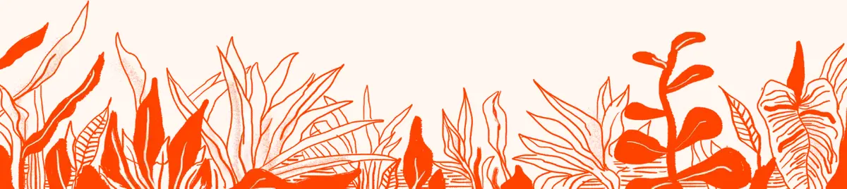
The visual identity is built around a near-monochrome pairing: bright orange-red (#ff4501) for nearly all text, navigation and calls to action, against a creamy canvas (#fff7f1). Pale peach (#ffefe9) appears in selected full-width bands, notably the collective introduction and footer, while white provides contrast inside orange sections and circular controls. Oversized, tightly composed display lettering dominates the opening and later transition moments; NeueMontreal supports this expressive scale while remaining clear in compact body copy and navigation. The page uses large areas of open canvas, centered editorial statements, and alternating full-width and contained sections rather than a rigid repeated card grid. Botanical line illustration gives the hero an organic counterpoint to the typographic block; portraits and a monochrome video add human and archival detail. Keep component styling flat and direct: fine peach rules outline selected cards, while the warm palette and section changes provide most of the hierarchy.
配色
点色块复制色值。用途说明来自对页面的实测位置(背景、文字、描边、按钮)与截图判读。
品牌色
表层色
中性色
功能色
页面底色 · Cream Canvas表层 · Peach Band主文字 · Signal Orange次要文字 · Soft White描边 · Apricot Line强调 · Signal Orange
Display lettering, headings, body copy, navigation, and buttons throughout the page.
角色
示例
字号
字重
行高
字距
特大标题
Oversized, cropped headline lettering in hero and transition sections.
First and Foremost
200px
700
0.8
0
一级标题
Primary section statements and prominent editorial headings.
First and Foremost
80px
400
1.4
0
二级标题
Large supporting section headings and feature introductions.
First and Foremost
58px
100
1.2
0
三级标题
Subsection headings and service or content titles.
First and Foremost
36px
100
1.2
0
四级标题
Short uppercase labels and emphatic section markers.
First and Foremost
28px
900
normal
0
正文
Explanatory paragraphs, service descriptions, and supporting copy.
The quick brown fox 敏捷的狐狸
16px
400
normal
0
按钮
Large, light-weight text on prominent pill-shaped calls to action.
The quick brown fox 敏捷的狐狸
26px
100
3.08
0
导航
Header navigation links and primary site navigation.
The quick brown fox 敏捷的狐狸
22px
400
1.36
0
间距与布局
基准单位 2px · 密度:宽松
160px版块间距
3px元素间距
—卡片内边距
1296px内容最大宽度
3px
16px
28px
30px
35px
40px
50px
58px
60px
65px
80px
100px
110px
160px
The measured page max width is 1296px, with a spacious overall density and a 160px section gap. The header aligns a stacked wordmark, a short introduction, and right-side links across three areas. A full-bleed typographic hero leads into centered editorial content, then alternates pale full-width bands with warm-canvas sections. Feature and service content shifts between split layouts and columns; team imagery spans the page. Preserve broad breathing room and strong alignment changes rather than forcing every block into one grid.
圆角与层次
按钮 · 9999px
卡片 · 50%
xl · media
The page is predominantly flat: section backgrounds, typography, and whitespace establish hierarchy instead of stacked cards. Selected text cards use a thin #ffc2a9 outline, and some media has a pronounced warm-tinted shadow. Preserve clean edges and restrained layering; avoid adding generic shadows to buttons or content blocks.
组件
下面的预览按实测的按钮、输入框、徽标、卡片样式重建(字体用替代字体)。
Header
A three-area header places a stacked orange wordmark on the left, a short introduction beside a vertical divider, and compact links on the right.
Display hero
An oversized orange headline is intentionally cropped by the viewport, with botanical line art filling the lower edge.
Editorial statement
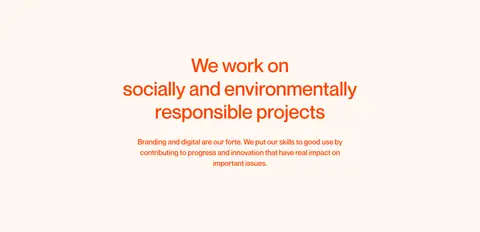
Centered heading and compact supporting paragraph sit in a large open canvas area.
Collective feature
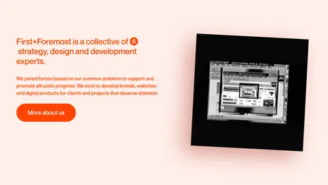
A peach band pairs a left-aligned text block and orange pill CTA with an offset monochrome video or media frame.
Comparison band
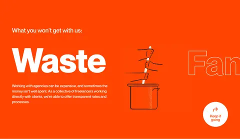
A full-width orange section uses white headings and copy, illustrations, and a circular white control.
Service list
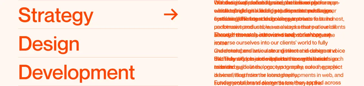
Large orange service labels stack beside explanatory copy, with a small arrow cue and an outlined language badge.
Team panel
An orange feature panel combines white heading and description, a white pill CTA, and a horizontal row of circular portraits.
Footer
A pale peach footer keeps copyright information and compact social icons on a simple, uncluttered row.
Imagery · The hero pairs massive orange lettering with a fine-line botanical illustration that rises from the lower edge. Other sections use a monochrome archival-style video, small illustrated vignettes, and a row of circular team portraits. Keep imagery documentary and graphic rather than glossy; use clear crops, natural contrast, and occasional warm visual integration with the surrounding orange or peach.
Use #ff4501 for the primary text and action color.
Keep the main canvas warm with #fff7f1.
Alternate peach bands selectively to mark important sections.
Let display lettering extend beyond its container when the composition calls for it.
Pair expressive typography with concise, readable supporting copy.
Use illustrations and photography as purposeful editorial accents.
✕ 不该做
Do not introduce unmeasured palette colors.
Do not turn every content block into a bordered card.
Do not center-align every section; vary alignment with intent.
Do not compress the page into a dense, dashboard-like layout.
Do not use glossy product renders or generic decorative gradients.
Do not add shadows to elements that are otherwise flat.
给 AI 的提示词
想快速出一个同风格的新页面,把这段话连同 DESIGN.md 一起发给 AI。
Build a new agency page in the First and Foremost visual style. Use #fff7f1 Cream Canvas as the dominant background and #ff4501 Signal Orange for text, navigation, and primary actions. Reserve #ffefe9 Peach Band for occasional full-width section changes; use #ffffff Soft White for reversed content on orange and #ffc2a9 Apricot Line for delicate outlines. Set typography in NeueMontreal or a close free sans-serif substitute, mixing oversized display lettering with light editorial headings and compact body copy. Create a spacious, long-form layout with changing alignments, split features, and selective full-bleed sections. Use organic line illustration, candid team portraits, and documentary media. Keep surfaces mostly flat, buttons rounded, and calls to action direct. Avoid extra colors, generic card grids, and decorative gradients.